【CSS3】---background-origin background-clip background-size
来源:互联网 发布:国外交友软件 编辑:程序博客网 时间:2024/04/26 00:59
设置元素背景图片的原始起始位置。
语法:
background-origin : border-box | padding-box | content-box;
参数分别表示背景图片是从边框,还是内边距(默认值),或者是内容区域开始显示。
效果如下:
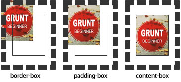
需要注意的是,如果背景不是no-repeat,这个属性无效,它会从边框开始显示。
例子:
<!DOCTYPE html><html><head> <meta charset="utf-8"><title>背景原点</title><style type="text/css">.wrap { width:220px; border:20px dashed #000; padding:20px; font-weight:bold; color:#000; background:#ccc url(http://static.mukewang.com/static/img/logo_index.png) no-repeat; background-origin:content-box;//内容区域显示 position: relative;}.wrap span { position: absolute; left:0; top:0;}.content { height:80px; border:1px solid #333;}</style> </head> <body><div class="wrap"><span>padding</span> <div class="content">content</div></div></body></html>
效果:
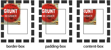
background-clip
用来将背景图片做适当的裁剪以适应实际需要。
语法:
background-clip : border-box | padding-box | content-box | no-clip
参数分别表示从边框、或内填充,或者内容区域向外裁剪背景。no-clip表示不裁切,和参数border-box显示同样的效果。backgroud-clip默认值为border-box。
效果如下图所示:
例子:
<!DOCTYPE html><html><head> <meta charset="utf-8"><title>背景裁切</title><style type="text/css">.wrap { width:220px; border:20px dashed #000; padding:20px; font-weight:bold; color:#000; background:#ccc url(http://static.mukewang.com/static/img/logo_index.png) no-repeat; background-origin: border-box; background-clip:padding-box; position: relative;}.wrap span { position: absolute; left:0; top:0;}.content { height:80px; border:1px solid #333;}</style> </head> <body><div class="wrap"><span>padding</span> <div class="content">content</div></div></body></html>
效果: padding-box效果:
background-size
设置背景图片的大小,以长度值或百分比显示,还可以通过cover和contain来对图片进行伸缩。
语法:
background-size: auto | <长度值> | <百分比> | cover | contain
取值说明:
1、auto:默认值,不改变背景图片的原始高度和宽度;
2、<长度值>:成对出现如200px 50px,将背景图片宽高依次设置为前面两个值,当设置一个值时,将其作为图片宽度值来等比缩放;
3、<百分比>:0%~100%之间的任何值,将背景图片宽高依次设置为所在元素宽高乘以前面百分比得出的数值,当设置一个值时同上;
4、cover:顾名思义为覆盖,即将背景图片等比缩放以填满整个容器;
5、contain:容纳,即将背景图片等比缩放至某一边紧贴容器边缘为止。
提示:大家可以在右边的编辑窗口输入自己的代码尝试不同取值的效果。
multiple backgrounds
多重背景,也就是CSS2里background的属性外加origin、clip和size组成的新background的多次叠加,缩写时为用逗号隔开的每组值;用分解写法时,如果有多个背景图片,而其他属性只有一个(例如background-repeat只有一个),表明所有背景图片应用该属性值。
语法缩写如下:
background : [background-color] | [background-image] | [background-position][/background-size] | [background-repeat] | [background-attachment] | [background-clip] | [background-origin],...
可以把上面的缩写拆解成以下形式:
background-image:url1,url2,...,urlN;
background-repeat : repeat1,repeat2,...,repeatN;backround-position : position1,position2,...,positionN;background-size : size1,size2,...,sizeN;background-attachment : attachment1,attachment2,...,attachmentN;background-clip : clip1,clip2,...,clipN;background-origin : origin1,origin2,...,originN;background-color : color;
注意:
- 用逗号隔开每组 background 的缩写值;
- 如果有 size 值,需要紧跟 position 并且用 "/" 隔开;
- 如果有多个背景图片,而其他属性只有一个(例如 background-repeat 只有一个),表明所有背景图片应用该属性值。
- background-color 只能设置一个。
举例:
有三张单独的图片:


使用多背景技术实现:
例子:
<!DOCTYPE html><html><head> <meta charset="utf-8"><title>多重背景</title><style type="text/css">.demo{ width: 300px; height: 140px; border: 1px solid #999; background-image: url(http://img.mukewang.com/54cf2365000140e600740095.jpg), url(http://img.mukewang.com/54cf238a0001728d00740095.jpg), url(http://img.mukewang.com/54cf23b60001fd9700740096.jpg); background-position: left top, 100px 0, 200px 0; background-repeat: no-repeat, no-repeat, no-repeat; margin:0 0 20px 0;}.task { width: 300px; height: 140px; border: 1px solid #999; background:url(http://static.mukewang.com/static/img/logo_index.png) left top/75% 50% no-repeat, url(http://static.mukewang.com/static/img/logo_index.png) right bottom/50% 45% no-repeat; }</style> </head> <body><div class="demo"></div><div class="task"></div></body></html>
效果:
- 【CSS3】---background-origin background-clip background-size
- css3新增背景属性background-clip/background-origin/background-size
- css3中的background的新特性background-origin,background-clip,background-size详解
- CSS3教程:background-clip和background-origin
- CSS3 background-origin,background-clip的比较
- css3 background-clip和background-origin
- CSS3背景:background-origin、background-clip、 background-size、multiple backgrounds、制作导航菜单综合练习题
- text-shadow,background-origin,background-size,background-clip
- css3:背景属性background-origin/clip详解
- 深入浅出CSS3:background-clip,background-origin和border-image教程
- 深入浅出CSS3:background-clip,background-origin和border-image教程
- CSS3中background-clip和background-origin的区别
- 深入浅出CSS3:background-clip,background-origin和border-image教程
- 深入浅出CSS3:background-clip,background-origin和border-image教程
- css3中background-clip和background-origin的区别
- 深入浅出CSS3 background-clip,background-origin和border-image教程
- CSS3 Background-clip
- CSS3之background-clip
- 【CSS3】---颜色RGBA及渐变色
- 【CSS3】---text-overflow 与 word-wrap
- 【CSS3】---嵌入字体@font-face
- 服务器被黑给我上了一课
- 【CSS3】---文本阴影text-shadow
- 【CSS3】---background-origin background-clip background-size
- 【CSS3】---练习制作导航菜单
- 【CSS3】---属性选择器
- 【CSS3】---结构性伪类选择器-root+not+empty+target
- 【CSS3】---结构性伪类选择器-first-child+last-child
- UIImage+ImageEffects的category 模糊效果:
- CSS强制英文/中文换行与不换行
- 【CSS3】---first-of-type选择器+nth-of-type(n)选择器
- android studio下gradle与Git出错解决方法