Matplotlib 如何画散点图的图例
来源:互联网 发布:js给div设置内容 编辑:程序博客网 时间:2024/05/18 13:44
作者:SunnyMarkLiu
链接:https://www.zhihu.com/question/37146648/answer/80425957
来源:知乎
著作权归作者所有。商业转载请联系作者获得授权,非商业转载请注明出处。
from matplotlib import pyplot as pltfrom matplotlib import font_managerimport file2matrixmatrix, labels = file2matrix.file2matrix('datingTestSet.txt')print matrixprint labelszhfont = matplotlib.font_manager.FontProperties(fname='/usr/share/fonts/truetype/arphic/ukai.ttc')""" 比较好看的绘制方法 """plt.figure(figsize=(8, 5), dpi=80)axes = plt.subplot(111) #111代表将画布分割成1行1列,图像画在从左到右从上到下的第1块# 将三类数据分别取出来# x轴代表飞行的里程数# y轴代表玩视频游戏的百分比type1_x = []type1_y = []type2_x = []type2_y = []type3_x = []type3_y = []print 'range(len(labels)):'print range(len(labels))for i in range(len(labels)): if labels[i] == 1: # 不喜欢 type1_x.append(matrix[i][0]) type1_y.append(matrix[i][1]) if labels[i] == 2: # 魅力一般 type2_x.append(matrix[i][0]) type2_y.append(matrix[i][1]) if labels[i] == 3: # 极具魅力 print i, ':', labels[i], ':', type(labels[i]) type3_x.append(matrix[i][0]) type3_y.append(matrix[i][1])type1 = axes.scatter(type1_x, type1_y, s=20, c='red')type2 = axes.scatter(type2_x, type2_y, s=40, c='green')type3 = axes.scatter(type3_x, type3_y, s=50, c='blue')# plt.scatter(matrix[:, 0], matrix[:, 1], s=20 * numpy.array(labels),# c=50 * numpy.array(labels), marker='o',# label='test')plt.xlabel(u'每年获取的飞行里程数', fontproperties=zhfont)plt.ylabel(u'玩视频游戏所消耗的事件百分比', fontproperties=zhfont)axes.legend((type1, type2, type3), (u'不喜欢', u'魅力一般', u'极具魅力'), loc=2, prop=zhfont)plt.show()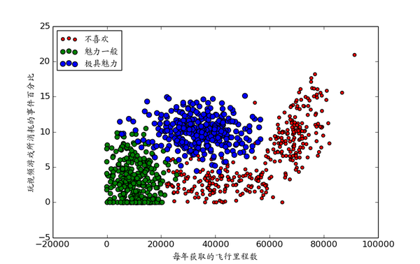
0 0
- Matplotlib 如何画散点图的图例
- matplotlib最简单的带图例线图
- python matplotlib如何将图例放在图外
- python matplotlib如何将图例放在图外
- Matplotlib设置图例字体大小
- 【Matplotlib】 增加图例
- 【Matplotlib】图例分开显示
- matplotlib图例中文乱码
- matplotlib 图例显示中文
- matplotlib图例中文乱码(比较笨的办法)
- matplotlib的基本用法(四)——设置legend图例
- windows下matplotlib图例中文无法显示的解决办法
- matplotlib绘制图例标签中带有公式的图
- matplotlib——对坐标的控制,加图例注释
- matplotlib图例中文显示问题
- python matplotlib绘图时图例显示问题
- Matplotlib 图例中文显示(大小修改)
- Matplotlib 中文用户指南 3.6 图例指南
- 数据库连接监控 P6Spy
- Apache ActiveMQ使用详解
- rsync文件同步工具,可实现Linux之间,Linux与Windows之间的文件同步
- 设计模式(六)--迭代模式
- IIS 7上部署PHP
- Matplotlib 如何画散点图的图例
- android studio配置git详解
- Xcode中SVN相关问题大串讲
- Android 源码查看和解析
- IOS11操作系统满满黑科技值不值得拥有?
- RxAndroid
- map/reduce之间的shuffle,partition,combiner过程的详解
- 单例模式的几种写法
- opencv 摄像头捕获的图像保存为avi视频 代码解析