react-native 布局教程
来源:互联网 发布:java 随机数原理 编辑:程序博客网 时间:2024/04/29 23:58
react-native 布局教程
1 flex布局基本概念
flex是Flexible Box的缩写,意为”弹性布局”,用来为盒状模型提供最大的灵活性。采用flex布局的元素,称为flex容器(flex container),简称”容器”。它的所有子元素自动成为容器成员,称为flex项目(flex item),简称”项目”。如下图所示:
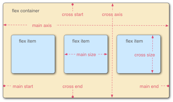
容器默认存在两根轴:主轴(main axis)和交叉轴(cross axis)。主轴的开始位置(与边框的交叉点)叫做main start,结束位置叫做main end;交叉轴的开始位置叫做cross start,结束位置叫做cross end。
项目默认沿主轴排列。单个项目占据的主轴空间叫做main size,占据的交叉轴空间叫做cross size。
Flex布局与Android的线性布局(LinearLayout)有点类似,都可以设置布局方向,对齐方式,以及项目的布局占位权重,区别是flex容器中项目分布的总长度超出屏幕宽度,超出的那部分项目不可见,项目不会变形,或者可以设置flexWrap属性,让容器可以分行布局,所有项目都能显示出来。
2 flex基本属性
flex属性声明在:/node_modules/react-native/Libraries/StyleSheet/LayoutPropTypes.js
// https://developer.mozilla.org/en-US/docs/Web/CSS/flex-direction flexDirection: ReactPropTypes.oneOf([ 'row', 'column' ]), // https://developer.mozilla.org/en-US/docs/Web/CSS/flex-wrap flexWrap: ReactPropTypes.oneOf([ 'wrap', 'nowrap' ]), // How to align children in the main direction // https://developer.mozilla.org/en-US/docs/Web/CSS/justify-content justifyContent: ReactPropTypes.oneOf([ 'flex-start', 'flex-end', 'center', 'space-between', 'space-around' ]), // How to align children in the cross direction // https://developer.mozilla.org/en-US/docs/Web/CSS/align-items alignItems: ReactPropTypes.oneOf([ 'flex-start', 'flex-end', 'center', 'stretch' ]), // How to align the element in the cross direction // https://developer.mozilla.org/en-US/docs/Web/CSS/align-items alignSelf: ReactPropTypes.oneOf([ 'auto', 'flex-start', 'flex-end', 'center', 'stretch' ]), // https://developer.mozilla.org/en-US/docs/Web/CSS/flex flex: ReactPropTypes.number,由上述代码,我们可以看到flex的属性并不多,而且很好记忆,以下将会一一介绍
flex属性可以分为容器属性和项目属性
其中容器属性包括:flexDirection,justifyContent,alignItems,flexWrap
项目属性包括:flex,alignSelf
以下介绍会使用到一些代码和图片,先定义两个简单组件,方便理解
//定义一个默认半径为20,颜色为#527fe4的圆组件var Circle = React.createClass({ render : function(){ var size = this.props.size || 20; var color = this.props.color || '#527fe4'; return <View style={{backgroundColor:color,borderRadius:size/2,height:size,width:size,margin:1}}/> },});//定义一个放置标题和项目的容器,传入的value属性将会是需要介绍的flex属性var Value = React.createClass({ render : function(){ var value = <View> <Text style={styles.valueText}>{this.props.title}</Text> <View style={[styles.valueContainer,this.props.value]}> {this.props.children} </View> </View>; return value; },});//定义一个数组放置5个圆var children = [<Circle/>,<Circle/>,<Circle/>,<Circle/>,<Circle/>];2.1 容器属性
flexDirection:布局方向,决定主轴的方向,默认值是
column,即纵向布局值 描述 row 横向布局,主轴为水平方向 column 纵向布局,主轴为竖直方向row:横向布局
代码:<Value title='row' value={{flexDirection:'row'}}> {children}</Value>视图:

column:纵向布局
代码:<Value title='column' value={{flexDirection:'column'}}> {children}</Value>视图:

justifyContent:主轴方向对齐方式,默认值是
flex-start,即主轴的开端值 描述 flex-start 主轴开端 center 居中 flex-end 主轴末端 space-between 项目与项目之间插入相等空隙 space-around 项目两旁插入相等空隙flex-start:主轴开端
代码:<Value title='flex-start' value={{flexDirection:'row', justifyContent:'flex-start'}}> {children}</Value>视图:

center:主轴的中间位置
代码:<Value title='center' value={{flexDirection:'row',justifyContent:'center'}}> {children}</Value>视图:

flex-end:主轴的末端位置
代码:<Value title='flex-end' value={{flexDirection:'row',justifyContent:'flex-end'}}> {children}</Value>视图:

space-between:项目与项目之间插入相同距离的空隙
代码:<Value title='space-between' value={{flexDirection:'row',justifyContent:'space-between'}}> {children}</Value>视图:

space-around:项目两旁插入相同距离的空隙
代码:<Value title='space-around' value={{flexDirection:'row',justifyContent:'space-around'}}> {children}</Value>视图:

alignItems:交叉轴方向对齐方式,默认值
flex-start,即交叉轴开端值 描述 flex-start 交叉轴开端 center 交叉轴居中 flex-end 交叉轴末端flex-start:交叉轴开端

center:交叉轴的中间位置

flex-end:交叉轴的末端位置

flexWrap:包含内容,默认值是
nowrap,不包裹所有内容值 描述 nowrap 项目沿主轴方向布局,超出容器长度的部分不可见 wrap 项目沿主轴布局所需长度大于容器总长度时,分行布局,所有项目内容都可见nowrap:不包裹内容
代码:<Value title='nowrap' value={{flexWrap:'nowrap',flexDirection:'row'}}> {children}{children}{children}{children}</Value>视图::

wrap:包裹内容
代码:<Value title='wrap' value={{flexWrap:'wrap',flexDirection:'row'}}> {children}{children}{children}{children}</Value>视图:

2.2 项目属性
flex:布局权重
值 描述 >=0 项目占位权重,容器包含至少2项目时,项目使用flex属性才有意义1:0:flex=0的项目占用空间仅为内容所需空间,flex=1的项目会占据其余所有空间
代码:<Value title='1:0' value={{flexDirection:'row'}}> <Text style={{color:'white',flex:1,textAlign:'center',backgroundColor:'red',fontSize:20,paddingHorizontal:10}}>flex=1</Text> <Text style={{color:'white',textAlign:'center',backgroundColor:'yellow',fontSize:20,paddingHorizontal:10}}>flex=0</Text></Value>
2:1
代码:<Value title='2:1' value={{flexDirection:'row'}}> <Text style={{color:'white',flex:2,textAlign:'center',backgroundColor:'blue',fontSize:20}}>flex=2</Text> <Text style={{color:'white',flex:1,textAlign:'center',backgroundColor:'green',fontSize:20}}>flex=1</Text></Value>
1:1:1:1
代码:<Value title='1:1:1:1' value={{flexDirection:'row'}}> <Text style={{color:'white',flex:1,textAlign:'center',backgroundColor:'red',fontSize:20}}>flex=1</Text> <Text style={{color:'white',flex:1,textAlign:'center',backgroundColor:'yellow',fontSize:20}}>flex=1</Text> <Text style={{color:'white',flex:1,textAlign:'center',backgroundColor:'blue',fontSize:20}}>flex=1</Text> <Text style={{color:'white',flex:1,textAlign:'center',backgroundColor:'green',fontSize:20}}>flex=1</Text></Value>
alignSelf:项目交叉轴方向自身对齐方式
值 描述 flex-start 开端 center 居中 flex-end 末端代码:
<Value title='alignSelf' value={{flexDirection:'row',height:30,alignItems:'center'}}> <View style={{alignSelf:'flex-start'}}> <Circle/> </View> <View style={{alignSelf:'flex-end'}}> <Circle/> </View> <View style={{alignSelf:'flex-start'}}> <Circle/> </View> <View style={{alignSelf:'flex-end'}}> <Circle/> </View> <View style={{alignSelf:'flex-start'}}> <Circle/> </View></Value>视图:

3 Layout的其他属性
layout除了flex属性之外,当然还有其他属性,同样声明在:/node_modules/react-native/Libraries/StyleSheet/LayoutPropTypes.js
width: ReactPropTypes.number, height: ReactPropTypes.number, top: ReactPropTypes.number, left: ReactPropTypes.number, right: ReactPropTypes.number, bottom: ReactPropTypes.number, margin: ReactPropTypes.number, marginVertical: ReactPropTypes.number, marginHorizontal: ReactPropTypes.number, marginTop: ReactPropTypes.number, marginBottom: ReactPropTypes.number, marginLeft: ReactPropTypes.number, marginRight: ReactPropTypes.number, padding: ReactPropTypes.number, paddingVertical: ReactPropTypes.number, paddingHorizontal: ReactPropTypes.number, paddingTop: ReactPropTypes.number, paddingBottom: ReactPropTypes.number, paddingLeft: ReactPropTypes.number, paddingRight: ReactPropTypes.number, borderWidth: ReactPropTypes.number, borderTopWidth: ReactPropTypes.number, borderRightWidth: ReactPropTypes.number, borderBottomWidth: ReactPropTypes.number, borderLeftWidth: ReactPropTypes.number, position: ReactPropTypes.oneOf([ 'absolute', 'relative' ]),position:默认值为relative
react的默认位置方式是relative,项目是一个接一个排列下去的,absolute为绝对布局,一般会与left和top属性一起使用。有时候我们需要实现某些项目重叠起来,absolute属性就能发挥作用了,例如下图:

react的基本组件暂时不支持以图片作为背景,所以这里的的转入是一个文本组件,而红色的圆形是一个图片组件,在IOS里面组件也可以作为容器,图片可以正常显示,但是在Android里面,可能存在些问题,如果使用组件作为容器都会出现图片变得好奇怪,所以就可以absoulte来解决问题了。代码如下:
<View style={{width:80,height:80,alignItems:'center',justifyContent:'center'}}> <Image style={{position:'absolute',left:0,top:0,resizeMode:'contain',width:80,height:80}} source={require('image!finance_usercenter_ic_into')}/> <Text style={{width:80,textAlign:'center',color:'white',fontSize:16}}>转入</Text></View>这里的View跟Android的View有点不一样,View是可以作为容器也可以作为项目,View作为容器还有其他很多属性,例如backgroundColor,borderWidth,borderColor,opacity等等,这里不一一介绍。
4 布局的尺寸说明
react native的宽高是不需要带单位的,那些width,height,padding,margin的赋值都直接是数字的,当你设定width:10,在IOS的话就是设置了10pt宽度,而在Android上面是10dp,在做项目时,辛勤的美工会帮我们标出所有UI控件的宽,高,边距等等,他们用的单位也是dp,所以赋值style中宽高时,直接填入数字即可。
- react-native 布局教程
- react-native 布局
- React-Native中的布局
- React Native Flex布局
- react-native布局
- react-native flex布局
- React Native布局篇
- 【ReactNative】react-native 布局
- react native 布局篇
- React Native-FlexBox布局
- React Native 布局
- React Native Flexbox布局
- React Native FlexBox布局
- React-native 布局
- React Native FlexBox布局
- React Native FlexBox布局
- react-native布局demo1
- 【ReactNative】react-native 布局
- git学习一 git基础介绍
- 大数乘法和快速傅里叶变换FFT
- 如何用学校的有网关的网线连接笔记本电脑
- 修改visual studio的默认快捷键
- 新项目开发及运行环境配置-nodejs前台+java后台+postgresql数据库+nginx+tomcat
- react-native 布局教程
- 微信小程序的组件用法与传统HTML5标签的区别
- java之接口
- insert into on DUPLICATE KEY UPDATE使用
- 庆祝博客开通,这是个良好的开端,哈哈哈哈!
- IIS安装报错:使用了托管处理程序,但是未安装或未完整安装 ASP.NET
- MySQL 入门常用命令大全(上)
- 计算机视觉caffe之路附1:Ubuntu+Opencv+Caffe开发深度学习常见错误及经验
- ARM程序的镜像文件以及在内存中的分区