CSS/LESS tips and snippets
来源:互联网 发布:探索者结构设计软件 编辑:程序博客网 时间:2024/06/05 00:31
<style type="text/css"> span.inner { color: green; } span.outer { color: red; text-decoration: line-through; }</style><span class="outer"> <span class="inner">foo bar</span></span>
虽然css3中定义了p {
text-decoration: underline;
-moz-text-decoration-color: red; /* Code for Firefox */
text-decoration-color: red;
}
剪切效果实现
实现思路:利用一个和需要剪切的元素背景色相同的一个svg作为元素after seudo element的background,设置绝对定位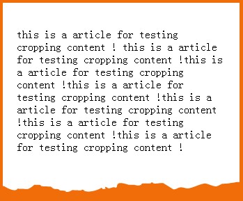
<body><article> <p>this is a article for testing cropping content ! this is a article for testing cropping content !this is a article for testing cropping content !this is a article for testing cropping content !this is a article for testing cropping content !this is a article for testing cropping content !this is a article for testing cropping content ! </p></article></body>
body { background: #f06d09;}article { background: white; width: 300px; padding:20px; position: relative;}article::after{ content: ""; position: absolute; top:100%; left:0; height:20px; width: 100%; background: url(http://html5hub.com/wp-content/themes/html5hub/images/rip.svg?1404843590) bottom center;}
http://codepen.io/anon/pen/YwKYzb
关于@media以及@keyframe的selector
.screen-color { @media screen { color: green; @media (min-width: 768px) { color: red; } } @media tv { color: black; }}//将编译输出以下@media screen { .screen-color { color: green; }}@media screen and (min-width: 768px) { .screen-color { color: red; }}@media tv { .screen-color { color: black; }}
当gulp-less编译时,如果extend(.NONEXISINGMIXIN),则不会主动抛出任何异常,注意这里依然有依赖关系!但是对于@import一个不存在的文件,或者调用不存在的mixin,或者语法错误,都会抛出异常
bootstrap less代码组织学习心得:
一般extend只用于对于静态的class来做扩展,而静态的class则可能需要一个调用一个含参数的mixin来实现! component modifier file(extend一个component selector再加上自己的css) + components file(调用mixin构建一个组件的selector) + common mixin file(定义mixin,永远不会被编译输出!) 这样我们最好在前端LESS项目中,使用三级文件结构: mixin->component->componentMod
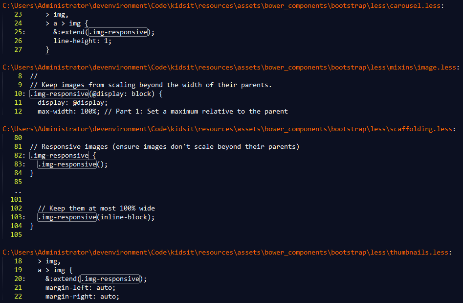
以下面的bootstrap代码为例,mixins/image.less文件定义了.img-responsive() mixin; scaffolding.less中的.img-responsive则定义了有responsive特性的img所应该有的css属性;carousel.less和thumbnails.less文件中则定义modifier class:即responsive image在carousel和thumnnail两种场景下的modifier
使用lessc --lint编译器输出extend无法找到对应class的错误
vagrant@homestead:~/nodewrapper$ lessc --lint /home/vagrant/Code/resources/assets/less/style.less extend ' .clearfix' has no matchesextend ' .clearfix' has no matchesextend ' .clearfix' has no matches
这个命令实际上是非常有用的,因为类似自动化build工具,gulp-less在extend出现错误时不会有任何打印输出!!!这会让你一筹莫展
如何解决背景图片下内容文字由于对比度问题导致的无法阅读问题
经常,我们希望有一个漂亮的图片作为页面一个block的背景色,外加一个滤镜,会将图片模糊化或者变暗,这种效果非常棒,但是往往可能会带来一个问题:前景的文字由于和背景图片相叠加,很有可能难以阅读,怎么办呢?
一个思路是:使用另外一个绝对定位的div来做overlay覆盖掉前面的内容部分,同时设置该overlay的background为rgba(0,0,0,0.6),设置内容block的文本color为white(或者任何和黑色有较高对比度的颜色),设置内容block的z-index为大于0,这样就可以达到二者兼得的效果
<div class="bg-imaged"> <div class="jobinfo">this is a job info card this is a job info cardthis is a job info cardthis is a job info cardthis is a job info cardthis is a job info cardthis is a job info cardthis is a job info cardthis is a job info cardthis is a job info cardthis is a job info card</div> <div class="overlay"></div></div>
.bg-imaged{ background: url(https://pull-foodplanet-kumma.netdna-ssl.com/IMG/rtpposter.gif); position: relative; /* background-size: cover; */}.jobinfo{ width: 900px; height: 400px; position:relative; z-index: 10; color: white;}.overlay{ position: absolute; top: 0; left: 0; right: 0; bottom: 0; background-color: rgba(0,0,0,0.6);}
style the scrollbar
IE是最早引入scrollbar style的浏览器,chrome,firefox各有不同。
::-webkit-scrollbar-track { background-color: #b46868;} /* the new scrollbar will have a flat appearance with the set background color */ ::-webkit-scrollbar-thumb { background-color: rgba(0, 0, 0, 0.2); } /* this will style the thumb, ignoring the track */ ::-webkit-scrollbar-button { background-color: #7c2929;} /* optionally, you can style the top and the bottom buttons (left and right for horizontal bars) */ ::-webkit-scrollbar-corner { background-color: black;} /* if both the vertical and the horizontal bars appear, then perhaps the right bottom corner also needs to be styled */
为了保持兼容性,可以使用jquery的一个plugin:
http://jscrollpane.kelvinluck.com/
float
http://www.cnblogs.com/coffeedeveloper/p/3145790.html
float元素默认宽度为内容宽度 ,并且脱离文档流(也就是说该元素不再占有原有的位置,后续元素将补上去占有其位置),向指定方向(left,right)一直移动直到被其container挡住为止。
注意:float元素脱离文档流和绝对定位元素的脱离文档流还是有些区别:float元素会被container挡住限制,而absolute positioned元素则没有这个限制.
所有float的元素本身在同一个文档流中,也就是说他们是互相影响的(和绝对定位时脱离文档流有所不同)。
对后续的元素来说,floated元素脱离了文档流,但是对于后续的内容来说该floated元素仍然在文档流
为了消除浮动元素对后续元素的影响,可以在后续元素中设置clear属性来清除浮动,实际使用中一般在浮动元素的父元素上增加一个clearfix的通用hack(原理是通过:after伪元素设置clear both)来实现清除浮动元素对后续的影响。
Flex
1. flex container: display:flex即可
2. flex item:flex container中的在文档流中的直接子元素
3.main-axis:排列的主方向
4.cross axis:主方向的垂直方向
flex-direction: row/row-reverse/column/column-reverse:指定子元素的排列顺序
flex-wrap:是否允许换行
flex-flow: 上面direction和wrap的整合写法
order: item的排序序号,默认为0
弹性相关的flex-grow(设置item在container以flex-basis做完布局后,如果有空余空间,则给该item分配的剩余空间的百分比),flex-shrink,flex-basis(设置flex item的初始宽高)
一个flex item分配的宽度=flex-basis+flow-grow/sum(flow-grow)*remainWidthAfterFlexBasisLayouted
flex-shrink:当以flex-basis布局时,发现remain为负时,就按照这个flex-shrink的比例相应缩减item的宽度。 一个flex item分配宽度=flex-basis+flow-shrink/sum(flow-shrink)*remain(注意:remain这里为负数)
对齐: justify-content, align-items,align-self,align-content
子元素撑满父元素垂直居中的几个CSS思路
https://segmentfault.com/a/1190000000381042
如何解决由于内容变化导致scroll而发生渲染抖动的问题?
有时候,我们可能频繁操作web app,导致动态html内容经常超过body的范围,从而浏览器自动加入一个滚动框,而一旦内容又恢复到body可以容纳的话,又会自动清除滚动框,这可能不一定是你想要的效果,因为浏览器会因此而发生渲染闪烁。一个解决方案是:添加:overflow: scroll css代码
body{ overflow: scroll; }
- CSS/LESS tips and snippets
- javascript tips and snippets
- Code snippets for tips
- Two informative resources: Tooltips and CSS tips
- less css
- Less-CSS
- Problem and Solution Code Snippets
- css tips
- CSS tips
- CSS Tips
- css tips
- [css] tips
- css tips
- The CSS Anthology : 101 Essential Tips, Tricks and Hacks
- sublime text 3插件-Emmet Css Snippets
- code snippets about copy constructor and temporary
- Code Snippets - Named Colors and Hex Equivalents
- LESS CSS 框架简介
- LESS嵌套中的Mixins和classes
- Less的guards and argument matching
- less @import and extend及mixin详解
- 爬虫Internal server error
- CSS media query应用中的层叠特性使用最佳实践
- CSS/LESS tips and snippets
- mysql视图------第一章
- css display属性详解
- css outline属性
- 救济金发放,紫书P82UVa133
- 提高 iOS App 通知功能启用率的三个策略
- 根据viewport的size自动调整fontsize大小
- 查看域名是否支持IPv6
- html tags and attribute集参考