ggplot2图形解析
来源:互联网 发布:mysql blob最大长度 编辑:程序博客网 时间:2024/06/16 23:05
ggplot2是用于绘图的R语言扩展包。图形组件通过“+”符号, 以图层(layer)的方式来完成图形语法叠加,构成最终的绘图, 每个图层中的图形组件可以分别设定数据、映射或其他相关参数, 因此组件之间具有相对独立性的,可以单独对图层进行修改。
一、ggplot2基本语法
元素 描述 Data(数据) 用于绘图的数据,只能是数据框(data.frame)格式。 Aesthetics(图形属性)表示映射数据的标度。aes参数控制了对哪些变量进行图形映射,以及映射方式。
标度是一种函数,它控制了数学空间到图形元素空间的映射。
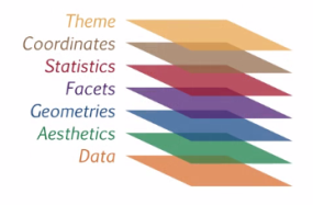
Geometries(几何图形) 表示数据的视觉元素 Facet(分面) 用来描述数据如何被拆分为子集,并分别进行绘图。 Statics(统计) 帮助理解数据的表现方式。 Coordinate(坐标) 图形绘制的空间描述 Theme(主题)控制着图形中的非数据元素外观,主要对标题、坐标轴标签、图例标签等文字调整,
以及网格线、背景、轴须的颜色搭配
、
图层结构:
二、ggplot2各图层说明
1、data(数据)
# 创建一个包含data和aes图层的ggplot对象
dia_plot <- ggplot(dataset , aes(x =, y = ))
2、Aesthetics(图形属性)
aes()函数是ggplot2中的映射函数,是数据关联到相应的图形属性的一种对应关系,将一个变量中离散或连续的数据与一个图形属性相互关联。
分组(group)也是ggplot2的映射关系的一种,ggplot2默认所有观测点分为一组。将观测点按另外的离散变量进行分组处理, 可修改默认的分组设置。
aes() 中的图形属性如下:
:x:对应x轴的坐标位置
y:对应y轴的坐标位置
color:边框颜色
fill:填充色
size:点直径或线条厚度
alpha:透明度
labels:图形或者坐标的文字标签
shape:形状
示例:
# 创建数据集为mtcars,mpg映射 x ,0 映射y的散点图。
p <- ggplot(mtcars, aes(x = mpg, y = wt, color = factor(gear)))
ggplot(mtcars, aes(x = mpg, y = 0)) +
geom_jitter()
3、Geometries(几何图形)
Geo图层控制着生成的图形类型。例如用geom_point()生成散点图,geom_line()生成折线图。 aes层设置的映射关系是默认的, 在Geo图层中沿用已设定的默认映射关系, 也可以在Geo图层进行更改。可用的几何图形如下:
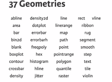
常用的图形类型有:
scatter plots(散点图):point、jitter、abline
Bar plots(柱形图): histogram、bar、errorbar
line plots (线条图): line、smooth
示例:
#散点图, jitter使每个点在x轴的方向上产生随机的偏移, 从而减少图形重叠的问题
ggplot(mtcars, aes(x = cyl, y = wt)) +
geom_jitter(width = 0.1)
#柱形图
ggplot(mtcars, aes(mpg)) +
geom_histogram(binwidth = 1)
# 增加映射 ..density.. 到y属性
ggplot(mtcars, aes(mpg)) +
geom_histogram(aes(y = ..density..), binwidth = 1)
# 线条图
ggplot(dataset, aes(x = , y = )) +
geom_line()
4、统计
每一个几何对象都有一个默认的统计变换, 并且每一个统计变换都有一个默认的几何对象。以某种方式对数据信息进行汇总, 例如stat_smooth()添加平滑曲线。
ggplot指令中,smooth(平滑曲线)按照每个子群分别计算,因为这里存在一个隐匿的图形属性:group继承了col。
示例:
#设置图形属性group =1表示绘制通过所有点的单个线性模型
ggplot(mtcars, aes(x = wt, y = mpg, col = cyl)) +
geom_point() +
geom_smooth(method = "lm", se = FALSE) +
geom_smooth(aes(group = 1), method = "lm", se = FALSE, linetype = 2)
ggplot(mtcars, aes(x = wt, y = mpg, col = factor(cyl))) +
geom_point() +
stat_smooth(method = "lm", se = F) +
stat_smooth(method = "loess", aes(group = 1),
se = F, col = "black", span = 0.7)
5、Coordinate(坐标)
用来控制图形的尺寸。
标度(scale)控制着数据到图形属性的映射,将数据转化为视觉上可以感知的东西, 如大小、颜色、位置和形状。所以通过标度可以修改坐标轴和图例的参数。
可使用 coord_fixed() 或coord_equal()设置图形的长宽比,默认 aspect = 1。
示例:
p <- ggplot(mtcars, aes(x = wt, y = hp, col = am)) + geom_point() + geom_smooth()
# Add scale_x_continuous
p +
scale_x_continuous(limits = c(3, 6), expand = c(0, 0))
# Add coord_cartesion: the proper way to zoom in:
p +
coord_cartesian(xlim = c(3, 6))
# 使用函数改变y轴的界限。
ggplot(mtcars, aes(x = mpg, y = 0)) +
geom_jitter() +
scale_y_continuous(limits = c(-2,2))
# coord_polar()函数将一个平面的x-y笛卡尔坐标转换成极坐标,可用来制作饼图。
wide.bar <- ggplot(mtcars, aes(x = 1, fill = cyl)) +
geom_bar(width = 1)
# Convert wide.bar to pie chart
wide.bar +
coord_polar(theta = "y")
6、分面(facet)
Facets是表现分类变量的一种方式。 先将数据划分为多个子集, 然后将每个子集数据绘制到页面,在同一个页面上摆放多幅图形
ggplot2提供了2种分面类型:网格型(facet_grid)和封装型(facet_wrap)。网格型生成的是一个2维的面板网格, 面板的行与列通过变量来定义, 本质是2维的; 封装型先生成一个1维的面板条块, 然后再分装到2维中, 本质是1维的。最直接的分面使用方法是 facet_grid()函数,只需要规定使用标点符号的行和列上使用的分类变量。
当一个分类变量具有多个等级(level),但并非所有level都存在于另一个变量的子集中,可以丢弃不用的level。
示例:设置scale = "free_y" 和 space = "free_y" 移除没有数据的行。.
ggplot(mamsleep, aes(x = time, y = name, col = sleep)) +
geom_point() +
facet_grid(vore ~ ., scale = "free_y", space = "free_y")
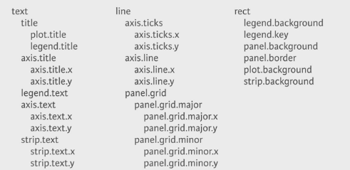
7、Theme(主题)
是跟数据无关的可视元素,数据可视化的最后一步,使图形美观。
按作用对象分成三种类型及对应的函数:
Rectangle(矩形区域):element_rect()
Line(线条): element_text()
text (文字):element_line()
在图形页面中的不同图框之间存在空白,分面(facet)之间、x轴标签和图框之间,图框与整个面板背景之间都存在着空白。示例如下:
# 增加分面之间的空白
library(grid)
z + theme(panel.spacing.x = unit(2, "cm"))
#移除多余的图形边距空白
z + theme(panel.spacing.x = unit(2, "cm"),
plot.margin = unit(c(0,0,0,0), "cm"))
管理、更新和保存主题
theme_update() 在原图层主题设置上进行更新。
theme_set(old) 重新装载图层设置。
应用示例:
# Theme layer saved as an object, theme_pink
theme_pink <- theme(panel.background = element_blank(),
legend.key = element_blank(),
legend.background = element_blank(),
strip.background = element_blank(),
plot.background = element_rect(fill = myPink, color = "black", size = 3),
panel.grid = element_blank(),
axis.line = element_line(color = "black"),
axis.ticks = element_line(color = "black"),
strip.text = element_text(size = 16, color = myRed),
axis.title.y = element_text(color = myRed, hjust = 0, face = "italic"),
axis.title.x = element_text(color = myRed, hjust = 0, face = "italic"),
axis.text = element_text(color = "black"),
legend.position = "none")
# Apply theme_pink to z2
z2 + theme_pink
# Change code so that old theme is saved as old
old <- theme_update(panel.background = element_blank(),
legend.key = element_blank(),
legend.background = element_blank(),
strip.background = element_blank(),
plot.background = element_rect(fill = myPink, color = "black", size = 3),
panel.grid = element_blank(),
axis.line = element_line(color = "black"),
axis.ticks = element_line(color = "black"),
strip.text = element_text(size = 16, color = myRed),
axis.title.y = element_text(color = myRed, hjust = 0, face = "italic"),
axis.title.x = element_text(color = myRed, hjust = 0, face = "italic"),
axis.text = element_text(color = "black"),
legend.position = "none")
# Display the plot z2
z2
# Restore the old plot
theme_set(old)

- ggplot2图形解析
- ggplot2-为图形添加直线
- ggplot2作图详解2:ggplot图形对象
- ggplot2作图详解:ggplot图形对象
- <Data Visualization>1 ggplot2 图形语法
- ggplot2
- ggplot2
- ggplot2
- ggplot2
- ggplot2作图详解5:图层语法和图形组合
- ggplot2作图详解:图层语法和图形组合
- 读书笔记 ▏ggplot2数据分析与图形艺术Ch.1-2
- C# 解析 SGI 图形
- C图形函数解析
- 图形点扫描解析
- iOS图形渲染解析
- 解析DXF图形文件格式
- ggplot2 note
- zabbix-3.2.3安装
- robotframework-ride 运行报monitorcolors not recognized
- Linux 中 tomcat 服务检测/重启 sh 脚本
- 09.03周日
- [模板]-线段树-区间修改 + 区间查询
- ggplot2图形解析
- java控制台学生管理系统
- Python进阶学习笔记——函数式编程之返回函数&闭包
- Eigen matrix to Matlab .mat
- Tomcat8配置tomcat-users.xml配置
- 探索React----第一章:ReactRouterV2基础
- selenium不能调用chrome v54 打开网页
- Java Web基础 Action+Service +Dao三层的功能划分
- UAC关闭设置