Going Deeper into Regression Analysis with Assumptions, Plots & Solutions
来源:互联网 发布:22种免费网络推广方式 编辑:程序博客网 时间:2024/06/05 08:33
Going Deeper into Regression Analysis with Assumptions, Plots & Solutions
Introduction
All models are wrong, but some are useful – George Box
Regression analysis marks the first step in predictive modeling. No doubt, it’s fairly easy to implement. Neither it’s syntax nor its parameters create any kind of confusion. But, merely running just one line of code, doesn’t solve the purpose. Neither just looking at R² or MSE values. Regression tells much more than that!
In R, regression analysis return 4 plots using plot(model_name) function. Each of the plot provides significant information or rather an interesting story about the data. Sadly, many of the beginners either fail to decipher the information or don’t care about what these plots say. Once you understand these plots, you’d be able to bring significant improvement in your regression model.
For model improvement, you also need to understand regression assumptions and ways to fix them when they get violated.
In this article, I’ve explained the important regression assumptions and plots (with fixes and solutions) to help you understand the regression concept in further detail. As said above, with this knowledge you can bring drastic improvements in your models.
Note: To understand these plots, you must know basics of regression analysis. If you are completely new to it, you can start here. Then, proceed with this article.
Assumptions in Regression
Regression is a parametric approach. ‘Parametric’ means it makes assumptions about data for the purpose of analysis. Due to its parametric side, regression is restrictive in nature. It fails to deliver good results with data sets which doesn’t fulfill its assumptions. Therefore, for a successful regression analysis, it’s essential to validate these assumptions.
So, how would you check (validate) if a data set follows all regression assumptions? You check it using the regression plots (explained below) along with some statistical test.
Let’s look at the important assumptions in regression analysis:
- There should be a linear and additive relationship between dependent (response) variable and independent (predictor) variable(s). A linear relationship suggests that a change in response Y due to one unit change in X¹ is constant, regardless of the value of X¹. An additive relationship suggests that the effect of X¹ on Y is independent of other variables.
- There should be no correlation between the residual (error) terms. Absence of this phenomenon is known as Autocorrelation.
- The independent variables should not be correlated. Absence of this phenomenon is known as multicollinearity.
- The error terms must have constant variance. This phenomenon is known as homoskedasticity. The presence of non-constant variance is referred to heteroskedasticity.
- The error terms must be normally distributed.
What if these assumptions get violated ?
Let’s dive into specific assumptions and learn about their outcomes (if violated):
1. Linear and Additive: If you fit a linear model to a non-linear, non-additive data set, the regression algorithm would fail to capture the trend mathematically, thus resulting in an inefficient model. Also, this will result in erroneous predictions on an unseen data set.
How to check: Look for residual vs fitted value plots (explained below). Also, you can include polynomial terms (X, X², X³) in your model to capture the non-linear effect.
2. Autocorrelation: The presence of correlation in error terms drastically reduces model’s accuracy. This usually occurs in time series models where the next instant is dependent on previous instant. If the error terms are correlated, the estimated standard errors tend to underestimate the true standard error.
If this happens, it causes confidence intervals and prediction intervals to be narrower. Narrower confidence interval means that a 95% confidence interval would have lesser probability than 0.95 that it would contain the actual value of coefficients. Let’s understand narrow prediction intervals with an example:
For example, the least square coefficient of X¹ is 15.02 and its standard error is 2.08 (without autocorrelation). But in presence of autocorrelation, the standard error reduces to 1.20. As a result, the prediction interval narrows down to (13.82, 16.22) from (12.94, 17.10).
Also, lower standard errors would cause the associated p-values to be lower than actual. This will make us incorrectly conclude a parameter to be statistically significant.
How to check: Look for Durbin – Watson (DW) statistic. It must lie between 0 and 4. If DW = 2, implies no autocorrelation, 0 < DW < 2 implies positive autocorrelation while 2 < DW < 4 indicates negative autocorrelation. Also, you can see residual vs time plot and look for the seasonal or correlated pattern in residual values.
3. Multicollinearity: This phenomenon exists when the independent variables are found to be moderately or highly correlated. In a model with correlated variables, it becomes a tough task to figure out the true relationship of a predictors with response variable. In other words, it becomes difficult to find out which variable is actually contributing to predict the response variable.
Another point, with presence of correlated predictors, the standard errors tend to increase. And, with large standard errors, the confidence interval becomes wider leading to less precise estimates of slope parameters.
Also, when predictors are correlated, the estimated regression coefficient of a correlated variable depends on which other predictors are available in the model. If this happens, you’ll end up with an incorrect conclusion that a variable strongly / weakly affects target variable. Since, even if you drop one correlated variable from the model, its estimated regression coefficients would change. That’s not good!
How to check: You can use scatter plot to visualize correlation effect among variables. Also, you can also use VIF factor. VIF value <= 4 suggests no multicollinearity whereas a value of >= 10 implies serious multicollinearity. Above all, a correlation table should also solve the purpose.
4. Heteroskedasticity: The presence of non-constant variance in the error terms results in heteroskedasticity. Generally, non-constant variance arises in presence of outliers or extreme leverage values. Look like, these values get too much weight, thereby disproportionately influences the model’s performance. When this phenomenon occurs, the confidence interval for out of sample prediction tends to be unrealistically wide or narrow.
How to check: You can look at residual vs fitted values plot. If heteroskedasticity exists, the plot would exhibit a funnel shape pattern (shown in next section). Also, you can use Breusch-Pagan / Cook – Weisberg test or White general test to detect this phenomenon.
5. Normal Distribution of error terms: If the error terms are non- normally distributed, confidence intervals may become too wide or narrow. Once confidence interval becomes unstable, it leads to difficulty in estimating coefficients based on minimization of least squares. Presence of non – normal distribution suggests that there are a few unusual data points which must be studied closely to make a better model.
How to check: You can look at QQ plot (shown below). You can also perform statistical tests of normality such as Kolmogorov-Smirnov test, Shapiro-Wilk test.
Interpretation of Regression Plots
Until here, we’ve learnt about the important regression assumptions and the methods to undertake, if those assumptions get violated.
But that’s not the end. Now, you should know the solutions also to tackle the violation of these assumptions. In this section, I’ve explained the 4 regression plots along with the methods to overcome limitations on assumptions.
1. Residual vs Fitted Values
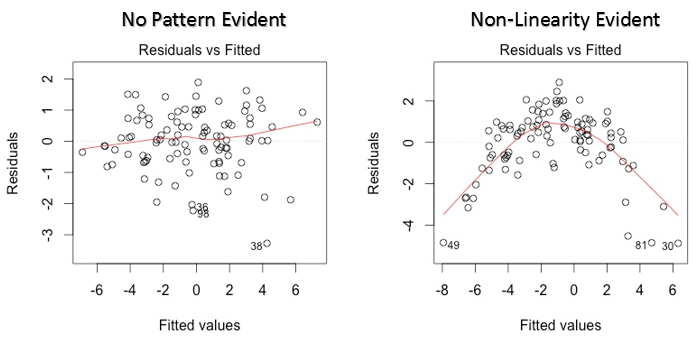
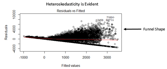
This scatter plot shows the distribution of residuals (errors) vs fitted values (predicted values). It is one of the most important plot which everyone must learn. It reveals various useful insights including outliers. The outliers in this plot are labeled by their observation number which make them easy to detect.
There are two major things which you should learn:
- If there exist any pattern (may be, a parabolic shape) in this plot, consider it as signs of non-linearity in the data. It means that the model doesn’t capture non-linear effects.
- If a funnel shape is evident in the plot, consider it as the signs of non constant variance i.e. heteroskedasticity.
Solution: To overcome the issue of non-linearity, you can do a non linear transformation of predictors such as log (X), √X or X² transform the dependent variable. To overcome heteroskedasticity, a possible way is to transform the response variable such as log(Y) or √Y. Also, you can use weighted least square method to tackle heteroskedasticity.
2. Normal Q-Q Plot
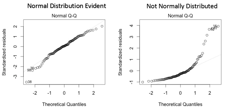
This q-q or quantile-quantile is a scatter plot which helps us validate the assumption of normal distribution in a data set. Using this plot we can infer if the data comes from a normal distribution. If yes, the plot would show fairly straight line. Absence of normality in the errors can be seen with deviation in the straight line.
If you are wondering what is a ‘quantile’, here’s a simple definition: Think of quantiles as points in your data below which a certain proportion of data falls. Quantile is often referred to as percentiles. For example: when we say the value of 50th percentile is 120, it means half of the data lies below 120.
Solution: If the errors are not normally distributed, non – linear transformation of the variables (response or predictors) can bring improvement in the model.
3. Scale Location Plot
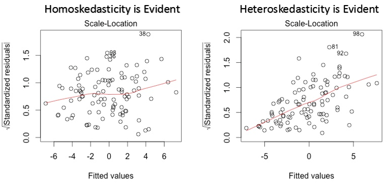
This plot is also used to detect homoskedasticity (assumption of equal variance). It shows how the residual are spread along the range of predictors. It’s similar to residual vs fitted value plot except it uses standardized residual values. Ideally, there should be no discernible pattern in the plot. This would imply that errors are normally distributed. But, in case, if the plot shows any discernible pattern (probably a funnel shape), it would imply non-normal distribution of errors.
Solution: Follow the solution for heteroskedasticity given in plot 1.
4. Residuals vs Leverage Plot
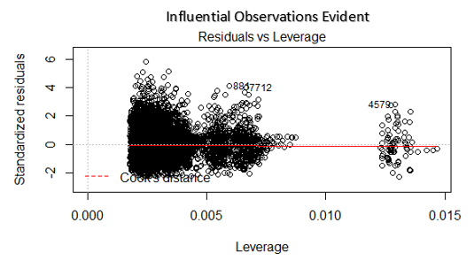
It is also known as Cook’s Distance plot. Cook’s distance attempts to identify the points which have more influence than other points. Such influential points tends to have a sizable impact of the regression line. In other words, adding or removing such points from the model can completely change the model statistics.
But, can these influential observations be treated as outliers? This question can only be answered after looking at the data. Therefore, in this plot, the large values marked by cook’s distance might require further investigation.
Solution: For influential observations which are nothing but outliers, if not many, you can remove those rows. Alternatively, you can scale down the outlier observation with maximum value in data or else treat those values as missing values.
Case Study: How I improved my regression model using log transformation
End Notes
You can leverage the true power of regression analysis by applying the solutions described above. Implementing these fixes in R is fairly easy. If you want to know about any specific fix in R, you can drop a comment, I’d be happy to help you with answers.
My motive of this article was to help you gain the underlying knowledge and insights of regression assumptions and plots. This way, you would have more control on your analysis and would be able to modify the analysis as per your requirement.
Did you find this article useful ? Have you used these fixes in improving model’s performance? Share your experience / suggestions in the comments.
- Going Deeper into Regression Analysis with Assumptions, Plots & Solutions
- Going Deeper with convolutions
- Going deeper with convolutions
- Going Deeper with Convolutions
- Going deeper with convolutions
- Going deeper with convolutions
- going deeper with convolutions笔记
- PS: Going Deeper With Convolutions___CVPR2015
- Going deeper with convolutions笔记
- going deeper with convolution---googlenet
- GoogleNet:Going deeper with convolutions
- GoogleNet - Going deeper with convolutions
- 《Going Deeper with Convolutions》笔记
- Inceptionism: Going Deeper into Neural Networks[译]
- (GoogLeNet)Going deeper with convolutions笔记
- 《Going Deeper With Convolution》学习笔记
- 论文笔记:going deeper with convolutions
- Going deeper with convolutions-GoogLeNet(阅读)
- C语言初步-第34讲:用循环累加(分数的累加)
- java 对象锁和类锁的区别
- 设计模式之外观模式
- Escape character is '^]'.
- facebook开源项目全景投影转换Transform360
- Going Deeper into Regression Analysis with Assumptions, Plots & Solutions
- TCP/IP的开肠破肚(4)
- HDU
- JQuery学习系列基础教程
- PDF.JS的基本使用
- 如何正确的在VBA/VB中引用C#/VB.NET开发的DLL
- C++对象模型之内存布局三(虚继承)
- android:layout_marginEnd隐藏的坑
- HQL详细用法