【ExtJs学习笔记】6.ExtJs布局
来源:互联网 发布:淘宝卖衣服代理兼职 编辑:程序博客网 时间:2024/06/05 17:36
ExtJs布局
参考文章
1. Auto 默认布局
Auto布局是ExtJs的默认布局,当我们不指定任何layout的时候,用Auto Layout来组织子元素。
Ext.onReady(function() { var childPnl1 = { frame : true, height : 50, html : 'My First Child Panel', title : 'First children are fun' }; var childPnl2 = { xtype : 'panel', width : 150, html : 'Second child', title : 'Second children have all the fun!' }; var myWin = Ext.create("Ext.Window", { height : 300, width : 300, title : 'A window with a container layout', autoScroll : true, items : [ childPnl1, childPnl2 ] }); myWin.show();});上面的代码既是在一个window组价中包含了两个panel组件,没有指定布局方式,因此组件将按默认方式自动排列。
2. Anchor 锚点布局
Anchor布局将使组件固定于父容器的某一个位置,使用anchor布局的子组件尺寸相对于容器的尺寸,即父容器容器的大小发生变化时,使用anchor布局的组件会根据规定的规则重新渲染位置和大小。
AnchorLayout布局没有任何的直接配置选项(继承的除外),然而在使用AnchorLayout布局时,其子组件都有一个anchor属性,用来配置此子组件在父容器中所处的位置。
Anchor属性为一组字符串,可以使用百分比或者是-数字来表示。配置字符串使用空格隔开,例如:
- anchor:’75% 25%’,表示宽度为父容器的75%,高度为父容器的25%
- anchor:’-295 -300’,表示组件相对于父容器右边距为295,相对于父容器的底部位300
- anchor:’-250 10%’,混合模式,表示组件党对于如容器右边为250,高度为父容器的10%
var myWin = Ext.create("Ext.Window", { height : 300, width : 300, layout : 'anchor', autoScroll : true, border : false, anchorSize : '400', items : [ { title : 'Panel1', anchor : '100%, 25%', frame : true }, { title : 'Panel2', anchor : '0, 50%', frame : true }, { title : 'Panel3', anchor : '50%, 25%', frame : true } ]});运行结果: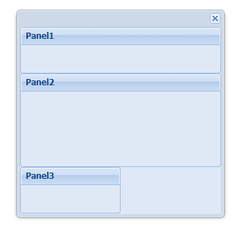
当anchor的配置为百分比时,分别表示所占父容器宽、高的百分比。
var myWin = Ext.create("Ext.Window", { height : 300, width : 300, layout : 'anchor', autoScroll : true, id : 'myWin', border : false, anchorSize : '400', items : [ { title : 'Panel1', anchor : '-50, -150', frame : true }, { title : 'Panel2', anchor : '-10, -150', frame : true } ]});运行结果: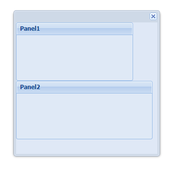
当anchor的配置为数字时(一般为负数),分别表示自己的宽、高为父容器宽、高尺寸与配置的数字相加,即减去这个数字的绝对值,因此数字通常为负数。当数字为正时,子元素尺寸会超过父元素大小。
3. Absolute 绝对布局
Absolute布局是继承自Anchor布局的,但是Absolute是使用标准的x,y来定义子元素的坐标,所以当父容器大小改变时,子元素不会随之变化。
Ext.onReady(function() { var myWin = Ext.create("Ext.Window", { height : 300, width : 300, layout : 'absolute', autoScroll : true, id : 'myWin', border : false, items : [ { title : 'Panel1', x : 50, y : 50, height : 100, width : 100, html : 'x: 50, y:100', frame : true }, { title : 'Panel2', x : 90, y : 120, height : 75, width : 100, html : 'x: 90, y: 120', frame : true } ] }); myWin.show();});运行结果: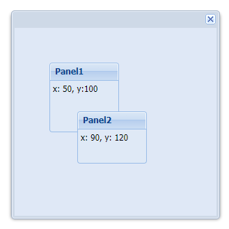
4. Accordion 手风琴布局(可折叠布局)
Accordion顾名思义,是一种可折叠的布局,类似于手风琴的样式,所以通常被用来作为导航栏或一级菜单,在其面板上定义菜单树。
运行结果: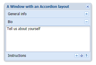
每一栏都可以展开和收缩,并且只有一栏被展开。
5. Border 边界布局
Border布局是将页面划分为东,南,西,北,中五个部分,也是最常见的一种布局方式,我们可以根据项目的实际需求保留其中的部分区域,而将其他部分隐藏掉,灵活性很高。
Ext.onReady(function () { Ext.create("Ext.Viewport", { layout: 'border', defaults: { frame: true, split: true }, items: [{ title: 'North Panel', region: 'north', height: 100, minHeight: 100, maxHeight: 150, collapsible: true }, { title: 'South Panel', region: 'south', height: 75, split: false, margins: { top: 5 } }, { title: 'East Panel', region: 'east', width: 100, minWidth: 75, maxWidth: 150, collapsible: true }, { title: 'West Panel', region: 'west', collapsible: true, collapseMode: 'mini', width: 100 }, { xtype: 'container', region: 'center', layout: 'fit', id: 'centerRegion', autoEl: {}, items: { title: 'Center Panel', id: 'centerPanel', html: 'I am disposable', frame: true } } ] });});这段代码中每一个items都有一个region属性,分别指定了组件所在布局的方位。collapsible属性表示该区域是否可以收缩,collapseMode指定收缩后的显示情况,mini将不显示面板原来的标题。
运行结果: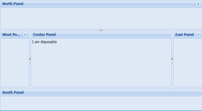
6. Card 卡片布局
Card 布局是一种向导试的布局方式,它在显示的时候,本身是没有上一步、下一步按钮的,但提供了上一步、下一步的操作方法,我们需要在界面中添加导航按钮来配合实际的业务需要。
Ext.onReady(function () { var handleNav = function (btn) { var activeItem = myWin.layout.activeItem, index = myWin.items.indexOf(activeItem), numItems = myWin.items.getCount(), indicatorEl = Ext.getCmp('indicator').el; if (btn.text == 'Forward' && index < numItems - 1) { index++; myWin.layout.setActiveItem(index); indicatorEl.update((index + 1) + ' of ' + numItems); } else if (btn.text == 'Back' && index > 0) { myWin.layout.setActiveItem(index - 1); indicatorEl.update(index + ' of ' + numItems); } }; var myWin = Ext.create("Ext.Window", { height: 200, width: 300, autoScroll: true, id: 'myWin', title: 'A Window with a Card layout', layout: 'card', activeItem: 0, defaults: { border: false }, items: [{ id: "card0", html: "first card" }, { id: "card1", html: "second card" }, { id: "card2", html: "third card" } ], dockedItems: [{ xtype: 'toolbar', dock: 'bottom', items: [{ text: 'Back', handler: handleNav }, '-', { text: 'Forward', handler: handleNav }, '->', { type: 'component', id: 'indicator', style: 'margin-right: 5px', html: '1 of 3' } ] }] });});dockedItems通常用来设置toolbar或菜单栏的位置,常设置为top,bottom分别放置在顶部和底部。
运行结果: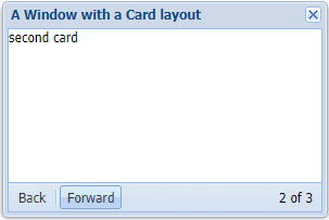
7. Fit 填充
Fit Layout 是很常用的一种布局,在Fit布局中,子元素将自动填满整个父容器。
在Fit 布局下,对其子元素设置宽度是无效的。如果在Fit 布局中放置了多个组件,则只会显示第一个子元素。典型的案例就是当客户要求一个window或panel中放置一个GRID组件,grid组件的大小会随着父容器的大小改变而改变。
Ext.onReady(function() { var myWin = Ext.create("Ext.Window", { height : 200, width : 200, layout : 'fit', autoScroll : true, border : false, items : [ { title : 'Panel1', html : 'I fit in my parent!', frame : true } ] }); myWin.show();});运行结果: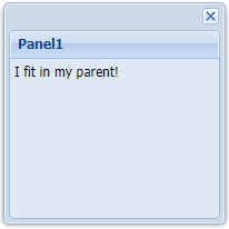
8. Column 列布局
Column 布局用来创建一个多列的布局格式,列宽度可以使用像素值或百分比。
Column布局支持一个columnWidth属性,在布局过程中,使用columnWidth指定每个面板的宽度的百分比,他们的和加起来为1。
columnWidth和width可混合使用,这个时候系统将减去width占用的宽度,然后再根据百分比计算列的宽度。
另外,如果任何子面板没有指定columnWidth值,那么它将占满剩余的空间
Ext.onReady(function () { var myWin = Ext.create("Ext.Window", { height: 200, width: 400, autoScroll: true, id: 'myWin', title: 'A Window with a Column layout', layout: 'column', defaults: { frame: true }, items: [{ title: 'Col 1', id: 'col1', columnWidth: .3 }, { title: 'Col 2', html: "20% relative width", columnWidth: .2 }, { title: 'Col 3', html: "100px fixed width", width: 100 }, { title: 'Col 4', frame: true, html: "50% relative width", columnWidth: .5 } ], renderTo: Ext.getBody() }); myWin.show();});运行结果: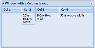
9. Table 表格布局
Table Layout 将内容绘制在table标签中,table的列数可以指定,还可以通过设置rowSpan和colSpan来创建复杂的布局。
Ext.onReady(function () { var myWin = Ext.create("Ext.Window", { height: 300, width: 300, border: false, autoScroll: true, id: 'myWin', title: 'A Window with a Table layout', layout: { type: 'table', columns: 3 }, defaults: { height: 50, width: 50 }, items: [{ html: '1' }, { html: '2' }, { html: '3' }, { html: '4' }, { html: '5' }, { html: '6' }, { html: '7' }, { html: '8' }, { html: '9' } ] }); myWin.show();});运行结果: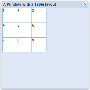
10. Hbox和Vbox
Hbox
HBox Layout 将子元素放在同一水平位置,通过align设置子元素的对齐方式,对齐方式有:
- top : 默认的对其方式,顶部对齐
- middle : 中间对齐
- bottom : 底部对齐
- stretch : 拉伸对齐,所有子元素根据父容器的高度拉伸
- stretchmax : 拉伸对齐,所有子元素根据子元素中最高的高度拉伸
Ext.onReady(function () { var myWin = Ext.create("Ext.Window", { width: 500, height: 300, title: "HBoxLayout Panel", layout: { type: 'hbox', align: 'stretch' }, items: [{ xtype: 'panel', title: 'Inner Panel One', flex: 2 }, { xtype: 'panel', title: 'Inner Panel Two', flex: 1 }, { xtype: 'panel', title: 'Inner Panel Three', flex: 1 }], }); myWin.show();});运行结果: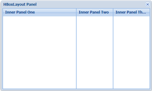
Vbox
VBox Layout 以垂直的方式组织所有子元素。它的子元素可以通过align属性来设置对齐方式,vbox的对齐方式有:
- left : 左对齐,默认对其方式
- center : 中间对齐
- right : 右对齐
- stretch : 以父容器的宽度拉伸对齐
- stretchmax : 以所有子元素中的最大宽度拉伸对齐
Ext.onReady(function () { var myWin = Ext.create("Ext.Window", { width: 500, height: 400, title: "VBoxLayout Panel", layout: { type: 'vbox', align: 'center' }, items: [{ xtype: 'panel', title: 'Inner Panel One', width: 250, flex: 2 }, { xtype: 'panel', title: 'Inner Panel Two', width: 250, flex: 4 }, { xtype: 'panel', title: 'Inner Panel Three', width: '50%', flex: 4 }], }); myWin.show();});运行结果: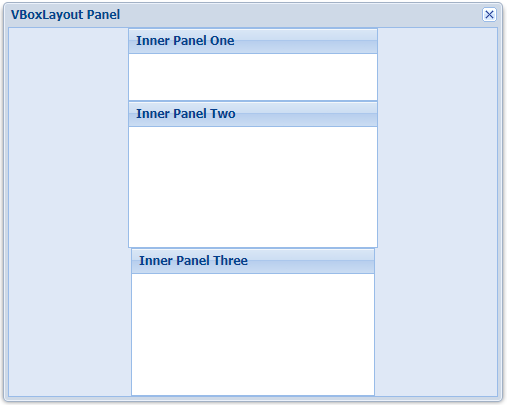
11. Form 表单布局
Form Layout 用来组织表单字段的,Form Layout 下的表单字段会被拉伸到表单的宽度。
var panel = Ext.create("Ext.panel.Panel", { width: 350, height: 240, title: "FormLayout Panel", layout: 'form', bodyPadding: 5, defaultType: 'textfield', items: [{ fieldLabel: '姓名', name: 'name', allowBlank: false }, { fieldLabel: '公司', name: 'company' }, { fieldLabel: 'Email', name: 'email', vtype: 'email' }, { fieldLabel: '年龄', name: 'age', xtype: 'numberfield', minValue: 0, maxValue: 100 }], renderTo: Ext.getBody()});运行结果: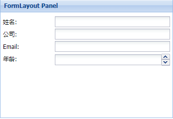
文章在Github上也有同步更新~
Github地址:https://github.com/AQingC/extjs-notes
- 【ExtJs学习笔记】6.ExtJs布局
- ExtJs 布局学习笔记
- ExtJs学习笔记(12)_Anchor布局
- ExtJs学习笔记(13)_Card布局
- ExtJs学习笔记(15)_Column布局
- ExtJs学习笔记(14)_fit布局
- ExtJs学习笔记(17)_Form布局
- ExtJs学习笔记(16)_table布局
- ExtJs学习笔记(14)_Column布局
- ExtJs学习笔记(15)_fit布局
- ExtJs学习笔记(13)_Card布局
- ExtJs学习笔记(12)_Anchor布局
- ExtJs学习笔记(17)_table布局
- ExtJs学习笔记(16)_Form布局
- ExtJS学习笔记:复杂页面布局实现
- ExtJs笔记 layout 布局
- Extjs学习 layout布局
- ExtJs学习笔记(11)_Absolute布局和Accordion布局
- Java学习笔记之集合(四):LinkedList集合的特点和常用方法
- CSDN中上传图片的问题
- java集合类多条件排序
- 人脸检测发展:从VJ到深度学习(下)
- 中國居民至台灣地區旅遊前置作業與相關限制(自由行、不論特殊情況)
- 【ExtJs学习笔记】6.ExtJs布局
- hdu 6215 链表
- Android 安装apk
- cookie和session(转)
- 【MySQL】10条SQL优化语句,让你的MySQL数据库跑得更快!
- oracle11g创建表空间、用户及授权
- 事件委托或事件代理
- 中文技术文档的写作规范
- Python入门与实践笔记-03