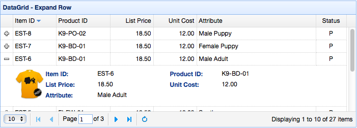
DataGrid
来源:互联网 发布:京东12g数据库网盘 编辑:程序博客网 时间:2024/06/07 05:10
http://www.jeasyui.com/documentation/datagrid.php
Extend from $.fn.panel.defaults. Override defaults with $.fn.datagrid.defaults.
The datagrid displays data in a tabular format and offers rich support to select, sort, group and edit data. The datagrid has been designed to reduce development time and to require no specific knowledge from developers. It is both featherweight and feature-rich. Cell merging, multi-column headers, frozen columns and footers are just a few of its features.
Dependencies
- panel
- resizable
- linkbutton
- pagination
Usage Example
Create datagrid from an existing table element, defining columns, rows, and data in html.
- <table class="easyui-datagrid">
- <thead>
- <tr>
- <th data-options="field:'code'">Code</th>
- <th data-options="field:'name'">Name</th>
- <th data-options="field:'price'">Price</th>
- </tr>
- </thead>
- <tbody>
- <tr>
- <td>001</td><td>name1</td><td>2323</td>
- </tr>
- <tr>
- <td>002</td><td>name2</td><td>4612</td>
- </tr>
- </tbody>
- </table>
Create datagrid via <table> markup. The nested <th> tags define the columns on the table.
- <table class="easyui-datagrid" style="width:400px;height:250px"
- data-options="url:'datagrid_data.json',fitColumns:true,singleSelect:true">
- <thead>
- <tr>
- <th data-options="field:'code',width:100">Code</th>
- <th data-options="field:'name',width:100">Name</th>
- <th data-options="field:'price',width:100,align:'right'">Price</th>
- </tr>
- </thead>
- </table>
Create datagrid using javascript is also allowed.
- <table id="dg"></table>
- $('#dg').datagrid({
- url:'datagrid_data.json',
- columns:[[
- {field:'code',title:'Code',width:100},
- {field:'name',title:'Name',width:100},
- {field:'price',title:'Price',width:100,align:'right'}
- ]]
- });
Query data with some parameters.
- $('#dg').datagrid('load', {
- name: 'easyui',
- address: 'ho'
- });
After changing data to server, refresh the front data.
- $('#dg').datagrid('reload'); // reload the current page data
DataGrid Properties
The properties extend from panel. below is the added properties for datagrid.
Available since version 1.3.2.rightresizeEdgenumberThe resizing column edge. Available since version 1.5.3.5autoRowHeightbooleanDefines if set the row height based on the contents of that row. Set to false can improve loading performance.truetoolbararray,selectorThe top toolbar of datagrid panel. Possible values:
1) an array, each tool options are same as linkbutton.
2) a selector that indicate the toolbar.
Define toolbar within a <div> tag:
$('#dg').datagrid({toolbar: '#tb'});<div id="tb"><a href="#" class="easyui-linkbutton" data-options="iconCls:'icon-edit',plain:true"/a><a href="#" class="easyui-linkbutton" data-options="iconCls:'icon-help',plain:true"/a></div>Define toolbar via array:
$('#dg').datagrid({toolbar: [{iconCls: 'icon-edit',handler: function(){alert('edit')}},'-',{iconCls: 'icon-help',handler: function(){alert('help')}}]});nullstripedbooleanTrue to stripe the rows.falsemethodstringThe method type to request remote data.postnowrapbooleanTrue to display data in one line. Set to true can improve loading performance.trueidFieldstringIndicate which field is an identity field.nullurlstringA URL to request data from remote site.nulldataarray,objectThe data to be loaded. Available since version 1.3.2.Code example:
$('#dg').datagrid({data: [{f1:'value11', f2:'value12'},{f1:'value21', f2:'value22'}]});nullloadMsgstringWhen loading data from remote site, show a prompt message.Processing, please wait …emptyMsgstringThe message to be shown when no records exist. paginationbooleanTrue to show a pagination toolbar on datagrid bottom.falserownumbersbooleanTrue to show a row number column.falsesingleSelectbooleanTrue to allow selecting only one row.falsectrlSelectbooleanTrue to only allow multi-selection when ctrl+click is used. Available since version 1.3.6.falsecheckOnSelectbooleanIf true, the checkbox is checked/unchecked when the user clicks on a row. If false, the checkbox is only checked/unchecked when the user clicks exactly on the checkbox.Available since version 1.3.trueselectOnCheckbooleanIf set to true, clicking a checkbox will always select the row. If false, selecting a row will not check the checkbox.
Available since version 1.3.truescrollOnSelectbooleanIf set to true, scroll to the row automatically when selecting it. Available since version 1.5.2.truepagePositionstringDefines position of the pager bar. Available values are: 'top','bottom','both'.
Available since version 1.3.bottompageNumbernumberWhen set pagination property, initialize the page number.1pageSizenumberWhen set pagination property, initialize the page size.10pageListarrayWhen set pagination property, initialize the page size selecting list.[10,20,30,40,50]queryParamsobjectWhen request remote data, sending additional parameters also.
Code example:
$('#dg').datagrid({queryParams: {name: 'easyui',subject: 'datagrid'}});{}sortNamestringDefines which column can be sorted.nullsortOrderstringDefines the column sort order, can only be 'asc' or 'desc'.ascmultiSortbooleanDefines if to enable multiple column sorting. Available since version 1.3.4.falseremoteSortbooleanDefines if to sort data from server.trueshowHeaderbooleanDefines if to show row header.trueshowFooterbooleanDefines if to show row footer.falsescrollbarSizenumberThe scrollbar width(when scrollbar is vertical) or height(when scrollbar is horizontal).18rownumberWidthnumberThe width of the row number column. Available since version 1.5.30editorHeightnumberThe default height of the editors.24rowStylerfunctionReturn style such as 'background:red'. The function take two parameters:rowIndex: the row index, start with 0
rowData: the record corresponding to this row
Code example:
$('#dg').datagrid({rowStyler: function(index,row){if (row.listprice>80){return 'background-color:#6293BB;color:#fff;'; // return inline style// the function can return predefined css class and inline style// return {class:'r1', style:{'color:#fff'}};}}}); loaderfunctionDefines how to load data from remote server. Return false can abort this action. This function takes following parameters:param: the parameter object to pass to remote server.
success(data): the callback function that will be called when retrieve data successfully.
error(): the callback function that will be called when failed to retrieve data.json loaderloadFilterfunctionReturn the filtered data to display. The function take one parameter 'data' that indicate the original data. You can change original source data to standard data format. This function must return standard data object that contain 'total' and 'rows' properties.
Code example:
// removing 'd' object from asp.net web service json output$('#dg').datagrid({loadFilter: function(data){if (data.d){return data.d;} else {return data;}}}); editorsobjectDefines the editor when editing a row.predefined editorsviewobjectDefines the view of datagrid.default viewColumn Properties
The DataGrid Columns is an array object, which element is an array too. The element of element array is a config object, which defines every column field.
Code example:
- columns:[[
- {field:'itemid',title:'Item ID',rowspan:2,width:80,sortable:true},
- {field:'productid',title:'Product ID',rowspan:2,width:80,sortable:true},
- {title:'Item Details',colspan:4}
- ],[
- {field:'listprice',title:'List Price',width:80,align:'right',sortable:true},
- {field:'unitcost',title:'Unit Cost',width:80,align:'right',sortable:true},
- {field:'attr1',title:'Attribute',width:100},
- {field:'status',title:'Status',width:60}
- ]]
value: the field value.
rowData: the row record data.
rowIndex: the row index.
Code example:
$('#dg').datagrid({columns:[[{field:'userId',title:'User', width:80,formatter: function(value,row,index){if (row.user){return row.user.name;} else {return value;}}}]]});undefinedstylerfunctionThe cell styler function, return style string to custom the cell style such as 'background:red'. The function take three parameter:value: the field value.
rowData: the row record data.
rowIndex: the row index.
Code example:
$('#dg').datagrid({columns:[[{field:'listprice',title:'List Price', width:80, align:'right',styler: function(value,row,index){if (value < 20){return 'background-color:#ffee00;color:red;';// the function can return predefined css class and inline style// return {class:'c1',style:'color:red'}}}}]]});undefinedsorterfunctionThe custom field sort function that used to do local sorting, take two parameters:a: the first field value.
b: the second field value.
Code example:
$('#dg').datagrid({remoteSort: false,columns: [[{field:'date',title:'Date',width:80,sortable:true,align:'center', sorter:function(a,b){ a = a.split('/'); b = b.split('/'); if (a[2] == b[2]){ if (a[0] == b[0]){ return (a[1]>b[1]?1:-1); } else { return (a[0]>b[0]?1:-1); } } else { return (a[2]>b[2]?1:-1); } } }]]});undefinededitorstring,objectIndicate the edit type. When string indicates the edit type, when object contains two properties:type: string, the edit type, possible types are: text,textbox,numberbox,numberspinner, combobox,combotree,combogrid,datebox,datetimebox, timespinner,datetimespinner, textarea,checkbox,validatebox.
options: object, the editor options corresponding to the edit type.undefined
Editor
Override defaults with $.fn.datagrid.defaults.editors.
Every editor has following actions:
For example, the text editor is defined as following:
- $.extend($.fn.datagrid.defaults.editors, {
- text: {
- init: function(container, options){
- var input = $('<input type="text" class="datagrid-editable-input">').appendTo(container);
- return input;
- },
- destroy: function(target){
- $(target).remove();
- },
- getValue: function(target){
- return $(target).val();
- },
- setValue: function(target, value){
- $(target).val(value);
- },
- resize: function(target, width){
- $(target)._outerWidth(width);
- }
- }
- });
DataGrid View
Override defaults with $.fn.datagrid.defaults.view.
The view is an object that will tell datagrid how to render rows. The object must defines the following functions:
target: DOM object, the datagrid object.
container: the rows container.
frozen: indicate if to render the frozen container.renderFootertarget, container, frozenThis is an option function to render row footer.renderRowtarget, fields, frozen, rowIndex, rowDataThis is an option function and will be called by render function.refreshRowtarget, rowIndexDefines how to refresh the specified row.onBeforeRendertarget, rowsFires before the view is rendered.onAfterRendertargetFires after the view is rendered.
Events
The events extend from panel, below is the added events for datagrid.
index: the clicked row index, start with 0
row: the record corresponding to the clicked rowonDblClickRowindex,rowFires when the user double clicks a row, the parameters contains:
index: the clicked row index, start with 0
row: the record corresponding to the clicked rowonClickCellindex,field,valueFires when the user clicks a cell.onDblClickCellindex,field,valueFires when the user double clicks a cell.
Code example:
// when double click a cell, begin editing and make the editor get focus$('#dg').datagrid({onDblClickCell: function(index,field,value){$(this).datagrid('beginEdit', index);var ed = $(this).datagrid('getEditor', {index:index,field:field});$(ed.target).focus();}});onBeforeSortColumnsort,orderFires before the user sorts a column, return false to cancel this action. Available since version 1.3.6.onSortColumnsort,orderFires when the user sorts a column, the parameters contains:sort: the sort column field name
order: the sort column orderonResizeColumnfield,widthFires when the user resizes the column.onBeforeSelectindex,rowFires before the user selects a row, return false to cancel this action. Available since version 1.4.1.onSelectindex,rowFires when the user selects a row, the parameters contains:
index: the selected row index, start with 0
row: the record corresponding to the selected rowonBeforeUnselectindex,rowFires before the user unselects a row, return false to cancel this action. Available since version 1.4.1.onUnselectindex,rowFires when the user unselects a row, the parameters contains:
index: the unselected row index, start with 0
row: the record corresponding to the unselected rowonSelectAllrowsFires when the user selects all rows.onUnselectAllrowsFires when the user unselects all rows.onBeforeCheckindex,rowFires before the user checks a row, return false to cancel this action. Available since version 1.4.1.onCheckindex,rowFires when the user checks a row, the parameters contains:
index: the checked row index, start with 0
row: the record corresponding to the checked row
Available since version 1.3.onBeforeUncheckindex,rowFires before the user unchecks a row, return false to cancel this action. Available since version 1.4.1.onUncheckindex,rowFires when the user unchecks a row, the parameters contains:
index: the unchecked row index, start with 0
row: the record corresponding to the unchecked row
Available since version 1.3.onCheckAllrowsFires when the user checks all rows. Available since version 1.3.onUncheckAllrowsFires when the user unchecks all rows. Available since version 1.3.onBeforeEditindex,rowFires before the user starts editing a row, return false to cancel this action. The parameters contains:
index: the editing row index, start with 0
row: the record corresponding to the editing rowonBeginEditindex,rowFires when a row goes into edit mode. Available since version 1.3.6.onEndEditindex,row,changesFires when finishing editing but before destroying editors. Available since version 1.3.6.onAfterEditindex,row,changesFires after the user finishes editing, the parameters contains:
index: the editing row index, start with 0
row: the record corresponding to the editing row
changes: the changed field/value pairsonCancelEditindex,rowFires when the user cancels editing a row, the parameters contains:
index: the editing row index, start with 0
row: the record corresponding to the editing rowonHeaderContextMenue,fieldFires when the header of datagrid is right clicked.onRowContextMenue,index,rowFires when a row is right clicked.
Methods
Code example:
var opts = $('#dg').datagrid('getColumnFields');// get unfrozen columnsvar opts = $('#dg').datagrid('getColumnFields', true); // get frozen columnsgetColumnOptionfieldReturn the specified column option.resizeparamDo resize and do layout.loadparamLoad and show the first page rows. If the 'param' is specified, it will replace with the queryParams property. Usually do a query by passing some parameters, this method can be called to load new data from server.$('#dg').datagrid('load',{code: '01',name: 'name01'});reloadparamReload the rows. Same as the 'load' method but stay on current page.reloadFooterfooterReload the footer rows. Code examples:// update footer row values and then refreshvar rows = $('#dg').datagrid('getFooterRows');rows[0]['name'] = 'new name';rows[0]['salary'] = 60000;$('#dg').datagrid('reloadFooter');// update footer rows with new data$('#dg').datagrid('reloadFooter',[{name: 'name1', salary: 60000},{name: 'name2', salary: 65000}]);loadingnoneDisplay loading status.loadednoneHide loading status.fitColumnsnoneMake columns auto expand/collapse to fit datagrid width.fixColumnSizefieldFix columns size. If 'field' parameter is not assigned, all columns size will be fixed.Code example:
$('#dg').datagrid('fixColumnSize', 'name'); // fix the 'name' column size$('#dg').datagrid('fixColumnSize'); // fix all columns sizefixRowHeightindexFix the specified row height. If 'index' parameter is not assigned, all rows height will be fixed.freezeRowindexFreeze the specify row that will always be displayed at the top when the datagrid is scrolled down. Available since version 1.3.2.autoSizeColumnfieldadjusts the column width to fit the contents. Available since version 1.3.loadDatadataLoad local data, the old rows will be removed.getDatanoneReturn the loaded data.getRowsnoneReturn the current page rows.getFooterRowsnoneReturn the footer rows.getRowIndexrowReturn the specified row index, the row parameter can be a row record or an id field value.getCheckednoneReturn all rows where the checkbox has been checked. Available since version 1.3.getSelectednoneReturn the first selected row record or null.getSelectionsnoneReturn all selected rows, when no record selected, an empty array will return.clearSelectionsnoneClear all selections.clearCheckednoneClear all checked rows. Available since version 1.3.2.scrollToindexScroll to the specified row. Available since version 1.3.3.gotoPageparamGo to the specified page. Available since version 1.4.4.Usage example:
// go to page 3$('#dg').datagrid('gotoPage', 3);// go to page 3 with callback$('#dg').datagrid('gotoPage', {page: 3,callback: function(page){console.log(page)}})highlightRowindexHighlight a row. Available since version 1.3.3.selectAllnoneSelect all current page rows.unselectAllnoneUnselect all current page rows.selectRowindexSelect a row, the row index start with 0.selectRecordidValueSelect a row by passing id value parameter.unselectRowindexUnselect a row.checkAllnoneCheck all current page rows. Available since version 1.3.uncheckAllnoneUncheck all current page rows. Available since version 1.3.checkRowindexCheck a row, the row index start with 0. Available since version 1.3.uncheckRowindexUncheck a row, the row index start with 0. Available since version 1.3.beginEditindexBegin editing a row.endEditindexEnd editing a row.cancelEditindexCancel editing a row.getEditorsindexGet the specified row editors. Each editor has the following properties:actions: the actions that the editor can do, same as the editor definition.
target: the target editor jQuery object.
field: the field name.
type: the editor type, such as 'text','combobox','datebox', etc.getEditoroptionsGet the specified editor, the options contains two properties:
index: the row index.
field: the field name.
Code example:
// get the datebox editor and change its valuevar ed = $('#dg').datagrid('getEditor', {index:1,field:'birthday'});$(ed.target).datebox('setValue', '5/4/2012');refreshRowindexRefresh a row.validateRowindexvalidate the specified row, return true when valid.updateRowparamUpdate the specified row, the param contains following properties:index: the row index to be updated.
row: the new row data.
Code example:
$('#dg').datagrid('updateRow',{index: 2,row: {name: 'new name',note: 'new note message'}});appendRowrowAppend a new row. The new row will be added to the last position:$('#dg').datagrid('appendRow',{name: 'new name',age: 30,note: 'some messages'});insertRowparamInsert a new row, the param contains following properties:index: the row index to insert into, if not defined, append the new row.
row: the row data. Code examples:
// insert a new row at second row position$('#dg').datagrid('insertRow',{index: 1,// index start with 0row: {name: 'new name',age: 30,note: 'some messages'}});deleteRowindexDelete a row.getChangestypeGet changed rows since the last commit. The type parameter indicate which type changed rows, possible value is: inserted,deleted,updated,etc. When the type parameter is not assigned, return all changed rows.acceptChangesnoneCommits all the changes data since it was loaded or since the last time acceptChanges was called.rejectChangesnoneRolls back all the changes data since it was created, or since the last time acceptChanges was called.mergeCellsoptionsMerge some cells to one cell, the options contains following properties:index: the row index.
type: the row type, possible values are 'body','footer'.
field: the field name.
rowspan: the rowspan count to be merged.
colspan: the colspan count to be merged.
Code example:
// merge the footer rows$('#dg').datagrid('mergeCells', {index: 1,field: 'name',colspan: 2,type: 'footer'});showColumnfieldDisplay the specified column.hideColumnfieldHide the specified column.sortparamSort the datagrid. Available since version 1.3.6.Code example:
// sort on a column$('#dg').datagrid('sort', 'itemid');// sort on a column with specified order$('#dg').datagrid('sort', {sortName: 'productid',sortOrder: 'desc'});// sort on multiple columns$('#dg').datagrid('sort', {sortName: 'productid,listprice',sortOrder: 'desc,asc'}); - DataGrid
- datagrid
- DataGrid
- datagrid
- datagrid
- Datagrid
- dataGrid
- datagrid
- DATAGRID
- datagrid
- DataGrid
- DataGrid
- DataGrid
- DataGrid
- DataGrid
- datagrid
- DataGrid
- DataGrid
- Gradle Maven 依赖管理
- 文章标题
- 把二元查找树转变成排序的双向链表
- NSURLSession代理的强引用
- APP闪退分析及Crash日志获取
- DataGrid
- Android图片加载框架比较----Glide,Picasso,Fresco
- jq控制文本字数加省略号
- AJAX跨域问题小结
- 隐式游标属性
- 优秀的工程师更加注重基础-UIbutton
- 切域后台进行的批量账号和组导入导出
- 几种常用的版本控制系统优缺点比较
- 欢迎使用CSDN-markdown编辑器