一个炫酷的 TabLayout 与 CoordinatorLayout 相结合的自定义控件
来源:互联网 发布:lua 脚本 java 编辑:程序博客网 时间:2024/06/05 17:19
CoordinatorTabLayout

中文版文档
CoordinatorTabLayout is a custom composite control that quickly implements the combination of TabLayout and CoordinatorLayout. Inherited to the CoordinatorLayout, in the following components used CollapsingToolbarLayout contains TabLayout.
Usage
Step 1
Add the following to your build.gradle:
dependencies { compile 'cn.hugeterry.coordinatortablayout:coordinatortablayout:1.1.0'}Step 2
Config in xml:
<cn.hugeterry.coordinatortablayout.CoordinatorTabLayout xmlns:android="http://schemas.android.com/apk/res/android" xmlns:app="http://schemas.android.com/apk/res-auto" android:id="@+id/coordinatortablayout" android:layout_width="match_parent" android:layout_height="match_parent"> <android.support.v4.view.ViewPager android:id="@+id/vp" android:layout_width="match_parent" android:layout_height="match_parent" app:layout_behavior="@string/appbar_scrolling_view_behavior" /></cn.hugeterry.coordinatortablayout.CoordinatorTabLayout>Step 3
Use it in your own code:
1.setTitle(String title):Set the CoordinatorTabLayout's title.
2.setupWithViewPager(ViewPager viewPager):To link the two together.
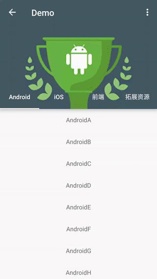
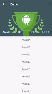
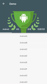
3.setImageArray(int[] imageArray):Set the image array of the header according to the number of tabs and pass it to the control.
//Add the fragment to the viewpager initFragments(); initViewPager(); //Image array mImageArray = new int[]{ R.mipmap.bg_android, R.mipmap.bg_ios, R.mipmap.bg_js, R.mipmap.bg_other}; mCoordinatorTabLayout = (CoordinatorTabLayout) findViewById(R.id.coordinatortablayout); mCoordinatorTabLayout.setTitle("Demo") .setImageArray(mImageArray) .setupWithViewPager(mViewPager);Finish, enjoy it.
More
Set the content scrim
setImageArray(int[] imageArray, int[] colorArray):Set the color array to use for the content scrim for each tab.
mColorArray = new int[]{ android.R.color.holo_blue_light, android.R.color.holo_red_light, android.R.color.holo_orange_light, android.R.color.holo_green_light}; mCoordinatorTabLayout.setImageArray(mImageArray, mColorArray);Set translucent status bar
setTransulcentStatusBar(Activity activity):Set translucent status bar,Support android4.4 and above.
mCoordinatorTabLayout.setTransulcentStatusBar(activity);Set back enable
setBackEnable(Boolean canBack):To enable the Up button for an activity that has a parent activity.
@Override protected void onCreate(Bundle savedInstanceState) { ... mCoordinatorTabLayout.setBackEnable(true); ... } @Override public boolean onOptionsItemSelected(MenuItem item) { if (item.getItemId() == android.R.id.home) { finish(); } return super.onOptionsItemSelected(item); }Load header images from network
setLoadHeaderImagesListener(LoadHeaderImagesListener loadHeaderImagesListener):Set the listener that gets the header images.
@Override protected void onCreate(Bundle savedInstanceState) { ... mCoordinatorTabLayout.setTitle("Demo") .setBackEnable(true) .setContentScrimColorArray(mColorArray) .setLoadHeaderImagesListener(new LoadHeaderImagesListener() { @Override public void loadHeaderImages(ImageView imageView, TabLayout.Tab tab) { switch (tab.getPosition()) { case 0: //load header images break; ... } } }) .setupWithViewPager(mViewPager); }You also can load header images using glide/picasso,Sample
Gets the child control
getActionBar():get the ActionBargetTabLayout():get the TabLayoutgetImageView():get the ImageView
More code
Attributes
app:contentScrim-> color.Defaults to ?attr/colorPrimaryapp:tabIndicatorColor-> color.app:tabTextColor-> color.
Demo
http://fir.im/ctlayout
LICENSE
- 一个炫酷的 TabLayout 与 CoordinatorLayout 相结合的自定义控件
- TabLayout和CoordinatorLayout相结合的库的全面详解及修改
- Tablayout,CoordinatorLayout与Behavior
- 今日头条的频道管理与头部的tablayout的相结合的详解
- Android控件CoordinatorLayout和TabLayout
- 自定义一个好看点的TabLayout.Tab
- 一个神奇的控件——Android CoordinatorLayout与Behavior使用指南
- 一个神奇的控件——Android CoordinatorLayout与Behavior使用指南
- 自定义ViewGroup可折叠控件,类似CoordinatorLayout的效果
- React实战-一个非常棒的React与Material风格相结合的UI控件库(Material-UI)
- CoordinatorLayout的一个例子
- 一个线程池与任务池相结合的案例
- 使用CoordinatorLayout打造一个炫酷的详情页
- 使用 CoordinatorLayout 打造一个炫酷的详情页
- 使用CoordinatorLayout打造一个炫酷的详情页
- TabLayout的自定义实现
- 自定义TabLayout的实现
- 自定义TabLayout的Tab
- 用汇编语言实现在210实现流水灯
- springMVC-初步认识-基本原理
- 图像的线性分类器(感知机、SVM、Softmax)
- openstack安装RabbitMQ报错,无法启动Rabbit
- 周志华老师推荐机器学习书单
- 一个炫酷的 TabLayout 与 CoordinatorLayout 相结合的自定义控件
- 数据实验7倒置无头节点单链表
- Spring(二、Spring IOC)
- CSS 布局初探
- 运行scrapy框架报错ModuleNotFoundError: No module named 'win32api' ,下载安装包也不行的解决办法。
- XML
- Struts 2入门案例
- XML_DTD
- C++风格_格式