CSS绘制三角形
来源:互联网 发布:手机上微页制作软件 编辑:程序博客网 时间:2024/06/01 23:24
我们的网页因为 CSS 而呈现千变万化的风格。这一看似简单的样式语言在使用中非常灵活,只要你发挥创意就能实现很多比人想象不到的效果。特别是随着 CSS3 的广泛使用,更多新奇的 CSS 作品涌现出来。
今天给大家带来 CSS 三角形绘制方法
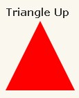
#triangle-up {
width: 0;
height: 0;
border-left: 50px solid transparent;
border-right: 50px solid transparent;
border-bottom: 100px solid red;
}
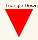
#triangle-down {
width: 0;
height: 0;
border-left: 50px solid transparent;
border-right: 50px solid transparent;
border-top: 100px solid red;
}
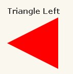
#triangle-left {
width: 0;
height: 0;
border-top: 50px solid transparent;
border-right: 100px solid red;
border-bottom: 50px solid transparent;
}
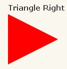
#triangle-right {
width: 0;
height: 0;
border-top: 50px solid transparent;
border-left: 100px solid red;
border-bottom: 50px solid transparent;
}
#triangle-topleft {
width: 0;
height: 0;
border-top: 100px solid red;
border-right: 100px solid transparent;
}
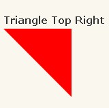
#triangle-topright {
width: 0;
height: 0;
border-top: 100px solid red;
border-left: 100px solid transparent;
}
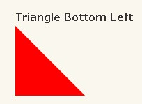
#triangle-bottomleft {
width: 0;
height: 0;
border-bottom: 100px solid red;
border-right: 100px solid transparent;
}
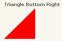
#triangle-bottomright {
width: 0;
height: 0;
border-bottom: 100px solid red;
border-left: 100px solid transparent;
}
今天给大家带来 CSS 三角形绘制方法
代码如下:
#triangle-up {
width: 0;
height: 0;
border-left: 50px solid transparent;
border-right: 50px solid transparent;
border-bottom: 100px solid red;
}
代码如下:
#triangle-down {
width: 0;
height: 0;
border-left: 50px solid transparent;
border-right: 50px solid transparent;
border-top: 100px solid red;
}
代码如下:
#triangle-left {
width: 0;
height: 0;
border-top: 50px solid transparent;
border-right: 100px solid red;
border-bottom: 50px solid transparent;
}
代码如下:
#triangle-right {
width: 0;
height: 0;
border-top: 50px solid transparent;
border-left: 100px solid red;
border-bottom: 50px solid transparent;
}

代码如下:
#triangle-topleft {
width: 0;
height: 0;
border-top: 100px solid red;
border-right: 100px solid transparent;
}
代码如下:
#triangle-topright {
width: 0;
height: 0;
border-top: 100px solid red;
border-left: 100px solid transparent;
}
代码如下:
#triangle-bottomleft {
width: 0;
height: 0;
border-bottom: 100px solid red;
border-right: 100px solid transparent;
}
代码如下:
#triangle-bottomright {
width: 0;
height: 0;
border-bottom: 100px solid red;
border-left: 100px solid transparent;
}
talk bubble

.box{ width: 100px; height: 60px; border-radius: 10px; background-color: blue; color: #fff; line-height: 60px; text-align: center; position: relative; }.box:before{ content:""; position:absolute; right: 100%; top:17px; width: 0; height: 0; border-right: 20px solid blue; border-bottom: 13px solid transparent; border-top:13px solid transparent;}pointer

.box{ width: 200px; height: 40px; background-color: red; position: relative; } .box:before{ content:""; position:absolute; background-color: #fff; right:-20px; bottom: 0; width: 0; height: 0; border-left: 20px solid red; border-bottom: 20px solid transparent; border-top:20px solid transparent; } .box:after{ content:""; position:absolute; width: 0; height: 0; border-left: 20px solid #fff; border-bottom: 20px solid transparent; border-top:20px solid transparent; }diamond

.box{ width: 50px; border-bottom: 25px solid red; border-right: 25px solid transparent; border-left: 25px solid transparent; position: relative; } .box:after{ content:""; position:absolute; width: 0; height: 0; top:25px; left:-25px; border-top: 70px solid red; border-left: 50px solid transparent; border-right:50px solid transparent; }阅读全文
1 0
- 使用CSS绘制三角形
- 纯css绘制三角形
- CSS 三角形绘制方法
- css绘制三角形方法
- CSS绘制三角形
- CSS绘制三角形
- 用css绘制三角形
- css绘制三角形
- 使用CSS绘制三角形
- css绘制三角形图标
- CSS绘制三角形
- csS绘制三角形
- 纯 CSS 绘制三角形
- CSS绘制三角形
- 纯css绘制三角形
- CSS 三角形绘制方法
- CSS 三角形绘制方法
- CSS绘制三角形
- intellij idea常用快捷键与使用
- js或者css样式未生效。
- 国王游戏(贪心+模拟)
- 2017软开秋招之路--下半程记录
- 自定义组合控件处理
- CSS绘制三角形
- Kotlin类和对象 (四)--- 可见性修饰符
- 数据存储(无数据库版)之四:Email提醒
- Tablayout+viewpager
- Hbase启动时没有Hmaster进程
- 关于string中的如果使用变量的笔记
- 【MTK】如何开关默认USB调试功能
- setNeedsLayout、layoutIfNeeded and layoutSubviews区别
- fedora 26 添加一个用户并且让用户获得root权限