android:shape的使用
来源:互联网 发布:arm linux gcc安装包 编辑:程序博客网 时间:2024/05/01 05:09
Android中常常使用shape来定义控件的一些显示属性,今天看了一些shape的使用,对shape有了大体的了解,稍作总结:
先看下面的代码:
<shape> <!-- 实心 --> <solid android:color="#ff9d77"/> <!-- 渐变 --> <gradient android:startColor="#ff8c00" android:endColor="#FFFFFF" android:angle="270" /> <!-- 描边 --> <stroke android:width="2dp" android:color="#dcdcdc" /> <!-- 圆角 --> <corners android:radius="2dp" /> <padding android:left="10dp" android:top="10dp" android:right="10dp" android:bottom="10dp" /> </shape>solid:实心,就是填充的意思
android:color指定填充的颜色
gradient:渐变
android:startColor和android:endColor分别为起始和结束颜色,ndroid:angle是渐变角度,必须为45的整数倍。
另外渐变默认的模式为android:type="linear",即线性渐变,可以指定渐变为径向渐变,android:type="radial",径向渐变需要指定半径android:gradientRadius="50"。
stroke:描边
android:width="2dp" 描边的宽度,android:color 描边的颜色。
我们还可以把描边弄成虚线的形式,设置方式为:
android:dashWidth="5dp"
android:dashGap="3dp"
其中android:dashWidth表示'-'这样一个横线的宽度,android:dashGap表示之间隔开的距离。
corners:圆角
android:radius为角的弧度,值越大角越圆。
我们还可以把四个角设定成不同的角度,方法为:<corners android:topRightRadius="20dp" 右上角 android:bottomLeftRadius="20dp" 右下角 android:topLeftRadius="1dp" 左上角 android:bottomRightRadius="0dp" 左下角 />
这里有个地方需要注意,bottomLeftRadius是右下角,而不是左下角,这个有点郁闷,不过不影响使用,记得别搞错了就行。
还有网上看到有人说设置成0dp无效,不过我在测试中发现是可以的,我用的是2.2,可能修复了这个问题吧,如果无效的话那就只能设成1dp了。
padding:间隔
这个就不用多说了,XML布局文件中经常用到。
大体的就是这样,以下是一个使用的具体示例:用在Selector中作为Button的背景,分别定义了按钮的一般状态、获得焦点状态和按下时的状态,具体代码如下:main.xml: <Button android:layout_width="wrap_content" android:layout_height="wrap_content" android:text="TestShapeButton" android:background="@drawable/button_selector" /> >
button_selector.xml:<?xml version="1.0" encoding="utf-8"?> <selector xmlns:android="http://schemas.android.com/apk/res/android"> <item android:state_pressed="true" > <shape> <!-- 渐变 --> <gradient android:startColor="#ff8c00" android:endColor="#FFFFFF" android:type="radial" android:gradientRadius="50" /> <!-- 描边 --> <stroke android:width="2dp" android:color="#dcdcdc" android:dashWidth="5dp" android:dashGap="3dp" /> <!-- 圆角 --> <corners android:radius="2dp" /> <padding android:left="10dp" android:top="10dp" android:right="10dp" android:bottom="10dp" /> </shape> </item> <item android:state_focused="true" > <shape> <gradient android:startColor="#ffc2b7" android:endColor="#ffc2b7" android:angle="270" /> <stroke android:width="2dp" android:color="#dcdcdc" /> <corners android:radius="2dp" /> <padding android:left="10dp" android:top="10dp" android:right="10dp" android:bottom="10dp" /> </shape> </item> <item> <shape> <solid android:color="#ff9d77"/> <stroke android:width="2dp" android:color="#fad3cf" /> <corners android:topRightRadius="5dp" android:bottomLeftRadius="5dp" android:topLeftRadius="0dp" android:bottomRightRadius="0dp" /> <padding android:left="10dp" android:top="10dp" android:right="10dp" android:bottom="10dp" /> </shape> </item> </selector>
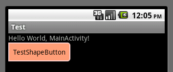
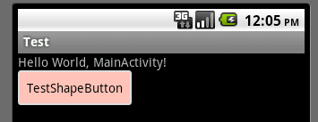
运行效果如下图:
一般状态:
获得焦点状态:
按下状态:
原文地址:http://dev.10086.cn/cmdn/wiki/index.php?doc-view-6087.html

- android:shape的使用
- android:shape的使用
- android:shape的使用
- android:shape的使用
- android:shape的使用
- android:shape的使用
- android:shape的使用
- android:shape的使用
- android:shape的使用
- android:shape的使用
- android shape的使用
- android:shape的使用
- android:shape的使用
- android:shape的使用
- android:shape的使用
- android:shape的使用
- android:shape的使用
- android:shape的使用
- Pentaho
- S2SH所需要用到的包
- poj 1222 EXTENDED LIGHTS OUT //高斯消元
- PHP学习文件操作
- VC中怎么把CString类型的变量赋值给字符数组
- android:shape的使用
- 【WinCE】WinCE中开机启动应用程序,并且不进桌面的解决办法!
- 【Ubuntu下 ftp应用】【窗口没有最大化最小化】【调整关闭按钮到菜单栏右侧】【Movie Player和Gnome MPlayer 中文字幕问题】【修改Ubuntu启动项】
- 数据库连接池的配置
- 模态窗口提交
- fedora14 环境下 编译成模块/
- C++中的&表示引用与取址的用法
- Java流_2
- java流_3