Android学习-组件3(选项卡,拖动条,进度条,图像视图)
来源:互联网 发布:淘宝店铺免费打折工具 编辑:程序博客网 时间:2024/06/04 19:16
一.选项卡:
TabHost组件,可以方便的放置多个标签页,每个标签页相当于获得了一个与外部容器相同大小的组件,通过这种方式就可以在一个容器里放置更多组件,;
TabHost仅仅是一个简单的容器,可以通过一下两种方法来创建选项卡,添加选项卡;
1. newTabSpec(String tag):创建
2. addTab(TabHost.TabSpectabSpec);添加选项卡;
使用TabHost的一般步骤为:
)1、在界面布局中定义TabHost组件,并为该组件定义该选项卡的内容,
)2、Activity应该继承TabActivity.
)3、调用TabActivity的getTabHost方法获取Tabhost对象。
)4、通过TabHost对象的方法来创建选项卡,添加选项卡;
下面通过一个实例来示范选项卡的用法;
程序布局文件:
<?xml version="1.0"encoding="utf-8"?><TabHost xmlns:android="http://schemas.android.com/apk/res/android" android:layout_width="match_parent" android:layout_height="match_parent" android:background="@drawable/gallery_selected_pressed">第一个标签的内容 <LinearLayout android:id="@+id/tab1" android:layout_width="fill_parent" android:layout_height="fill_parent" android:orientation="vertical"> </LinearLayout>第二个标签的内容 <LinearLayout android:id="@+id/tab2" android:layout_width="fill_parent" android:layout_height="fill_parent" android:orientation="vertical"> </LinearLayout>第三个标签的内容 <LinearLayout android:id="@+id/tab3" android:layout_width="fill_parent" android:layout_height="fill_parent" android:orientation="vertical"> </LinearLayout> </TabHost>
通过上面的布局文件定义我们创建了三个组件,可以为TabHost添加三个标签页。
JAVA代码:
public class UIWorkActivity extends TabActivity { TabHost tabhost = null; public void onCreate(Bundle savedInstanceState) { super.onCreate(savedInstanceState); tabhost = this.getTabHost(); LayoutInflater in = LayoutInflater.from(this); in.inflate(R.layout.main, tabhost.getTabContentView(),true); tabhost.addTab(tabhost.newTabSpec("tab1").setIndicator("高兴",getResources().getDrawable(R.drawable.emo_im_laughing)) .setContent(R.id.tab1)); tabhost.addTab(tabhost.newTabSpec("tab2").setIndicator("难 //添加标签图片的方法过",getResources().getDrawable(R.drawable.emo_im_sad)) .setContent(R.id.tab2)); tabhost.addTab(tabhost.newTabSpec("tab3").setIndicator("兴奋",getResources().getDrawable(R.drawable.emo_im_money_mouth)) .setContent(R.id.tab3)); }运行效果演示:

二、进度条(ProgressBar):
进度条通常用于向用户显示某个耗时操作的完成的百分比,可以动态的显示进度,
1.通过style属性可以为progressBar指定风格,
@android:style/Widget.ProgressBar.Horizontal
水平
@android:style/Widget.ProgressBar.Small
小进度条
@android:style/Widget.ProgressBar.inverse
普通大小
@android:style/Widget.ProgressBar.Large
大进度条
@android:style/Widget.ProgressBar.Large.inverse
大进度条
@android:style/Widget.ProgressBar.Small.inverse
小进度条
2.ProgressBar还支持以下的常用属性:
Android:max
进度条的最大值
Android:progress
进度条已完成的进度值
Android:progressDrawable
进度条轨道的绘制形式
Android:indeterminate
属性设为true:设置进度条不精确显示进度
Android:indeterminateDrawable
设置不显示进度的进度条的Drawable对象
Android:indeterminateDuration
设置不精确显示进度的持续时间
XML属性值
说明
3.ProgressBar提供了一下方法设置进度的完成百分比;
1、setProgress(int) 设置完成进度的百分比;
2、incrementProgressBy(int):设置进度条的进度增加或减少,当参数为正数是进度增加,当为负值是进度减少;
下面用实例来说明一下ProgressBar的使用:
public class proessDemoextends Activity { ProgressBar bar = null; int i = 0; int barmax = 0; Handler handler = new Handler(); public void onCreate(Bundle savedInstanceState) { super.onCreate(savedInstanceState); setContentView(R.layout.progressbar); findViews(); } private void findViews() { bar = (ProgressBar) this.findViewById(R.id.bar2); bar.setMax(1000); barmax = bar.getMax(); new Thread(new Runnable() { public void run() { while (i < barmax) { i = dowork(); handler.post(new Runnable() { public void run() { bar.setProgress(i); } }); try { Thread.sleep(50); } catch (InterruptedException e) { e.printStackTrace(); } } } }).start(); } public int dowork() { return i += 1; }
Xml布局文件的配置:
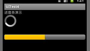
<?xml version="1.0"encoding="utf-8"?><LinearLayout xmlns:android="http://schemas.android.com/apk/res/android" android:layout_width="fill_parent" android:layout_height="fill_parent" android:orientation="vertical" > <TextView android:layout_width="fill_parent" android:layout_height="wrap_content" android:text="进度条演示" /> <ProgressBar android:id="@+id/bar1" android:layout_width="wrap_content" android:layout_height="wrap_content" android:max="530" android:progress="100" /> <ProgressBar android:id="@+id/bar2" style="@android:style/Widget.ProgressBar.Small" android:layout_marginTop="30dp" android:layout_width="fill_parent" android:layout_height="wrap_content" android:max="530" android:progress="100" android:secondaryProgress="300"/> </LinearLayout>
运行效果演示:
三、拖动条(SeekBar):
拖动条和进度条很相似,知识进度是通过颜色填充来显示进度完成的程度,而拖动条是则通过滑块的位置来识别标识,
下面来通过一个实例来说明拖动条的作用,
Xml:
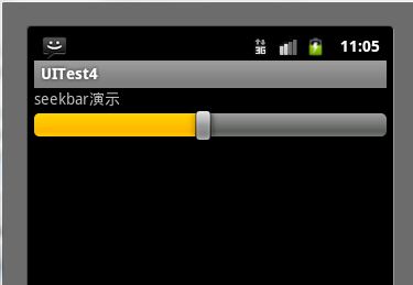
<LinearLayout xmlns:android="http://schemas.android.com/apk/res/android" android:layout_width="match_parent" android:layout_height="match_parent" android:orientation="vertical" > <TextView android:layout_width="fill_parent" android:layout_height="wrap_content" android:text="seekbar演示" /><SeekBar android:layout_width="fill_parent" android:layout_height="wrap_content" android:max="1000" android:id="@+id/seekbar" /> </LinearLayout>
Java文件:
public class SeekbarDemo extends Activity implements OnSeekBarChangeListener { SeekBar seekbar = null; protected void onCreate(Bundle savedInstanceState) { super.onCreate(savedInstanceState); this.setContentView(R.layout.seekbar); findViews(); } private void findViews() { seekbar = (SeekBar) this.findViewById(R.id.seekbar); seekbar.setOnSeekBarChangeListener(this); } public void onProgressChanged(SeekBar seekBar, int progress, boolean fromUser) { } public void onStartTrackingTouch(SeekBar seekBar) { Log.d("TAG", String.valueOf(seekbar.getProgress())); } public void onStopTrackingTouch(SeekBar seekBar) { Log.d("TAG", String.valueOf(seekbar.getProgress())); } }
运行效果:
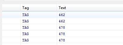
移动进度条
日志信息输出的变化:
四、图像视图:(ImageView)
ImageView是继承View的组件,主要功能是显示图片,并且任何的Drawable对象都可以使用ImageView来显示;
下面是ImageView支持的XML属性和相关方法,
Xml属性
相关method
说明
android: adjustViewBounds
setAdjustViewBounds(boolean)
设置是否需要调整自己边界
android:maxHeight
SetMaxwidth(int)
设置最大高度
android:maxWidth
SetMaxHeight(int)
设置最大宽度
android:scaleType
SetScaleType(ImageViewScaleType)
设置显示图片如何移动或缩放以适应ImageView的尺寸
android:src
setImageResource(int)
设置显示图片的ID
实例演示:
XML文件,
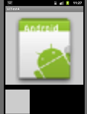
<ImageView android:layout_width="fill_parent" android:layout_height="300dp" android:src="@drawable/ic_launcher" android:background="#cccccc" android:scaleType="fitCenter" android:id="@+id/imageview1" /> <ImageView android:layout_width="100dp" android:layout_height="100dp" android:background="#cccccc" android:scaleType="fitStart" android:id="@+id/imageview2" android:layout_marginTop="20dp" />
Java文件:
public class ImageDemo extends Activity implements OnTouchListener { ImageView imageView1, imageView2; protected void onCreate(Bundle savedInstanceState) { super.onCreate(savedInstanceState); this.setContentView(R.layout.image); findViews(); } private void findViews() { imageView1 = (ImageView) this.findViewById(R.id.imageview1); imageView2 = (ImageView) this.findViewById(R.id.imageview2); imageView1.setOnTouchListener(this); } public boolean onTouch(View v, MotionEvent event) { float scale = 412 / 320; int x = (int) (event.getX() * scale); int y = (int) (event.getY() * scale); int width = (int) (100 * scale); int height = (int) (100 * scale); BitmapDrawable bitmapDrawable = (BitmapDrawable) imageView1 .getDrawable(); imageView2.setImageBitmap(Bitmap.createBitmap( bitmapDrawable.getBitmap(), x, y, width, height)); return false; } }
运行效果:
- Android学习-组件3(选项卡,拖动条,进度条,图像视图)
- Android组件 拖动条(SeekBar)
- Android组件 拖动条(SeekBar)
- 第七章 —高级组件:拖动条seekBar、星级评分条RatingBar、进度条ProgressBar、滚动视图ScrollView
- Android开发之进度条、拖动条、TabHost
- Android的进度条与拖动条
- Android高级组件之拖动条(SeekBar)
- android学习--TabHost选项卡组件
- Android中的进度条、拖动条及星级评分控件
- 【Android开发】高级组件-拖动条和星级评分条
- android---拖动条(SeekBar)
- CreateJS 学习3 图像拖动
- 【Android开发】基本组件-图像视图
- Android-SeekBar(拖动进度条)
- android拖动条和评分组件的使用
- Android组件08—拖动条SeekBar和RatingBar
- Android自定义组件学习笔记(1)---仿网页进度条
- Android控件之ProgressBar(进度条),ToggleButton/SwitchBar(开关按钮),SeekBar(拖动条)/RatingBar(等级评分)
- 白盒测试技术实战训练
- UI组件详解3---- ProgressBar、SeekBar、ImageView与TabHost
- 关于数据库的E-R图设计
- 思科IOS软件命名规则
- vector容器
- Android学习-组件3(选项卡,拖动条,进度条,图像视图)
- concepts 阅读总结1——体系结构
- zju 1006 zoj 1006
- asp.net 获取 当前日期时间 及 前后N天日期时间(DropDownList数据绑定)
- 去除svn蓝色问号
- Java中的耦合性
- iOS已发布应用中对异常信息捕获和处理
- Linux 文件系统构建命令mkfs
- PopupWindow消失时实在自动隐藏 软键盘