HTML5+CSS3 打造个性进度条 一
来源:互联网 发布:java 树结构 treenode 编辑:程序博客网 时间:2024/04/29 21:27
本例以chrome浏览器下效果为准
一、第一个例子
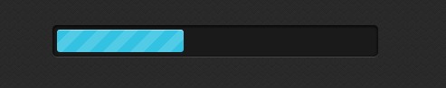
效果图:
1、 基本的HTML
HTML代码非常简单:
<body style='margin:100px 10px;'><div style=" width:360px; margin:0 auto"><div class="progress-bar blue stripes"><span style="width: 40%"></span></div></div></body>
2、 CSS代码
<style> body { background: #222 url("data:image/png;base64,iVBORw0KGgoAAAANSUhEUgAAAAoAAAAKCAMAAAC67D+PAAAAFVBMVEUqKiopKSkoKCgjIyMuLi4kJCQtLS0dJckpAAAAO0lEQVR42iXLAQoAUQhCQSvr/kfe910jHIikElsl5qVFa1iE5f0Pom/CNZdbNM6756lQ41NInMfuFPgAHVEAlGk4lvIAAAAASUVORK5CYII="); }/*---------------------------*/ .progress-bar { background-color: #1a1a1a; height: 25px; padding: 5px; width: 350px; margin: 70px 0 20px 0; -moz-border-radius: 5px;-webkit-border-radius: 5px;border-radius: 5px; -moz-box-shadow: 0 1px 5px #000 inset, 0 1px 0 #444;-webkit-box-shadow: 0 1px 5px #000 inset, 0 1px 0 #444;box-shadow: 0 1px 5px #000 inset, 0 1px 0 #444; } .progress-bar span { display: inline-block; height: 100%;background-color: #777; transition: width .4s ease-in-out;border-radius: 3px;box-shadow: 0 1px 0 rgba(255, 255, 255, .5) inset; -webkit-border-radius: 3px;-webkit-box-shadow: 0 1px 0 rgba(255, 255, 255, .5) inset;-webkit-transition: width .4s ease-in-out;-ms-transition: width .4s ease-in-out;-o-transition: width .4s ease-in-out;-moz-transition: width .4s ease-in-out;-moz-border-radius: 3px;-moz-box-shadow: 0 1px 0 rgba(255, 255, 255, .5) inset; }/*---------------------------*/ .blue span { background-color: #34c2e3; }/*---------------------------*/.stripes span { -webkit-background-size: 30px 30px; background-size: 30px 30px;background-image: -webkit-gradient(linear, left top, right bottom,color-stop(.25, rgba(255, 255, 255, .15)), color-stop(.25, transparent),color-stop(.5, transparent), color-stop(.5, rgba(255, 255, 255, .15)),color-stop(.75, rgba(255, 255, 255, .15)), color-stop(.75, transparent),to(transparent)); background-image: -webkit-linear-gradient(135deg, rgba(255, 255, 255, .15) 25%, transparent 25%, transparent 50%, rgba(255, 255, 255, .15) 50%, rgba(255, 255, 255, .15) 75%, transparent 75%, transparent);-moz-animation: animate-stripes 3s linear infinite; -webkit-animation: animate-stripes 3s linear infinite;/* chrome safri */-moz-background-size: 30px 30px; background-image: -moz-linear-gradient(135deg, rgba(255, 255, 255, .15) 25%, transparent 25%, transparent 50%, rgba(255, 255, 255, .15) 50%, rgba(255, 255, 255, .15) 75%, transparent 75%, transparent); background-image: -ms-linear-gradient(135deg, rgba(255, 255, 255, .15) 25%, transparent 25%, transparent 50%, rgba(255, 255, 255, .15) 50%, rgba(255, 255, 255, .15) 75%, transparent 75%, transparent); background-image: -o-linear-gradient(135deg, rgba(255, 255, 255, .15) 25%, transparent 25%, transparent 50%, rgba(255, 255, 255, .15) 50%, rgba(255, 255, 255, .15) 75%, transparent 75%, transparent); background-image: linear-gradient(135deg, rgba(255, 255, 255, .15) 25%, transparent 25%, transparent 50%, rgba(255, 255, 255, .15) 50%, rgba(255, 255, 255, .15) 75%, transparent 75%, transparent); } @-webkit-keyframes animate-stripes { 0% {background-position: 0 0;} 100% {background-position: 60px 0;} } @-moz-keyframes animate-stripes {0% {background-position: 0 0;} 100% {background-position: 60px 0;} } </style>- HTML5+CSS3 打造个性进度条 一
- 将个性化进行到底 VB中打造个性进度条
- HTML5+css3圆形指针旋转进度条、css3动态进度条
- HTML5+CSS3(一)
- HTML5 CSS3 精美案例 : 实现VCD包装盒个性幻灯片
- HTML5 CSS3 精美案例 : 实现VCD包装盒个性幻灯片
- 用CSS3打造HTML5的Logo
- 用CSS3打造HTML5的Logo
- 纯 CSS3 打造的按钮实例 | HTML5、CSS3、DEMO 实例
- CSS3 HTML5实例一(圆角)
- Photoshop和WPF双剑配合,打造炫酷个性的进度条控件
- Substance 打造个性 NetBeans
- 轮播图插件、CSS3进度条插件、HTML5动画特效
- HTML5 CSS3专题 纯CSS打造相册效果
- jquery_mobile.js+html5+css3打造手机平板等各种效果
- HTML5+CSS3+JQuery打造自定义视频播放器
- 使用javascript,HTML5,CSS3打造移动端音乐播放器
- HTML5 CSS3专题 纯CSS打造相册效果
- 分离轴测试
- android中的ANR总结
- 史上最详细MySQL5.5复制配置步骤,与以前版本的有所不同
- VC6: 在对话框中打开新对话框
- 设计模式之代理模式学习分享[Darren]
- HTML5+CSS3 打造个性进度条 一
- 硬件工程师
- vc++中 extern "C" 详解
- spring 注入map,set,list,property
- 【Android基础】Activity的启动模式(android:launchMode)
- DirectX9 SDK Samples(23) HDRFormats Sample
- 748 - Exponentiation
- N97的软格和硬格
- 打印图形Test1