国外仿照flipboard的一个jquery操作示例
来源:互联网 发布:天猫店铺装修软件 编辑:程序博客网 时间:2024/05/18 00:36
原文:http://tympanus.net/codrops/2012/05/07/experimental-page-layout-inspired-by-flipboard/
EXPERIMENTAL PAGE LAYOUT INSPIRED BY FLIPBOARD


VIEW DEMO DOWNLOAD SOURCE
Today we want to share an experimental 3D layout with you. It’s inspired by the famous Flipboard app where a seamlessly “normal” page flips like a page in a book when swiped. We’ve tried to re-create that effect using CSS 3D transforms and JavaScript, making a layout that is “flippable” and responsive. While the swiping makes sense for touch devices, dragging will do for normal browsers.
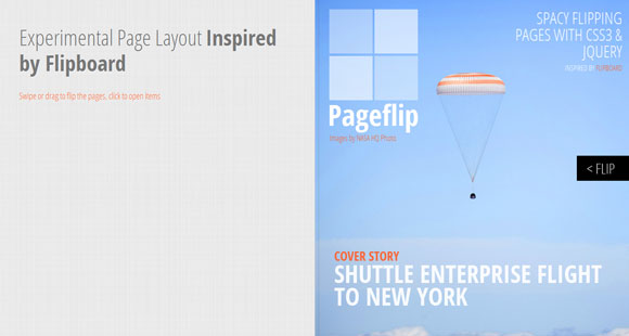
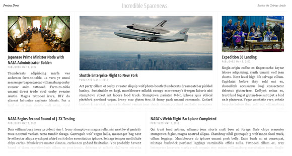
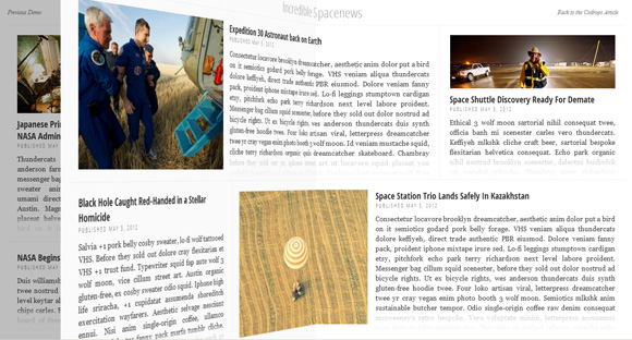
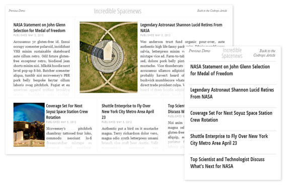
For the demo, we’ve made a little booklet with some placeholder text and images from NASA HQ. The images are licensed under the Creative Commons Attribution-NonCommercial 2.0 Generic License. The placeholder text is byhttp://hipsteripsum.me/.
Please notice that this is very experimental and just a proof-of-concept. It was tested in the latest versions of Safari, Chrome and Safari Mobile. The behavior is unfortunately not as nice as expected in Firefox.

There are probably still many undiscovered bugs and although Safari and Chrome support all the properties used, we had to apply a couple of hacks to overcome some unexpected behavior. Let us know about your experience with it and how it performs.
Some of the jQuery plugins we are using for this:
- History.js for keeping track of the current state/pages
- TouchSwipe for dragging and swiping the pages
- Modernizr for checking browser support of the CSS properties
The HTML is build up of a main wrapper with the class container and the ID flip. Inside, we’ll have all the pages, the first one being the cover and the last one being the back of the booklet. The other pages will contain some title element and boxes. These boxes will each need an additional “height” and “width” class which will give the element percentage-based dimensions. For example, w-50 is a class that will give the element a width of 50%. Depending on how a page should be laid out, we would add a fitting set of items:
<divid="flip"class="container"> <divclass="f-page f-cover"> <!-- ... --> </div> <divclass="f-page"> <divclass="f-title"> <!-- ... --> </div> <divclass="box w-50 h-100"> <divclass="img-cont img-1"></div> <h3>Headline <span>Published May 7, 2012</span></h3> <p>Some text</p> </div> <divclass="box w-50 h-100"> <!-- ... --> </div> </div> <divclass="f-page"> <!-- ... --> </div> <!-- ... --> <divclass="f-page f-cover-back"> <!-- ... --> </div></div>We are applying some “tricks” for making everything work responsively. The images are background-images and we set the background size of that element to “cover” while leaving the width and height fluid, in percentages. That’s of course not how it should be done. But it’s just for demonstration purpose. The teaser text is already loaded, and just “cut off” because the box is set to overflow “hidden”. To make it look smoother, we’ve just added a pseudo-element with a white to transparent gradient which covers the last bit of the box.
A great help for creating responsive layouts like these is this:
* { box-sizing: border-box } which finally got the attention it deserves thanks to this article by Paul Irish. When laying out elements using percentages it really comes in handy to use the border-box value since we can for example, define paddings in pixels and not break our 50% width box.
We will use jQuery Templates for creating the book structure:
<scriptid="pageTmpl"type="text/x-jquery-tmpl"> <divclass="${theClass}"style="${theStyle}"> <divclass="front"> <divclass="outer"> <divclass="content"style="${theContentStyleFront}"> <divclass="inner">{{html theContentFront}}</div> </div> </div> </div> <divclass="back"> <divclass="outer"> <divclass="content"style="${theContentStyleBack}"> <divclass="inner">{{html theContentBack}}</div> </div> </div> </div> </div> </script>The trick is to create a left side and a right side of a page, hiding half of each side to make it appear as one.
Before we call our experimental plugin, we need to check browser support first:
<script type="text/javascript"src="http://ajax.googleapis.com/ajax/libs/jquery/1.7.2/jquery.min.js"></script><script type="text/javascript"> var$container = $( '#flip'), $pages = $container.children().hide(); Modernizr.load({ test: Modernizr.csstransforms3d && Modernizr.csstransitions, yep : ['js/jquery.tmpl.min.js','js/jquery.history.js','js/core.string.js','js/jquery.touchSwipe-1.2.5.js','js/jquery.flips.js'], nope:'css/fallback.css', callback : function( url, result, key ) { if( url === 'css/fallback.css') { $pages.show(); } elseif( url === 'js/jquery.flips.js') { $('#flip').flips(); } } }); </script>If there is browser support for CSS 3D transforms and transitions we’ll load all the other necessary scripts and call ourflips plugin.
Please note again that it’s only experimental, but nonetheless, I hope you find it interesting.
- 国外仿照flipboard的一个jquery操作示例
- 国外看到的一个DELPHI XE5 POPMENU的示例
- 一个仿照JQUERY的链式结构JS包的结构详解
- 仿照hibernate封装的一个对数据库操作的jdbc工具类
- 一个仿照Nginx的内存池
- 仿照淘宝ued的一个菜单栏
- 一个用java仿照魔塔写的小游戏
- 仿照Iterator写的一个迭代器
- 一个完整的jQuery datatable示例
- 用canvas实现的Flipboard
- Jquery 操作 Frame示例
- JQuery 操作 Frame示例
- Jquery 操作 Frame示例
- 绘画---仿照一个Bitmap绘制一个新的Bitmap对象
- c#操作axwebbrowser的一个简单示例
- 文件操作的一个简单示例
- JQuery插件第二十三个:仿照DOM对象的outerHTML
- 封装自己的js库(一)---仿照JQuery
- 经济萧条的时代下,买彩票减压可行吗?
- VS2008 if else等语句块的收缩
- POJ 1067(广搜水题)
- 让IIS6.0支持PHP的配置方法
- 虚析构函数和protected析构函数
- 国外仿照flipboard的一个jquery操作示例
- 数据仓库建设失败的主要原因(鲁百年)
- iframe / frame
- SVN服务器搭建
- 分享100佳精美的作品集网站设计案例
- eclipse xml自动提示
- Google面试题 07042012 [1]
- C#制作Windows service服务系列一:制作一个可安装、可启动、可停止、可卸载的Windows service
- 实现删除嵌套的注释