django中highcharts的用法
来源:互联网 发布:idea2016新建java项目 编辑:程序博客网 时间:2024/05/17 22:06
转自:http://catherinetenajeros.blogspot.com/2013/03/highcharts.html
Highcharts
Highcharts is a charting library written in pure JavaScript, offering intuitive, interactive charts to your web site or web application. Highcharts currently supports line, spline, area, areaspline, column, bar, pie, scatter, angular gauges, arearange, areasplinerange, columnrange and polar chart types.
Demo: Highcharts Demo
Download: Highcharts 3.0.2
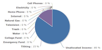
I want to show you on how to use Highcharts. I will create a pie chart.
#models.py
#views.py
#template
{% load static %}
<div id="categoryPieChart"
style="min-width: 250px; height: 250px; margin: 0 auto"></div>
<script src="{% static 'js/highcharts.js' %}"></script>
<script src="{% static 'js/modules/exporting.js' %}"></script>
<script>
function numberWithCommas(x) {
var parts = x.toString().split(".");
parts[0] = parts[0].replace(/\B(?=(\d{3})+(?!\d))/g, ",");
return parts.join(".");
}
$(function () {
var chart;
$(document).ready(function() {
chart = new Highcharts.Chart({
chart: {
renderTo: 'categoryPieChart'
},title: {
text: 'Category'
},tooltip: {
formatter: function() {
return '<b>'+ this.point.name +'</b>: '+ numberWithCommas(this.y.toFixed(2));
}
},exporting: {
enabled: false
},plotOptions: {
pie: {
dataLabels: {
enabled: true,
formatter: function() {
return '<b>'+ this.point.name +'</b>: '+ Math.round(this.percentage) +' %';
}
}
}
},series: [{
type: 'pie',
data: [
{% for cat in categories %}
[
'{{ cat.name }}',
{% if cat.amount > 0 %}
{{ cat.amount }}
{% else %}
0
{% endif %}
],
{% endfor %}
]
}]
});
});
});
});
</script>
Demo: Highcharts Demo
Download: Highcharts 3.0.2
I want to show you on how to use Highcharts. I will create a pie chart.
#models.py
from django.db import models
class Category(models.Model):
name = models.CharField(
max_length=50
)
amount = models.DecimalField(
max_digits=10,
decimal_places=2,
default=0
)
#views.py
categories = Category.objects.filter()
#template
{% load static %}
<div id="categoryPieChart"
style="min-width: 250px; height: 250px; margin: 0 auto"></div>
<script src="{% static 'js/highcharts.js' %}"></script>
<script src="{% static 'js/modules/exporting.js' %}"></script>
<script>
function numberWithCommas(x) {
var parts = x.toString().split(".");
parts[0] = parts[0].replace(/\B(?=(\d{3})+(?!\d))/g, ",");
return parts.join(".");
}
$(function () {
var chart;
$(document).ready(function() {
chart = new Highcharts.Chart({
chart: {
renderTo: 'categoryPieChart'
},title: {
text: 'Category'
},tooltip: {
formatter: function() {
return '<b>'+ this.point.name +'</b>: '+ numberWithCommas(this.y.toFixed(2));
}
},exporting: {
enabled: false
},plotOptions: {
pie: {
dataLabels: {
enabled: true,
formatter: function() {
return '<b>'+ this.point.name +'</b>: '+ Math.round(this.percentage) +' %';
}
}
}
},series: [{
type: 'pie',
data: [
{% for cat in categories %}
[
'{{ cat.name }}',
{% if cat.amount > 0 %}
{{ cat.amount }}
{% else %}
0
{% endif %}
],
{% endfor %}
]
}]
});
});
});
});
</script>
另外一篇文章,转自:http://www.web4py.com/blog/highcharts-with-django-part-1-use-jquery-to-read-djangos-template-table-data-to-generate-charts/
Highcharts is a really cool charting library which written in pure javascript. I used it to demonstrate data in my several projects. It can supports supports line, spline, area, areaspline, column, bar, pie, scatter, angular gauges, arearange, areasplinerange, columnrange and polar chart types. You can get all the things from the official website: http://www.highcharts.com
My first usage is use highcharts to show the companies' social network related data in http://trackinglocal.com . This is a web application which developed by me. Here are some screen shots of the highcharts usage.
Image 1: The line chart
Image 2: the stack column chart
Actually the 2 charts are very simple to implement. I didn't use any of backend django handle anything. It's just use jQuery to read the html table then generate the chart. Highcharts provide powerful api to let's generate charts dynamically. Here is a example:
1. first, define a table to contain the data:
<table id="data_table" class="table table-striped table-bordered">
<thead>
<tr>
<th>Fans (FB)</th>
<th>Followers (TW)</th>
<th>Views (YT)</th>
<th>Facebook Score</th>
<th>Twitter Score</th>
<th>YouTube Score</th>
<th>Health Score</th>
<th>Date</th>
</tr>
</thead>
<tbody>
{% if entity_data_list %}
{% for item in entity_data_list %}
<tr>
<td>{{ item.fb_likes }}</td>
<td>{{ item.tw_followers_count }}</td>
<td>{{ item.yt_view_count }}</td>
<td>{{ item.fb_abs|floatformat:2 }}</td>
<td>{{ item.tw_abs|floatformat:2 }}</td>
<td>{{ item.yt_abs|floatformat:2 }}</td>
<td class="tssh_data">{{ item.tssh_pwr_reduced|floatformat:2 }}</td>
<td class="time_taken">{{ item.created|date:"Y-m-d H:i" }}</td>
</tr>
{% endfor %}
{% else %}
<tr>
<td colspan="2">No data</td>
</tr>
{% endif %}
</tbody>
</table>
Well I just make the 2 <td> with class "tssh_data" and "time_taken" which need to show in chart. I used the django template language since this site is built by python/django, and it's the django template.
2. Then I use jQuery to read the table to generate chart:
var option = {
chart:{
renderTo:'company_chart',
type:'line',
zoomType:'x'
},
title:{
text:"TrackingSocial Health Score of {{ entity.company_name }}"
},
subtitle:{
text:'<a href="{% url client_entity_view %}?list_id={{ list_id }}&entity_id={{ entity_id }}&list_type={{ list_type }}">Source</a>'
},
xAxis:{
type:'datetime',
dateTimeLabelFormats:{
minute:'%H:%M',
hour:'%H:%M',
day:'%e. %b',
month:'%b \'%y',
year:'%Y'
}
},
yAxis:{
title:{
text:'TrackingSocial Health Score'
},
labels:{
formatter:function () {
return this.value;
}
}
},
tooltip:{
formatter:function () {
return '<b>' + Highcharts.dateFormat('%Y-%m-%d %H:%M', this.x) + '</b><br/>' +
this.y;
}
},
plotOptions:{
pointStart:'',
area:{
marker:{
enabled:false,
symbol:'circle',
radius:2,
states:{
hover:{
enabled:true
}
}
}
}
},
series:[
{
name:"{{ entity.company_name }}",
data:[]
}
]
};
$('.time_taken').each(function () {
var d = new Date(this.innerHTML.replace(" ", "T") + ":00Z");
option.series[0].data.push([d.getTime()]);
});
$('.tssh_data').each(function (i) {
option.series[0].data[i].push(parseFloat(this.innerHTML));
});
You can see use jQuery each method to read the table data which has the class name "time_taken" and "tssh_data". Then push these data into highcharts' option. And the option contains many things such as the chart's type, x and y axis, etc. We just need push the data into series list. And at the end, please do not forget to generate chart with this option.
var chart = new Highcharts.Chart(option);
- django中highcharts的用法
- django中for的用法
- Django 中form的用法
- Django 中form的用法
- Django Highcharts
- django highcharts
- Django中关于url的用法
- django 中imagefield和filepathfiled的用法
- django 中cookies和session的用法
- highcharts用法
- EXT中 使用的 highcharts
- Highcharts中数据的作用
- HighCharts中PieChart的实现
- 同一个页面中定义多个HighCharts的option方法与Jquery.extend()的用法
- highcharts用法php的json输出
- Django的url用法
- django的表单用法~~
- django模型的用法
- POJ-1984-Navigation Nightmare
- Ios编译问题
- android之adb环境变量配置
- android的SQLite数据类型
- hdu4277 USACO ORZ(dfs+set判重)
- django中highcharts的用法
- android sharedpreference 保存对象
- POJ 2739 Sum of Consecutive Prime Numbers
- SPRING-MVC访问静态文件,如jpg,js,css
- 《学习Qt之路2》笔记:Qt对话框模式
- URAL 1654 Cipher Message(栈)
- android UEventObserver的用法
- 我的Java日记--Char
- read 系统调用剖析