第四天(Using Layouts in Sencha Touch)
来源:互联网 发布:win10防火墙端口设置 编辑:程序博客网 时间:2024/06/07 10:00
原文链接:http://docs.sencha.com/touch/2.2.0/#!/guide/layouts
Using Layouts in Sencha Touch
Contents
- Intro and HBox
- VBox Layout
- Card Layout
- Fit Layout
- Docking
- Pack and Align (HBox)
- Pack and Align (VBox)
- Further Reading
在st中使用布局
Intro and HBox
Layouts describe the sizing and positioning on Components in your app. For example, an email client might have a list of messages pinned to the left, taking up one third of the available width, and a message viewing panel in the rest of the screen.
布局描述了你的app中组件的大小和位置。例如,一个邮件客户端,左边可能是一个占据屏幕尺寸1/3的邮件列表,剩下的区域是一个邮件预览的面板。
We can achieve this using an hbox layout and its ability to 'flex' items within it. Flexing means that we divide the available area based on the flex of each child component, so to achieve our example above we can set up flexes like shown in the following image:
我们可以通过一个横向布局及对子项设置flex参数来达到此目的。柔性意味着我们可以通过每个子项的flex参数来划分可用的屏幕区域,因此为了达到下面例子所示的效果,我们可以像图片中所示来设置flex参数。
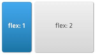
In the code for this layout we need to specify the 'hbox' layout on any Container, then supply a flex parameter for each of the child components (Panels in this case) as follows:
在这种布局的代码中,不管是何种布局(该例中是面板)我们都要设置它为水平布局,然后为其每一个子项设置一个flex参数,如下所示:
Ext.create('Ext.Container', { fullscreen: true, layout: 'hbox', items: [ { xtype: 'panel', html: 'message list', flex: 1 }, { xtype: 'panel', html: 'message preview', flex: 2 } ]});This creates a Container that fills the screen, and inside of it creates a message list panel and a preview panel. Their relative flex configs of 1 and 2 respectively means that the message list takes up one third of the available width, with the preview taking the remaining two thirds. If our Container was 300px wide, the first item (flex: 1) will be 100px wide and the second (flex: 2) will be 200px wide.
上面创建了一个沾满整个屏幕的容器,在它的里面创建了一个信息列表的面板和一个预览的面板。他们的flex参数设置为1和2,意味着信息列表占可用宽度的1/3,信息预览占剩下的2/3。如果我们的容器宽度为300px,第一个子项会占据100px的宽度,第二个子项会占据200px的宽度。
The hbox layout is one of the most useful layouts, as it can arrange components in a wide variety of horizontal combinations. See the HBox documentationfor more examples.
水平布局是最常用的布局方式之一,因为它能够使组件在书评方向进行组合。查看HBox documentation获取更多例子。
VBox Layout
垂直布局
VBox is similar to HBox, just vertical instead of horizontal. Again, we can visualize this easily as a set of stacked boxes:
垂直布局与横向布局类似,只是垂直代替了水平。再次的,我们可以想象下一堆盒子:
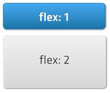
The code to create this is almost identical to the previous example, we only traded layout: 'hbox' for layout: 'vbox':
下面的代码跟上一个例子差不多完全一样,我们只是用垂直布局替代了水平布局:
Ext.create('Ext.Container', { fullscreen: true, layout: 'vbox', items: [ { xtype: 'panel', html: 'message list', flex: 1 }, { xtype: 'panel', html: 'message preview', flex: 2 } ]});If our Container was 300px tall, the first panel (flex: 1) would be 100px tall, and the second (flex: 2) would be 200px tall. See the VBox documentation for more examples.
如果你的容器高度是300px,第一个面板(flex:1)的会占据100px的高度,第二个(flex:2)会占据200px的高度。查看VBox documentation获取更多信息。
Card Layout
卡片布局
Sometimes you want to show several information screens information on a small device screen. TabPanels and Carousels both enable you to see one screen of many at a time, and underneath they both use a Card Layout.
有时,你想在一个比较小的屏幕设备上展示几屏的信息。选项卡面板和旋转切换面板都可以使你同时在一屏上看很多信息,而且他们的底层都是用的卡片布局。
Card Layout takes the size of the Container it is applied to and sizes the currently active item so as to completely fill the Container. It then hides the rest of the items, allowing you to change which one is currently visible, but only showing one at once:
卡片布局与它填充到的容器的尺寸相适应,并使当前活动的项填充满容器。然后它会隐藏其它项,允许你改变哪一个为当前可见,但是一次只能显示一个:

In the previous image, the gray box is the Container, and the blue box inside it is the currently active card. The three other cards are hidden from view, but can be swapped in later. While it is not very common to create Card layouts directly, you can do this as follows:
在上面的图片中,灰色的盒子是容器,里面的蓝色盒子是当前活动的项。其它3个子项被视图隐藏了,但是能被切换显示出来。通常不会直接创建卡片布局,你可以像下面这样做:
var panel = Ext.create('Ext.Panel', { layout: 'card', items: [ { html: "First Item" }, { html: "Second Item" }, { html: "Third Item" }, { html: "Fourth Item" } ]});panel.setActiveItem(1);In this example we created a Panel with a Card Layout and later set the second item as active (the active item index is zero-based, so 1 corresponds to the second item). In most cases you should however use a Tab Panel or a Carousel.
这个例子中,我们用卡片布局创建了一个面板,并且设置第二个子项为活动项(活动项的索引是从0开始的,因此1代表第二项)。大部分情况下你应该使用选项卡面板或者旋转切换面板。
Fit Layout
填充布局
The Fit Layout is probably the simplest layout available. All it does is make a child component fit the full size of its parent Container.
填充布局或许是所有布局中最简单的布局。它所做的是让一个子控件填满它的父容器。
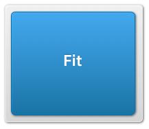
For example, if you have a parent Container that is 200px by 200px and give it a single child component and a 'fit' layout, the child component will also be 200px by 200px:
例如:你有一个宽和高分别为200px的容器,给了它一个子控件并设置为fit布局,那么子控件的宽、高也会被设置为200px:
var panel = Ext.create('Ext.Panel', { width: 200, height: 200, layout: 'fit', items: { xtype: 'panel', html: 'Also 200px by 200px' }});Ext.Viewport.add(panel);Please note that if you add more than one item into a container that has a fit layout, only the first item will be visible. If you want to switch between multiple items, use the Card layout instead.
注意,如果你往一个fit布局的容器中添加了不止一个子项,那么只有第一个子项是可见的。如果你想在不同的子项只见相互切换,那么请用卡片布局来代替。
Docking
停靠
Every layout is capable of docking items inside it. Docking enables you to place additional Components at the top, right, bottom, or left edges of the parent Container, resizing the other items as necessary.
每一种布局都能够在其子项中使用停靠属性。停靠能够使额外的组件停靠在父容器的上面、右边、下面或者左边,根据需要调整其它子项。
For example, coming back to our first hbox layout from this guide, let us imagine we want to dock another component at the top, like shown in the following image:
例如,回到本篇中我们的第一个水平布局例子,我们想象想在顶部放置另外一个组件,如下面的图片所示:

This feature is often used for items such as toolbars and banners, and it is easy to achieve using the docked: 'top' configuration:
这种特性经常被用在顶部工具栏、横幅上,使用docked:top配置很容易实现该目的:
Ext.create('Ext.Container', { fullscreen: true, layout: 'hbox', items: [ { docked: 'top', xtype: 'panel', height: 20, html: 'This is docked to the top' }, { xtype: 'panel', html: 'message list', flex: 1 }, { xtype: 'panel', html: 'message preview', flex: 2 } ]});You can add any number of docked items by simply providing the dock configuration on the child components that you want docked. Items can also be docked on any side, for example if we wanted to do this with our previous vbox example:
你能够在你想停靠的任何子项上设置dock属性。子项也能够停靠在任意一边,例如,我们用上一个垂直布局的例子来演示:
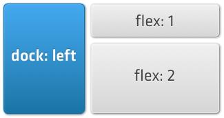
we could achieve this by specifying docked: 'left':
我们可以通过配置docked:left来达到此目的:
Ext.create('Ext.Container', { fullscreen: true, layout: 'vbox', items: [ { docked: 'left', xtype: 'panel', width: 100, html: 'This is docked to the left' }, { xtype: 'panel', html: 'message list', flex: 1 }, { xtype: 'panel', html: 'message preview', flex: 2 } ]});You can add multiple docked items on each side (for example docking several items in the 'bottom' position).
你能在每一边上设置多个停靠的子项(例如将多个子项停靠在底部)。
Pack and Align (HBox)
包裹与对其(水平布局)
The Pack and Align feature controls how child elements are aligned in a layout. 'Pack' refers to the axis of your current layout, while 'Align' is the opposite. For example, in an HBox layout, Pack refers to the horizontal axis, and Align to the vertical axis. The following example illustrates the difference:
包裹与对其属性控制了子元素在布局中是如何对齐的。包裹于当前布局的轴线关联,对齐则刚好相反。例如,在一个水平布局中,包裹与水平轴线关联,对齐与垂直轴线关联,下面的例子展示了它们的不同:
Pack and Align (VBox)
包裹于对齐(垂直布局)
Further Reading
延伸阅读
Layouts are only a part of the Sencha Touch ecosystem. In order to better understand the framework and how it works, we recommend reading the following guides:
布局只是st系统的一部分。为了更好的理解该框架及它是如何工作的,推荐阅读如下内容:
- Components and Containers 组件与容器
- The Class System 类系统
- The Data Package 包
- Getting Started 开始
- 第四天(Using Layouts in Sencha Touch)
- 第二天(Using Components in Sencha Touch)
- 第十二天(Understanding and Using Events in Sencha Touch)
- 第五天(Using the Data Package in Sencha Touch)
- Using Validations and Associations in Sencha Touch
- Sencha Touch 2 官方文档翻译之 Using Views in your Applications(使用视图)
- Sencha Touch 2 官方文档翻译之 Using Views in your Applications(使用视图)
- Sencha Touch 2 快速入门系列(五)-- 布局(Layouts)
- 第十五天(Using AJAX with Sencha Touch)
- 第九天(How to Use Classes in Sencha Touch)
- 第十六天(Theming Sencha Touch)
- What's New in Sencha Touch 2.0
- Sencha Touch 2 官方文档翻译之 Using Models(使用数据模型)
- Sencha Touch 2 官方文档翻译之 Using Models(使用数据模型)
- sencha touch 入门系列 (三)sencha touch 项目创建
- sencha touch 入门系列 (一)sencha touch 简介
- sencha touch 入门系列 (二)sencha touch 开发准备
- sencha touch笔记(3)
- [整]Android 优化布局层次结构
- 华为机试题目:识别字符串中的整数并转换为数字形式
- POJ 2253 Frogger【最短路变形——路径上最小的最大权】
- SQLite数据库查看工具(免费)
- NB多项式模型、神经网络、SVM初步—斯坦福ML公开课笔记6
- 第四天(Using Layouts in Sencha Touch)
- Difference between Full Binary Tree and Complete Binary Tree
- 华为2011上机笔试题2+参考程序
- Ajax和Jquery学习总结(1)
- 枚举法---八皇后
- 我理解的Android加载器
- 产品经理利器之gui design studio
- 天梯 1012 最大公约数和最小公倍数问题
- STL源码剖析---红黑树原理详解上