对 Android 开发者有益的 40 条优化建议
来源:互联网 发布:下载软件 纳米盒子 编辑:程序博客网 时间:2024/05/19 18:45
转自:http://www.oschina.net/translate/40-developer-tips-for-android-optimization?cmp&p=1#
英文原文:40 Developer Tips for Android Optimization
Here’s a good way to get into Android programming:
- Find some code that does something similar to what you want to do
- Adjust it to try to make it do your thing
- Watch it fail
- Troubleshoot using StackOverflow
Repeat the process for the each feature you want to add. This method will keep you motivated and, because you keep iterating, you’ll also learn a lot without realising it. However, you’ll need to go a bit further when you release the app.

下面是开始Android编程的好方法:
- 找一些与你想做事情类似的代码
- 调整它,尝试让它做你像做的事情
- 经历问题
- 使用StackOverflow解决问题
对每个你像添加的特征重复上述过程。这种方法能够激励你,因为你在保持不断迭代,不经意中你学到了很多。然而,当你发布应用时你还要做一些更深入的事情。
To go from having some code that works pretty well to having an awesome app is a big jump, much bigger on Android than it is on iOS. When publishing on iOS your app jumps from one device – your phone – to a lot of devices that are pretty similar – same size screen, all with pretty good hardware, 95% running the same OS version. On Android, your app leaps into the void.
Your app must be able to handle whatever comes its way: in terms of screens, processor, custom OS, API level, and any other device specific quirks.
Here are my personal tips for making Android awesome.
译者信息从一些可正常工作的代码到一个可怕的应用程序是一个巨大的跳跃,相比iOS平台Android更是如此 。当在iOS上发布应用时只是在一个设备上跳跃–你的手机–对很多设备而言都很相似–同样大小的屏幕,都有很好的硬件,95%上运行相同版本的操作系统。在Android应用中你不会遇到这种情况。
你的程序必须能够处理一切:从屏幕,处理器,定制的操作系统,API层级以及任何其他的特定设备。
这是我对使Android应用舒服起来的个人建议。
Targeting screen size and resolution
There are currently over 100 different screen sizes on Android, and an even greater profusion of resolutions. To make your app look good on different screen configurations there are two things you’ll need to make sure of:
- You have a good layout or structure for different screen sizes
- Your images work well at different resolutions
These are independent tasks, you might have a super tablet layout, but your graphics could look horribly bobbly on it. We’ll look at them in turn.
译者信息目标屏幕尺寸及解决方法
在Android世界里目前有超过100种的不同屏幕尺寸,但解决方法也很丰富。为使你的应用适应不同的屏幕配置有两件事情你需要确定:
- 你对不同的屏幕尺寸有一个好的布局和结构
- 你的图像在不同分辨率下工作良好
Designing layouts for multiple screen sizes
Tip 1: ScrollViews and ListViews are an easy win.
While there are a huge array of screen sizes, most of the variation – for phones at least – is in the screen height. For this reason ScrollViews and ListViews work well. They’re not appropriate for all views, however. For the dashboard tab in OpenSignal users should see everything all in one go, without scrolling. For the more advanced stats tab, scrolling is not such a bad thing. If you can design your layouts so they work well across all screens without using a scrollview, do so, but it’s an easy way of making sure it works on a lots of screens.
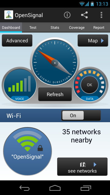
Dashboard style screens shouldn’t scroll
译者信息
为不同的屏幕而设计
1.通常会用ScrollView 和 ListView 轻松搞定
当我们有一系列不同尺寸的大屏手机时,它们之间最大的不同就是屏幕的高度。因此ScrollView和ListView通常可是有效的工作,虽然有时它们并不能完全覆盖全部屏幕。在OpenSignal中的Dashboard标签下我们可以看到所有部件一气呵成,不存在滑动、对于许多高级类型标签中,滑动展示并不见得是一件坏事。如果你能够为你所有的设计匹配到各种屏幕上面去,那么最好不过。否则,这两个控件会让你用最小的开发代价来保证你的软件在大多数屏幕上正常展示。
Dashboard style 的设计不需要scroll
Tip 2: Use the folder structures. The resource folder structure is powerful in Android, it allows you to vary images/strings/layout files/dimensions/colours depending on the api level/language/screen size/screen resolution among other things. Here’s an example of some of the things you can do with it: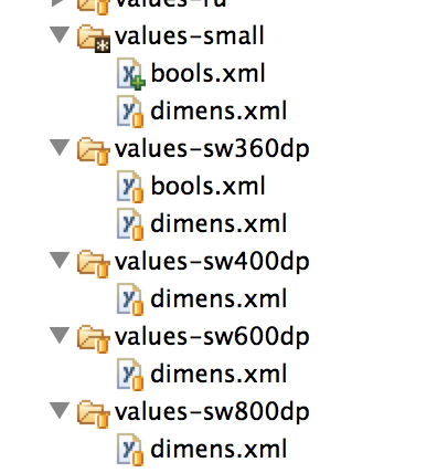
In values-small (above) I have a bools.xml file, this contains a line:
<resources>
<bool name="small_screen">true</bool>
</resources>
In the code I reference that like so:
if(getResources().getBoolean(R.bool.small_screen)){
getSupportActionBar().hide();
}
On small screened devices that boolean is found to be true and I hide the ActionBar to save space. This is actually using the marvellous ActionBarSherlock, more on that later. In values-sw360dp – so for screens wider than 360dp – I have
<resources>
<bool name="small_screen">false</bool>
</resources>
For large screens, the ActionBar is not hidden.
I don’t need to include the bools.xml file in values-sw400dp, because of the way that the OS searches for resources. For example for a device of width 600dp (600/160=3.75 inches, so this is what we generally call a 7″ tablet) the OS will look for a bools.xml in values-sw600dp and fail, look again in values-sw400dp and fail, then look in values-sw360dp and look no further.
译者信息
2: 使用文件夹. Android 的资源文件夹结构非常强大, 它允许开发者将不同的图片、字符串、布局文件、外形、颜色这些资源,在api、代码、屏幕尺寸等部分. 下面是一个例子,展示了在资源文件夹下你可以怎样做:
在 values-small 文件夹中存放了一个 bools.xml 文件, 文件中有如下几行代码:
1<resources>2<bool name="small_screen">true</bool>3</resources>在代码中我可这样引用:
1if(getResources().getBoolean(R.bool.small_screen)){2getSupportActionBar().hide();3}在小尺寸设备中boolean值将置为true 我此时将因此ActionBar来节省空间. 这段代码正是非凡的ActionBarSherlock 扩展库中的一部分,稍后再详细介绍. 在values-sw360dp文件夹中,存放对应屏幕宽于360dp的资源文件。与上面相同的位置,有如下代码
1<resources>2<bool name="small_screen">false</bool>3</resources>对于大屏幕而言,ActionBar就置为了显示状态.
我不需要将 bools.xml 文件放入 values-sw400dp文件夹中, 因为操作系统会自动按相应路径搜索. 例如一个设备宽 600dp (600/160=3.75 英寸, 这就是我们通常所说的7片装) 操作系统会在values-sw600dp 和其包含的的文件夹中搜索 bools.xml 文件, 若没有找到则搜索 values-sw400dp 文件夹,在搜索 values-sw360dp 文件夹以此类推.
Tip 3: 160dp = 1 inch. 320 dp = 2 inches. dp == dip
Tip 4: you can use these folder structure tricks for all resource types For example you can use the system of appending folder names for XML layouts e.g. layout-sw360dp can be used if you have a layout file you want to target to screen width 360dp. If you want to switch the layout between portrait and landscape you can go one step further:
layout-sw360dp-land
layout-sw360dp-port
But wait, half your users will speak Arabic? You probably want to flip your layout right to left, try:
layout-sw360dp-land
layout-sw360dp-port
layout-sw360dp-land-ar
layout-sw360dp-port-ar
The first two files will get served for all other languages, your -ar files just for Arabic.
Tip 5: Resource rules of thumb:
XXX // i.e. no append to the folder name: default – use this for Nexus One, Droid 2, S2
XXX-sw360dp // larger phones – Galaxy Nexus, S3, S4
XXX-sw600dp // 7″ tablets
XXX-sw720dp // 10” tablets
For Kindle devices things differ, use:
XXX-large-mdpi // kindle fire 7″
XXX-large-hdpi // kindle fire 7″ HD
建议3:160dp = 1英寸。320 dp = 2英寸。dp = dip 建议4:你可以用这些目录结构技巧来应付所有资源类型,比如你的XML布局用指定的系统目录名称
来解决这个问题,如:layout-sw360dp目录可以匹配目标宽是360dp的机器。如果你也要支持横竖屏布局切换的话,可以用如下目录:
layout-sw360dp-landlayout-sw360dp-port
别急,你有一半的用户是说阿拉伯语的?那就将布局名称改为下面的样子吧:
layout-sw360dp-land
layout-sw360dp-port
layout-sw360dp-land-ar
layout-sw360dp-port-ar
前两个可以适用于所有语言,-ar代表阿拉伯语。建议5:资源规则简介:
XXX //例子:没有添加目录名:默认-适用于Nexus One,Droid 2,S2
XXX-sw360dp // 比较大的手机 – Galaxy Nexus, S3, S4
XXX-sw600dp // 7〃 平板
XXX-sw720dp // 10” 平板
在Kindle设备有些不同,如下:
XXX-large-mdpi // kindle fire 7〃
XXX-large-hdpi // kindle fire 7〃 HD
Tip 6: you don’t have to tailor all your layout files, you could instead tailor the dimens.xml files. In the screenshot a few paragraphs up, you’ll notice that I have a lot of dimens.xml files in my values folders, that’s because I prefer to work with a single set of layout.xml files, within each layout file I have code like:
<ImageView
android:layout_centerHorizontal="true"
android:layout_marginTop="@dimen/small_margin"
android:layout_width="@dimen/dashBoardWidth"
android:layout_height="@dimen/dashBoardHeight"
android:id="@+id/dashboard"/>
Where e.g. small_margin is defined in a dimens.xml file:
<resources>
<dimen name="small_margin">4dp</dimen>
</resources>
That 4dp varies between all the dimens files. I have an Excel file that creates all these different dimension definitions based on scaling up by a certain factor. You might ask: why not just let the Android OS handle all the scaling? Wy not, instead of hardcoding all values, just use one values folder and one layout folder? That would work, everything would get scaled if it was properly set up, but some elements look stupid scaled.
译者信息建议6:如果你不想裁剪所有的布局文件,你可以用dimens.xml文件。你要是留心我上面的文章,你就会注意到在我的values目录里有很多dimens.xml,这样是因为我更喜欢在一个layout.xml里设置值,在每一个布局文件里我喜欢这样做:01<ImageView02android:layout_centerHorizontal="true"03android:layout_marginTop="@dimen/small_margin"04android:layout_width="@dimen/dashBoardWidth"05android:layout_height="@dimen/dashBoardHeight"06android:id="@+id/dashboard"/>07 08small_margin是在dimen.xml文件里定义的:09 10<resources>11 12<dimen name="small_margin">4dp</dimen>13</resources>Tip 7: Let whitespace scale more than graphics. Let graphics scale more than buttons. Buttons, checkboxes, toggles look stupid when scaled up. A button that’s 100dip (0.63″) on a phone does not want to become 200dip (1.25″) on a tablet of twice the screen width. Just because the screens are bigger, it does not mean that tablets are used by giants. Instead, let the space between buttons increase while your shiny dials and images expand.
Tip 8: Use the GraphicalLayout tool for fast previews. GraphicalLayout is the WYSIWG editor for XML files. I prefer to write all my elements directly – instead of dragging and dropping – but after adding some elements, test out your layout on various screen sizes by toggling the GraphicalLayout selecting from the dropdown.
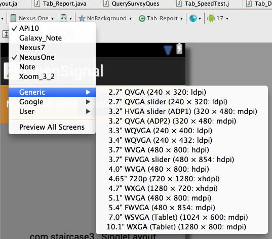
Lots of options, use them.
Scaling Images
译者信息
建议7:让空白空间大于图像空间。让图像空间大于按钮的大小。如果将按钮,多选框,切换控件放大后是很丑陋的。一个100dip(0.63")大小的按钮是不想在平板上显示为原来两倍宽度200dip(1.25")的.原因是屏幕变大了,这不是说平板是给巨人用的。我们可以这样做,在按钮增加的空间和图片扩展的空间里添加空白。
建议8:用GraphicalLayout工具快速预览。GraphicalLayout是WYSIWG XML编辑器。我喜欢直接编写元素-而不是拖,丢弃的可见编程方式,但在添加一些元素之后,可以在GraphicalLayout的下拉选择菜单里选择不同屏幕尺寸进行测试。 这里有很多选项供你选择。
图片缩放
Tip 9: Don’t scale all your images. Getting the layout files to adjust to different screen-sizes is just half the battle, the elements themselves (e.g. images) must work when blown up onto high-res screens. The conceptually simplest way of doing this is to produce a whole host of images and pop them into a matching plethora of drawable folders:drawable-sw600dp-ldpi
drawable-sw600dp-mdpi
drawable-sw600dp-hdpi
drawable-sw600dp-xhdpi
drawable-sw600dp-xxhdpi
… And the same for other screen widths.
Don’t do this.
You will go insane in the membrane.
Having drawble-ldpi, drawable-hdpi, etc. folders might be worthwhile, but you don’t necessarily need to have all of them.
建议9:不要把所有的图片都缩放了。用布局文件来适应不同屏幕尺寸的方法只是成功的一半,布局里的元素(如:图片)也要能在高分辨率的屏幕下良好工作。在概念上比较简单的方式就是创建一套完整的图片目录并将它们与很多drawable目录匹配起来。
drawable-sw600dp-ldpidrawable-sw600dp-mdpi
drawable-sw600dp-hdpi
drawable-sw600dp-xhdpi
drawable-sw600dp-xxhdpi
...其它的类似。
不要这样做:
你不要太尽信书了。
一般来说有drawble-ldpi, drawable-hdpi等目录就足够了,不需要将所有的情况都加上。
Tip 10: Avoid bitmaps (jpg, png). For some images – such as icons – bitmaps might be the best option, as they are simple to include. But where possible avoid them, you can save a lot of space and achieve much sharper results by using different methods.
Tip 11: Use XML Drawables. Wherever you can use XML drawables instead of bitmaps. XML drawables won’t let you do everything, but I was surprised by how flexible they are. Android developer docs have a full overview, but here’re some tasters:
<shape
xmlns:android="http://schemas.android.com/apk/res/android"
android:shape="rectangle" >
<corners
android:bottomRightRadius="14dp"
android:bottomLeftRadius="14dp"
android:topLeftRadius="14dp"
android:topRightRadius="14dp"/>
<gradient
android:startColor="@color/off_white"
android:endColor="@color/pale_yellow"
android:angle="270"
android:type="linear"/>
<stroke
android:width="4dp"
android:color="@color/osm_darkerblue"/>
</shape>
This defines a rectangle with rounded corners, a border (darker blue) and a gradient. In layout files you can set it whatever width you like and it will look crisp on any screen. Ideal for buttons.
译者信息建议10:避免使用位图(jpg,png)。对于一些图标来说,用位图是个不错的选择,因为它们使用简单。但是如果可以避免使用位图,你可以节省很多空间。但用不同的方法也可以达到很好的结果。
建议11:用XML绘图。位图都可以用XML绘图来代替的。XML绘图不是万能的,但是它的方便性还是使我感到惊讶。Android开发文档中有详细的介绍,这里有个简单的例子:
01<shape02xmlns:android="http://schemas.android.com/apk/res/android"03android:shape="rectangle" >04<corners05android:bottomRightRadius="14dp"06android:bottomLeftRadius="14dp"07android:topLeftRadius="14dp"08android:topRightRadius="14dp"/>09<gradient10android:startColor="@color/off_white"11android:endColor="@color/pale_yellow"12android:angle="270"13android:type="linear"/>14<stroke15android:width="4dp"16android:color="@color/osm_darkerblue"/>17</shape>Tip 12: Use more XML Drawables. Just to get you a bit more excited about XML drawables, the radar background below is a rather more complex example:

No bitmaps were harmed in the making of this UI (except the icons).
Tip 13: Use yet more XML Drawables (with bitmaps if you must). How did we build the super cool icons for WeatherSignal – the lightbulb that dynamically fills up depending on light intensity and the pressure needle that rotates? Here we used bitmaps in conjunction with XML:
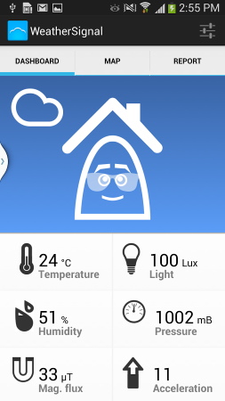
For the lightbulb we used two PNGs: icon_magnitude_min (an empty lightbulb) and icon_magnitude_max (one filled with light) and we dynamically cropped the latter. To set this up I used:
<layer-list xmlns:android="http://schemas.android.com/apk/res/android">
<item
android:drawable="@drawable/icon_magnitude_min"
/>
<item >
<clip
android:clipOrientation="vertical"
android:drawable="@drawable/icon_magnitude_max"
android:gravity="top"
/>
</item>
</layer-list>
In the java I get I reference to the clipdrawable and control its level based on light intensity.
译者信息建议12:用更多的XML绘图。再来介绍一个用XML绘图制作出能更加让你兴奋的例子,下面的雷达背景看起来是不是更加的复杂:
不用位图对你的UI是没有坏处的(除过图标)。
建议13:仍然用更多的XML绘图(如果必须,就用位图)。那我们怎样为天气信号构建一个超酷的图标-让灯泡动态的依据光的强度来进行自动填充,以及怎么点击指针后让其旋转呢?这里我们用位图和XML结合起来做个例子:
灯泡我们用PNG图:icon_magnitude_min(一个空的灯泡)和icon_magnitude_max(充满光的灯泡),然后我们动态的裁剪后者。为了实现这个目标我是这样做的:
01<layer-list xmlns:android="http://schemas.android.com/apk/res/android">02<item03android:drawable="@drawable/icon_magnitude_min"04/>05<item >06<clip07android:clipOrientation="vertical"08android:drawable="@drawable/icon_magnitude_max"09android:gravity="top"10/>11</item>12</layer-list>Tip 14: Why use 9-patch (when you can use XML drawables)? Android have the option to use 9-patches to define drawables, a number of tutorials illustrate how to use them to make a button that can stretch while keeping the same corners (and avoiding pixellation). If you know how to use 9-patches already, perhaps from web design, then they might be worth using. If you’re unfamiliar with 9-patches I would advocate remaining that way. Creating 9 patches is more involved than creating most bitmaps and if you want to adjust anything – e.g. corner radius or the colours, it’s back to the graphics editor. Much of what 9-patches are used to achieve can be done through XML.
译者信息建议14: 为什么要用9-patch (当你可以用XML drawables的时候)? Android具有使用9-patches 来定义drawables的选择,有些教程阐述了怎样用它们来做一个按钮,这样可以在伸展的时候保持几个角不变 (并且避免了像素处理)。如果你已经知道怎样使用9-patches,可能是从web设计中学会的,那么它们或许值得一用。如果你对9-patches并不熟悉,我建议你维持原样。如果你想适应什么东西——例如拐角的圆弧或者颜色,创建9个小块要比创建位图更多被涉及,这就像回到了图像编辑器的时代。许多用9-patches获得的效果也可以通过XML获得。
Tip 15: Create custom views by overriding onDraw(). There are some things XML just isn’t so great at, we draw a lot of graphs in OpenSignal and WeatherSignal and there are libraries for this, but we coded our graphs custom. It’s kind of fun. You might never need to do it, but to make graphics that are highly dynamic and custom it is often the only way to go.
Tip 16: Use SVG where you can’t use XML. Sometimes overriding onDraw() and painstakingly coding up all the lines and arcs you need to draw your custom view is overkill. After all, there is a language for vector graphics, it’s called … Scalable Vector Graphics. It’s what powers one of the coolest Android apps ever – Androidify. In fact they built the library just for that app, and they released it here: SVG for Android It’s what we used to draw the dashboard in OpenSignal.
Tip 17: GZip your SVG files. Makes them smaller and they parse quicker.
Tip 18: The SVG library doesn’t support everything. In particular some alpha channels don’t seem to work, you may even have to edit them out in the code.
译者信息建议15: 通过覆盖onDraw()创建自定义views. 有些事情XML并不十分在行,我们在OpenSignal和WeatherSignal中画过许多图像,为此有许多的库,但是我们要为自定义图像自己编写代码。这很有趣。或许你永远也不需要做这个,但为了使图像高度动态并自定义,这经常是唯一可行的办法。
建议16:在不能使用XML的地方使用SVG. 有时候覆盖onDraw()并勤勤恳恳的为自定义view编写代码画出需要的线条与弧线是过于技术化了。毕竟有一种矢量图像语言,它称作…Scalable Vector Graphics(可扩展矢量图形)。它也是史上最酷的Android应用之一—Androidify的动力来源。事实上他们创建这个库就是为了那款应用,他们将它发布在这里:SVG for Android 。这也就是我们在OpenSignal中画仪表盘所用到的。
建议17: 对SVG文件GZip压缩. 将它们变得更小它们就会处理的更快。建议18: SVG库并不是支持一切. 在一些特定的alpha通道中似乎不能正常工作,你甚至不得不在代码中将它们剔除。
Targeting consistent appearance across all Androids versions
Tip 19: On some Android OS’s (TouchWhizz/HTC Sense/MotoBlur etc) the default buttons and other UI widgets will look very different to how they look on stock Android. I wish it weren’t so, but there it is.
Tip 20: Customise your UI widgets. To make sure your app looks the same on all devices, you’ll need to customise everything, it’s not as hard as you might think and in doing so you’ll get a lot more control over how your app looks.
Tip 21: Selectors are super for building buttons. We saw above how to define a button background in XML, but what do you do to create a button that changes when clicked? Easy: define the background to be an XML file as below, which will receive the button state and serve up the appropriate drawable.
<?xml version="1.0" encoding="utf-8"?>
<selector xmlns:android="http://schemas.android.com/apk/res/android">
<item android:state_pressed="true" android:drawable="@drawable/btn_bg_selected" />
<item android:state_focused="true" android:drawable="@drawable/btn_bg" />
<item android:drawable="@drawable/btn_bg" /> <!-- default -->
</selector>
Tip 22: The ActionBar and many animation styles didn’t exist pre Honeycomb, use ActionBarSherlock and NineOldAndroids instead. Jake Wharton’s Android libraries are a tour de force of backwards compatibility. As a bonus, it ABS also gives you more power of customising the ActionBar.
译者信息达到在android所有版本里表示展现一致的目标
建议19:在一些android系统里(如TouchWhizz/HTC Sense/MotoBlur等等),默认的buttons和其他UI组件会跟原生系统里的看起来差别很大。我希望这不是真的,但事实却是如此。
建议20:自定义你的UI组件。为了确定你的app在所有的设备里看起来是一致的,你将需要自定义所有的东西。这其实没有你想象中那么难,只要你做到了,你将能更加好地把握到你的app的展示外观。
建议21:Selectors是创建buttons的利器。我们在上面提到了如何在XML里定义button的背景,但是你将如何创建一个当按下去会改变的button呢?很简单:像下面那样在xml文件里定义背景。该xml文件将接收到button当前状态并且在外观上做出相应的改变。
1<?xml version="1.0" encoding="utf-8"?>2<selector xmlns:android="http://schemas.android.com/apk/res/android">3<item android:state_pressed="true" android:drawable="@drawable/btn_bg_selected" />4<item android:state_focused="true" android:drawable="@drawable/btn_bg" />5<item android:drawable="@drawable/btn_bg" /> <!-- default -->6</selector>Targeting speed
Tip 23: Test on slow phones. You’ll not only see any problems with slowness, but they’ll drive you nuts, no-one likes a slow app.
Tip 24: Keep your XML layout hierarchy flat. More layers means the system does a lot more work parsing your code and it can take views longer to deploy.
Tip 25: Use Android Lint. Right click on project folder in Eclipse>Android Tools>Run Lint. This can catch a host of things that can improve speed, or just make your code cleaner.
Tip 26: Android Lint can get it wrong. It can suggest things that will break your code in subtle ways, so do understand what it suggests before you make changes.
Tip 27: Using <merge> can help flatten your view hierarchy. Simple way of getting rid of superfluous layers. Great post explaining this and the difference it makes on Android Developers.
Tip 28: Use HierarchyViewer to see your layout hierarchy in its gory glory. This is a brilliant tool which shows just how many layers of layouts you have and which of them are slowing things down.
译者信息把速度作为目标
建议23:在运行慢的手机上测试。你将在运行慢的手机上发现很多问题,同时它让你抓狂,没人会喜欢运行慢的程序。
建议24:尽量减少XML布局层次。更多的层次意味着系统将为解析你的代码付出更多的工作,这将会让图像渲染的更慢。
建议25:用Android Lint。在工程目录上右键选择Eclipse>Android Tools>Run Lint。它将会得到程序的一些信息,并能提高程序的运行速度,或者它能让你得代码更加清爽。
建议26:Android Lint可以得到错误信息。它可以给你的代码提供很详细的信息,并在你出错之前就可以给做出提示。
建议27:用<merge>可以帮助你减少视图层次结构。这是一种简单的方式来去除多余的层次。好的文章都对此有所解释,而且在 Android Developer中它也显得与众不同。
建议28:用HierarchyViewer可以直观的看到你布局的层次。这个智能的工具可以显示布局中有多少层次,而且可以提示出那些可以让程序变慢。
Tip 29: Use RelativeLayout whenever you can. AbsoluteLayout is deprecated, don’t use it. Often you will have a choice between RelativeLayout and LinearLayout, go with RelativeLayout as you’ll almost always end up with fewer layers in your view hierarchy. An example, suppose you want to make a view something like:
Box A takes up left half of the screen | Box B takes up right half of the screen
Your first instinct is probably to use:
<LinearLayout
android:layout_width=”match_parent”
android:layout_height=”wrap_content”
android:orientation=”horizontal”
>
<TextView
android:text=”Box A takes up left half of the screen”
android:layout_width=”0dip”
android:layout_height=”wrap_content”
android:layout_weight=”1″
/>
<TextView
android:text=”Box B takes up left half of the screen”
android:layout_width=”0dip”
android:layout_height=”wrap_content”
android:layout_weight=”1″
/>
</LinearLayout>
That works just fine, but you could also use:
<RelativeLayout
android:layout_width=”match_parent”
android:layout_height=”wrap_content”
android:orientation=”horizontal”
>
<TextView
android:text=”Box A takes up left half of the screen”
android:layout_width=”match_parent”
android:layout_height=”wrap_content”
android:layout_toLeftOf=”@+id/dummy_center”
/>
<View
android:id=”@+id/dummy_center”
android:layout_width=”0dip”
android:layout_height=”0dip”
android:layout_gravity=”center”
/>
<TextView
android:text=”Box B takes up left half of the screen”
android:layout_width=”match_parent”
android:layout_height=”wrap_content”
android:layout_toRightOf=”@+id/dummy_center”
/>
</RelativeLayout>
This second form doesn’t look much better than the first, in fact it looks worse: we’ve introduced a whole new element. But suppose we want to add in image into each box, schematically:
Box A takes up left half IMAGE | Box B takes up right half IMAGE
Pursuing the first method, you’d need to introduce a second level of LinearLayouts, pursuing the second you could put your images directly into the same RelativeLayout – for example by specifying that the first image should be to the left of “dummy_center” and TextView A should be to the left of that. So you’d have 7 elements across 3 levels of view hierarchy (LinearLayout way), versus 6 elements across 2 levels (RelativeLayout). All this stuff adds up.
译者信息建议29:如果可以尽量用RelativeLayout。AbsoluteLayout已经过期了,就不要用了。你经常会遇到在RelativeLayout和LinearLayout中做出选择的情况,那就直接用RelativeLayouot吧,因为它可以让你减少视图层次。比如,你想实现一个如下视图:
盒子 A 在屏幕左半边 |盒子 B在屏幕右半边
你首先会想到这么做:
01<LinearLayout02android:layout_width=”match_parent”03android:layout_height=”wrap_content”04android:orientation=”horizontal”05>06<TextView07android:text=”Box A takes up left half of the screen”08android:layout_width=”0dip”09android:layout_height=”wrap_content”10android:layout_weight=”1″11/>12<TextView13android:text=”Box B takes up left half of the screen”14android:layout_width=”0dip”15android:layout_height=”wrap_content”16android:layout_weight=”1″17/>18</LinearLayout>19That works just fine, but you could also use:20<RelativeLayout21android:layout_width=”match_parent”22android:layout_height=”wrap_content”23android:orientation=”horizontal”24>25<TextView26android:text=”Box A takes up left half of the screen”27android:layout_width=”match_parent”28android:layout_height=”wrap_content”29android:layout_toLeftOf=”@+id/dummy_center”30/>31<View32android:id=”@+id/dummy_center”33android:layout_width=”0dip”34android:layout_height=”0dip”35android:layout_gravity=”center”36/>37<TextView38android:text=”Box B takes up left half of the screen”39android:layout_width=”match_parent”40android:layout_height=”wrap_content”41android:layout_toRightOf=”@+id/dummy_center”42/>43</RelativeLayout>盒子 A 在屏幕左半边 图片|盒子 B在屏幕右半边 图片
用第一中方法,你得创建一个有两个层次的LinearLayout,如果用第二种方法,你可以直接在同一个RelativeLayout中加入图片,比如要指定第一个图片必须在“dummy_center”的左边,而且一个TextView A必须也在其左侧。那么你就得用7个元素3个视图层次了(LinearLayout 方式),而(RelativeLayout方式)只用6个元素2个层次,这样所有的工作添加完成。
Tip 30: Use external profilers as well as DDMS. These help you see unnecessary network calls, watch power usage, garbage collection, state changes (e.g. when onStop and onDestroy are called). LittleEye is my current favourite.
Tip 31: Use AsyncTasks. The Android team must have got so fed up with people making network calls on the UI thread that they turned it into a compile error a few API levels back. But there’s probably a lot of other work in any app that can be take off the UI thread, allowing layouts to render faster and improving its responsiveness.
译者信息建议30:用一些扩展工具如DDMS。这可以帮助你发现一些不必要的网络调用、查看电池使用量、垃圾回收信息,状态变化(例子:当回调onStop和onDestroy时)等。LittleEye是我目前比较喜欢的工具。
建议31:用AsyncTasks。Anroid工程团队受够了人们经常在UI线程里面实现网络调用(译注:耗时操作,容易阻塞UI刷新),所以他们实现了一些可产生编译级错误信息的API。但是仍然在很多app中的一些工作会拖垮UI线程,我们要考虑到UI布局要快以及提高UI的响应性。
Targeting low file size
Tip 32: Some Android devices have a 100mb limit. Things are changing, but there’s still a lot of users out there who will have to think a lot about whether a 5Mb app deserves its space. If you allow users to install to the SD card, it’s not a problem but you shouldn’t allow this if your app needs to start onBoot (e.g. for most widgets). Even for newer devices, users are going to be happier if your APK is small so it downloads quicker.
Tip 33: Use XML resources (last time I recommend this, I promise) These save a tonne of space over PNGs, as you only need one for many screen configurations and a single XML file is almost always smaller than a PNG showing the same thing.
Tip 34: When you must use PNGs always optimize (with PNGCrush or ImageOptim)
译者信息目标机器空间小
建议32:一些Aandroid设备有100mb空间大小的限制。现在情况已有变化了,但是仍然有很多用户还会担心5Mb大小的app会浪费空间。如果你可以选择将app装入SD卡的话,这就不是问题了,但如果你的app需要在onBoot里启动的话你就不能装入SD卡了(例子:如一些窗体小部件).甚至对于一些新的设备,如果能很快的下载一个小的APK的话,用户还是很高兴的。
建议33:用XML资源(我发誓上次我已经提醒过了),这将比PNG资源节省很多空间,当你仅仅需要一个可以满足很多屏幕大小的配置时,一个XML文件会比能实现同样功能的PNG省空间。
建议34:如果要用PNG,最好优化一下(用PNGCrush或ImageOptim)Targeting bugs
Tip 35: On the Android developer console check for any bugs that have been sent automatically.
Tip 36: ProGuard is turned on by default now. Proguard is awesome (speeds up your app and reduces filesize) but it can make StackTraces very obscure. You’ll need to retrace the StackTraces, to do this you’ll need to hang onto the Proguard mapping files created on each build, I put them into a folder with the version code’s name.
Tip 37: Adjust ProGuard config to show line numbers in StackTraces. Make sure your proguard.cfg has a line:
-keepattributes SourceFile,LineNumberTable
Tip 38: Use staged rollouts Test the waters on 5% of devices, watch for bug reports.
Tip 39: Use a device testing lab Device Anywhere and Perfecto Mobile offer virtual testing labs where you can log onto a real device. I find them sort of clunky and often the devices are kind of messed up by being so unceasingly tested on. If you work out of a co-working centre, or have several Android developer friends get a “device pool” going.
Tip 40: More code less blog posts. Nah, sharing is caring, I just can’t think of a 40th.
目标bugs
建议35:在Android开发者控制台里检查所有被自动检测出来的bugs.建议36: ProGuard现在是默认启动着的. Proguard太好用了 (提高你app的速度和降低文件大小),但这也让StackTraces 非常难以处理。你将需要重新追踪你的StackTraces,因此你将需要继续保留在每次构建中创建的Proguard的映射文件。我把它们都放到以代码版本号命名的文件夹里。
建议37: 为了显示StackTraces里的行数,你需要修改ProGuard的配置。确认你的proguard.cfg拥有下面这句话:
-keepattributes SourceFile,LineNumberTable
建议38:使用staged rollouts。测试5%的基础用户,并且观察bug报告。
建议39:使用真实设备测试平台。Device Anywhere and Perfecto Mobile提供了虚拟测试平台,在那里,你可以使用真正的移动设备。我发现他们有一些笨拙,加入连续不断地进行测试的话,会导致有一些糟糕的情况。如果你在联合办公的环境里工作,或者有一些Android开发的好友,那么去启动一个“设备池”吧。
建议40: 多写代码少写博客。其实不是的, 分享就是关爱, 我只是想不出第40条写什么是了。
- 对 Android 开发者有益的 40 条优化建议
- 对 Android 开发者有益的 40 条优化建议(一)
- 对 Android 开发者有益的 40 条优化建议(二)
- 对 Android 开发者有益的 40 条优化建议(一)
- 对 Android 开发者有益的 40 条优化建议(二)
- 对Android开发者有益的40条优化建议
- 对 Android 开发者有益的 40 条优化建议
- 对Android开发者有益的40条优化建议
- 对 Android 开发者有益的 40 条优化建议
- 对 Android 开发者有益的 40 条优化建议
- 对 Android 开发者有益的 40 条优化建议
- 对Android开发者有益的40条优化建议
- 对 Android 开发者有益的 40 条优化建议
- 对 Android 开发者有益的 40 条优化建议
- 对Android开发者有益的40条优化建议
- 对 Android 开发者有益的 40 条优化建议
- 对 Android 开发者有益的 40 条优化建议
- 对 Android 开发者有益的 40 条优化建议
- Linux Crontab 计划任务 命令详解
- [HNOI2002]营业额统计 Splay tree入门题
- 我的第一棵树--家谱
- HTTP POST GET详解
- 搜索引擎优化技巧如何看待
- 对 Android 开发者有益的 40 条优化建议
- 求职报名不应忽视四大问题 避免自挖陷阱
- 工作小结碎碎念(1): FPM for Web Dynpro从零开始
- Ajax与JSP防止缓存
- Send ActionScript Worker Messages 2.5x Faster
- apue 中c/s模式编程的一些基本知识
- js,jsp--前端开发过程中浏览器版本的判定
- Jacob 操作 MsProject - 建立任务结构
- 常用数据结构