UI效果(2): shape
来源:互联网 发布:最优化理论与算法 答案 编辑:程序博客网 时间:2024/06/03 02:26
android中的控件不是很多,布局也很少。但是这些东西很灵活,所以想设计好的界面还是需要一定的功底的。
本篇博客,您可以了解到:
<1> 自定义 Toast
<2> Button特殊效果
在sdk的api中,相信你可以找到名为Shape Drawable的这样一篇文章,位置:
如果,你想更加理解掌握这篇博客,建议好好地、仔细地看看这篇Shape Drawable文章。
秀一下效果图,呵呵!
启动应用时候,第一次出现效果:

让该Button获得焦点,效果:

还有,就是按下Button会改变其颜色(红色)并弹出Toast:

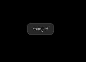
如果,你是一个细心的人就会发现Toast与以往显示的位置不一样,呵呵。代码如下:
- findViewById(R.id.btn_change).setOnClickListener(new OnClickListener() {
- @Override
- public void onClick(View v) {
- Toast toast = Toast.makeText(DroidButtonActivity.this, "changed", Toast.LENGTH_LONG);
- toast.setGravity(Gravity.CENTER, 0, 0);
- toast.show();
- }
- });
那么,看看该xml文件内容吧!?
- <?xml version="1.0" encoding="utf-8"?>
- <selector xmlns:android="http://schemas.android.com/apk/res/android">
- <item android:state_pressed="true">
- <shape>
- <gradient android:startColor="#bb0000" android:endColor="#cc0000"
- android:angle="270" />
- <stroke android:width="3dp" android:color="#aa0000" />
- <corners android:radius="2dp" />
- <padding android:left="10dp" android:top="10dp"
- android:right="10dp" android:bottom="10dp" />
- </shape>
- </item>
- <item android:state_focused="true">
- <shape>
- <gradient android:startColor="#00aa00" android:endColor="#00bb00"
- android:angle="270" />
- <stroke android:width="2dp" android:color="#00cc00" />
- <corners android:radius="2dp" />
- <padding android:left="10dp" android:top="10dp"
- android:right="10dp" android:bottom="10dp" />
- </shape>
- </item>
- <item>
- <shape>
- <gradient android:startColor="#0000bb" android:endColor="#0000cc"
- android:angle="270" />
- <stroke android:width="2dp" android:color="#0000aa" />
- <corners android:radius="2dp" />
- <padding android:left="10dp" android:top="10dp"
- android:right="10dp" android:bottom="10dp" />
- </shape>
- </item>
- </selector>
- <?xml version="1.0" encoding="utf-8"?>
- <LinearLayout xmlns:android="http://schemas.android.com/apk/res/android"
- android:orientation="vertical"
- android:layout_width="fill_parent"
- android:layout_height="fill_parent"
- >
- <TextView
- android:layout_width="fill_parent"
- android:layout_height="wrap_content"
- />
- <Button
- android:id="@+id/btn_change"
- android:layout_width="fill_parent"
- android:layout_height="wrap_content"
- android:layout_marginTop="10dip"
- android:text="change"
- android:background="@drawable/an_button"/>
- </LinearLayout>
完整代码下载:http://download.csdn.net/source/3469895
转自:http://blog.csdn.net/veryitman/article/details/6633970
0 0
- UI效果(2): shape
- UI效果(2): shape
- Android UI---控件Shape效果
- UI效果(2)
- 【Android UI】 Shape详解
- 【Android UI】 Shape详解
- 【Android UI】 Shape详解
- 【Android UI】 Shape详解
- Shape---UI优化
- android UI 之shape
- ui之shape
- Android UI设计:shape
- Android UI 利用Drawable Shape给控件加边框/立体效果
- android shape渐近线效果
- android shape阴影效果
- Shape定义阴影效果
- UI界面效果研究2
- 【Android UI】 Shape详解 (GradientDrawable)
- java提高篇(二二)-----LinkedList
- python中编解码的问题
- 谷歌浏览器javascript调试教程
- HTML5之SVG详解(一):基本概括
- 黑马程序员_正则表达式
- UI效果(2): shape
- 函数调用,形参实参的变化
- seo优化:如何做好网站首页的布局
- PRVF-4664 PRVF-4657: Found inconsistent name resolution entries for SCAN name (文档 ID 887471.1)
- 兼职做了DB设计和维护的体会(存储过程,视图,函数,范式)
- python lambda和reduce 学习札记1 跟我学python
- FusionCharts 3D双柱状图
- 1-4 递归打印包含文件
- 如何让新站快速拥有排名