IOS 7过渡----Bars and Bar Buttons
来源:互联网 发布:淘宝商城巴拉巴拉 编辑:程序博客网 时间:2024/06/05 17:43
Bars and Bar Buttons
In iOS 7, the status bar is transparent, and other bars—that is, navigation bars, tab bars, toolbars, search bars, and scope bars—are translucent. As a general rule, you want to make sure that content fills the area behind the bars in your app.
Most bars also draw a blur behind them, unless you provide a custom background image for the bar.
iOS 7 introduces the barPosition property for identifying bar position, which helps you specify when a custom background image should extend behind the status bar. The UIBarPositionTopAttached value means that a bar is at the top of the screen and its background extends upward into the status bar area. In contrast, the UIBarPositionTop value means that a bar is at the top of its local context—for example, at the top of a popover—and that it doesn’t provide a background for the status bar.
By default, all bar buttons are borderless. For details, see Bar Buttons.
在 iOS 7 ,状态条是透明的,其他条如状态条、tab条、工具条,搜索条、范围条等都是半、透明的!作为通用原则,你需要保证你的内容填充这些bar的后面区域。
大多数bar的背景都是模糊的,除非你提供了一个自定义的背景给它们。
IOS 7引入了 barPosition 属性,这个属性定义了bar的位置,可以设置背景图是否要延伸到状态条下面。UIBarPositionTopAttached属性值意味着这个BAR是在屏幕的顶部并且它的背景是向上延伸到状态条区域的。相反,UIBarPositionTop属性值意味着BAR是在当前显示区域的顶端比如在弹出框的顶端,并且它是不提供状态条的背景的。
默认的,所有的BAR上面的按钮都是无框的,详情请见:see Bar Buttons.
The Status Bar
Because the status bar is transparent, the view behind it shows through. The style of the status bar refers to the appearance of its content, which includes items such as time, battery charge, and Wi-Fi signal. Use aUIStatusBarStyle constant to specify whether the status bar content should be dark or light:
因为状态条是透明的,视图在它后面会直接显示。状态条的风格关系到内容的展现,包括比如时间、电量、WIFI信号。使用aUIStatusBarStyle 值来指定状态条的内容应该亮还是暗:
UIStatusBarStyleDefaultdisplays dark content. Use when light content is behind the status bar.
UIStatusBarStyleLightContentdisplays light content. Use when dark content is behind the status bar.
In some cases, the background image for a navigation bar or a search bar can extend up behind the status bar (for details, see Navigation Bar and Search Bar and Scope Bar). If there are no bars below the status bar, the content view should use the full height of the screen. To learn how to ensure that a view controller lays out its views properly, see Using View Controllers.
在有些情况下,导航条或者搜索条的背景图可以向上延伸到状态条,(详细请见see Navigation Bar and Search Bar and Scope Bar)。如果状态条下面没有BAR,视图的内容占满整个屏幕。学习如何布局视图控制器,请见:see Using View Controllers.
In iOS 7, you can control the style of the status bar from an individual view controller and change it while the app runs. To opt in to this behavior, add the UIViewControllerBasedStatusBarAppearance key to an app’sInfo.plist file and give it the value YES.
在IOS 7,你可以控制应用启动时候状态条的风格,在INFO.PLIST里面修改UIViewControllerBasedStatusBarAppearance 值为YES,即可。
Navigation Bar
A navigation bar helps users navigate through an information hierarchy and, optionally, manage screen contents.
导航条帮助用户引导信息的浏览,选择管理屏幕内容。
iOS 7
iOS 6
iOS 7
iOS 6
Bar style
Translucent light (default) or translucent dark.
By default, the translucentproperty is YES.
Opaque gradient blue (default) or opaque black.
By default, the translucent property is NO.
Appearance
A one-pixel hairline appears at the bottom edge.底部边缘是一像素的线
A drop shadow appears at the bottom edge.底部边缘是下投的阴影
Tinting
Use tintColor to tint bar button items.
Use barTintColor to tint the bar background.
Use tintColor to tint the bar background.
Back button
The Back control is a chevron plus the title of the previous screen. * 返回控制器是一个箭头符号+上一页的标题
The Back button is a bordered button that contains the title of the previous screen.
* If you want to use a custom image to replace the default chevron, you also need to create a custom mask image. iOS 7 uses the mask to make the previous screen’s title appear to emerge from—or disappear into—the chevron during navigation transitions. To learn about the properties that control the Back button and mask image, see UINavigationBar Class Reference.
×如果你想自定义一个图片来替换默认的返回符号,你需要创建一个自定义掩码图像(去掉背景,背景透明的图形)。在IOS 7使用掩码来使上一个屏幕的标题显示或者消失,当返回符号在导航动画切换的时候。要知道更多,请看: see UINavigationBar Class Reference.
iOS 7 makes it easy to add a search bar to a navigation bar. For details, see Search Bar and Scope Bar.
IOS 7使增加搜索条和导航条更加简单了,详情请看:see Search Bar and Scope Bar.
If you create a background image for a navigation bar that uses the UIBarPositionTopAttached bar position—or for a navigation bar within a navigation controller—make sure the image includes the status bar area. Specifically, create a high-resolution background image that has a height of 128 points.
如果你为设置了属性为UIBarPositionTopAttached的导航条增加了背景图,或者为在导航控制器内的导航BAR增加了背景图,请确保图形包含在状态条里面。这个比较特殊,创建一个高清的背景(普通像素×2),它的高度有128像素。(导航条高度+状态条的高度)×2
The following table describes how iOS 7 treats resizable navigation bar background images of various heights. (To learn how to specify a resizing mode for an image, see UIImage Class Reference.)
下面表格的内容描述了IOS 7在各种高度情况下导航条的背景情况:(如何设置图片大小的,请见: UIImage Class Reference.)
Height (high resolution)
Resizing treatment
Status bar background appearance
88 points
Horizontally resized as appropriate (the image is not vertically tiled or stretched).
Black, if usingUIBarPositionTopAttached.
Provided by the window background, if usingUIBarPositionTop.
Less than 88 points
Vertically resized to 128 points if usingUIBarPositionTopAttached or 88 points if usingUIBarPositionTop.
Horizontally resized as appropriate.
Provided by the bar background.
128 points
Horizontally resized as appropriate.
Provided by the bar background.
1 point
Vertically resized to 128 points if usingUIBarPositionTopAttached or if using a navigation controller. Vertically resized to 88 points if usingUIBarPositionTop.
Horizontally resized as appropriate.
Provided by the bar background.
Avoid using an extra-tall background image to display a custom drop shadow below the navigation bar. This technique won’t work in iOS 7, because the extra height extends into the status bar area instead of below the navigation bar. If you want to add a drop shadow to your navigation bar, create a custom background image and use the shadowImage property to specify a custom shadow image.
不要使用额外的背景图去展示自定义下投阴影在导航条下。这个技术实现在IOS 7上不能实现,因为额外的高度会衍射到状态条下的区域而不是在导航条下面。(也就是说你图片变高了,高出的部分是顶到状态条方向的,而不会延伸到导航条下)。如果你想添加一个导航条的阴影,创建一个自定义背景图片,然后使用 shadowImage 属性来指定自定义背景图片。
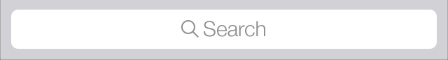
Search Bar and Scope Bar
A search bar accepts users’ text, which can be used as input for a search. A search bar can have a scope bar attached below it.
一个搜索条接受用户的文本输入来搜索。搜索条可以有个搜索范围BAR在它下面。
iOS 7
iOS 6
iOS 7
iOS 6
Bar style
Translucent light (default) or translucent dark.
By default, the translucent property isYES.
Opaque gradient blue (default) or opaque black.
By default, the translucent property isNO.
Appearance
A one-pixel hairline appears at the bottom edge.
A drop shadow appears at the bottom edge.
Tinting
Use tintColor to tint foreground elements.
Use barTintColor to tint the bar background.
Use tintColor to tint the bar background.
If you create a background image for a search bar that uses the UIBarPositionTopAttached bar position, make sure the image height includes the height of the status bar. If you create a resizable background image, see Table 5-1 for details on how iOS 7 resizes images of various sizes.
如果你为搜索条创建一个背景并且指定了BAR位置为UIBarPositionTopAttached,请保证图片的高度包含了状态条的高度。如果你创建一个可变高度的背景图片,请查看 Table 5-1 来看IOS 7是如何重新针对多个高度设置图片的各种大小的。
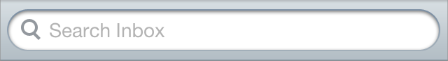
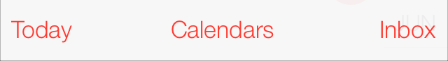
In iOS 7, UISearchDisplayController includes the displaysSearchBarInNavigationBar property, which lets you put a search bar in a navigation bar, similar to the one in Calendar:
在IOS 7, UISearchDisplayController 包含了displaysSearchBarInNavigationBar 属性,该属性可以让你在一个导航条里面进行搜索,类似在日历里面加入的搜索按钮。
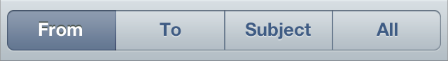
A scope bar lets users define the scope of a search.
搜索范围条让用户定义了搜索的范围
NOTE
A scope bar can’t appear by itself; it must be attached to a search bar.
搜索范围条不能独立展示,它必须附加在搜索条上面
iOS 7
iOS 6
iOS 7
iOS 6
Bar style
Translucent light (default) or translucent dark.
By default, the translucent property isYES.
Opaque gradient blue (default) or opaque black.
By default, the translucent property isNO.
Appearance
A one-pixel hairline appears at the bottom edge.
A drop shadow appears at the bottom edge.
Tinting
Use tintColor to tint scope button contents.
Use barTintColor to tint the bar background.
Use tintColor to tint the bar background.
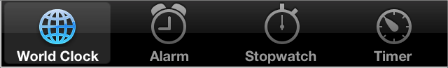
Tab Bar
A tab bar gives people the ability to switch between different subtasks, views, and modes.
TAB BAR 让用户能够切换多任务、多视图、多模块
iOS 7
iOS 6
iOS 7
iOS 6
Bar style
UITabBar includes the barStyleproperty.
Translucent light (default) or translucent dark.
By default, the translucentproperty is YES.
Opaque gradient black (default). In iOS 6, the tab bar doesn’t include the barStyle ortranslucent properties.
Appearance
The divider image is optional; if provided, a custom selection indicator image is used.
Selection indicator image drawn behind the tab icon.
Tinting
Use tintColor to tint selected tab bar items.
Use barTintColor to tint the bar background.
Use tintColor to tint the bar background.
If you create a custom icon for a tab bar item, you can also use the selectedImage property of UITabBarItemto specify a second icon that represents the selected state of the item. If you don’t provide a selected version of a custom icon, the same icon is used in both states.
如果你为TAB BAR元素创建自定义图标,你可以使用 UITabBarItem 的selectedImage 属性来指定图片。如果你没有提供自定义的选中图标,那么选中和不选中都是同个图标。
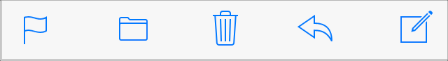
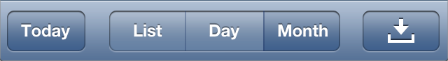
Toolbar
A toolbar contains controls that perform actions related to objects in the current screen or view.
工具条包含了一些控件,来执行当前屏幕或者视图的相关操作。
iOS 7
iOS 6
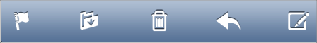
iOS 7
iOS 6
Bar style
Translucent light (default) or translucent dark.
By default, the translucent property is YES.
Opaque gradient blue (default) or opaque black.
By default, the translucentproperty is NO.
Appearance
A one-pixel hairline appears at the top edge.
A drop shadow appears at the top edge.
Tinting
Use tintColor to tint bar button items.
Use barTintColor to tint the bar background.
Use tintColor to tint the bar background.
Related information
UIToolbarPosition constants are deprecated; useUIBarPosition constants instead.
–
If you create a resizable background image, see Table 5-1 for details on how iOS 7 resizes images of various sizes.
如果你创建了一个可变尺寸的背景图片,请看 Table 5-1 for details on how iOS 7 resizes images of various sizes.
Bar Buttons
In iOS 6, bar buttons are either bordered or borderless. In iOS 7, all bar buttons are borderless.
在IOS 6里面,BAR按钮即有边框的又有无边框的,在IOS 7里面,所有的按钮都是无边框的。
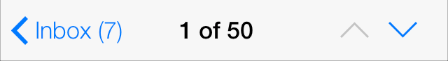
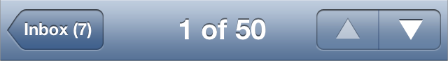
For clarity, iOS 7 apps often use titles in bar buttons instead of graphical symbols. For example, Calendar in iOS 7 uses Inbox instead of a custom graphic:
为了更加清晰,IOS 7经常使用标题来代替符号图形。比如,IOS 7的日历使用了 INBOX 来代替自定义的图形。
iOS 7
iOS 6
In earlier versions of iOS, custom bar button art was automatically treated as a template image. (A template image is used as a mask to create the final image.) In iOS 7, you can use the following UIImage properties to specify whether a custom graphic should be treated as a template image or be fully rendered:
在更早的IOS 版本,自定义BAR 按钮,都是有不少模板图片的。在IOS 7里面,你可以使用下面的UIImage 属性来指定是否是自定义图形来作为模板图片使用或者完全放弃模板。
UIImageRenderingModeAlwaysTemplate. The image should be treated as a template image.UIImageRenderingModeAlwaysOriginal. The image should be rendered as is.
If you don’t specify a treatment for your image—or you opt out of a treatment in a particular situation—the image receives the default treatment defined by the enclosing view. For example, by default bars use the template treatment, whereas by default a slider uses the fully rendered treatment.
如果你不设置你的图片,或者你的选择很特别,图片会收到默认的处理,默认处理由它所在的视图决定。比如说,默认的BAR使用的模板处理,然后默认的滑动器使用了完全放弃模板的处理。
NOTE
A template image acquires the tint color of its parent (to learn more about tint color in iOS 7, see Using Tint Color). If you don’t want a bar button item to receive tinting, set the UIImageRenderingModeAlwaysOriginalproperty for the image.
一个模板图形会从父视图获取TINT颜色,如果你不想按钮这么做,设置 图片的 UIImageRenderingModeAlwaysOriginalproperty 属性
- IOS 7过渡----Bars and Bar Buttons
- IOS 7过渡----Bars and Bar Buttons
- IOS 7过渡----Bars and Bar Buttons
- Wrestling with Status Bars and Navigation Bars on iOS 7(在处理iOS7中的Status Bar和Navigation Bar时的挣扎)
- Wrestling with Status Bars and Navigation Bars on iOS 7
- wrestling-with-status-bars-and-navigation-bars-on-ios-7
- Buttons in button bars should be borderless; use style="?android:attr/buttonBarButtonStyle" (and ?an
- Buttons in button bars should be borderless; use style="?android:attr/buttonBarButtonStyle" (and ?an
- Customizing Navigation Bar and Status Bar in iOS 7
- Customizing Navigation Bar and Status Bar in iOS 7
- Customizing Navigation Bar and Status Bar in iOS 7
- Customizing Navigation Bar and Status Bar in iOS 7 .
- Customizing Navigation Bar and Status Bar in iOS 7
- Buttons in button bars should be borderless
- Buttons in button bars should be borderless
- Status bar and navigation bar appear over my view's bounds in iOS 7
- iOS 7过渡指南
- iOS 7 交互式过渡
- 我的第一个程序
- 查看oracle数据库是否为归档模式启动
- VA05 ALV 格式调整
- 使用adb install 时 提示error: more than one device and emulator
- [C++字符串替换函数的实现]
- IOS 7过渡----Bars and Bar Buttons
- 发布网站时出现 “同时存在于“c:"WINDOWS"Microsoft.NET"Framework"v2.0.50727"Temporary ”错误解决方法
- CentOS 6.4(64位)上安装错误libstdc++.so.6(GLIBCXX_3.4.14)解决办法
- 随机抽样一致 RANSAC
- Anagrams(字母易位造词法) strings 检测算法
- 手把手教你selenium_搭建环境_软件下载
- 怎样写好简历
- Qt串口通信学习方法
- 增强现实技术:何时能真正应用到航空、医疗领域