windows窗口控件点击——CheckButton(一)
来源:互联网 发布:linux tomcat下载32位 编辑:程序博客网 时间:2024/06/14 04:28
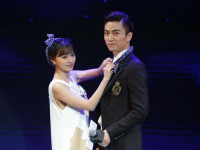
试图通过发送消息到一个button控件来模拟鼠标点击,遇到了点小麻烦,一直没有成功。该控件如图:

一开始,我是按照之前点击button控件的情况来处理,先是用FindWindowEx()查找到该控件的句柄,通过句柄和GetDlgCtrlID()函数来获取此button控件的ID,得到句柄和I控件D后,就可以对此控件发送消息了,代码如下:
hBtn = ::FindWindowEx(hWnd, NULL, NULL, _T("无边距打印")); //通过控件的标题来查找句柄
IDn = ::GetDlgCtrlID(hBtn);
::SendNotifyMessage(hWnd, WM_COMMAND, MAKELONG(IDn, BN_CLICKED), (long)hBtn);
这段代码没有生效,但是当我把上面代码替换成该窗口中的其他Button控件,如OK按钮,却是可以成功点击到的。
难道”无边距打印“那个控件不是Button类型?但显然不对,因为在spy++中明显能看到这个控件是一个Button。我又试了PostMessage(),SendMessage()等各种消息发送函数,也试了MK_LBUTTON等鼠标点击消息,但都以失败告终。不过我想,这种前面有个打勾的框框和一般的button外观看起来就差异很大,也许Button会有不同的类型。于是我在VS的toolbox里面找了一下,找到了这种前面有个小框框的控件,原来它的名字叫做CheckBox。在MSDN搜索了一下,看到了这个:
BS_3STATE Same as a check box, except that the box can be dimmed as well as checked. The dimmed state typically is used to show that a check box has been disabled.
BS_AUTO3STATE Same as a three-state check box, except that the box changes its state when the user selects it.
BS_AUTOCHECKBOX Same as a check box, except that a check mark appears in the check box when the user selects the box; the check mark disappears the next time the user selects the box.
BS_AUTORADIOBUTTON Same as a radio button, except that when the user selects it, the button automatically highlights itself and removes the selection from any other radio buttons with the same style in the same group.
BS_BITMAP Specifies that the button displays a bitmap.
BS_BOTTOM Places text at the bottom of the button rectangle.
BS_CENTER Centers text horizontally in the button rectangle.
BS_CHECKBOX Creates a small square that has text displayed to its right (unless this style is combined with the BS_LEFTTEXT style).
BS_DEFPUSHBUTTON Creates a button that has a heavy black border. The user can select this button by pressing the ENTER key. This style enables the user to quickly select the most likely option (the default option).
BS_FLAT Specifies that the button is two-dimensional; it does not use the default shading to create a 3-D image.
BS_GROUPBOX Creates a rectangle in which other buttons can be grouped. Any text associated with this style is displayed in the rectangle's upper-left corner.
BS_ICON Specifies that the button displays an icon.
BS_LEFT Left aligns the text in the button rectangle. However, if the button is a check box or radio button that does not have the BS_RIGHTBUTTON style, the text is left aligned on the right side of the check box or radio button.
BS_LEFTTEXT When combined with a radio-button or check-box style, the text appears on the left side of the radio button or check box.
BS_MULTILINE Wraps the button text to multiple lines if the text string is too long to fit on a single line in the button rectangle.
BS_NOTIFY Enables a button to send BN_DBLCLK, BN_KILLFOCUS, and BN_SETFOCUS notification messages to its parent window. Note that buttons send the BN_CLICKED notification message regardless of whether it has this style.
BS_OWNERDRAW Creates an owner-drawn button. The framework calls the DrawItem member function when a visual aspect of the button has changed. This style must be set when using theCBitmapButton class.
BS_PUSHBUTTON Creates a pushbutton that posts a WM_COMMAND message to the owner window when the user selects the button.
BS_PUSHLIKE Makes a button (such as a check box, three-state check box, or radio button) look and act like a push button. The button looks raised when it isn't pushed or checked, and sunken when it is pushed or checked.
BS_RADIOBUTTON Creates a small circle that has text displayed to its right (unless this style is combined with the BS_LEFTTEXT style). Radio buttons are usually used in groups of related, but mutually exclusive, choices.
BS_RIGHT Right aligns the text in the button rectangle. However, if the button is a check box or radio button that does not have the BS_RIGHTBUTTON style, the text is right aligned on the right side of the check box or radio button.
BS_RIGHTBUTTON Positions a radio button's circle or a check box's square on the right side of the button rectangle. Same as the BS_LEFTTEXT style.
BS_TEXT Specifies that the button displays text.
BS_TOP Places text at the top of the button rectangle.
BS_USERBUTTON Obsolete, but provided for compatibility with 16-bit versions of Windows. Win32-based applications should use BS_OWNERDRAW instead.
BS_VCENTER Places text in the middle (vertically) of the button rectangle
原来Button是分这么多的style的,有了方向就好办了,很快,在MSDN找到一个叫ButtonSetCheck()的函数:LRESULT Button_SetCheck( HWND hwndCtl, int check);Check 参数说明如下:
- check
Type: int
The check state. This parameter can be one of the following values.
Value Meaning - BST_CHECKED
Sets the button state to checked.
- BST_INDETERMINATE
Sets the button state to grayed, indicating an indeterminate state. Use this value only if the button has the BS_3STATE or BS_AUTO3STATE style.
- BST_UNCHECKED
Sets the button state to cleared.
接下来的就很简单了,只要一句Button_SetCheck(hBtn, BST_UNCHECKED); 就可以轻松把CheckBox前的小框框取消打勾。
- windows窗口控件点击——CheckButton(一)
- Windows窗口控件点击——CheckButton(二)
- Android第四讲——常用的基本控件(一)TextView、EditText、Button、RadioButton、CheckButton、ImageView
- cocos2d-C++ 学习UI控件(一)之 Button|CheckButton
- Python之Windows控件操作系列一:模拟鼠标点击
- Windows学习笔记16——子窗口控件
- windows学习笔记3——窗口和消息<一>
- windows子窗口控件---Win32
- 子窗口控件 -windows程序设计
- windows子窗口控件---Win32
- 子窗口控件 -windows程序设计
- 子窗口控件 -windows程序设计
- windows读书笔记------子窗口控件
- Windows程序设计-子窗口控件
- WPF——MVVM点击弹出窗口
- windows——窗口类别 窗口
- Windows程序设计学习笔记一——第一个windows窗口
- PyGobject(十)布局容器之Button篇——Gtk.CheckButton
- Linux初步学习三
- Ios本地存储(笔记)
- 高效Java异常处理机制
- 谷歌硬件帝国:从无人驾驶车到智能隐形眼镜
- 游戏服务器结构探讨
- windows窗口控件点击——CheckButton(一)
- UVA - 817 According to Bartjens
- C++读写EXCEL文件方式比较
- 监听端口号与PID
- pyqt 通过notepad打开中文文件
- Objective-C中的Category(分类)
- UVA 10790 How Many Points of Intersection? 简单数学题
- UVa11420 - Chest of Drawers(动态规划)
- CentOs怎么开机直接进入命令行模式