Asp.net Ajax Control Toolkit设计编程备忘录(色眼窥观版)——第4回(忍者专辑)
来源:互联网 发布:知乎 轻邮 编辑:程序博客网 时间:2024/06/05 02:18

 色即设——设计,从网页设计师的角度出发。因为自己的的特殊性(本身是软件工程师,但是对网页设计却有浓厚的兴趣),所以我的此系列文章不仅仅从编程角度出发,还将从设计的角度出发来细数AjaxControlToolkit系列控件,告诉你这些控件最终的结构表现形式、样式,还有如何修改他们的样式使之适合于你的网页整体规划。
窥,小视也——《说文》,此小视非必小视呀。此小视的意思是:水平有限,不能望其全貌,仅能管中窥豹。所以很多地方还请高人指点则个。
相关链接:
Asp.net Ajax Control Toolkit设计编程备忘录(色眼窥观版)——第1回(柿子专辑)
Asp.net Ajax Control Toolkit设计编程备忘录(色眼窥观版)——第2回(F4专辑)
Asp.net Ajax Control Toolkit设计编程备忘录(色眼窥观版)——第3回(UE专辑)
Asp.net Ajax Control Toolkit设计编程备忘录(色眼窥观版)——第4回(忍者专辑)
Asp.net Ajax Control Toolkit设计编程备忘录(色眼窥观版)——第5回(错不了专辑)
Asp.net Ajax Control Toolkit设计编程备忘录(色眼窥观版)——第6回(习惯专辑)
正文: 以前做一些小型网站的时候,老是觉得网页上空空的,不知道放什么东西好。但是当你做过大型网站或者大型企业内部管理系统后,你就会发现网页上其实是“寸土寸金”的(如图,就是我们以前的一个项目的真实截图)。很多地方(特别是表格内部)的空间是及其宝贵的。如何尽量在不出现滚动条的情况下把那么多东西塞到页面上真的会让你很伤脑筋。注意:我是说尽量不要出现滚动条,而不是说不能出现滚动条。为什么要尽量不要出现滚动条?现在你就打开163,然后把滚动条拖到最下面,看看里面的东西,自问一下,你是否关注过那些最下面的东西?随着页面的“加长”,越靠近页面底部的内容,将越不容易引起浏览者的关注。 而横向滚动条我们的项目是严禁出现的,因为滚动横向滚动条不符合用户的操作习惯。不过我也曾见过例外的,以前看过一个横着看的网站,所有的页面都只出现横向滚动条,而不出现竖向滚动条,不过,那是一个张扬个性的个人网站,所以倒也无妨。不过商业性的网站,还是不要玩个性的好。横向和竖向滚动条同时出现的情况,绝对是禁止出现的,那是对浏览者的挑战。尽量不出现滚动条,项目内容却很多,那要怎么办呢?好在Asp.net Ajax Control Toolkit提供了一系列的可以让我们节省大量空间的控件。它们通过“隐”(即隐藏,平时不显示,关键时刻用到的时候才显示出来)、“折”(即折叠,平时龟缩很小,用到时可以方便地展开以展现内容)的方式保卫了我们网页上的大量空间。“隐”“折”,读音和含义都有点像“忍者”,所以这次的副标题就叫做“忍者”专辑吧。(又一个标题党诞生了-_-b…)下面就让我们稍稍地介绍三个(其实还有很多类似的控件,这里只列举其三)。
10:DropDown
“隐”系列的浅池卧龙,加上你的想象力,此控件必将给与你惊喜。下面是个小例子,仅仅是抛块砖。当文本框内需要(或者必须)填写一些已经存在于数据库中的数据时,让用户选择,而不是让用户按键盘自己去打字,不仅可以提高用户的体验度,也能有效的避免因用户而造成的错误。我的这个例子中,只要文本框获得焦点就会立即弹出一个列表(数据量较大的时候,可以加上检索功能),供用户选择,这样就有效的避免了因输入错误的名字造成的错误,个人感觉是中不错的做法。来看它的属性,官方网站文档提供的较少,我做了一些补充。
1. TargetControlID - The ID of the control which needs a drop-down.【目标控件】
2. DropDownControlID - The ID of the control which will be displayed as the dropdown.【欲下拉出现的控件】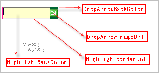 补充几个:
补充几个:
3. DropArrowBackColor-下拉箭头背景颜色
4. DropArrowImageUrl-下拉箭头图片url
5. DropArrowWidth – 下拉箭头宽度(但是我测试发现无效,高人指点一下)
6. HighlightBackColor –高亮背景颜色
7. HighlightBorderColor – 高亮边框颜色
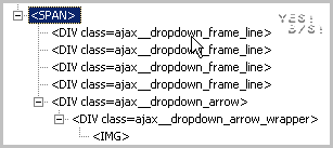 那4个div竟然是用来充当4个边的。而且这个四个边从样式来看好像只是用来表现HighlightBorderColor的。这让我有点不太理解。真正有用的是ajax__dropdown_arrow_wrapper 样式class(它的名称是固定的)。先看看它的默认样式:
 .ajax__dropdown_arrow_wrapper {
 }{ LEFT: 50%;POSITION: absolute;TOP: 50%}#form1 .ajax__dropdown_arrow_wrappe1r {}{ LEFT: 50%; POSITION: absolute; TOP: 4px; }
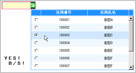
11.CollapsiblePanel
“折”系列的小可爱。别让她的一大片属性所迷惑,其实这个真的算是一个很温柔的控件啦。温柔到你可以随意地调教她,它的外观完全掌握在你的手里。你可以像“画”html页面一样制作它,因为它本身并没有外观,所谓只有“神”而没有“形”,所有的呈现都基于那些目标控件的设计。同时它的最终展现的DOM也很单纯。下面是它那容易让人生畏的属性:
1. TargetControlID - the Panel to operate expand and collapse.【目标控件,推荐Panel】
2. CollapsedSize - The size of the target, in pixels, when it is in the collapsed state.【展开时的尺寸】
3. ExpandedSize - The size of the target, in pixels, when it is in the opened state.【收缩时仍然露出来的尺寸】
4. Collapsed - Specifies that the object should initially be collapsed or expanded. Set this to match your initial size. In this case, we initially set the panel to a height of 0 to match the CollapsedSize property, so when the page first renders, we don't see the panel expanded.【初始状态是否展开】
5. AutoCollapse - True to automatically collapse when the mouse is moved off the panel.【鼠标移上去是否自动收缩】
6. AutoExpand - True to automatically expand when the mouse is moved over the panel.【鼠标移上去是否自动展开】
7. ScrollContents - True to add a scrollbar if the contents are larger than the panel itself. False to just clip the contents.【是否包含滚动条】
8. ExpandControlID/CollapseControlID - The controls that will expand or collapse the panel on a click, respectively. If these values are the same, the panel will automatically toggle its state on each click.【引发展开/收缩事件的目标控件】
9. TextLabelID - The ID of a label control where the "status text" for the panel will be placed. The panel will replace the internal HTML of this control (e.g. any HTML between the tags).【说明状态的Label控件】
10. CollapsedText - The text to show in the control specified by TextLabelID when the panel is collapsed. This text is also used as the alternate text of the image if ImageControlID is set.【收缩时显示的文言】
11. ExpandedText - The text to show in the control specified by TextLabelID when the panel is opened. This text is also used as the alternate text of the image if ImageControlID is set.【展开时显示的文言】
12. ImageControlID - The ID of an Image control where an icon indicating the collapsed status of the panel will be placed. The extender will replace the source of this Image with the CollapsedImage and ExpandedImage urls as appropriate. If the ExpandedText or CollapsedText properties are set, they are used as the alternate text for the image.【用来说明状态的Image控件】
13. CollapsedImage - The path to an image used by ImageControlID when the panel is collapsed【收缩时显示的图片】
14. ExpandedImage - The path to an image used by ImageControlID when the panel is expanded【展开时显示的图片】
15. ExpandDirection - can be "Vertical" or "Horizontal" to determine whether the panel expands top-to-bottom or left-to-right.【展开方向,竖向or横向】
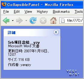
这个控件没有什么好说的,外观的掌控完全在乎那些目标控件的设计,只给个图片,看着是不是很熟悉?模拟winXP资源管理器左侧的。呵呵~
12.HoverMenu
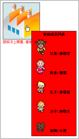
“隐”系列的王者。直译是浮动菜单,但是它的作用可不仅仅是用来浮出菜单,结合你的想象,它能带你走的更远。下面的例子模拟展示了它在web游戏方面的应用(没有客户端,基于B/S的网络游戏,随着网络带宽的发展和一些好的游戏创意的出现必将在未来的网络游戏市场上占有一席之地),此例子仅为抛砖,请勿较真。
先来看看属性:
1. TargetControlID - The control that the extender is targeting. When the mouse cursor is over this control, the hover menu popup will be displayed.【目标控件】
2. PopupControlID - The ID of the control to display when mouse is over the target control. In this case, it's just a simple panel with two links:【弹出的控件】
3. HoverCssClass - The CSS class to apply to the target when the hover menu popup is visible.【弹出控件后原来目标控件的样式,注意:它不会继承原来目标控件的样式,而是直接覆盖。】
4. PopupPostion - Where the popup should be positioned relative to the target control. Can be Left (Default), Right, Top, Bottom, Center.【弹出位置】
5. OffsetX/OffsetY - The number of pixels to offset the Popup from it's default position, as specified by PopupPosition. So if you want it to popup to the left of the target and have a 5px space between the popup and the target, the value should be "-5".【X/Y坐标偏移量】
6. PopDelay - The time delay from when the mouse enters the target to when the popup is shown, in milliseconds. Default is 100.【弹出/缩回的时间延迟,单位是毫秒,默认是100毫秒】
这个控件有比DropDown更自由的弹出位置可以设置,DropDown看名字就知道——只能在下方弹出.,而且还提供了X/Y坐标偏移量属性,所以你可以将这个控件在页面的任意位置上弹出。再加上提供了HoverCssClass属性,可以用来设置弹出浮动控件以后目标控件的样式。所以这个HoverMenu真的要比DropDown友好很多。推荐使用。东西比较简单,关键就是看你的想象力和设计能力。不多说,直接贴个图:
其实Asp.net Ajax Control Toolkit还有很多“忍者”控件,我以后还会以其他角度去讲解它们。今天便不多说了。欲知后事如何,且听下回分解。
上周请假了3天,回来发现工作积了一大堆,所以直到今天才放出这第4回。真是对不住各位关注此系列的朋友了。因为一些特殊的原因,我要尽快赶回大量的工作,还要超前的完成一部分。所以,第5回可能要稍微延迟2天放出。只能说声抱歉,并感谢各位一如既往的对本系列的关注,谢谢。
keyword:ajax HoverMenu,ajax CollapsiblePanel,ajax DropDown,asp.net ajax,ajax教程,ajax基础教程,ajax技术,ajax.net,asp ajax,ajax设计,ajax网页设计,ajax表现
- Asp.net Ajax Control Toolkit设计编程备忘录(色眼窥观版)——第4回(忍者专辑)
- Asp.net Ajax Control Toolkit设计编程备忘录(色眼窥观版)——第4回(忍者专辑)
- Asp.net Ajax Control Toolkit设计编程备忘录(色眼窥观版)——第4回(忍者专辑)
- Asp.net Ajax Control Toolkit设计编程备忘录(色眼窥观版)——第6回(习惯专辑)
- Asp.net Ajax Control Toolkit设计编程备忘录(色眼窥观版)——第2回(F4专辑)
- Asp.net Ajax Control Toolkit设计编程备忘录(色眼窥观版)——第3回(UE专辑)
- Asp.net Ajax Control Toolkit设计编程备忘录(色眼窥观版)——第5回(错不了专辑)
- Asp.net Ajax Control Toolkit设计编程备忘录(色眼窥观版)——第1回(柿子专辑)
- Asp.net Ajax Control Toolkit设计编程备忘录(色眼窥观版)——第2回(F4专辑)
- Asp.net Ajax Control Toolkit设计编程备忘录(色眼窥观版)——第3回(UE专辑)
- Asp.net Ajax Control Toolkit设计编程备忘录(色眼窥观版)——第5回(错不了专辑)
- Asp.net Ajax Control Toolkit设计编程备忘录(色眼窥观版)——第3回(UE专辑)
- ASP.NET AJAX Control Toolkit 控件说明
- ASP.NET AJAX Control Toolkit 控件说明
- ASP.NET AJAX Control Toolkit 控件说明
- 配置Asp.net Ajax Control Toolkit
- 配置Asp.net Ajax Control Toolkit
- 配置Asp.net Ajax Control Toolkit
- Asp.net Ajax Control Toolkit设计编程备忘录(色眼窥观版)——第2回(F4专辑)
- Fraunhofer IIS 音频水印技术
- FastStone Capture 很好用的截图软件!
- Asp.net Ajax Control Toolkit设计编程备忘录(色眼窥观版)——第3回(UE专辑)
- 基于MATLAB的数字水印技术研究
- Asp.net Ajax Control Toolkit设计编程备忘录(色眼窥观版)——第4回(忍者专辑)
- 使用DELPHI 制做外挂
- Asp.net Ajax Control Toolkit设计编程备忘录(色眼窥观版)——第5回(错不了专辑)
- MPEG-4视频数字水印技术的设计与实现
- C++ BigInteger (beta version)
- 基于MPEG压缩域的视频数字水印
- 让RadRails可以提示语法
- 水印协议中需要解决的一些问题
- Eclipse 中“Activation.main: 警告:...(转载,作者不详)