Mayavi
来源:互联网 发布:怎么来淘宝店铺 编辑:程序博客网 时间:2024/06/04 17:58
http://docs.enthought.com/mayavi/mayavi/mlab.html
mlab: Python scripting for 3D plotting
Section summary
This section describes the mlab API, for use of Mayavi as a simple plotting in scripts or interactive sessions. This is the main entry point for people interested in doing 3D plotting à la Matlab or IDL in Python. If you are interested in a list of all the functions exposed in mlab, see the MLab reference.
The mayavi.mlab module, that we call mlab, provides an easy way to visualize data in a script or from an interactive prompt with one-liners as done in the matplotlib pylab interface but with an emphasis on 3D visualization using Mayavi2. This allows users to perform quick 3D visualization while being able to use Mayavi’s powerful features.
Mayavi’s mlab is designed to be used in a manner well-suited to scripting and does not present a fully object-oriented API. It is can be used interactively with IPython.
Warning
When using IPython with mlab, as in the following examples, IPython must be invoked with the -wthread command line option like so:
Or, for IPython recent version (0.11 and above):
If you are using the Enthought Python Distribution, or the latest Python(x,y) distribution, the Pylab menu entry will start ipython with the right switch. In older release of Python(x,y) you need to start “Interactive Console (wxPython)”.
For more details on using mlab and running scripts, read the section Running mlab scripts
In this section, we first introduce simple plotting functions, to create 3D objects as representations of numpy arrays. Then we explain how properties such as color or glyph size can be modified or used to represent data, we show how the visualization created through mlab can be modified interactively with dialogs, we show how scripts and animations can be ran. Finally, we expose a more advanced use of mlab in which full visualization pipeline are built in scripts, and we give some detailed examples of applying these tools to visualizing volumetric scalar and vector data.
Section contents
- A demo
- 3D Plotting functions for numpy arrays
- Changing the looks of the visual objects created
- Figures, legends, camera and decorations
- Running mlab scripts
- Animating the data
- Assembling pipelines with mlab
- Case studies of some visualizations
A demo
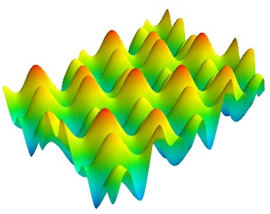
To get you started, here is a pretty example showing a spherical harmonic as a surface:
Bulk of the code in the above example is to create the data. One line suffices to visualize it. This produces the following visualization:
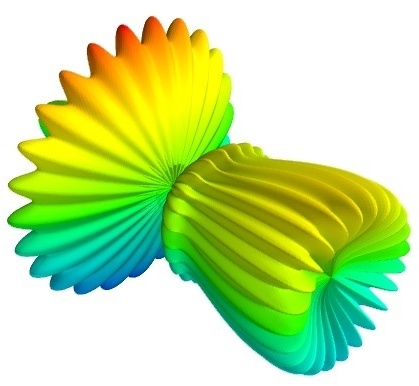
The visualization is created by the single function mesh() in the above.
Several examples of this kind are provided with mlab (see test_contour3d, test_points3d, test_plot3d_anim etc.). The above demo is available as test_mesh. Under IPython these may be found by tab completing on mlab.test. You can also inspect the source in IPython via the handy mlab.test_contour3d??.
3D Plotting functions for numpy arrays
Visualization can be created in mlab by a set of functions operating on numpy arrays.
The mlab plotting functions take numpy arrays as input, describing the x, y, and z coordinates of the data. They build full-blown visualizations: they create the data source, filters if necessary, and add the visualization modules. Their behavior, and thus the visualization created, can be fine-tuned through keyword arguments, similarly to pylab. In addition, they all return the visualization module created, thus visualization can also be modified by changing the attributes of this module.
Note
In this section, we only list the different functions. Each function is described in detail in the MLab reference, at the end of the user guide, with figures and examples. Please follow the links.
0D and 1D data
 points3d()
 Plots glyphs (like points) at the position of the supplied data, described by x, y, z numpy arrays of the same shape.
 plot3d()
 Plots line between the supplied data, described by x, y, z 1D numpy arrays of the same length.
2D data
 imshow()
 View a 2D array as an image.
 surf()
 View a 2D array as a carpet plot, with the z axis representation through elevation the value of the array points.
 contour_surf()
 View a 2D array as line contours, elevated according to the value of the array points.
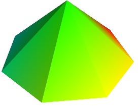
 mesh()
 Plot a surface described by three 2D arrays, x, y, z giving the coordinates of the data points as a grid.
Unlike surf(), the surface is defined by its x, y and z coordinates with no privileged direction. More complex surfaces can be created.
 barchart()
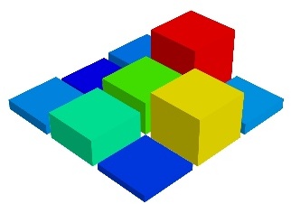
 Plot an array s, or a set of points with explicit coordinates arrays, x, y and z, as a bar chart, eg for histograms.
This function is very versatile and will accept 2D or 3D arrays, but also clouds of points, to position the bars.
 triangular_mesh()
 Plot a triangular mesh, fully specified by x, y and z coordinates of its vertices, and the (n, 3) array of the indices of the triangles.
Vertical scale of surf() and contour_surf()
surf() and contour_surf() can be used as 3D representation of 2D data. By default the z-axis is supposed to be in the same units as the x and y axis, but it can be auto-scaled to give a 2/3 aspect ratio. This behavior can be controlled by specifying the “warp_scale=’auto’”.
From data points to surfaces.
Knowing the positions of data points is not enough to define a surface, connectivity information is also required. With the functions surf() and mesh(), this connectivity information is implicitly extracted from the shape of the input arrays: neighboring data points in the 2D input arrays are connected, and the data lies on a grid. With the function triangular_mesh(), connectivity is explicitly specified. Quite often, the connectivity is not regular, but is not known in advance either. The data points lie on a surface, and we want to plot the surface implicitly defined. The delaunay2d filter does the required nearest-neighbor matching, and interpolation, as shown in the (Surface from irregular data example).
3D data
 contour3d()
 Plot iso-surfaces of volumetric data defined as a 3D array.
 quiver3d()
 Plot arrows to represent vectors at data points. The x, y, z position are specified by numpy arrays, as well as the u, v, w components of the vectors.
 flow()
 Plot a trajectory of particles along a vector field described by three 3D arrays giving the u, v, wcomponents on a grid.
Structured or unstructured data
contour3d() and flow() require ordered data (to be able to interpolate between the points), whereas quiver3d() works with any set of points. The required structure is detailed in the functions’ documentation.
Note
Many richer visualizations can be created by assembling data sources filters and modules. See the Assembling pipelines with mlab and the Case studies of some visualizations sections.
Changing the looks of the visual objects created
Adding color or size variations
The color of the objects created by a plotting function can be specified explicitly using the ‘color’ keyword argument of the function. This color is then applied uniformly to all the objects created.
If you want to vary the color across your visualization, you need to specify scalar information for each data point. Some functions try to guess this information: these scalars default to the norm of the vectors, for functions with vectors, or to the z elevation for functions where it is meaningful, such as surf() or barchart().
This scalar information is converted into colors using the colormap, or also called LUT, for Look Up Table. The list of possible colormaps is:
The easiest way to choose the colormap, most adapted to your visualization is to use the GUI (as described in the next paragraph). The dialog to set the colormap can be found in the Colors and legends node.
To use a custom-defined colormap, for the time being, you need to write specific code, as show in Custom colormap example.
The scalar information can also be displayed in many different ways. For instance it can be used to adjust the size of glyphs positioned at the data points.
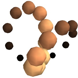
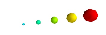
A caveat: Clamping: relative or absolute scaling Given six points positionned on a line with interpoint spacing 1:
If we represent a scalar varying from 0.5 to 1 on this dataset:
We represent the dataset as spheres, using points3d(), and the scalar is mapped to diameter of the spheres:
By default the diameter of the spheres is not ‘clamped’, in other words, the smallest value of the scalar data is represented as a null diameter, and the largest is proportional to inter-point distance. The scaling is only relative, as can be seen on the resulting figure:
This behavior gives visible points for all datasets, but may not be desired if the scalar represents the size of the glyphs in the same unit as the positions specified.
In this case, you shoud turn auto-scaling off by specifying the desired scale factor:
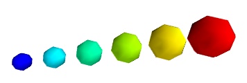
Warning
In earlier versions of Mayavi (up to 3.1.0 included), the glyphs are not auto-scaled, and as a result the visualization can seem empty due to the glyphs being very small. In addition the minimum diameter of the glyphs is clamped to zero, and thus the glyph are not scaled absolutely, unless you specify:
There are many more ways to represent the scalar or vector information attached to the data. For instance, scalar data can be ‘warped’ into a displacement, e.g. using a WarpScalar filter, or the norm of scalar data can be extracted to a scalar component that can be visualized using iso-surfaces with the ExtractVectorNorm filter.
You may want to display color related to one scalar quantity while using a second for the iso-contours, or the elevation. This is possible but requires a bit of work: see Atomic orbital example.
If you simply want to display points with a size given by one quantity, and a color by a second, you can use a simple trick: add the size information using the norm of vectors, add the color information using scalars, create a quiver3d() plot choosing the glyphs to symmetric glyphs, and use scalars to represent the color:
Changing the scale and position of objects
Each mlab function takes an extent keyword argument, that allows to set its (x, y, z) extents. This give both control on the scaling in the different directions and the displacement of the center. Beware that when you are using this functionality, it can be useful to pass the same extents to other modules visualizing the same data. If you don’t, they will not share the same displacement and scale.
The surf(), contour_surf(), and barchart() functions, which display 2D arrays by converting the values in height, also take a warp_scaleparameter, to control the vertical scaling.
Changing object properties interactively
Mayavi, and thus mlab, allows you to interactively modify your visualization.
The Mayavi pipeline tree can be displayed by clicking on the mayavi icon in the figure’s toolbar, or by using show_pipeline() mlab command. One can now change the visualization using this dialog by double-clicking on each object to edit its properties, as described in other parts of this manual, or add new modules or filters by using this icons on the pipeline, or through the right-click menus on the objects in the pipeline.
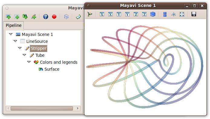
The record feature
A very useful feature of this dialog can be found by pressing the red round button of the toolbar of the pipeline view. This opens up a recorder that tracks the changes made interactively to the visualization via the dialogs, and generates valid lines of Python code. To find out about navigating through a program in the pipeline, see Organisation of Mayavi visualizations: the pipeline.
In addition, for every object returned by a mlab function, this_object.edit_traits() brings up a dialog that can be used to interactively edit the object’s properties. If the dialog doesn’t show up when you enter this command, please see Running mlab scripts.
Using mlab with the full Envisage UI
Sometimes it is convenient to write an mlab script but still use the full envisage application so you can click on the menus and use other modules etc. To do this you may do the following before you create an mlab figure:
This will give you the full-fledged UI instead of the default simple window.
Figures, legends, camera and decorations
Handling several figures
All mlab functions operate on the current scene, that we also call figure(), for compatibility with matlab and pylab. The different figures are indexed by key that can be an integer or a string. A call to the figure() function giving a key will either return the corresponding figure, if it exists, or create a new one. The current figure can be retrieved with the gcf() function. It can be refreshed using the draw() function, saved to a picture file using savefig() and cleared using clf().
Figure decorations
Axes can be added around a visualization object with the axes() function, and the labels can be set using the xlabel(), ylabel() andzlabel() functions. Similarly, outline() creates an outline around an object. title() adds a title to the figure.
Color bars can be used to reflect the color maps used to display values (LUT, or lookup tables, in VTK parlance). colorbar() creates a color bar for the last object created, trying to guess whether to use the vector data or the scalar data color maps. The scalarbar()and vectorbar() function scan be used to create color bars specifically for scalar or vector data.
A small xyz triad can be added to the figure using orientation_axes().
Warning
The orientation_axes() was named orientationaxes before release 3.2.
Moving the camera
The position and direction of the camera can be set using the view() function. They are described in terms of Euler angles and distance to a focal point. The view() function tries to guess the right roll angle of the camera for a pleasing view, but it sometimes fails. The roll() explicitly sets the roll angle of the camera (this can be achieve interactively in the scene by pressing down the control key, while dragging the mouse, see Interaction with the scene).
The view() and roll() functions return the current values of the different angles and distances they take as arguments. As a result, the view point obtained interactively can be stored and reset using:
Rotating the camera around itself
You can also rotate the camera around itself using the roll, yaw and pitch methods of the camera object. This moves the focal point:
Unlike the view() and roll() function, the angles are incremental, and not absolute.
Modifying zoom and view angle
The camera is entirely defined by its position, its focal point, and its view angle (attributes ‘position’, ‘focal_point’, ‘view_angle’). The camera method ‘zoom’ changes the view angle incrementally by the specify ratio, where as the method ‘dolly’ translates the camera along its axis while keeping the focal point constant. The move() function can also be useful in these regards.
Note
Camera parallel scale
In addition to the information returned and set by mlab.view and mlab.roll, a last parameter is needed to fully define the view point: the parallel scale of the camera, that control its view angle. It can be read (or set) with the following code:
Running mlab scripts
Mlab, like the rest of Mayavi, is an interactive application. If you are not already in an interactive environment (see next paragraph), to interact with the figures or the rest of the drawing elements, you need to use the show() function. For instance, if you are writing a script, you need to call show() each time you want to display one or more figures and allow the user to interact with them.
Using mlab interactively
Using IPython, mlab instructions can be run interactively, or in scripts using IPython‘s %run command:
You need to start IPython with the -wthread option, that became –gui=wx in the recent IPython versions (when installed with EPD, thepylab start-menu link does this for you). In this environment, the plotting commands are interactive: they have an immediate effect on the figure, alleviating the need to use the show() function.
Mlab can also be used interactively in the Python shell of the mayavi2 application, or in any interactive Python shell of wxPython-based application (such as other Envisage-based applications, or SPE, Stani’s Python Editor).
Using together with Matplotlib’s pylab
If you want to use Matplotlib’s pylab with Mayavi’s mlab in IPython you should:
if your IPython version is greater than 0.11: start IPython with:
else, if your IPython version is greater than 0.8.4: start IPython with the following options:
elsewhere, start IPython with the -wthread option:
and before importing pylab, enter the following Python commands:
If you want matplotlib and mlab to work together by default in IPython, you can change you default matplotlib backend, by editing the~/.matplotlib/matplotlibrc to add the following line:
Capturing mlab plots to integrate in pylab
Starting from Mayavi version 3.4.0, the mlab screenshot() can be used to take a screenshot of the current figure, to integrate in a matplotlib plot.
In scripts
Mlab commands can be written to a file, to form a script. This script can be loaded in the Mayavi application using the File->Open file menu entry, and executed using the File->Refresh code menu entry or by pressing Control-r. It can also be executed during the start of the Mayavi application using the -x command line switch.
As mentioned above, when running outside of an interactive environment, for instance with python myscript.py, you need to call theshow() function (as shown in the demo above) to pause your script and have the user interact with the figure.
You can also use show() to decorate a function, and have it run in the event-loop, which gives you more flexibility:
With this decorator, each time the image function is called, mlab makes sure an interactive environment is running before executing the image function. If an interactive environment is not running, mlab will start one and the image function will not return until it is closed.
Animating the data
Often it isn’t sufficient to just plot the data. You may also want to change the data of the plot and update the plot without having to recreate the entire visualization, for instance to do animations, or in an interactive application. Indeed, recreating the entire visualization is very inefficient and leads to very jerky looking animations. To do this, mlab provides a very convenient way to change the data of an existing mlab visualization. Consider a very simple example. The mlab.test_simple_surf_anim function has this code:
The first two lines define a simple plane and view that. The next three lines animate that data by changing the scalars producing a plane that rotates about the origin. The key here is that the s object above has a special attribute called mlab_source. This sub-object allows us to manipulate the points and scalars. If we wanted to change the x values we could set that too by:
The only thing to keep in mind here is that the shape of x should not be changed.
If multiple values have to be changed, you can use the set method of the mlab_source to set them as shown in the more complicated example below:
Notice the use of the set method above. With this method, the visualization is recomputed only once. In this case, the shape of the new arrays has not changed, only their values have. If the shape of the array changes then one should use the reset method as shown below:
Many standard examples for animating data are provided with mlab. Try the examples with the name mlab.test_<name>_anim, i.e. where the name ends with an _anim to see how these work and run.
Note
It is important to remember distinction between set and reset. Use set or directly set the attributes (x, y, scalars etc.) when you are not changing the shape of the data but only the values. Use reset when the arrays are changing shape and size. Reset usually regenerates all the data and can be inefficient when compared to set or directly setting the traits.
Warning
When creating a Mayavi pipeline, as explained in the following subsection, instead of using ready-made plotting function, the mlab_source attribute is created only on sources created via mlab. Pipeline created entirely using mlab will present this attribute.
Note
If you are animating several plot objects, each time you modify the data with there mlab_source attribute, Mayavi will trigger a refresh of the scene. This operation might take time, and thus slow your animation. In this case, the tip Accelerating a Mayavi script may come in handy.
Assembling pipelines with mlab
The plotting functions reviewed above explore only a small fraction of the visualization possibilities of Mayavi. The full power of Mayavi can only be unleashed through the control of the pipeline itself. As described in the An overview of Mayavi section, a visualization in Mayavi is created by loading the data in Mayavi with data source object, optionally transforming the data throughFilters, and visualizing it with Modules. The mlab functions build complex pipelines for you in one function, making the right choice of sources, filters, and modules, but they cannot explore all the possible combinations.
Mlab provides a sub-module pipeline which contains functions to populate the pipeline easily from scripts. This module is accessible in mlab: mlab.pipeline, or can be imported from mayavi.tools.pipeline.
When using an mlab plotting function, a pipeline is created: first a source is created from numpy arrays, then modules, and possibly filters, are added. The resulting pipeline can be seen for instance with the mlab.show_pipeline command. This information can be used to create the very same pipeline directly using the pipeline scripting module, as the names of the functions required to create each step of the pipeline are directly linked to the default names of the objects created by mlab on the pipeline. As an example, let us create a visualization using surf():
The following pipeline is created:
The same pipeline can be created using the following code:
Data sources
The mlab.pipeline module contains functions for creating various data sources from arrays. They are fully documented in details in theMlab pipeline-control reference. We give a small summary of the possibilities here.
Mayavi distinguishes sources with scalar data, and sources with vector data, but more important, it has different functions to create sets of unconnected points, with data attached to them, or connected data points describing continuously varying quantities that can be interpolated between data points, often called fields in physics or engineering.
scalar_scatter() (creates a PolyData)
vector_scatter() (creates an PolyData)
scalar_field() (creates an ImageData)
vector_field() (creates an ImageData)
array2d_source() (creates an ImageData)
line_source() (creates an PolyData)
triangular_mesh_source() (creates an PolyData)
All the mlab.pipline source factories are functions that take numpy arrays and return the Mayavi source object that was added to the pipeline. However, the implicitly-connected sources require well-shaped arrays as arguments: the data is supposed to lie on a regular, orthogonal, grid of the same shape as the shape of the input array, in other words, the array describes an image, possibly 3 dimensional.
Note
More complicated data structures can be created, such as irregular grids or non-orthogonal grid. See the section on data structures.
Modules and filters
For each Mayavi module or filter (see Modules and Filters), there is a corresponding mlab.pipeline function. The name of this function is created by replacing the alternating capitals in the module or filter name by underscores. Thus ScalarCutPlane corresponds toscalar_cut_plane.
In general, the mlab.pipeline module and filter factory functions simply create and connect the corresponding object. However they can also contain addition logic, exposed as keyword arguments. For instance they allow to set up easily a colormap, or to specify the color of the module, when relevant. In accordance with the goal of the mlab interface to make frequent operations simple, they use the keyword arguments to choose the properties of the created object to suit the requirements. It can be thus easier to use the keyword arguments, when available, than to set the attributes of the objects created. For more information, please check out the docstrings. Full, detailed, usage examples are given in the next subsection.
Case studies of some visualizations
Visualizing volumetric scalar data
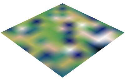
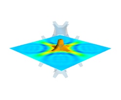
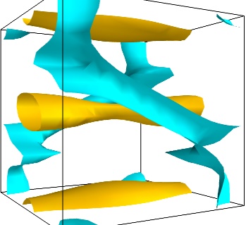
There are three main ways of visualizing a 3D scalar field. Given the following field:
To display iso surfaces of the field, the simplest solution is simply to use the mlab contour3d() function:
The problem with this method is that the outer iso-surfaces tend to hide inner ones. As a result, quite often only one iso-surface can be visible.
Volume rendering is an advanced technique in which each voxel is given a partly transparent color. This can be achieved with mlab.pipeline using the scalar_field() source, and the volume module:
For such a visualization, tweaking the opacity transfer function is critical to achieve a good effect. Typically, it can be useful to limit the lower and upper values to the 20 and 80 percentiles of the data, in order to have a reasonable fraction of the volume transparent:
It is useful to open the module’s dialog (eg through the pipeline interface, or using it’s edit_traits() method) and tweak the color transfer function to render the transparent low-intensity regions of the image. For this module, the LUT as defined in the `Colors and legends` node are not used
The limitations of volume rendering is that, while it is often very pretty, it can be difficult to analyze the details of the field with it.
While less impressive, cut planes are a very informative way of visualizing the details of a scalar field:
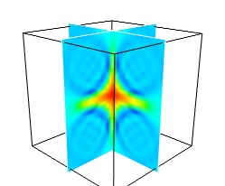
The image plane widget can only be used on regular-spaced data, as created by mlab.pipeline.scalar_field, but it is very fast. It should thus be prefered to the scalar cut plane, when possible.
Clicking and dragging the cut plane is an excellent way of exploring the field.
Finally, it can be interesting to combine cut planes with iso-surfaces and thresholding to give a view of the peak areas using the iso-surfaces, visualize the details of the field with the cut plane, and the global mass with a large iso-surface:
In some cases, though not in our example, it might be usable to insert a threshold filter before the cut plane, eg:to remove area with values below ‘s.min()+0.1*s.ptp()’. In this case, the cut plane needs to be implemented withmlab.pipeline.scalar_cut_plane as the data looses its structure after thresholding.
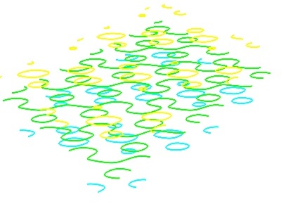
Visualizing a vector field
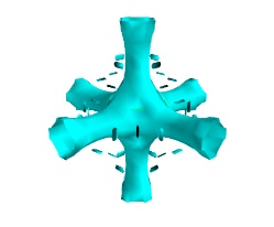
A vector field, i.e., vectors continuously defined in a volume, can be difficult to visualize, as it contains a lot of information. Let us explore different visualizations for the velocity field of a multi-axis convection cell [1], in hydrodynamics, as defined by its components sampled on a grid, u, v, w:
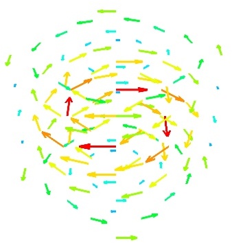
The simplest visualization of a set of vectors, is using the mlab function quiver3d:
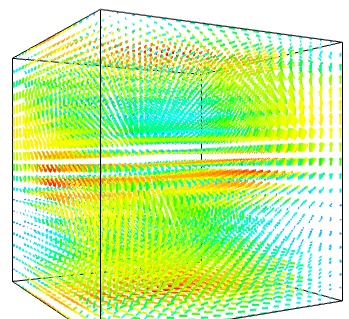
The main limitation of this visualization is that it positions an arrow for each sampling point on the grid. As a result the visualization is very busy.
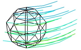
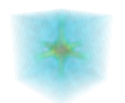
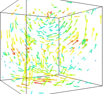
We can use the fact that we are visualizing a vector field, and not just a bunch of vectors, to reduce the amount of arrows displayed. For this we need to build a vector_field source, and apply to it the vectors module, with some masking parameters (here we keep only one point out of 20):
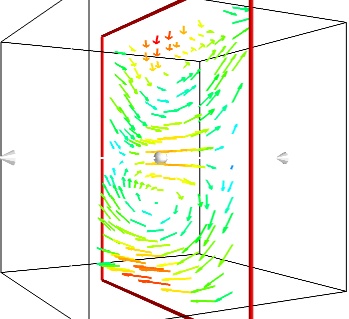
If we are interested in displaying the vectors along a cut, we can use a cut plane. In particular, we can inspect interactively the vector field by moving the cut plane along: clicking on it and dragging it can give a very clear understanding of the vector field:
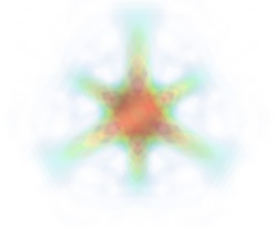
An important parameter of the vector field is its magnitude. It can be interesting to display iso-surfaces of the normal of the vectors. For this we can create a scalar field from the vector field using the ExtractVectorNorm filter, and use the Iso-Surface module on it. When working interactively, a good understanding of the magnitude of the field can be gained by changing the values of the contours in the object’s property dialog.
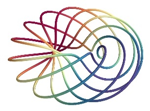
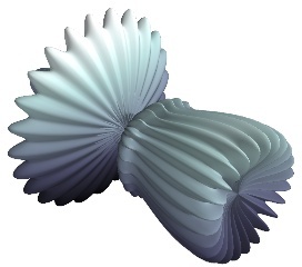
For certain vector fields, the line of flow along the field can have an interesting meaning. For instance this can be interpreted as a trajectory in hydrodynamics, or field lines in electro-magnetism. We can display the flow lines originating for a certain seed surface using the streamline module, or the mlab flow() function, which relies on streamlineinternally:
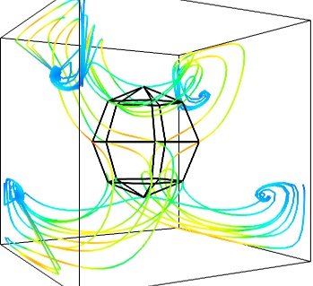
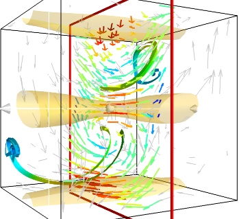
Giving a meaningful visualization of a vector field is a hard task, and one must use all the tools at hand to illustrate his purposes. It is important to choose the message conveyed. No one visualization will tell all about a vector field. Here is an example of a visualization made by combining the different tools above:
Note
Although most of this section has been centered on snippets of code to create visualization objects, it is important to remember that Mayavi is an interactive program, and that the properties of these objects can be modified interactively, as described in Changing object properties interactively. It is often impossible to choose the best parameters for a visualization before hand. Colors, contour values, colormap, view angle, etc... should be chosen interactively. If reproducibiles are required, the chosen values can be added in the original script.
Moreover, the mlab functions expose only a small fraction of the possibilities of the visualization objects. The dialogs expose more of these functionalities, that are entirely controlled by the attributes of the objects returned by the mlab functions. These objects are very rich, as they are built from VTK objects. It can be hard to find the right attribute to modify when exploring them, or in the VTK documentation, thus the easiest way is to modify them interactively using the pipeline view dialog and use the record feature to find out the corresponding lines of code. See Organisation of Mayavi visualizations: the pipeline to understand better the link between the lines of code generated by the record feature and mlab. .
![]()
Table Of Contents
- mlab: Python scripting for 3D plotting
- A demo
- 3D Plotting functions for numpy arrays
- 0D and 1D data
- 2D data
- 3D data
- Changing the looks of the visual objects created
- Adding color or size variations
- Changing the scale and position of objects
- Changing object properties interactively
- Figures, legends, camera and decorations
- Handling several figures
- Figure decorations
- Moving the camera
- Running mlab scripts
- Using mlab interactively
- Using together with Matplotlib’s pylab
- In scripts
- Animating the data
- Assembling pipelines with mlab
- Data sources
- Modules and filters
- Case studies of some visualizations
- Visualizing volumetric scalar data
- Visualizing a vector field
Previous topic
Filters
Next topic
Advanced use of Mayavi
This Page
Quick search
Enter search terms or a module, class or function name.
Google Search
Citing Mayavi
If you publish articles using Mayavi, please cite Mayavi. We need these citations to justify time and resources on the software.
- Mayavi
- Python MayaVi
- Linux python3 安装Mayavi
- 1. Mayavi入门
- 2. Mayavi的管线
- python mayavi三维绘图
- 8. Mayavi可视化实例
- mayavi作图指南0-mayavi在python3下的安装
- 三维绘图之Mayavi.mlab
- Winpython环境下mayavi配置
- win10 + anaconda +moviepy + mayavi + ffmpeg
- win7 Python3 安装mayavi 记录
- Ubuntu下 python3 安装Mayavi
- 用Mayavi画3D图
- Python包安装——mayavi安装
- Python.Mayavi -- Python三维图表绘制
- python下vtk及mayavi的安装
- Python 中的绘图matplotlib & mayavi库
- HDU4869:Turn the pokers(费马小定理+快速幂)
- 用Dancing Links求解精确覆盖问题
- 杭电 acm 2009
- OJ J
- java中gc的整理
- Mayavi
- CopyOnWriteArrayList源码阅读
- ros路由器cpu占用率高的原因和解决
- POJ 2540 半平面交
- cocos2d-x 3.0 开发(一) Hello_New_World
- jsp 跳转问题
- 安卓学习笔记(一)Android ImageButton、ImageView控件属性设置 图片显示问题
- asp.net 页面初级介绍1
- 快速排序