使用inline-block实现图片列表展示(对比float的实现)
来源:互联网 发布:广元外卖软件 编辑:程序博客网 时间:2024/06/16 02:10
Using inline-block to Display a Product Grid View
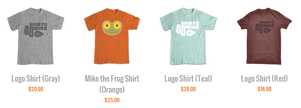
I have been working on a website that displays products in a grid view, with each product containing a title, an image and some in a grid view. To achieve this layout, I used an unordered list with the CSS display property on each item set to inline-block. Let me walk you through the code and point out how this approach works well for a responsive layout.
Here’s a sample of the HTML for the list:
Why Not Floats?
Your first inclination might be to use floats. Floating the list items works really well if each element has the exact same height. In most instances, though, that’s not the case. Even if they are all the same now, that might change in the future. When the items have different heights, you’ll see some weird stacking issues. (The second item is taller in my example. With floats that fifth item catches on it.) ") To adjust for this, I’ve seen people wrap each row in a separate div or add clears to the first item in each row. But these adjustments force your layout to have a set number of columns, making it less adaptable in the changing layouts of responsive design.
To adjust for this, I’ve seen people wrap each row in a separate div or add clears to the first item in each row. But these adjustments force your layout to have a set number of columns, making it less adaptable in the changing layouts of responsive design.
Display Options
Instead of float, I give each list item a width and change the display from block to inline-block.
What exactly does this accomplish? Most HTML elements by default have a display property set block or inline:
- Elements with a display of
blocktake up the full width of their parent elements and have their own horizontal line. - Elements with a display of
inlinetake up only the space they need and can share their horizontal line with other elements.
A new block-level element will force a break to a new line. Think about paragraphs (<p> tags) as an example: any new paragraph starts a new line. Inline elements, on the other hand, can sit nicely on a line with other elements. Think about emphasis elements and links (<a> and <em> tags): a new inline element does notforce a new line. Take a look at this code example:
 Images are inline elements. If you put an image in the middle of a string of text, it will sit inline with that text.
 Note that the image is taller than the text. Inline elements do not need to be the same height to sit on a line together. The shorter elements on the line will just have blank space above or below them. Each line of text starts fully below the previous one.
 inline-blockis a third display option, and it unsurprisingly combines aspects of both the inline and the block options. The element sits inline just like an image does. But we can specify its height and width with CSS, and it can have block-level children elements that take up multiple lines inside of it.
 To achieve the grid view, we set every list item to display as inline-block. Just like words in a paragraph, products will appear next to each other; when there’s no room on a line for another product, the next product will simply wrap to the next line. With items of different heights, you’ll usually want the top edge of them to line up. This doesn’t happen by default, but you can easily modify that with the
 vertical-alignCSS property.
Responsive
This technique works nicely with a responsive layout. On a smaller screen, you might want to show only three products in a row instead of four. As the parent element gets smaller, the line will be shorter and items will naturally start wrapping to the next line earlier. ")
Caveat: One Big Drawback
If you put spaces or hard returns between two block-level elements, the browser ignores it. That means you can use spacing and indentation to make your HTML easier to read without having an effect on the display. With inline elements, that’s not the case. If you put a space between text or link tags, for example, the browser will display that space. The browser treats whitespace between two inline-block elements the same as it does inline elements. This makes sense if you think about it, but it means that you have to write the starting tag of a new element immediatelyafter the previous ending tag to get the margins and padding to work like you would think. Here’s how I would modify my list to account for that:
To me, this is a small price to pay to get the flexibility and responsiveness of inline-block for a product grid view like this.
Browser Support?
All modern browsers support the inline-block value for the display property. Internet Explorer 6 and 7 did not support it, but there was a simple hack you could use to get it to work. For old time’s sake, here’s the code:
- 使用inline-block实现图片列表展示(对比float的实现)
- css inline-block 与 float的使用
- inline-block + justify实现列表两端对齐
- HTML实现图片列表展示
- inline-block替换float:left列表
- 关于float和inline-block实现不规则瀑布布局的探索
- 横向布局中浮动float和inline-block的使用
- CSS属性display:inline-block;实现列表布局
- 跨浏览器的 inline-block 实现
- 跨浏览器的 inline-block 实现[CSS]
- block、inline、inline-block对比
- block、inline、inline-block对比
- block、inline、inline-block对比
- block、inline、inline-block对比
- inline-block和float的区别
- inline-block与float浮动的区别
- 使用float:left来实现横排的列表框
- inline-block 的使用
- C#异步跨线程
- 1002455 - Errors in texts: Messages VX 201, VX 111, and VX 205
- Android版busybox编译
- java解惑之名字重用的术语表
- PHP采集程序中常用的函数
- 使用inline-block实现图片列表展示(对比float的实现)
- 调用函数排序
- WebService 之 WSDL文件 讲解
- 子类、父类、静态成员变量,构造函数的执行顺序
- Weka算法介绍[
- UICollectionView的使用方法
- 【Mysql】利用group by附带having进行聚类查询
- Markdown 11种基本语法
- 详解用CSS绘制3D旋转立方体