android 封装好的BottomTabBar
来源:互联网 发布:欠淘宝贷款2年了没还上 编辑:程序博客网 时间:2024/05/29 00:33
1 在android app开发过程中,会发现很多App的底部(顶部一样) 会仿效IPHONE的设计。。做一个导航。 如下图黑色部分:
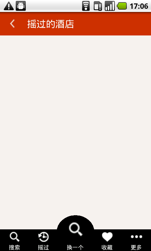

(这个是实现效果) 这个是设计原型
1.1 要是中间部分没有那个拱起来的部分,那么可能设计还简单一些。。 仔细分析下设计原型,,,中间那个 摇摇 的图标要大一些,而且和其他图标没在一个水平线上。
1.2 总的思想就是 先封装一个 没有 凸起 的通用,自动适配的组建。。。然后。。。在上面 通过 FrameLayout 放置一个 突起的组建。。。
1.3 设计细节
1.3.1 自己写一个 BottomTabBar (extends) LinearLayout . 通过 Inflater 加载一个 自定义的 View (通过xml配置), 在View 的xml 中,注意书写好适配就OK了。
注意 layout_weight 的使用。(参见上一篇 listview)
自定义LinearLayout:
- package com.dp.android.widget;
- import com.dp.android.elong.shake.R;
- import android.content.Context;
- import android.util.AttributeSet;
- import android.view.LayoutInflater;
- import android.view.View;
- import android.widget.LinearLayout;
- public class BottomTabBar extends LinearLayout {
- //--implements two kinds of constructions--
- public BottomTabBar(Context context) {
- super(context);
- init(context);
- }
- public BottomTabBar(Context context, AttributeSet attrs) {
- super(context, attrs);
- init(context);
- }
- private void init(Context context) {
- LayoutParams lp = new LayoutParams(LayoutParams.FILL_PARENT,LayoutParams.WRAP_CONTENT);
- setLayoutParams(lp);
- LayoutInflater mInflater = LayoutInflater.from(context);
- View v = mInflater.inflate(R.layout.bottom_tabs, null);
- addView(v,lp);
- }
- }
自定义的View(xml 形式)
- <?xml version="1.0" encoding="utf-8"?>
- <LinearLayout
- xmlns:android="http://schemas.android.com/apk/res/android"
- android:layout_width="fill_parent"
- android:layout_height="fill_parent"
- >
- <!-- 搜索 -->
- <LinearLayout
- android:id="@+id/ll_bottom_tabls_search"
- style = "@style/bottom_tabs_ll"
- >
- <ImageView
- android:id="@+id/im_search"
- style = "@style/bottom_tabs_image"
- android:src="@drawable/bottom_tab_search" />
- <TextView
- style = "@style/bottom_tabs_tv"
- android:text="@string/bottom_tab_search"
- />
- </LinearLayout>
- <!-- 摇过 -->
- <LinearLayout
- android:id="@+id/ll_bottom_tabls_history"
- style = "@style/bottom_tabs_ll"
- >
- <ImageView
- android:id="@+id/im_history"
- style = "@style/bottom_tabs_image"
- android:src="@drawable/bottom_tab_history" />
- <TextView
- style = "@style/bottom_tabs_tv"
- android:text="@string/bootom_tab_shake"
- />
- </LinearLayout>
- <!-- 换一个 -->
- <LinearLayout
- android:id="@+id/ll_bottom_tabls_change"
- style = "@style/bottom_tabs_ll"
- >
- <ImageView
- android:id="@+id/im_change"
- style = "@style/bottom_tabs_image"
- android:src="@drawable/bottom_tab_blank"
- />
- <TextView
- style = "@style/bottom_tabs_tv"
- android:text="@string/bottom_tab_change"
- />
- </LinearLayout>
- <!-- 收藏 -->
- <LinearLayout
- android:id="@+id/ll_bottom_tabls_collection"
- style = "@style/bottom_tabs_ll"
- >
- <ImageView
- android:id="@+id/im_collection"
- style = "@style/bottom_tabs_image"
- android:src="@drawable/bottom_tab_collection"
- />
- <TextView
- style = "@style/bottom_tabs_tv"
- android:text="@string/bootom_tab_collection"
- />
- </LinearLayout>
- <!-- 更多 -->
- <LinearLayout
- android:id="@+id/ll_bottom_tabls_more"
- style = "@style/bottom_tabs_ll"
- >
- <ImageView
- android:id="@+id/im_more"
- style = "@style/bottom_tabs_image"
- android:src="@drawable/bottom_tab_more"
- />
- <TextView
- style = "@style/bottom_tabs_tv"
- android:text="@string/bootom_tab_more"
- />
- </LinearLayout>
- </LinearLayout>
view 中用到的 三个 style
- <style name="bottom_tabs_ll" >
- <item name="android:layout_width">wrap_content</item>
- <item name="android:layout_height">wrap_content</item>
- <item name="android:background">@color/black</item>
- <item name="android:orientation">vertical</item>
- <item name="android:gravity">center</item>
- <item name="android:layout_gravity">bottom</item>
- <item name="android:layout_weight">1</item>
- </style>
- <style name="bottom_tabs_image" >
- <item name="android:layout_width">fill_parent</item>
- <item name="android:layout_height">wrap_content</item>
- <item name="android:paddingTop">5dip</item>
- </style>
- <style name="bottom_tabs_tv" >
- <item name="android:layout_width">fill_parent</item>
- <item name="android:layout_height">wrap_content</item>
- <item name="android:textSize">12sp</item>
- <item name="android:textColor">@color/common_white</item>
- <item name="android:paddingTop">3dip</item>
- <item name="android:gravity">center</item>
- </style>
//---------------------------------------------------------------下面是如何使用自己定义的 组建了-------------------------------------
1: 注意 BottomTabBar ,,, 这里面还用到了自定义的 “凸起” 组件。 MyBottmArc
<FrameLayout
android:layout_width="fill_parent"
android:layout_height="wrap_content"
android:background="@color/shake_yellow_bg"
android:orientation="vertical"
>
<com.dp.android.widget.BottomTabBar
android:id="@+id/bottom_tab_bar1"
android:layout_width="fill_parent"
android:layout_height="wrap_content"
android:paddingTop="30dip"
/>
<com.dp.android.widget.MyBottmArc
android:id="@+id/im_change"
android:layout_width="80dip"
android:layout_height="60dip"
android:padding="15dip"
android:src="@drawable/bottom_tab_search"
android:layout_gravity="top|center_horizontal"
/>
</FrameLayout>
//--------------------------------------------------------------------------------------下面看看 凸起 是怎么弄的---------------------------------------------------------------------------------
凸起 也是自己定义了一个 ImageView, 这个ImageView 的背景 就是绘制半个 圆弧。。。“拱形”
- package com.dp.android.widget;
- import android.content.Context;
- import android.graphics.Canvas;
- import android.graphics.Paint;
- import android.graphics.Rect;
- import android.graphics.RectF;
- import android.util.AttributeSet;
- import android.widget.ImageView;
- public class MyBottmArc extends ImageView {
- private static Paint paint = new Paint();
- public MyBottmArc(Context context) {
- super(context);
- }
- public MyBottmArc(Context context, AttributeSet attrs) {
- super(context, attrs);
- }
- public MyBottmArc(Context context, AttributeSet attrs, int defStyle) {
- super(context, attrs, defStyle);
- }
- protected void onDraw(Canvas canvas) {
- Rect m_rect = canvas.getClipBounds();
- canvas.save();
- paint.setColor(0xff000000);
- float m_left = m_rect.left;
- float m_top = m_rect.top;
- float m_right = m_rect.right;
- float m_bottom = (1.2f)*(m_rect.bottom);
- RectF m_rectf = new RectF(m_left,m_top,m_right,m_bottom);
- canvas.drawOval(m_rectf, paint);
- canvas.restore();
- super.onDraw(canvas);
- }
- }
- android 封装好的BottomTabBar
- android 封装好的BottomTabBar
- Android BottomTabBar的简单使用
- Android BottomTabBar控件的使用 Fragment 页面切换
- BottomTabBar的使用
- BottomTabBar的底部栏
- bottomTabBar的使用
- Android 自定义dialog(封装好的)
- android 封装好的ViewPagerIndicator指示器
- 封装好的Android 微信支付
- BottomTabBar
- BottomTabBar
- BottomTabBar
- 封装好的BufferedReader
- 封装好的Notification
- 封装好的webview
- android封装好的方法写增删改查
- Android之封装好的异步网络请求框架
- ADSafe超精简汇编修改启动无提示爽歪歪直接退出版
- Fiddler4 入门级使用教程
- 【Oracle】【SQL】rownum, row_number() 和 rank()的区别
- Nginx服务器nginx.conf的配置文件说明
- 一致性哈希算法与Java实现
- android 封装好的BottomTabBar
- hibernate 字段值比较
- VS2010中“工具>选项中的VC++目录编辑功能已被否决”解决方法
- start_kernel——page_address_init
- 呵呵,这个是我。。
- FastDFS安装、配置、部署(一)-安装和部署
- matlab插入排序
- django manage.py 的各种功能
- C语言中返回局部变量或临时变量的地址的错误