Android ProgressBar自定义图片进度,自定义渐变色进度条
来源:互联网 发布:2016年保险业数据 编辑:程序博客网 时间:2024/05/03 16:28
Android ProgressBar自定义图片进度,自定义渐变色进度条
android ProgressBar android ProgressBar案例 android progressBar背景图片
?1234567java.lang.Object ↳ android.view.View ↳ android.widget.ProgressBar直接子类AbsSeekBar间接子类RatingBar, SeekBar在某些操作的进度中的可视指示器,为用户呈现操作的进度,还它有一个次要的进度条,用来显示中间进度,如在流媒体播放的缓冲区的进度。一个进度条也可不确定其进度。在不确定模式下,进度条显示循环动画。这种模式常用于应用程序使用任务的长度是未知的。进度条也就是一个表示运转的过程,例如发送短信,连接网络等等,表示一个过程正在执行中
1、android.widget. ProgressBar,继承自android.view.View 。在android.widget包中。对应对话框ProgressDialog。ProgressBar有两种展示方式,表盘形式(普通、小、大)和条形填充形式。在layout定义时,需要通过设施style属性类设置展示方式。
ProgressBar的样式有四种:
android:progressBarStyle:默认进度条样式,不确定模式
android:progressBarStyleHorizontal:水平进度条样式
android:progressBarStyleLarge :大号进度条样式,也是不确定进度模式
android:progressBarStyleSmall :小号进度条样式,也是不确定进度模式
二、XML重要属性
android:max-- 这事进度条长度最大值
android:progress--设定度条当前进度值
android:secondaryProgress--第二进度条进度值
android:progressBarStyle:默认进度条样式
android:progressBarStyleHorizontal:水平样式
style="?android:attr/progressBarStyleLarge" --- 属性风格类型--大圆圈,如下图
style=”?android:attr/progressBarStyleSmall”--- 属性风格类型--小圆圈,如下图:
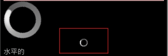
style="?android:attr/progressBarStyleHorizontal" --水平进度条 --如下图:

几秒钟之后自动滚到到如下:

也可以用下面的形式代替上面的形式的:
?123<ProgressBarstyle="@android:style/Widget.ProgressBar.Inverse"/>//中<ProgressBarstyle="@android:style/Widget.ProgressBar.Large.Inverse"/> //大圆<ProgressBarstyle="@android:style/Widget.ProgressBar.Small.Inverse"/> //小圆
三、重要方法
getMax():返回这个进度条的范围的上限
getProgress():返回当前进度值
getSecondaryProgress():返回次要当前进度值
incrementProgressBy(int diff):指定增加的进度--即步长
isIndeterminate():指示进度条是否在不确定模式下
setIndeterminate(boolean indeterminate):设置不确定模式下
setVisibility(int v):设置该进度条是否可视
四、重要事件
onSizeChanged(int w, int h, int oldw, int oldh):当进度值改变时引发此事件
接下来看案例:
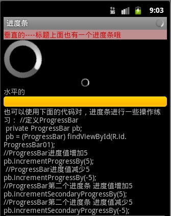
1.定义一个布局文件progressbar.xml
?1234567891011121314151617181920212223242526272829303132333435363738394041424344454647484950515253<?xmlversion="1.0"encoding="utf-8"?><ScrollViewxmlns:android="http://schemas.android.com/apk/res/android" android:layout_width="fill_parent" android:layout_height="match_parent" > <LinearLayout android:layout_width="fill_parent" android:layout_height="match_parent" android:orientation="vertical"><TextView android:id="@+id/startText" android:layout_width="fill_parent" android:layout_height="wrap_content" android:text="垂直的----标题上面也有一个进度条哦" android:textColor="#CD0000" android:background="#BC8F8F" /> <!-- style=”?android:attr/progressBarStyleLarge”大圆圈 --> <ProgressBar android:id="@+id/progtessBer_btn_id1" android:layout_width="wrap_content" android:layout_height="wrap_content" style="?android:attr/progressBarStyleLarge" /> <!-- style=”?android:attr/progressBarStyleSmall”小圆圈 --> <ProgressBar android:layout_width="wrap_content" android:layout_height="wrap_content" style="?android:attr/progressBarStyleSmall" android:layout_gravity="center_horizontal" /> <TextView android:id="@+id/startText1" android:layout_width="fill_parent" android:layout_height="wrap_content" android:text="水平的" android:textColor="#aaaaaa" /> <!-- style="?android:attr/progressBarStyleHorizontal" 水平进度条 --> <ProgressBar android:id="@+id/progtessBer_btn_id2" android:layout_width="fill_parent" android:layout_height="wrap_content" style="?android:attr/progressBarStyleHorizontal" /> <TextView android:layout_width="fill_parent" android:layout_height="wrap_content" android:text="@string/progress_text" /> </LinearLayout></ScrollView>2.之后定义java文件:ProgressBarDemo.java?12345678910111213141516171819202122232425262728293031323334353637383940414243444546474849505152535455565758596061626364656667686970717273747576777879808182838485868788899091packagecom.dream.app.start.first.prograssbar;importcom.dream.app.start.MenuDemo;importcom.dream.app.start.R;importcom.dream.app.start.R.id;importcom.dream.app.start.R.layout;importcom.dream.app.start.utils.PublicClass; importandroid.app.Activity;importandroid.content.Intent;importandroid.os.Bundle;importandroid.os.Handler;importandroid.text.method.ScrollingMovementMethod;importandroid.view.View;importandroid.view.View.OnClickListener;importandroid.view.Window;importandroid.widget.AdapterView;importandroid.widget.AdapterView.OnItemClickListener;importandroid.widget.ArrayAdapter;importandroid.widget.Button;importandroid.widget.ListView;importandroid.widget.ProgressBar;importandroid.widget.TextView;importandroid.widget.Toast; publicclass ProgressBarDemo extendsPublicClass { privateProgressBar progressbar,progressbar_1; Button btn1,btn2; privateint prostatus=0; //创建一个handler对象 private Handler handler=newHandler(); @Override protectedvoid onCreate(Bundle savedInstanceState) { // TODO Auto-generated method stub super.onCreate(savedInstanceState); //在标题条里放置进度条。请求窗口特色风格,这里设置成不明确的进度风格 requestWindowFeature(Window.FEATURE_INDETERMINATE_PROGRESS); //设置窗口进度条特性风格// requestWindowFeature(Window.FEATURE_PROGRESS); setContentView(R.layout.progressbar); //设置标题栏中的不明确的进度条是否可以显示,当你需要表示处理中的时候设置为True,处理完毕后设置为false setProgressBarIndeterminateVisibility(true); //设置进度条进度值,要乘以100的// setProgress(60*100);// setSecondaryProgress(80*100); btn2=(Button)findViewById(R.id.button_cancel);// btn2.setOnClickListener(onClick); progressbar=(ProgressBar)findViewById(R.id.progtessBer_btn_id2); progressbar_1=(ProgressBar)findViewById(R.id.progtessBer_btn_id1); //设置进度条的最大值 progressbar.setMax(100000); progressbar_1.setMax(100000); //新开启一个进程 newThread(newRunnable() { @Override publicvoid run() { // 循环1000次,不断地更新prostatus状态值 while(prostatus++<100000) { //将一个Runnable对象添加到消息队列中去 //并且当执行该对象的时候,执行run handler.post(newRunnable() { @Override publicvoid run() { //重新设置进度条当前的值 progressbar.setProgress(prostatus); progressbar_1.setProgress(prostatus); } }); } } }).start(); } //toast方法 privatevoid toastshow(String str) { Toast.makeText(getApplicationContext(), str, Toast.LENGTH_SHORT).show(); } }运行效果如下:

二:用图片实现滚动效果:
1.添加图片到drawable下

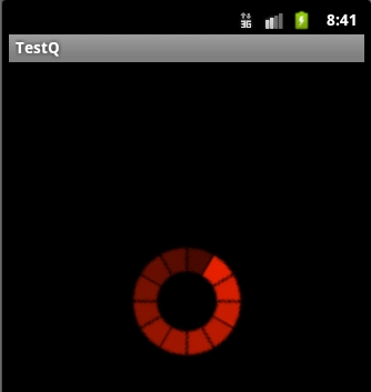
2.自定义图片资源文件iamge_progress.xml
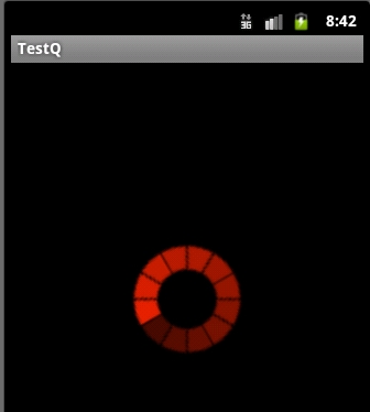
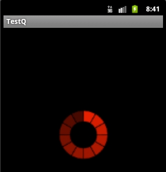
?1234567<?xmlversion="1.0"encoding="utf-8"?><animated-rotate xmlns:android="http://schemas.android.com/apk/res/android" android:drawable="@drawable/image_progress" android:pivotX="50%" android:pivotY="50%" />3.定义布局文件,progress.xml?1234567891011<?xmlversion="1.0"encoding="utf-8"?><LinearLayoutxmlns:android="http://schemas.android.com/apk/res/android"android:orientation="vertical"android:layout_width="fill_parent"android:layout_height="fill_parent"android:gravity="center"><ProgressBar android:indeterminateDrawable="@drawable/drawable_progress" android:layout_height="100dp" android:layout_width="100dp"/></LinearLayout> 运行效果如下:
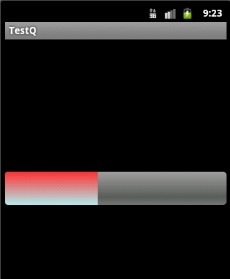
三》自定义渐变色进度条:
定义drawable资源文件color_progressbar.xml
?1234567891011121314151617181920212223242526272829303132333435363738<?xmlversion="1.0"encoding="utf-8"?><layer-listxmlns:android="http://schemas.android.com/apk/res/android"> <itemandroid:id="@android:id/background"> <shape> <cornersandroid:radius="5dip"/> <gradientandroid:startColor="#ff9d9e9d" android:centerColor="#ff5a5d5a" android:centerY="0.75" android:endColor="#ff747674" android:angle="270" /> </shape> </item> <itemandroid:id="@android:id/secondaryProgress"> <clip> <shape> <cornersandroid:radius="5dip"/> <gradientandroid:startColor="#80ffd300" android:centerColor="#80ffb600" android:centerY="0.75" android:endColor="#a0ffcb00" android:angle="270" /> </shape> </clip> </item> <itemandroid:id="@android:id/progress" > <clip> <shape> <cornersandroid:radius="5dip"/> <gradientandroid:startColor="#FF3030" android:endColor="#AEEEEE" android:angle="270"/> </shape> </clip> </item></layer-list>2.定义对应的不布局文件:progressbar.xml在此文件中引用我们定义的drawable资源配置文件?123456789101112<?xmlversion="1.0"encoding="utf-8"?><LinearLayoutxmlns:android="http://schemas.android.com/apk/res/android"android:orientation="vertical"android:layout_width="fill_parent"android:layout_height="fill_parent"android:gravity="center"><ProgressBar android:id="@+id/color_progressBar" android:indeterminateDrawable="@drawable/color_progress" android:layout_height="wrap_content" android:layout_width="match_parent"/></LinearLayout>或者在代码中给进度条设置自定义资源文件:
效果如下:
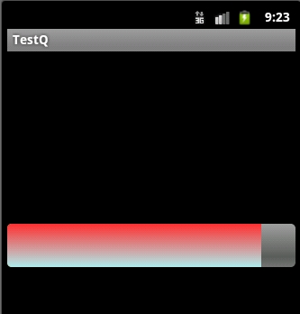
四:自定义progressbar颜色:
1.定义一个图片资源文件:
?1234567891011121314151617181920212223<?xmlversion="1.0"encoding="utf-8"?> <rotatexmlns:android="http://schemas.android.com/apk/res/android" android:fromDegrees="0" android:pivotX="50%" android:pivotY="50%" android:toDegrees="360"> <shape android:innerRadiusRatio="3" android:shape="ring" android:thicknessRatio="8" android:useLevel="false"> <gradient android:centerColor="#FFFFFF" android:centerY="0.50" android:endColor="#FFFF00" android:startColor="#000000" android:type="sweep" android:useLevel="false"/> </shape> </rotate>2.定义布局文件:?12345<ProgressBar android:id="@+id/color_progressBar2" android:indeterminateDrawable="@drawable/color_progress2" android:layout_height="wrap_content" android:layout_width="wrap_content"/>3.效果:
Android ProgressBar自定义图片进度,自定义渐变色进度条
java.lang.Object ↳ android.view.View ↳ android.widget.ProgressBar直接子类AbsSeekBar间接子类RatingBar, SeekBar在某些操作的进度中的可视指示器,为用户呈现操作的进度,还它有一个次要的进度条,用来显示中间进度,如在流媒体播放的缓冲区的进度。一个进度条也可不确定其进度。在不确定模式下,进度条显示循环动画。这种模式常用于应用程序使用任务的长度是未知的。进度条也就是一个表示运转的过程,例如发送短信,连接网络等等,表示一个过程正在执行中
1、android.widget. ProgressBar,继承自android.view.View 。在android.widget包中。对应对话框ProgressDialog。ProgressBar有两种展示方式,表盘形式(普通、小、大)和条形填充形式。在layout定义时,需要通过设施style属性类设置展示方式。
ProgressBar的样式有四种:
android:progressBarStyle:默认进度条样式,不确定模式
android:progressBarStyleHorizontal:水平进度条样式
android:progressBarStyleLarge :大号进度条样式,也是不确定进度模式
android:progressBarStyleSmall :小号进度条样式,也是不确定进度模式
二、XML重要属性
android:max-- 这事进度条长度最大值
android:progress--设定度条当前进度值
android:secondaryProgress--第二进度条进度值
android:progressBarStyle:默认进度条样式
android:progressBarStyleHorizontal:水平样式
style="?android:attr/progressBarStyleLarge" --- 属性风格类型--大圆圈,如下图
style=”?android:attr/progressBarStyleSmall”--- 属性风格类型--小圆圈,如下图:
style="?android:attr/progressBarStyleHorizontal" --水平进度条 --如下图:
几秒钟之后自动滚到到如下:
也可以用下面的形式代替上面的形式的:
<ProgressBarstyle="@android:style/Widget.ProgressBar.Inverse"/>//中<ProgressBarstyle="@android:style/Widget.ProgressBar.Large.Inverse"/> //大圆<ProgressBarstyle="@android:style/Widget.ProgressBar.Small.Inverse"/> //小圆三、重要方法
getMax():返回这个进度条的范围的上限
getProgress():返回当前进度值
getSecondaryProgress():返回次要当前进度值
incrementProgressBy(int diff):指定增加的进度--即步长
isIndeterminate():指示进度条是否在不确定模式下
setIndeterminate(boolean indeterminate):设置不确定模式下
setVisibility(int v):设置该进度条是否可视
四、重要事件
onSizeChanged(int w, int h, int oldw, int oldh):当进度值改变时引发此事件
接下来看案例:
1.定义一个布局文件progressbar.xml
<?xmlversion="1.0"encoding="utf-8"?><ScrollViewxmlns:android="http://schemas.android.com/apk/res/android" android:layout_width="fill_parent" android:layout_height="match_parent" > <LinearLayout android:layout_width="fill_parent" android:layout_height="match_parent" android:orientation="vertical"><TextView android:id="@+id/startText" android:layout_width="fill_parent" android:layout_height="wrap_content" android:text="垂直的----标题上面也有一个进度条哦" android:textColor="#CD0000" android:background="#BC8F8F" /> <!-- style=”?android:attr/progressBarStyleLarge”大圆圈 --> <ProgressBar android:id="@+id/progtessBer_btn_id1" android:layout_width="wrap_content" android:layout_height="wrap_content" style="?android:attr/progressBarStyleLarge" /> <!-- style=”?android:attr/progressBarStyleSmall”小圆圈 --> <ProgressBar android:layout_width="wrap_content" android:layout_height="wrap_content" style="?android:attr/progressBarStyleSmall" android:layout_gravity="center_horizontal" /> <TextView android:id="@+id/startText1" android:layout_width="fill_parent" android:layout_height="wrap_content" android:text="水平的" android:textColor="#aaaaaa" /> <!-- style="?android:attr/progressBarStyleHorizontal" 水平进度条 --> <ProgressBar android:id="@+id/progtessBer_btn_id2" android:layout_width="fill_parent" android:layout_height="wrap_content" style="?android:attr/progressBarStyleHorizontal" /> <TextView android:layout_width="fill_parent" android:layout_height="wrap_content" android:text="@string/progress_text" /> </LinearLayout></ScrollView>packagecom.dream.app.start.first.prograssbar;importcom.dream.app.start.MenuDemo;importcom.dream.app.start.R;importcom.dream.app.start.R.id;importcom.dream.app.start.R.layout;importcom.dream.app.start.utils.PublicClass;importandroid.app.Activity;importandroid.content.Intent;importandroid.os.Bundle;importandroid.os.Handler;importandroid.text.method.ScrollingMovementMethod;importandroid.view.View;importandroid.view.View.OnClickListener;importandroid.view.Window;importandroid.widget.AdapterView;importandroid.widget.AdapterView.OnItemClickListener;importandroid.widget.ArrayAdapter;importandroid.widget.Button;importandroid.widget.ListView;importandroid.widget.ProgressBar;importandroid.widget.TextView;importandroid.widget.Toast;publicclass ProgressBarDemo extendsPublicClass { privateProgressBar progressbar,progressbar_1; Button btn1,btn2; privateint prostatus=0; //创建一个handler对象 private Handler handler=newHandler(); @Override protectedvoid onCreate(Bundle savedInstanceState) { // TODO Auto-generated method stub super.onCreate(savedInstanceState); //在标题条里放置进度条。请求窗口特色风格,这里设置成不明确的进度风格 requestWindowFeature(Window.FEATURE_INDETERMINATE_PROGRESS); //设置窗口进度条特性风格// requestWindowFeature(Window.FEATURE_PROGRESS); setContentView(R.layout.progressbar); //设置标题栏中的不明确的进度条是否可以显示,当你需要表示处理中的时候设置为True,处理完毕后设置为false setProgressBarIndeterminateVisibility(true); //设置进度条进度值,要乘以100的// setProgress(60*100);// setSecondaryProgress(80*100); btn2=(Button)findViewById(R.id.button_cancel);// btn2.setOnClickListener(onClick); progressbar=(ProgressBar)findViewById(R.id.progtessBer_btn_id2); progressbar_1=(ProgressBar)findViewById(R.id.progtessBer_btn_id1); //设置进度条的最大值 progressbar.setMax(100000); progressbar_1.setMax(100000); //新开启一个进程 newThread(newRunnable() { @Override publicvoid run() { // 循环1000次,不断地更新prostatus状态值 while(prostatus++<100000) { //将一个Runnable对象添加到消息队列中去 //并且当执行该对象的时候,执行run handler.post(newRunnable() { @Override publicvoid run() { //重新设置进度条当前的值 progressbar.setProgress(prostatus); progressbar_1.setProgress(prostatus); } }); } } }).start(); }//toast方法 privatevoid toastshow(String str) { Toast.makeText(getApplicationContext(), str, Toast.LENGTH_SHORT).show(); }}运行效果如下:
二:用图片实现滚动效果:
1.添加图片到drawable下
2.自定义图片资源文件iamge_progress.xml
<?xmlversion="1.0"encoding="utf-8"?><animated-rotate xmlns:android="http://schemas.android.com/apk/res/android" android:drawable="@drawable/image_progress" android:pivotX="50%" android:pivotY="50%" /><?xmlversion="1.0"encoding="utf-8"?><LinearLayoutxmlns:android="http://schemas.android.com/apk/res/android"android:orientation="vertical"android:layout_width="fill_parent"android:layout_height="fill_parent"android:gravity="center"><ProgressBar android:indeterminateDrawable="@drawable/drawable_progress" android:layout_height="100dp" android:layout_width="100dp"/></LinearLayout>运行效果如下:
三》自定义渐变色进度条:
定义drawable资源文件color_progressbar.xml
<?xmlversion="1.0"encoding="utf-8"?><layer-listxmlns:android="http://schemas.android.com/apk/res/android"> <itemandroid:id="@android:id/background"> <shape> <cornersandroid:radius="5dip"/> <gradientandroid:startColor="#ff9d9e9d" android:centerColor="#ff5a5d5a" android:centerY="0.75" android:endColor="#ff747674" android:angle="270" /> </shape> </item> <itemandroid:id="@android:id/secondaryProgress"> <clip> <shape> <cornersandroid:radius="5dip"/> <gradientandroid:startColor="#80ffd300" android:centerColor="#80ffb600" android:centerY="0.75" android:endColor="#a0ffcb00" android:angle="270" /> </shape> </clip> </item> <itemandroid:id="@android:id/progress" > <clip> <shape> <cornersandroid:radius="5dip"/> <gradientandroid:startColor="#FF3030" android:endColor="#AEEEEE" android:angle="270"/> </shape> </clip> </item></layer-list><?xmlversion="1.0"encoding="utf-8"?><LinearLayoutxmlns:android="http://schemas.android.com/apk/res/android"android:orientation="vertical"android:layout_width="fill_parent"android:layout_height="fill_parent"android:gravity="center"><ProgressBar android:id="@+id/color_progressBar" android:indeterminateDrawable="@drawable/color_progress" android:layout_height="wrap_content" android:layout_width="match_parent"/></LinearLayout>或者在代码中给进度条设置自定义资源文件:
效果如下:
四:自定义progressbar颜色:
1.定义一个图片资源文件:
<?xmlversion="1.0"encoding="utf-8"?> <rotatexmlns:android="http://schemas.android.com/apk/res/android" android:fromDegrees="0" android:pivotX="50%" android:pivotY="50%" android:toDegrees="360"> <shape android:innerRadiusRatio="3" android:shape="ring" android:thicknessRatio="8" android:useLevel="false"> <gradient android:centerColor="#FFFFFF" android:centerY="0.50" android:endColor="#FFFF00" android:startColor="#000000" android:type="sweep" android:useLevel="false"/> </shape> </rotate><ProgressBar android:id="@+id/color_progressBar2" android:indeterminateDrawable="@drawable/color_progress2" android:layout_height="wrap_content" android:layout_width="wrap_content"/>
- Android ProgressBar自定义图片进度,自定义渐变色进度条
- Android ProgressBar自定义图片进度,自定义渐变色进度条
- Android ProgressBar自定义图片进度,自定义渐变色进度条
- Android ProgressBar自定义图片进度,自定义渐变色进度条
- Android ProgressBar自定义图片进度,自定义渐变色进度条
- Android ProgressBar自定义图片进度,自定义渐变色进度条
- Android ProgressBar自定义图片进度,自定义渐变色进度条
- Android ProgressBar自定义图片进度,自定义渐变色进度条
- Android ProgressBar自定义图片进度,自定义渐变色进度条
- Android ProgressBar自定义图片进度,自定义渐变色进度条
- Android ProgressBar自定义图片进度,自定义渐变色进度条
- Android ProgressBar自定义图片进度,自定义渐变色进度条
- Android ProgressBar自定义图片进度,自定义渐变色进度条
- Android ProgressBar自定义图片进度,自定义渐变色进度条
- Android ProgressBar自定义图片进度,自定义渐变色进度条
- Android ProgressBar自定义图片进度,自定义渐变色进度条
- Android自定义渐变色ProgressBar
- Android 自定义ProgressBar--进度自己设置图片
- 内联函数
- iOS开发陷阱之UITextField中文输入长度的限制
- 1002 搭桥-最小生成树 图论
- sizeof运算符的内存对齐问题
- Android文本输入框EditText属性和方法说明
- Android ProgressBar自定义图片进度,自定义渐变色进度条
- HDU5407 CRB and Candies
- Django连接SQL Server配置指引
- List集合按照对象中某个属性排序通用工具类(按对象中某属性排序)
- mmap函数用法及示例程序
- 虚拟机与主机不能ping通的解决方法
- 关于for循环遇到的一些错误
- 2015.08.29,今天开通CSDN博客了!
- Joison博客路之开启篇