sklearn 逻辑回归
来源:互联网 发布:jquery实现数据分页 编辑:程序博客网 时间:2024/05/22 09:00
This post looks into the problem of classification, a situation in which a response is a categorical variable. We will build upon the techniques that we previously discussed in the context of regression and show how they can be transferred to classification problems. This post introduces a number of classification techniques, and it will try to convey their corresponding strengths and weaknesses by visually inspecting the decision boundaries for each model.
This is part of a series of blog posts showing how to do common statistical learning techniques with Python. We provide only a small amount of background on the concepts and techniques we cover, so if you’d like a more thorough explanation check outIntroduction to Statistical Learning or sign up for the free online course run by the book’s authors here.
Scikit-learn
In this post we will use scikit-learn, an easy-to-use, general-purpose toolbox for machine learning in Python. We will use it extensively in the coming posts in this series so it’s worth spending some time to introduce it thoroughly.
Scikit-learn is a library that provides a variety of both supervised and unsupervised machine learning techniques. Supervised machine learning refers to the problem of inferring a function from labeled training data, and it comprises both regression and classification. Unsupervised machine learning, on the other hand, refers to the problem of finding interesting patterns or structure in the data; it comprises techniques such as clustering and dimensionality reduction. In addition to statistical learning techniques, scikit-learn provides utilities for common tasks such as model selection, feature extraction, and feature selection.
Scikit-learn provides an object-oriented interface centered around the concept of an Estimator. According to the scikit-learn tutorial “An estimator is any object that learns from data; it may be a classification, regression or clustering algorithm or a transformer that extracts/filters useful features from raw data.” The API of an estimator looks roughly as follows:
class Estimator(object): def fit(self, X, y=None): """Fits estimator to data. """ # set state of ``self`` return self def predict(self, X): """Predict response of ``X``. """ # compute predictions ``pred`` return predThe Estimator.fit method sets the state of the estimator based on the training data. Usually, the data is comprised of a two-dimensional numpy array X of shape (n_samples, n_predictors) that holds the so-called feature matrix and a one-dimensional numpy array y that holds the responses. Some estimators allow the user to control the fitting behavior. For example, the sklearn.linear_model.LinearRegression estimator allows the user to specify whether or not to fit an intercept term. This is done by setting the corresponding constructor arguments of the estimator object:
from sklearn.linear_model import LinearRegressionest = LinearRegression(fit_intercept=False)The docstring of the estimator shows you all available arguments – in IPython simply use LinearRegression? to view the docstring.
During the fitting process, the state of the estimator is stored in instance attributes that have a trailing underscore ('_'). For example, the coefficients of a LinearRegression estimator are stored in the attribute coef_:
import numpy as np# random training dataX = np.random.rand(10, 2)y = np.random.randint(2, size=10)est.fit(X, y)est.coef_ # access coefficientsEstimators that can generate predictions provide a Estimator.predict method. In the case of regression, Estimator.predictwill return the predicted regression values; it will return the corresponding class labels in the case of classification. Classifiers that can predict the probability of class membership have a method Estimator.predict_proba that returns a two-dimensional numpy array of shape (n_samples, n_classes) where the classes are lexicographically ordered.
Finally, there is a special type of Estimator called Transformer which transforms the input data — e.g. selects a subset of the features or extracts new features based on the original ones. In addition to a fit method, a Transformer object provides the following methods:
class Transformer(Estimator): def transform(self, X): """Transforms the input data. """ # transform ``X`` to ``X_prime`` return X_primeUsually, a Transformer does not provide a predict method, but in some cases it may. One transformer that we will use in this posting is sklearn.preprocessing.StandardScaler. This transformer centers each predictor in X to have zero mean and unit variance:
from sklearn.preprocessing import StandardScalerscaler = StandardScaler(copy=True) # always copy input data (don't modify in-place)X_centered = scaler.fit(X).transform(X)scaler.mean_ # mean that will be subtracted upon transformFor more information on scikit-learn please consult the detailed user guide or walk through the excellent tutorial.
Understanding Classification
Although regression and classification appear to be very different they are in fact similar problems.
In regression our predictions for the response are real-valued numbers; on the other hand, in classification the response is a mutually exclusive class label such as “Is the email spam/ham?” or “Is the credit card transaction fraudulent?”. If the number of classes is equal to two, then we call it a binary classification problem; if there are more than two classes, then we call it a multiclass classification problem. In the following we will assume binary classification because it’s the more general case, and — we can always represent a multiclass problem as a sequence of binary classification problems.
We can also think of classification as a function estimation problem where the function that we want to estimate separates the two classes. This is illustrated in the example below where our goal is to predict whether or not a credit card transaction is fraudulent — the dataset is provided by James et al., Introduction to Statistical Learning.
import pandas as pddf = pd.read_csv('https://d1pqsl2386xqi9.cloudfront.net/notebooks/Default.csv', index_col=0)# downsample negative cases -- there are many more negatives than positivesindices = np.where(df.default == 'No')[0]rng = np.random.RandomState(13)rng.shuffle(indices)n_pos = (df.default == 'Yes').sum()df = df.drop(df.index[indices[n_pos:]])df.head()On the left you can see a scatter plot where fraudulent cases are red dots and non-fraudulent cases are blue dots. A good separation seems to be a vertical line at around a balance of 1400 as indicated by the boxplots below.
from matplotlib import pyplot as pltfrom matplotlib.colors import ListedColormap%pylab inline# setup figureplt.figure(figsize=(10, 8))# scatter plot of balance (x) and income (y)ax1 = plt.subplot(221)cm_bright = ListedColormap(['#FF0000', '#0000FF'])ax1.scatter(df.balance, df.income, c=(df.default == 'Yes'), cmap=cm_bright) ax1.set_xlim((df.balance.min(), df.balance.max()))ax1.set_ylim((df.income.min(), df.income.max()))ax1.set_xlabel('balance')ax1.set_ylabel('income')ax1.legend(loc='upper right')# box plots for incomeax2 = plt.subplot(222)ax2.boxplot([df.income[df.default == 'Yes'], df.income[df.default == 'No']])ax2.set_ylim((df.income.min(), df.income.max()))ax2.set_xticklabels(('Yes', 'No'))ax2.set_ylabel('income')# box plots for balanceax3 = plt.subplot(223)ax3.boxplot([df.balance[df.default == 'Yes'], df.balance[df.default == 'No']], vert=0)ax3.set_xlim((df.balance.min(), df.balance.max()))ax3.set_yticklabels(('Yes', 'No'))ax3.set_xlabel('balance')plt.tight_layout()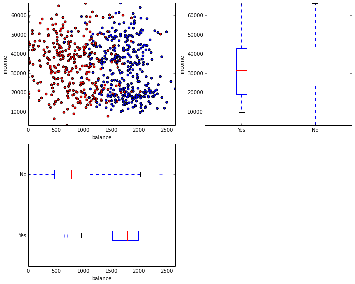
A simple approach to binary classification is to simply encode default as a numeric variable with 'Yes' == 1 and 'No' == -1; fit an Ordinary Least Squares regression model like we introduced in the last post; and use this model to predict the response as'Yes' if the regressed value is higher than 0.0 and 'No' otherwise. The points for which the regression model predicts 0.0 lie on the so-called decision surface — since we are using a linear regression model, the decision surface is linear as well.
The example below illustrates this. Note that we use the sklearn.linear_model.LinearRegression class in scikit-learn instead of the statsmodels.api.OLS class in statsmodels – they both implement the same procedure.
from sklearn.linear_model import LinearRegression# get feature/predictor matrix as numpy arrayX = df[['balance', 'income']].values# encode class labelsclasses, y = np.unique(df.default.values, return_inverse=True)y = (y * 2) - 1 # map {0, 1} to {-1, 1}# fit OLS regression est = LinearRegression(fit_intercept=True, normalize=True)est.fit(X, y)# plot data and decision surfaceax = plt.gca()ax.scatter(df.balance, df.income, c=(df.default == 'Yes'), cmap=cm_bright)try: plot_surface(est, X[:, 0], X[:, 1], ax=ax)except NameError: print('Please run cells in Appendix first')Points that lie on the left side of the decision boundary will be classified as negative; points on the right side, positive. The implementation of plot_surface can be found in the Appendix. We can asses the performance of the model by looking at theconfusion matrix — a cross tabulation of the actual and the predicted class labels. The correct classifications are shown in the diagonal of the confusion matrix. The off-diagonal terms show you the classification errors. A condensed summary of the model performance is given by the misclassification rate determined simply by dividing the number of errors by the total number of cases.
from sklearn.metrics import confusion_matrix as sk_confusion_matrix# the larger operator will return a boolean array which we will cast as integers for fancy indexingy_pred = (2 * (est.predict(X) > 0.0)) - 1def confusion_matrix(y_test, y_pred): cm = sk_confusion_matrix(y, y_pred) cm = pd.DataFrame(data=cm, columns=[-1, 1], index=[-1, 1]) cm.columns.name = 'Predicted label' cm.index.name = 'True label' error_rate = (y_pred != y).mean() print('error rate: %.2f' % error_rate) return cmconfusion_matrix(y, y_pred)In the above example we are assessing the model performance on the same data that we used to fit the model. This might be a biased estimate of the models performance, for a classifier that simply memorizes the training data has zero training error but would be totally useless to make predictions. It is much better to assess the model performance on a separate dataset called the test data or held-out data. Scikit-learn provides a number of ways to compute such held-out estimates of the model performance. One way is to simply split the data into a training and testing set.
from sklearn.cross_validation import train_test_split# create 80%-20% train-test splitX_train, X_test, y_train, y_test = train_test_split(X, y, test_size=0.2)# fit on training dataest = LinearRegression().fit(X_train, y_train)# test on data that was not used for fittingy_pred = (2 * (est.predict(X) > 0.0)) - 1confusion_matrix(y_test, y_pred)Classification Techniques
Different classification techniques can often be compared using the type of decision surface they can learn. The decision surfaces describe for what values of the predictors the model changes its predictions and it can take several different shapes: piece-wise constant, linear, quadratic, vornoi tessellation, …
This section will introduce three popular classification techniques: Logistic Regression, Discriminant Analysis, and Nearest Neighbor. We will investigate what their strengths and weaknesses are by looking at the decision boundaries they can model. In the following we will use three synthetic datasets that we adopted from this scikit-learn example.
# Adopted from: Gael Varoqueux# Andreas Muellerfrom collections import OrderedDictfrom sklearn.preprocessing import StandardScalerfrom sklearn.datasets import make_moons, make_circles, make_classification# generate 3 synthetic datasetsX, y = make_classification(n_features=2, n_redundant=0, n_informative=2, random_state=1, n_clusters_per_class=1)rng = np.random.RandomState(2)X += 2 * rng.uniform(size=X.shape)linearly_separable = (X, y)datasets = OrderedDict()for name, (X, y) in [('moon', make_moons(noise=0.3, random_state=0)), ('circles', make_circles(noise=0.2, factor=0.5, random_state=1)), ('linear', linearly_separable)]: X_train, X_test, y_train, y_test = train_test_split(X, y, test_size=.4, random_state=1) # standardize data scaler = StandardScaler().fit(X_train) datasets[name] = {'X_train': scaler.transform(X_train), 'y_train': y_train, 'X_test': scaler.transform(X_test), 'y_test': y_test}# plots the datasets - see Appendixplot_datasets()The task in each of the above examples is to separate the red from the blue points. Testing data points are plotted in lighter color. The left example contains two intertwined moon sickles; the middle example is a circle of blues framed by a ring of reds; and the right example shows two linearly separable gaussian blobs.
Logistic Regression
Logistic regression can be viewed as an extension of linear regression to classification problems. One of the limitations of linear regression is that it cannot provide class probability estimates. This is often useful, for example, when we want to inspect manually the most fraudulent cases. Basically, we would like to constrain the predictions of the model to the range \([0, 1]\) so that we can interpret them as probability estimates. In Logistic Regression, we use the logit function to clamp predictions from the range \([-\infty, \infty]\) to \([0, 1]\):
x = np.linspace(-10, 10, 100)y = 1.0 / (1.0 + np.exp(-x))plt.plot(x, y, 'r-', label='logit')plt.legend(loc='lower right')Logistic regression is available in scikit-learn via the class sklearn.linear_model.LogisticRegression. It uses liblinear, so it can be used for problems involving millions of samples and hundred of thousands of predictors. Lets see how Logistic Regression does on our three toy datasets:
from sklearn.linear_model import LogisticRegressionest = LogisticRegression()plot_datasets(est)As we can see, a linear decision boundary is not a poor approximation for the moon datasets, although we fail to separate the two tips of the sickles in the center. The cicles dataset, on the other hand, is not well suited for a linear decision boundary. The error rate of \(0.68\) is in fact worse than random guessing. For the linear dataset we picked in fact the correct model class — the error rate of 10% is due to the noise component in our data. The gradient shows you the probability of class membership — white shows you that the model is very uncertain about its prediction.
Linear Discriminant Analysis
Linear discriminant Analysis (LDA) is another popular technique which shares some similarities with LogisticRegression. LDA too finds linear boundary between the two classes where points on side are classified as one class and those on the other as classified as the other class.
from sklearn.lda import LDAest = LDA()plot_datasets(est)The major difference between LDA and LogisticRegression is the way each picks the linear decision boundary: Linear Discriminant Analysis models the decision boundary by making distributional assumptions about the data generating process while Logistic Regression models the probability of a sample being member of a class given its feature values.
Nearest Neighbor
Nearest Neighbor uses the notion of similarity to assign class labels; it is based on the smoothness assumption that points which are nearby in input space should have similar outputs. It does this by specifying a similarity (or distance) metric, and at prediction time it simply searches for the k most similar among the training examples to a given test example. The prediction is then either a majority vote of those k training examples or a vote weighted by similarity. The parameter k specifies the smoothness of the decision surface. The decision surface of a k-nearest neighbor classifier can be illustrated by the Voronoi tesselation of the training data, that show you the regions of constant respones.
Yet Nearest Neighbor differs fundamentally from the above models in that it is a so-called non-parametric technique: the number of parameters of the model can grow infinitely as the size of the training data grows. Furthermore, it can model non-linear decision boundaries, something that is important for the first two datasets: moons and circles.
from sklearn.neighbors import KNeighborsClassifierest = KNeighborsClassifier(n_neighbors=1)plot_datasets(est)If we increase k we enforce the smoothness assumption. This can be seen by comparing the decision boundaries in the plots below where k=5 to those above where k=1.
est = KNeighborsClassifier(n_neighbors=5)plot_datasets(est)- sklearn 逻辑回归
- Sklearn-LogisticRegression逻辑回归
- 逻辑回归--sklearn基本使用
- 调用sklearn实现逻辑回归
- 逻辑回归--sklearn基本使用
- 机器学习-sklearn逻辑回归分析
- sklearn中逻辑回归参数调整
- (sklearn)逻辑回归linear_model.LogisticRegression用法
- sklearn逻辑回归(Logistic Regression,LR)类库使用小结
- 【机器学习 sklearn】逻辑斯蒂回归模型--Logistics regression
- python sklearn-04:逻辑回归及其效果评估
- sklearn(scikit-learn) logistic regression loss(cost) function(sklearn中逻辑回归的损失函数)
- 机器学习之逻辑回归和softmax回归及sklearn和tensorflow代码示例
- 机器学习逻辑回归模型总结——从原理到sklearn实践
- 逻辑斯蒂回归(LogisticRegression)sklearn的一个例子中文解释
- 机器学习教程之3-逻辑回归(logistic regression)的sklearn实现
- sklearn 数据加载,数据归一,特征选择,逻辑回归,贝叶斯,k近邻,决策树,SVM
- 机器学习逻辑回归模型总结——从原理到sklearn实践
- 【more effective c++读书笔记】【第5章】技术(5)——Reference counting(引用计数)(1)
- Spring事务管理
- UVA-230 图书管理系统
- Android中Acition和Category常量表
- VC中RichEdit 控件的使用
- sklearn 逻辑回归
- android RecyclerView的基本介绍及用法(一)
- 大一新生的开学日记
- SOAPUI系列12- 使用 SOAPUI 执行负载测试
- Java序列化与反序列化
- 杭电OJ 1102(Constructing Roads)解题报告
- overlay网络技术之VXLAN详解
- MySQL数据丢失讨论
- NET使用了UpdatePanel后如何弹出对话框!