Matplotlib - bar,scatter and histogram plots
来源:互联网 发布:wpsoffice软件下载 编辑:程序博客网 时间:2024/06/02 04:06
Matplotlib - bar,scatter and histogram plots
- Simple bar plot
- Another bar plot
- Scatter plot
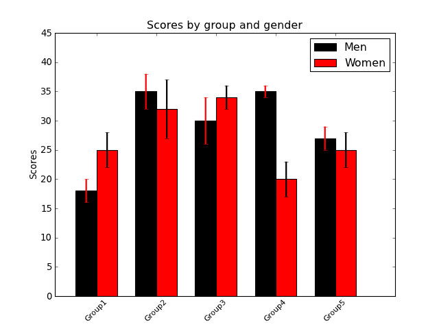
Simple bar plot
import numpy as npimport matplotlib.pyplot as pltfig = plt.figure()ax = fig.add_subplot(111)## the dataN = 5menMeans = [18, 35, 30, 35, 27]menStd = [2, 3, 4, 1, 2]womenMeans = [25, 32, 34, 20, 25]womenStd = [3, 5, 2, 3, 3]## necessary variablesind = np.arange(N) # the x locations for the groupswidth = 0.35 # the width of the bars## the barsrects1 = ax.bar(ind, menMeans, width, color='black', yerr=menStd, error_kw=dict(elinewidth=2,ecolor='red'))rects2 = ax.bar(ind+width, womenMeans, width, color='red', yerr=womenStd, error_kw=dict(elinewidth=2,ecolor='black'))# axes and labelsax.set_xlim(-width,len(ind)+width)ax.set_ylim(0,45)ax.set_ylabel('Scores')ax.set_title('Scores by group and gender')xTickMarks = ['Group'+str(i) for i in range(1,6)]ax.set_xticks(ind+width)xtickNames = ax.set_xticklabels(xTickMarks)plt.setp(xtickNames, rotation=45, fontsize=10)## add a legendax.legend( (rects1[0], rects2[0]), ('Men', 'Women') )plt.show()(Source code, png, hires.png, pdf)
Another bar plot
from mpl_toolkits.mplot3d import Axes3Dimport matplotlib.pyplot as pltimport numpy as npfig = plt.figure()ax = fig.add_subplot(111,projection='3d')for c, z in zip(['r', 'g', 'b', 'y'], [30, 20, 10, 0]): xs = np.arange(20) ys = np.random.rand(20) # You can provide either a single color or an array. To demonstrate this, # the first bar of each set will be colored cyan. cs = [c] * len(xs) cs[0] = 'c' ax.bar(xs, ys, zs=z, zdir='y', color=cs, alpha=0.8)ax.set_xlabel('X')ax.set_ylabel('Y')ax.set_zlabel('Z')plt.show()(Source code, png, hires.png, pdf)

Scatter plot
#!/usr/bin/env pythonimport matplotlib.pyplot as pltimport numpy as npfig = plt.figure()ax1 = fig.add_subplot(121)## the dataN=1000x = np.random.randn(N)y = np.random.randn(N)## left panelax1.scatter(x,y,color='blue',s=5,edgecolor='none')ax1.set_aspect(1./ax1.get_data_ratio()) # make axes square## right panelax2 = fig.add_subplot(122)props = dict(alpha=0.5, edgecolors='none' )handles = []colors = ['blue', 'green', 'magenta', 'cyan']for color in colors: x = np.random.randn(N) y = np.random.randn(N) s = np.random.randint(50,200) handles.append(ax2.scatter(x, y, c=color, s=s, **props))ax2.set_ylim([-5,11])ax2.set_xlim([-5,11])ax2.legend(handles, colors)ax2.grid(True)ax2.set_aspect(1./ax2.get_data_ratio())plt.show()(Source code, png, hires.png, pdf)

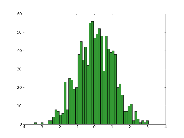
Histogram plot
Here is the matplotlib histogram demo
import numpy as npimport matplotlib.pyplot as pltfig = plt.figure()ax = fig.add_subplot(111)x = np.random.normal(0,1,1000)numBins = 50ax.hist(x,numBins,color='green',alpha=0.8)plt.show()(Source code, png, hires.png, pdf)
0 0
- Matplotlib - bar,scatter and histogram plots
- python_使用matplotlib画柱状图(bar),散点图(scatter)
- python_使用matplotlib画柱状图(bar),散点图(scatter)
- python_使用matplotlib画柱状图(bar),散点图(scatter)
- scatter plots smooth算法 lowess
- Matplotlib中的scatter函数
- matplotlib scatter 散点图
- matplotlib scatter( ) 绘制散点图
- matplotlib : axes.scatter
- R语言----绘图学习笔记之Scatter plots
- R语言----绘图学习笔记之Scatter plots
- Draw Line and Bar Chart with Matplotlib 画线和图表
- scatter 基本用法 python matplotlib
- Python 中用 matplotlib 画散列点 (Scatter)
- Python 中用 matplotlib 画散列点 (Scatter)
- matplotlib基础——matplotlib.pyplot.scatter
- Matplotlib: Stacked Bar Graphs
- matplotlib bar 柱状图
- uint8_t 头文件为#include<stdint.h>
- leedcode: Course Schedule
- Galaxy Zoo Challenge解决方案小结
- poj3734
- [PAT (Advanced Level) ]1011. World Cup Betting 解题文档
- Matplotlib - bar,scatter and histogram plots
- Js中获取超链接里面传递的参数值
- OBJ文件格式
- java
- AsyncTask的用法
- JAVA常见设计模式
- Tomcat配置
- @Autowired @Resource @Qualifier的区别
- python下载文件