Drawable 吐血总结
来源:互联网 发布:富饶之城网络版本 编辑:程序博客网 时间:2024/04/28 13:25
一.Drawable简介
Drawable是对可绘制物件的一般抽象,表示一种图像的概念,在实际开发中常被当做View的背景或者ImageView的图像,一般用xml来构建。(与View不同,没有事件和交互方法)
一般情况下,除了直接使用放在Drawable下的图片,其实的Drawable的用法都和xml相关,我们可以使用shape、layer-list等标签绘制一些背景,还可以通过selector标签定义View的状态的效果等。当然了基本每个标签都对应于一个真正的实体类,关系如下:(图片来自:Cyril Mottier :master_android_drawables)

二.Drawable优势
他使用简单,比自定义VIew的成本要低;其次,非图片类型的Drawable占用的空间较小,可以减小apk大小。
三.Drawable的分类
BitmapDrawable,ShapeDrawable,LayerDrawable,StateListDrawable,Levels,NinePatch,Scale,自定义
四.Drawable原理
setBounds()画在那里由附属View决定 draw(Canvas canvas)
五.自定义Drawable
圆角图片:
public class RoundRectImageDrawable extends Drawable { private Paint mPaint; private Bitmap mBitmap; private RectF rectF; public RoundRectImageDrawable(Bitmap bitmap) { mBitmap = bitmap;
//着色器 若图片过小使用拉伸形式在x,y上扩展 BitmapShader bitmapShader = new BitmapShader(bitmap, Shader.TileMode.CLAMP, Shader.TileMode.CLAMP); mPaint = new Paint(); mPaint.setAntiAlias(true);//抗锯齿 mPaint.setShader(bitmapShader); rectF = new RectF(0, 0, bitmap.getWidth(), bitmap.getHeight()); } @Override public void setBounds(int left, int top, int right, int bottom) { super.setBounds(left, top, right, bottom); rectF = new RectF(left, top, right, bottom); } @Override public void draw(Canvas canvas) {
//在30,30位置为圆心的圆弧 canvas.drawRoundRect(rectF, 30, 30, mPaint); } @Override public int getIntrinsicWidth() { return mBitmap.getWidth(); } @Override public int getIntrinsicHeight() { return mBitmap.getHeight(); } @Override public void setAlpha(int alpha) { mPaint.setAlpha(alpha); } @Override public void setColorFilter(ColorFilter cf) { mPaint.setColorFilter(cf); } @Override public int getOpacity() { return PixelFormat.TRANSLUCENT; }}
圆形图片:
public class CircleImageDrawable extends Drawable { private Paint mPaint; private int mWidth; private Bitmap mBitmap; private RectF rectF; public CircleImageDrawable(Bitmap bitmap) { mBitmap = bitmap; BitmapShader bitmapShader = new BitmapShader(bitmap, Shader.TileMode.CLAMP, Shader.TileMode.CLAMP); mPaint = new Paint(); mPaint.setAntiAlias(true); mPaint.setShader(bitmapShader); rectF = new RectF(0, 0, bitmap.getWidth(), bitmap.getHeight()); mWidth = Math.min(mBitmap.getWidth(), mBitmap.getHeight()); } @Override public void draw(Canvas canvas) { canvas.drawCircle(rectF.left+mWidth / 2, rectF.top+mWidth / 2, mWidth / 2, mPaint); } @Override public void setBounds(int left, int top, int right, int bottom) { super.setBounds(left, top, right, bottom); rectF = new RectF(left, top, right, bottom); mWidth = (int)Math.min(rectF.width(), rectF.height()); } @Override public int getIntrinsicWidth() { return mWidth; } @Override public int getIntrinsicHeight() { return mWidth; } @Override public void setAlpha(int alpha) { mPaint.setAlpha(alpha); } @Override public void setColorFilter(ColorFilter cf) { mPaint.setColorFilter(cf); } @Override public int getOpacity() { return PixelFormat.TRANSLUCENT; }}Drawable使用方法:
( (ImageView)findViewById(R.id.pic1)).setImageDrawable(new RoundRectImageDrawable(bitmap));( (ImageView)findViewById(R.id.pic2)).setImageDrawable(new CircleImageDrawable(bitmap));BitmapDrawable 表达一张图片
android:src 图片的资源id。
android:antialias抗锯齿。
android:dither是否开启抖动效果。让高质量的图片在低质量的屏幕上还能保持较好的显示效果
android:filter当图片被拉伸或者压缩时,开启过滤效果可以保持较好的显示效果。
android:gravity 当图片小于容器尺寸时,可以对图片进行定位。
android:tileMode平铺模式,默认关闭平铺模式disable.repeat表示的简单水平和竖直方向上的平铺效果,
mirror:表示在水平和竖直方向上呈现镜面投影。clamp 图片四周的像素会扩散到周围。
ShapeDrawable 通过颜色来构造图形
Shape类型详解:
Shape类型用来绘制几何图形,易用而轻量化。
Shape通常用xml文件方式使用,存放在drawable目录下
Shape原理:
draw(Canvas canvas,Paint paint)画Shape
onResize(float width,float height) 设置大小
Shape类型:
使用xml:
RectShape:矩形,直角矩形,圆角矩形
Ring,Line:环形,线行(xml)
OvalShape:椭圆形,圆形
只能使用代码:
PathShape:线形,环形
ArcShape:弧形
Shape的通用类型
图形的形状有四个选项:
android:shape:[rectangle(default),oval,line,ring]
另外oval,line必须通过<stroke>标签来指定线的宽度跟颜色信息。
ring的额外属性:
innerRadius:圆环的内半径。
thickness:圆环的厚度,若与thicknessRatio同时存在,以thickness为准。
innerRadiusRatio:内半径占整个drawable的宽度的比例,默认9。
thicknessRatio:厚度占整个drawable的宽度的比例,默认3。
useLevel:一般都应该使用false,否则有可能无法达到预期的显示效果,除非他被当做LevelLisDrawable来使用。
android:corners:圆角半径
int:radius 为四个角同时设定相同的角度,优先级低,会被单独设置的值取代,
单独设置: topLeftRadius,topRight......。
android:gradient:渐变
他与<solid>标签相互排斥,solid表示纯色。
angle:渐变的角度,默认为0,其值必须为45的整数倍,0表示从左到右,90从上到下。
centerX,Y:渐变中心的坐标
startColor centerColor endColor
type:linear 线行渐变 radial 径向渐变 sweep 扫描线渐变
gradientRadius:渐变半径,仅当type="radial"有效
android:solid :纯色填充
color:填充色
android:stroke Shape描边
width:描边的宽度
color:描边的颜色
dashWidth:虚线线段的宽度
dashGap:虚线线段的间隔
android:padding :包含他的View的空白
android:size: 设置ShapeDrawable的固有宽高,但作为View的背景,Shape还是会被拉伸或者缩小为View的大小。
eg:
A:
<shape xmlns:android="http://schemas.android.com/apk/res/android" android:shape="rectangle"> <corners android:radius="10dp" /> <solid android:color="#ff00ff" /> <padding android:bottom="8dp" android:left="8dp" android:right="8dp" android:top="8dp" /> <size android:width="100dp" android:height="100dp" /> <stroke android:width="4dp" android:color="@android:color/darker_gray" android:dashGap="4dp" android:dashWidth="40dp" /></shape>
<shape xmlns:android="http://schemas.android.com/apk/res/android" android:shape="oval"> <padding android:bottom="2dp" android:left="2dp" android:right="2dp" android:top="2dp" /> <corners android:radius="10dp" /> <size android:width="200dp" android:height="200dp" /> <gradient android:angle="0" android:centerColor="#00ff00" android:centerX="0.5" android:centerY="0.5" android:endColor="#0000ff" android:gradientRadius="100dp" android:startColor="#ff0000" android:type="radial" /></shape>
C:
<shape xmlns:android="http://schemas.android.com/apk/res/android" android:shape="line"> <solid android:color="#ff00ff" /> <padding android:bottom="2dp" android:left="2dp" android:right="2dp" android:top="2dp" /> <corners android:radius="10dp" /> <size android:height="20dp" /> <stroke android:width="8dp" android:color="#88000000" android:dashGap="4dp" android:dashWidth="20dp" /></shape>
xml文件只能显示横线
具体应用情况:把layerType设置为software才能显示虚线.
<ImageView android:layout_width="match_parent" android:layout_height="wrap_content" android:layerType="software" android:src="@drawable/line" />
Shape对象放入ShapeDrawable,ShapeDrawable设定画笔的风格
使用代码实现:环形
final ImageView oval=(ImageView) findViewById(R.id.oval); oval.setOnClickListener(new View.OnClickListener() { @Override public void onClick(View v) { oval.setImageResource(R.drawable.oval2); } }); shapeDrawable=new ShapeDrawable(); Path path = new Path(); path.moveTo(50, 0); path.lineTo(0, 50); path.lineTo(50, 100); path.lineTo(100, 50); path.lineTo(50, 0); path.close(); PathShape pathShape = new PathShape(path, 100, 100); shapeDrawable = new ShapeDrawable(pathShape); shapeDrawable.getPaint().setStyle(Paint.Style.FILL); shapeDrawable.getPaint().setColor(Color.BLUE); ((ImageView)findViewById(R.id.path)).setBackground(shapeDrawable);弧形
arcShape=new ArcShape(180,-270); shapeDrawable = new ShapeDrawable(arcShape); shapeDrawable.setBounds(0, 0, 100, 150); shapeDrawable.getPaint().setStrokeWidth(10); shapeDrawable.getPaint().setStyle(Paint.Style.STROKE); shapeDrawable.getPaint().setColor(Color.GREEN);((ImageView)findViewById(R.id.arc)).setBackground(shapeDrawable);LayerDrawable 一种层次化的drawable集合
对应xml标签是<layer-list>,通过将不同的drawable放置在不同的层上面从而达到一种叠加后的效果。
<?xml version="1.0" encoding="utf-8"?><layer-list xmlns:android="http://schemas.android.com/apk/res/android"> <item> <shape android:shape="rectangle"> <solid android:color="#0ac39e"></solid> </shape> </item> <item android:top="1dp" android:bottom="1dp" android:left="1dp" android:right="1dp" android:drawable="@drawable/eve"> <shape android:shape="rectangle"> <solid android:color="#ffffff"></solid> </shape> </item></layer-list>
StateListDrawable 表示Drawable集合
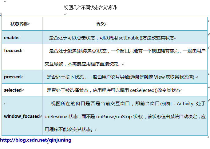
每一个drawable对应view的一种状态,Android框架为View定义了四种不同的状态,这些状态值的改变会引发View相关操作,例如:更换背景图片、是否触发点击事件等; 视图几种不同状态含义见下图:
其中selected和focused的区别有如下几点:
1,我们通过查看setSelected()方法,来获取相关信息。
SDK中对setSelected()方法----对于与selected状态有如下说明:
public void setSelected (boolean selected)
Since: APILevel 1
Changes the selection state of this view. Aview can be selected or not. Note that selection is not the same as
focus. Views are typically selected in the context of an AdapterView like ListView or GridView ;the selected view is
the view that is highlighted.
Parameters selected true if the view must be selected, false otherwise
由以上可知:selected不同于focus状态,通常在AdapterView类群下例如ListView或者GridView会使某个View处于
selected状态,并且获得该状态的View处于高亮状态。
2、一个窗口只能有一个视图获得焦点(focus),而一个窗口可以有多个视图处于”selected”状态中。
总结:focused状态一般是由按键操作引起的;
pressed状态是由触摸消息引起的;
selected则完全是由应用程序主动调用setSelected()进行控制。
例如:当我们触摸某个控件时,会导致pressed状态改变;获得焦点时,会导致focus状态变化。于是,我们可以通过这种
更新后状态值去更新我们对应的Drawable对象了。
使用:
系统会根据View当前的状态从selector中选择对应的item,每个item对应着一个具体的drawable,系统按照从上到下的顺序查找,直至插糟到第一条匹配的item。
- <?xml version="1.0" encoding="utf-8" ?>
- <selector xmlns:android="http://schemas.android.com/apk/res/android">
- <!-- 触摸时并且当前窗口处于交互状态 -->
- <item android:state_pressed="true" android:state_window_focused="true" android:drawable= "@drawable/pic1" />
- <!-- 触摸时并且没有获得焦点状态 -->
- <item android:state_pressed="true" android:state_focused="false" android:drawable="@drawable/pic2" />
- <!--选中时的图片背景-->
- <item android:state_selected="true" android:drawable="@drawable/pic3" />
- <!--获得焦点时的图片背景-->
- <item android:state_focused="true" android:drawable="@drawable/pic4" />
- <!-- 窗口没有处于交互时的背景图片 -->
- <item android:drawable="@drawable/pic5" />
- </selector>
selector作为color资源时,item指定android:color属性,并放与color目录下
<selector xmlns:android="http://schemas.android.com/apk/res/android" > <item android:color="#0000ff" android:state_pressed="true" /> <item android:color="#ff0000" android:state_checked="true" /> <item android:color="#00ffff" android:state_selected="true" /> <item android:color="#ffff00" android:state_activated="true" /> <item android:color="#00ff00" android:state_checked="false" /> <item android:color="#ff00ff" /></selector>
android:drawable也可以引用@color颜色值
<selector xmlns:android="http://schemas.android.com/apk/res/android" > <!-- 当前窗口失去焦点时 --> <item android:color="#ff0000" android:state_window_focused="false" /> <!-- 不可用时 --> <item android:color="#00ff00" android:state_enabled="false" /> <!-- 按压时 --> <item android:color="#0000ff" android:state_pressed="true" /> <!-- 被选中时 --> <item android:color="#00ffff" android:state_selected="true" /> <!-- 被激活时 --> <item android:color="#ffff00" android:state_activated="true" /> <!-- 默认时 --> <item android:color="#ff00ff" /></selector>在ListView的Item里设置StateIistDrawable有两个地方,人选其一:
andriod:listSelector,但默认背景是透明的。
itemView里设置android:background
<LinearLayout xmlns:android="http://schemas.android.com/apk/res/android" xmlns:tools="http://schemas.android.com/tools" android:layout_width="match_parent" android:layout_height="wrap_content" android:background="@drawable/statedrawable" android:descendantFocusability="blocksDescendants" android:paddingBottom="@dimen/activity_vertical_margin" android:paddingLeft="@dimen/activity_horizontal_margin" android:paddingRight="@dimen/activity_horizontal_margin" android:paddingTop="@dimen/activity_vertical_margin">statedrawable.xml
<selector xmlns:android="http://schemas.android.com/apk/res/android" android:enterFadeDuration="1000" android:exitFadeDuration="1000" > <item android:drawable="@drawable/rect90" android:state_pressed="true" /> <item android:drawable="@drawable/rect0" android:state_pressed="false" /> <item android:drawable="@drawable/rect315" /></selector>
先更到这
- Drawable 吐血总结
- caffe安装吐血总结
- 素数算法吐血总结
- 常用排序算法吐血总结
- Zookeeper 客户端源码吐血总结
- win7安装theano吐血总结
- 吐血
- 吐血
- sfilter动态加解密吐血总结
- sfilter动态加解密吐血总结
- sfilter动态加解密吐血总结
- 系统性能调优吐血总结分享
- 吐血总结:HOG特征+SVM训练过程
- 程序大全,吐血总结,围板必究,哈哈
- Python2 新手 编码问题 吐血总结
- Mac实用软件及功能吐血总结
- Java多线程学习(吐血超详细总结 )
- android Drawable 学习总结
- iPhone iOS 设备如何 取消 信任此电脑
- 多字节字符串<===>宽字符串
- 【Android Studio快捷键】之代码提示
- pyqt5 学习
- Java中的堆和栈的区别
- Drawable 吐血总结
- Myeclipse项目名改了tomcat访问链接失效
- android数据存储
- BeagleboneBack 从零开始系列之一(前期准备)
- 基于ASP.NET的微信开发心得体会(二)
- 好玩的js特效
- Android32_ExpandableListView、AutoCompleteTextView、ToggleButton
- linode VPS购买及使用教程
- mysql navicat导出csv