Android初学习 - 4.0以后支持的Switch按钮
来源:互联网 发布:小学英语软件哪个好 编辑:程序博客网 时间:2024/05/22 06:22
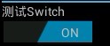
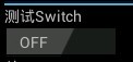
在android4.0里面,添加了一个和这个类似的控件:Switch,很形象,开关。效果图如下:
~T)6)A9QV.jpg)
其类关系图如下:
类的概述:
Switch是一个可以在两种状态切换的开关控件。用户可以拖动"thumb"来回选择,也可以像选择复选框一样点击切换Switch的状态。
主要方法:
Drawable.jumpToCurrentState() on all Drawable objects associated with this view.Measure the view and its content to determine the measured width and the measured height.
dispatchPopulateAccessibilityEvent(AccessibilityEvent) Changes the checked state of this button.
在TextView中的源码:
jumpDrawableToCurrentState():在与Switch相关的Drawable操作时调用 Drawable.jumpToCurrentState()这个方法。
- public int getCompoundDrawablePadding() {
- final Drawables dr = mDrawables;
- return dr != null ? dr.mDrawablePadding : 0;
- }
getTextOff()、getTextOn()、 setTextOff()、setTextOn()这四个方法比较简单,就是设定和获取非选中和选中状态下的文本值。
onMeasure():测量控件宽高,供绘图时使用。
onTouchEvent(MotionEvent ev)实现这一方法传递触摸屏运动事件。
setChecked()设置Switch的状态(选中,非选中)
setSwitchTextAppearance()设置字体大小
setSwitchTextTypefaces设置字体格式
google官方在/frameworks/base/core/res/res/values/styles.xml的一个定义:
- <style name="Widget.Holo.CompoundButton.Switch">
- <item name="android:track">@android:drawable/switch_track_holo_dark</item>
- <item name="android:thumb">@android:drawable/switch_inner_holo_dark</item>
- <item name="android:switchTextAppearance">@android:style/TextAppearance.Holo.Widget.Switch</item>
- <item name="android:textOn">@android:string/capital_on</item>
- <item name="android:textOff">@android:string/capital_off</item>
- <item name="android:thumbTextPadding">12dip</item>
- <item name="android:switchMinWidth">96dip</item>
- <item name="android:switchPadding">16dip</item>
- </style>
可以在main.xml中这样定义:
- <Switch
- android:id="@+id/demo_switch"
- android:layout_width="wrap_content"
- android:layout_height="wrap_content"
- android:layout_below="@+id/textView"
- android:textOn="开"
- android:textOff="关"
- />
当Switch状态切换时:
- mSwitch.setOnCheckedChangeListener(new OnCheckedChangeListener() {
- @Override
- public void onCheckedChanged(CompoundButton buttonView, boolean isChecked) {
- if(isChecked) {
- //选中时 do some thing
- statusText.setText("开");
- } else {
- //非选中时 do some thing
- statusText.setText("关");
- }
- }
- });
/////////////////////////////////////////////////////////////////////////////////////////////////////////////////////////////////////
google官方在/frameworks/base/core/res/res/values/styles.xml的一个定义:
- <style name="Widget.Holo.CompoundButton.Switch">
- <item name="android:track">@android:drawable/switch_track_holo_dark</item>
- <item name="android:thumb">@android:drawable/switch_inner_holo_dark</item>
- <item name="android:switchTextAppearance">@android:style/TextAppearance.Holo.Widget.Switch</item>
- <item name="android:textOn">@android:string/capital_on</item>
- <item name="android:textOff">@android:string/capital_off</item>
- <item name="android:thumbTextPadding">12dip</item>
- <item name="android:switchMinWidth">96dip</item>
- <item name="android:switchPadding">16dip</item>
- </style>
- 顶
- 0
- Android初学习 - 4.0以后支持的Switch按钮
- Android初学习 - 4.0以后支持的Switch按钮
- Android 自定义Switch开关按钮的样式
- Android中用switch区分点击是哪个按钮的写法
- java switch支持的数据类型
- switch支持的常量类型
- java switch支持的数据类型
- java switch支持的数据类型
- java switch支持的数据类型
- switch 对 String 的支持
- switch参数支持的类型
- switch case支持的类型
- Android 自定义实现switch开关按钮
- Android 自定义实现switch开关按钮
- Android 自定义实现switch开关按钮
- Android 自定义实现switch开关按钮
- Android 自定义实现switch开关按钮
- Android自定义Vview实现switch按钮
- shell命令-read
- 问题 H: 省赛专用题(8)
- Android Button可同时设置图片跟文字
- MPMoviePlayerController 网络视频加载
- android学习路线:如何成长为高级工程师
- Android初学习 - 4.0以后支持的Switch按钮
- 《CSS权威指南》读书笔记
- 177 - Nth Highest Salary
- maven跳过测试命令
- 贝塞尔曲线制作跳跃轨迹
- MyEclipse 启动 Tomcat 配置容器内存分配
- android改变全局字体大小
- NSSet介绍
- Andrew Ng 机器学习笔记(八)