Material Design学习(一)
来源:互联网 发布:如何看待马蓉 知乎 编辑:程序博客网 时间:2024/05/02 02:26
Material Design(一)
一些关于Material Design的学习资料:
http://android-developers.blogspot.jp/2015/05/android-design-support-library.html
https://github.com/lightSky/Awesome-MaterialDesign
https://github.com/chrisbanes/cheesesquare
http://www.androidhive.info/2015/04/android-getting-started-with-material-design/
本文译自:
http://www.sitepoint.com/material-design-android-design-support-library/
CSDN上MarkDown的代码高亮实在难看,可以去我的个人博客去看
Cui 的个人博客
介绍:
在Android 5.0 Lollipop发布的时候,Material Design一起被google推出。Material Design是一种新的设计语言,它给了Android app以及其他平台的app一种设计准则。
随着Material Design的到来,新的组件如“Floating Action Button”也随之出现,使用这些组件并确保向后兼容性通常是一个繁琐的过程,因此需要第三方的库来简化这个库。
在2015年的Google I/O大会上,google介绍了Android Design Support Library。这个库将会给开发者带来很多有趣的设计控件。这些控件可以很好的向后兼容,支持Android 2.1之后的所有版本,并且比之前的控件更好使用。这个库包括了一个导航的抽屉视图,输入框的浮动的标签,浮动的动作按钮,snackbar,以及一系列标签和滚动绑定在一起的框架。
Let‘ go:
Toolbar
你可以在以下地址找到源码
CSDN Material DEMO{本文测试的源码,结构比作者的清晰}
GitHub Material DEMO{原文作者的远吗}
在正式开始介绍这些控件时,我们需要建立一个项目设置一些风格。使用Android Studio创建一个新的Android工程,将其命名为DesignDemo,然后其他设为默认设置,确认最低SDK版本是API 15.
在build.gradle(Module:app)下添加以下依赖:
compile 'com.android.support:design:22.2.1'compile 'com.android.support:cardview-v7:22.2.1'第一句是添加design support library,第二句是添加CardView library(我们将在后面使用到),同步项目并更新Gradle files。这里可能设计下载一些支持库。
(这里有的人可能会出错,错误解决方案见下)
在res/value下创建一个资源文件叫做colors.xml(有的话就不用创建了)。按如下修改:
<?xml version="1.0" encoding="utf-8"?><resources><color name="primary">#3F51B5</color><color name="primary_dark">#303F9F</color><color name="accent">#FF4081</color></resources>按如下修改res/values/strings.xml,这里都是一些我们将在项目中需要使用的字符串
<resources><string name="app_name">Design Demo</string><string name="hello_world">Hello world!</string><string name="action_settings">Settings</string><string name="nav_item_attachment">Attachment</string><string name="nav_item_images">Images</string><string name="nav_item_location">My Location</string><string name="nav_sub_menu">Sub Menu</string><string name="nav_sub_menu_item01">Sub Menu Item 1</string><string name="nav_sub_menu_item02">Sub Menu Item 2</string><string name="drawer_header_text">Drawer Header</string><string name="second_activity_text">Lorem ipsum dolor sit amet, consectetur adipiscing elit. Proin consectetur diam id aliquam scelerisque. Donec ultrices lacus vel dignissim pharetra. Vivamus pharetra augue quis rhoncus placerat. Sed ultricies at risus non cursus. Nam rutrum leo nec placerat consectetur. Vestibulum feugiat eleifend diam, nec interdum augue tincidunt sit amet. Praesent feugiat est auctor lacus consectetur, vitae pellentesque dolor laoreet.</string><string name="title_activity_second">SecondActivity</string></resources>按如下修改res/values/styles.xml
<resources><!-- Base application theme. --><style name="AppTheme" parent="Theme.AppCompat.Light.NoActionBar"><!-- Customize your theme here. --><item name="colorPrimary">@color/primary</item><item name="colorPrimaryDark">@color/primary_dark</item><item name="colorAccent">@color/accent</item></style></resources>在上面代码中,我们定制了app的调色板,通过设置primary、primary-dark和accent颜色作为设计指导的特定的颜色。
其他的主题设置可以如下图那样去定制。
注意到我们没有使用android:作为字首,这是为了能更好的向后兼容,android:注解需要将最低限度API设置到21。我们将使用NoActionBar主题,因为我们将会使用Toolbar作为我们的Action Bar 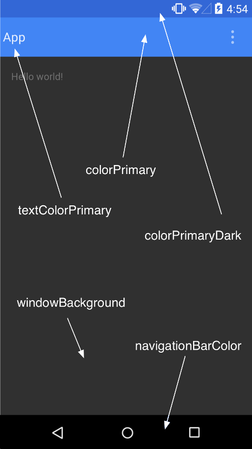
(Source:https://developer.android.com/training/material/theme.html)
为了创建Toolbar,修改res/layout/activity_main:
<RelativeLayout xmlns:android="http://schemas.android.com/apk/res/android"xmlns:tools="http://schemas.android.com/tools"android:layout_width="match_parent"android:layout_height="match_parent"tools:context=".MainActivity"><android.support.v7.widget.Toolbarandroid:id="@+id/toolbar"android:layout_width="match_parent"android:layout_height="?attr/actionBarSize"android:background="?attr/colorPrimary"android:theme="@style/ThemeOverlay.AppCompat.Dark" /></RelativeLayout>上面的代码中,我们删除了默认的RelativeLayout的padding属性并且从支持库中添加了一个Toolbar。如果你正在使用API21或更高级的API,你可以使用默认的Toolbar控件,不需要从支持库中获取
(解释:Toolbar在Android中有两个类的,一个来自support v7可以向后兼容,一个是API21及以上使用的)
在MainAcitivity中,修改其onCreate(Bundle)方法:
@Overrideprotected void onCreate(Bundle savedInstanceState) { super.onCreate(savedInstanceState); setContentView(R.layout.activity_main); Toolbar toolbar = (Toolbar) findViewById(R.id.toolbar); setSupportActionBar(toolbar); ActionBar actionBar = getSupportActionBar(); actionBar.setHomeAsUpIndicator(R.drawable.ic_menu); actionBar.setDisplayHomeAsUpEnabled(true);}从这里下载本工程的资源
https://github.com/sitepoint-editors/Design-Demo/tree/master/app/src/main/res
包含了绘制文件夹下的文件,你可以直接复制到你的项目工程中,这样可以保证你上面的代码没有错误。
运行这个App,你可以看到Toolbar被设置到app的Appear上了。 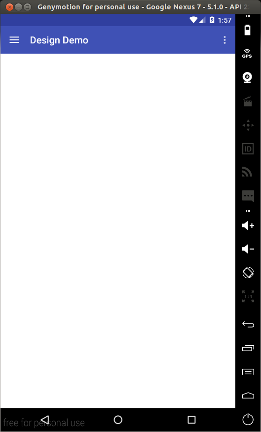
NavigationView
导航抽屉在Android app上是一个共有的控件,是一种在Android建立导航阶层的方法,其他的有像Tabs和Spinners。执行这些控件从来不是个简单的过程,但现在有了Design Support Library之后,使用这些控件就简单多了。
首先呢,你需要修改activity_main.xml
<android.support.v4.widget.DrawerLayout xmlns:android="http://schemas.android.com/apk/res/android" xmlns:app="http://schemas.android.com/apk/res-auto" android:id="@+id/drawer_layout" android:layout_width="match_parent" android:layout_height="match_parent" android:fitsSystemWindows="true"> <RelativeLayout android:layout_width="match_parent" android:layout_height="match_parent"> <android.support.v7.widget.Toolbar android:id="@+id/toolbar" android:layout_width="match_parent" android:layout_height="?attr/actionBarSize" android:background="?attr/colorPrimary" android:theme="@style/ThemeOverlay.AppCompat.Dark" /> </RelativeLayout> <android.support.design.widget.NavigationView android:id="@+id/navigation_view" android:layout_width="wrap_content" android:layout_height="match_parent" android:layout_gravity="start" app:headerLayout="@layout/drawer_header" app:menu="@menu/drawer"/></android.support.v4.widget.DrawerLayout>在上面的代码中,我们添加了一个NavigationView到布局上,NavigationView在DrawerLayout布局之中,NavigationView有两个重要的属性---app:headerLayout(用来作为header)和app:menu(将菜单资源填充到导航项中来)
在res/layout文件夹下,创建一个名为:drawer_header.xml,并按如下修改它。
<?xml version="1.0" encoding="utf-8"?><LinearLayout xmlns:android="http://schemas.android.com/apk/res/android" android:orientation="vertical" android:layout_width="match_parent" android:layout_height="150dp" android:background="?attr/colorPrimaryDark" android:padding="16dp" android:theme="@style/ThemeOverlay.AppCompat.Dark" android:gravity="bottom"> <TextView android:layout_width="match_parent" android:layout_height="wrap_content" android:text="@string/drawer_header_text" android:textAppearance="@style/TextAppearance.AppCompat.Body1"/></LinearLayout>这样就为抽屉创建了一个header,这个header的背景颜色是primary color,设置高度为150dp并加入一些文本。
下一步在res/menu创建一个file,命名为drawer.xml,按如下修改:
<?xml version="1.0" encoding="utf-8"?><menu xmlns:android="http://schemas.android.com/apk/res/android"> <group android:checkableBehavior="single"> <item android:id="@+id/navigation_item_attachment" android:checked="true" android:icon="@drawable/ic_attachment" android:title="@string/nav_item_attachment" /> <item android:id="@+id/navigation_item_images" android:icon="@drawable/ic_image" android:title="@string/nav_item_images" /> <item android:id="@+id/navigation_item_location" android:icon="@drawable/ic_place" android:title="@string/nav_item_location" /> </group> <item android:title="@string/nav_sub_menu"> <menu> <item android:icon="@drawable/ic_emoticon" android:title="@string/nav_sub_menu_item01" /> <item android:icon="@drawable/ic_emoticon" android:title="@string/nav_sub_menu_item02" /> </menu> </item></menu>在上面的代码中,我们创建了抽屉的菜单项,第一部分是可勾选的菜单项的集合,勾选的项目会在导航抽屉视图中变得高亮,可以使用户确认现在被勾选的是哪个项目,第二部分,我们使用了子header与第一部分项目进行分离。
在MainActivity.java中,添加以下变量。
private DrawerLayout mDrawerLayout;然后在onCreate(Bundle)的末尾添加如下代码:
mDrawerLayout = (DrawerLayout) findViewById(R.id.drawer_layout);修改onOptionsItemSelected(MenuItem):
@Overridepublic boolean onOptionsItemSelected(MenuItem item) { // Handle action bar item clicks here. The action bar will // automatically handle clicks on the Home/Up button, so long // as you specify a parent activity in AndroidManifest.xml. int id = item.getItemId(); switch (id) { case android.R.id.home: mDrawerLayout.openDrawer(GravityCompat.START); return true; case R.id.action_settings: return true; } return super.onOptionsItemSelected(item);}当为们点击那个看上去像汉堡的按钮时,抽屉将被打开。运行这个app你会看到: 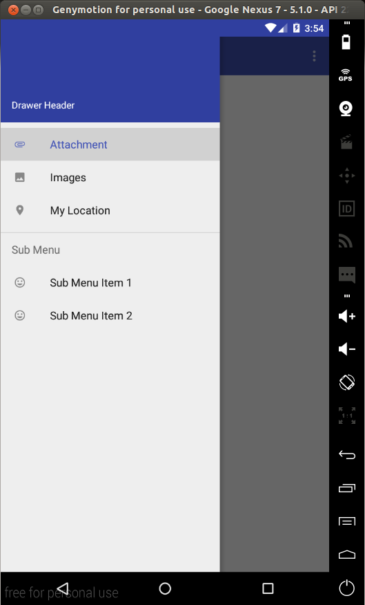
为了抓取抽屉项目的点击事件,我们需要给NavigationView设置OnNavigationItemSelectedListener在onCreate(Bundle)最后添加:
NavigationView navigationView = (NavigationView) findViewById(R.id.navigation_view);navigationView.setNavigationItemSelectedListener(new NavigationView.OnNavigationItemSelectedListener() { @Override public boolean onNavigationItemSelected(MenuItem menuItem) { menuItem.setChecked(true); mDrawerLayout.closeDrawers(); Toast.makeText(MainActivity.this, menuItem.getTitle(), Toast.LENGTH_LONG).show(); return true; } });上面的代码给NavigationView提供了监听器,所以当抽屉中的选项被选中时,它就被设置成已选,然后抽屉框会关闭,Toast会显示你所选的选项的标题。
在真正的app当中你会想要导航到其他的Fragment而不是仅仅显示Toast,当你再次打开抽屉时,你可以根据高亮确认你所选的选项是否被选中。
(太累了,就不逐字翻译了,有的介绍性的文字看原文吧)
Floating Action Button(FAB)
修改`res/layout/activity_main.xml
<android.support.v4.widget.DrawerLayout xmlns:android="http://schemas.android.com/apk/res/android" xmlns:app="http://schemas.android.com/apk/res-auto" android:id="@+id/drawer_layout" android:layout_width="match_parent" android:layout_height="match_parent" android:fitsSystemWindows="true"> <RelativeLayout android:layout_width="match_parent" android:layout_height="match_parent"> <android.support.v7.widget.Toolbar android:id="@+id/toolbar" android:layout_width="match_parent" android:layout_height="?attr/actionBarSize" android:background="?attr/colorPrimary" android:theme="@style/ThemeOverlay.AppCompat.Dark" /> <android.support.design.widget.FloatingActionButton android:id="@+id/fab" android:layout_width="wrap_content" android:layout_height="wrap_content" android:layout_alignParentBottom="true" android:layout_alignParentRight="true" android:layout_marginRight="@dimen/activity_horizontal_margin" android:layout_marginBottom="@dimen/activity_vertical_margin" android:src="@drawable/ic_done" /> </RelativeLayout> <android.support.design.widget.NavigationView android:id="@+id/navigation_view" android:layout_width="wrap_content" android:layout_height="match_parent" android:layout_gravity="start" app:headerLayout="@layout/drawer_header" app:menu="@menu/drawer"/></android.support.v4.widget.DrawerLayout>上面的代码添加了FAB,在布局的右下角。在布局中我们可以通过android:src设置展示在Button 上的图片,在代码中,我们可以通过setImageDrawable
运行app,你可以看到FAB。 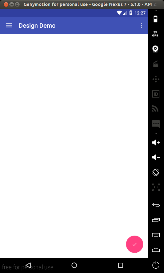
我们将在后面为FAB设置点击事件。
Snackbar
在MainActivity.java中,在onCreate(Bundle)的最后添加:
FloatingActionButton fab = (FloatingActionButton)findViewById(R.id.fab);fab.setOnClickListener(new View.OnClickListener() { @Override public void onClick(View v) { Snackbar.make(findViewById(R.id.drawer_layout), "I'm a Snackbar", Snackbar.LENGTH_LONG).setAction("Action", new View.OnClickListener() { @Override public void onClick(View v) { Toast.makeText(MainActivity.this, "Snackbar Action", Toast.LENGTH_LONG).show(); } }).show(); } }); ```在上面的代码中,为FAB添加了点击事件,`Snackbar`同样有点击事件。在上面的代码中,`Snackbar.make()`中有一个`view`参数,`Snackbar`总是会尝试显示该视图的最底部,运行app: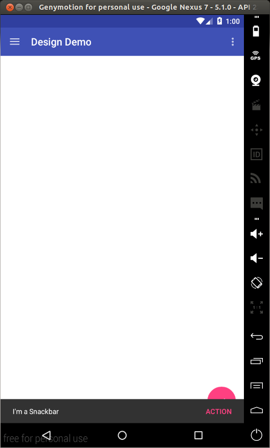发现`Snackbar `遮住了FAB,我们将在`CoordinatorLayout`修改它。### TabLayout修改`res/layout/activity_main.xml`如下:```xml<android.support.v4.widget.DrawerLayout android:id="@+id/drawer_layout" xmlns:android="http://schemas.android.com/apk/res/android" xmlns:app="http://schemas.android.com/apk/res-auto" android:layout_width="match_parent" android:layout_height="match_parent" android:fitsSystemWindows="true"> <RelativeLayout android:layout_width="match_parent" android:layout_height="match_parent"> <LinearLayout android:layout_width="match_parent" android:layout_height="match_parent" android:orientation="vertical"> <android.support.v7.widget.Toolbar android:id="@+id/toolbar" android:layout_width="match_parent" android:layout_height="?attr/actionBarSize" android:background="?attr/colorPrimary" android:theme="@style/ThemeOverlay.AppCompat.Dark" /> <android.support.design.widget.TabLayout android:id="@+id/tablayout" android:layout_width="match_parent" android:layout_height="wrap_content" android:background="?attr/colorPrimary" app:tabGravity="fill" android:theme="@style/ThemeOverlay.AppCompat.Dark" /> <android.support.v4.view.ViewPager android:id="@+id/viewpager" android:layout_width="match_parent" android:layout_height="0dp" android:layout_weight="1"/> </LinearLayout> <android.support.design.widget.FloatingActionButton android:id="@+id/fab" android:layout_width="wrap_content" android:layout_height="wrap_content" android:layout_alignParentBottom="true" android:layout_alignParentRight="true" android:layout_marginBottom="@dimen/activity_vertical_margin" android:layout_marginRight="@dimen/activity_horizontal_margin" android:src="@drawable/ic_done"/> </RelativeLayout> <android.support.design.widget.NavigationView android:id="@+id/navigation_view" android:layout_width="wrap_content" android:layout_height="match_parent" android:layout_gravity="start" app:headerLayout="@layout/drawer_header" app:menu="@menu/drawer"/></android.support.v4.widget.DrawerLayout><div class="se-preview-section-delimiter"></div>添加TabLayout的同时,我们也添加了ViewPager。
在MainActivity.java添加下面的子类:
public static class DesignDemoFragment extends Fragment { private static final String TAB_POSITION = "tab_position"; public DesignDemoFragment() { } public static DesignDemoFragment newInstance(int tabPosition) { DesignDemoFragment fragment = new DesignDemoFragment(); Bundle args = new Bundle(); args.putInt(TAB_POSITION, tabPosition); fragment.setArguments(args); return fragment; } @Nullable @Override public View onCreateView(LayoutInflater inflater, ViewGroup container, Bundle savedInstanceState) { Bundle args = getArguments(); int tabPosition = args.getInt(TAB_POSITION); TextView tv = new TextView(getActivity()); tv.setGravity(Gravity.CENTER); tv.setText("Text in Tab #" + tabPosition); return tv; }}<div class="se-preview-section-delimiter"></div>static class DesignDemoPagerAdapter extends FragmentStatePagerAdapter { public DesignDemoPagerAdapter(FragmentManager fm) { super(fm); } @Override public Fragment getItem(int position) { return DesignDemoFragment.newInstance(position); } @Override public int getCount() { return 3; } @Override public CharSequence getPageTitle(int position) { return "Tab " + position; }}然后在onCreate(Bundle)的底部添加:
DesignDemoPagerAdapter adapter = new DesignDemoPagerAdapter(getSupportFragmentManager());ViewPager viewPager = (ViewPager)findViewById(R.id.viewpager);viewPager.setAdapter(adapter);TabLayout tabLayout = (TabLayout)findViewById(R.id.tablayout);tabLayout.setupWithViewPager(viewPager);在上面的代码中,我们创建了一个Fragment类,里面的内容由一个TextView来填充,我们创建了FragmentStatePagerAdapter用来作为ViewPager的适配器。我们通过setupWithViewPager()把ViewPager加入到TabLayout中。运行app,你可以通过选择标签和滑动来选择标签页。 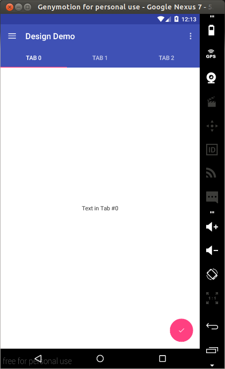
CoordinatorLayout
Design Support库介绍了CoordinatorLayout,这个布局可以提供子视图额外等级的触碰事件的控制。对Design Support库中的控件尤为有利。
其中一个例子就是解决上面Snackbar遮挡FAB的问题,方法是将FAB作为CoordinatorLayout的子视图,然后Snackbar.make()第一个参数设置成CoordinatorLayout的ID。
修改res/layout/activity_main.xml:
<android.support.v4.widget.DrawerLayout android:id="@+id/drawer_layout" xmlns:android="http://schemas.android.com/apk/res/android" xmlns:app="http://schemas.android.com/apk/res-auto" android:layout_width="match_parent" android:layout_height="match_parent" android:fitsSystemWindows="true"> <android.support.design.widget.CoordinatorLayout android:id="@+id/coordinator" android:layout_width="match_parent" android:layout_height="match_parent"> <LinearLayout android:layout_width="match_parent" android:layout_height="match_parent" android:orientation="vertical"> <android.support.v7.widget.Toolbar android:id="@+id/toolbar" android:layout_width="match_parent" android:layout_height="?attr/actionBarSize" android:background="?attr/colorPrimary" android:theme="@style/ThemeOverlay.AppCompat.Dark" /> <android.support.design.widget.TabLayout android:id="@+id/tablayout" android:layout_width="match_parent" android:layout_height="wrap_content" android:background="?attr/colorPrimary" app:tabGravity="fill" android:theme="@style/ThemeOverlay.AppCompat.Dark" /> <android.support.v4.view.ViewPager android:id="@+id/viewpager" android:layout_width="match_parent" android:layout_height="0dp" android:layout_weight="1"/> </LinearLayout> <android.support.design.widget.FloatingActionButton android:id="@+id/fab" android:layout_width="wrap_content" android:layout_height="wrap_content" android:layout_alignParentBottom="true" android:layout_gravity="bottom|right" android:layout_marginBottom="@dimen/activity_vertical_margin" android:layout_marginRight="@dimen/activity_horizontal_margin" android:src="@drawable/ic_done"/> </android.support.design.widget.CoordinatorLayout> <android.support.design.widget.NavigationView android:id="@+id/navigation_view" android:layout_width="wrap_content" android:layout_height="match_parent" android:layout_gravity="start" app:headerLayout="@layout/drawer_header" app:menu="@menu/drawer"/></android.support.v4.widget.DrawerLayout>如上面代码改动,FAB需要是CoordinatorLayout的子视图,所以我们将CoordinatorLayout替换了RelativeLayout,因此FAB的位置也需要修改 android:layout_gravity="bottom|right"(因为RelativeLayout被替换,alignXXX属性失效)。
之后在MainActivity.java中对Snackbar的构造进行修改,将CoordinatorLayout的ID作为Snackbar.make()的第一个参数。再次运行: 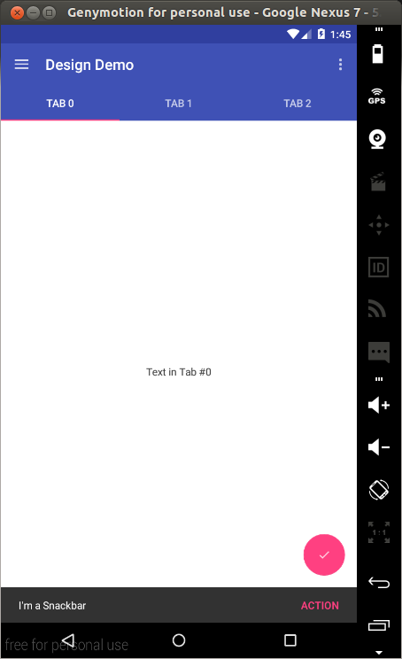
另一个主要作用是CoordinatorLayout涉及到app Bar和滚动机制,Design Support库提供了AppBarLayout允许Toolbar和其他(像TabLayout提供的标签页)对滚动事件有响应。
注意AppBarLayout对ListView不起作用,需要使用RecyclerVIew来创建滚动的列表。
首先在buile.gradle(Module:app)中添加以下语句并同步工程。
compile 'com.android.support:recyclerview-v7:22.2.1'````在`res/layout/`创建名为`fragment_list_view.xml`,修改如下:<div class="se-preview-section-delimiter"></div>```xml<?xml version="1.0" encoding="utf-8"?><android.support.v7.widget.RecyclerView xmlns:android="http://schemas.android.com/apk/res/android" android:id="@+id/recyclerview" android:layout_width="match_parent" android:layout_height="match_parent"/> ```在`res/layout`创建另一个布局文件,命名为`list_row.xml`,修改内容如下。```xml <?xml version="1.0" encoding="utf-8"?><LinearLayout xmlns:android="http://schemas.android.com/apk/res/android" android:orientation="vertical" android:padding="16dp" android:layout_width="match_parent" android:layout_height="56dp"> <TextView android:id="@+id/list_item" android:layout_width="wrap_content" android:layout_height="wrap_content"/></LinearLayout><div class="se-preview-section-delimiter"></div>创建一个名为DesignDemoREcyclerAdapter.java的文件,将下面的内容复制。
package com.echessa.designdemo; // Rename as Appropriateimport android.support.v7.widget.RecyclerView;import android.view.LayoutInflater;import android.view.View;import android.view.ViewGroup;import android.widget.TextView;import java.util.List;/** * Created by echessa on 7/24/15. */public class DesignDemoRecyclerAdapter extends RecyclerView.Adapter<DesignDemoRecyclerAdapter.ViewHolder> { private List<String> mItems; DesignDemoRecyclerAdapter(List<String> items) { mItems = items; } @Override public ViewHolder onCreateViewHolder(ViewGroup viewGroup, int i) { View v = LayoutInflater.from(viewGroup.getContext()).inflate(R.layout.list_row, viewGroup, false); return new ViewHolder(v); } @Override public void onBindViewHolder(ViewHolder viewHolder, int i) { String item = mItems.get(i); viewHolder.mTextView.setText(item); } @Override public int getItemCount() { return mItems.size(); } public class ViewHolder extends RecyclerView.ViewHolder { private final TextView mTextView; ViewHolder(View v) { super(v); mTextView = (TextView)v.findViewById(R.id.list_item); } }}<div class="se-preview-section-delimiter"></div>修改DesignDemoFragment.onCreateView()里的内容:
@Nullable @Override public View onCreateView(LayoutInflater inflater, ViewGroup container, Bundle savedInstanceState) { Bundle args = getArguments(); int tabPosition = args.getInt(TAB_POSITION); ArrayList<String> items = new ArrayList<String>(); for (int i = 0; i < 50; i++) { items.add("Tab #" + tabPosition + " item #" + i); } View v = inflater.inflate(R.layout.fragment_list_view, container, false); RecyclerView recyclerView = (RecyclerView)v.findViewById(R.id.recyclerview); recyclerView.setLayoutManager(new LinearLayoutManager(getActivity())); recyclerView.setAdapter(new DesignDemoRecyclerAdapter(items)); return v; } ```重新运行app,你可以看到列表了。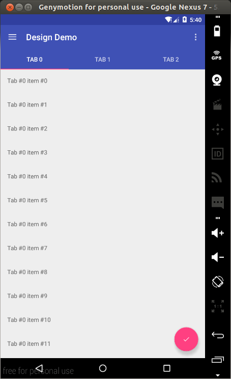上面这些完成之后,我们看看`CoordinatorLayout `提供的滚动行为。修改`activity_main.xml`:<div class="se-preview-section-delimiter"></div>```xml<android.support.v4.widget.DrawerLayout android:id="@+id/drawer_layout" xmlns:android="http://schemas.android.com/apk/res/android" xmlns:app="http://schemas.android.com/apk/res-auto" android:layout_width="match_parent" android:layout_height="match_parent" android:fitsSystemWindows="true"> <android.support.design.widget.CoordinatorLayout android:id="@+id/coordinator" android:layout_width="match_parent" android:layout_height="match_parent"> <android.support.design.widget.AppBarLayout android:layout_width="match_parent" android:layout_height="wrap_content" android:theme="@style/ThemeOverlay.AppCompat.Dark"> <android.support.v7.widget.Toolbar android:id="@+id/toolbar" android:layout_width="match_parent" android:layout_height="?attr/actionBarSize" android:background="?attr/colorPrimary" app:layout_scrollFlags="scroll|enterAlways"/> <android.support.design.widget.TabLayout android:id="@+id/tablayout" android:layout_width="match_parent" android:layout_height="wrap_content" android:background="?attr/colorPrimary" app:tabGravity="fill"/> </android.support.design.widget.AppBarLayout> <android.support.v4.view.ViewPager android:id="@+id/viewpager" android:layout_width="match_parent" android:layout_height="match_parent" app:layout_behavior="@string/appbar_scrolling_view_behavior"/> <android.support.design.widget.FloatingActionButton android:id="@+id/fab" android:layout_width="wrap_content" android:layout_height="wrap_content" android:layout_alignParentBottom="true" android:layout_gravity="bottom|right" android:layout_marginBottom="@dimen/activity_vertical_margin" android:layout_marginRight="@dimen/activity_horizontal_margin" android:src="@drawable/ic_done"/> </android.support.design.widget.CoordinatorLayout> <android.support.design.widget.NavigationView android:id="@+id/navigation_view" android:layout_width="**wrap_content**" android:layout_height="match_parent" android:layout_gravity="start" app:headerLayout="@layout/drawer_header" app:menu="@menu/drawer"/></android.support.v4.widget.DrawerLayout>如上面的代码所示,我们将Toolbar和TabLayout放进了AppBarLayout中,如上面所说的,AppBarLayout允许Toolbar和其他的视图通过标记ScrollingViewBehavior对滚动事件作出响应,当我们滑动RecyclerView,AppBarLayout根据子视图的滚动标示对子视图”滚”出屏幕还是”滚”进屏幕。
Flags include:
- scroll: This flag should be set for all views that want to scroll off the screen. For views that do not use this flag, they’ll remain pinned to the top of the screen
- enterAlways: This flag ensures that any downward scroll will cause this view to become visible, enabling the ‘quick return’ pattern
- enterAlwaysCollapsed: When your view has declared a minHeight and you use this flag, your View will only enter at its minimum height (i.e., ‘collapsed’), only re-expanding to its full height when the scrolling view has reached it’s top.
- exitUntilCollapsed: This flag causes the view to scroll off until it is ‘collapsed’ (its minHeight) before exiting
(具体的效果希望大家测试,这里就不说明了)
这里注意,我们需要把app:layout_behavior="@string/appbar_scrolling_view_behavior"添加到ViewPager中去的。
运行app,可以看到如下效果。 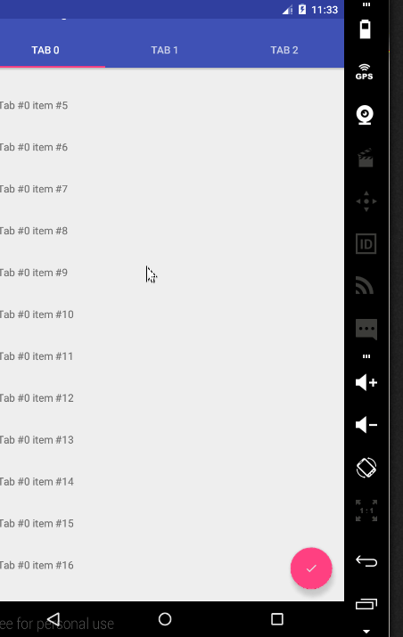
CollapsingToolbarLayout
CollapsingToolbarLayout提供了另外一种对AppBar的滚动行为。为了看效果,我们创建另一个Avtivity由Toolbar但没有TabLayout.
创建一个新的Activity(File -> New -> Activity -> Blank Activity)并且命名为SecondActivity.
修改res/layout/activity_second.xml:
<android.support.design.widget.CoordinatorLayout xmlns:android="http://schemas.android.com/apk/res/android" xmlns:app="http://schemas.android.com/apk/res-auto" android:layout_width="match_parent" android:layout_height="match_parent"> <android.support.design.widget.AppBarLayout android:layout_width="match_parent" android:layout_height="250dp" android:theme="@style/ThemeOverlay.AppCompat.Dark.ActionBar"> <android.support.design.widget.CollapsingToolbarLayout android:id="@+id/collapsing_toolbar" android:layout_width="match_parent" android:layout_height="match_parent" app:contentScrim="?attr/colorPrimary" app:layout_scrollFlags="scroll|exitUntilCollapsed"> <ImageView android:layout_width="match_parent" android:layout_height="match_parent" android:scaleType="centerCrop" android:src="@drawable/image" app:layout_collapseMode="parallax"/> <android.support.v7.widget.Toolbar android:id="@+id/toolbar" android:layout_width="match_parent" android:layout_height="?attr/actionBarSize" app:layout_collapseMode="pin"/> </android.support.design.widget.CollapsingToolbarLayout> </android.support.design.widget.AppBarLayout> <android.support.v4.widget.NestedScrollView android:layout_width="match_parent" android:layout_height="match_parent" app:layout_behavior="@string/appbar_scrolling_view_behavior"> <LinearLayout android:layout_width="match_parent" android:layout_height="match_parent" android:orientation="vertical" android:paddingTop="24dp"> <android.support.v7.widget.CardView android:layout_width="match_parent" android:layout_height="wrap_content" android:layout_margin="16dp"> <LinearLayout android:layout_width="match_parent" android:layout_height="wrap_content" android:orientation="vertical" android:padding="16dp"> <TextView android:layout_width="match_parent" android:layout_height="wrap_content" android:text="Lorem ipsum"/> <TextView android:layout_width="match_parent" android:layout_height="wrap_content" android:text="@string/second_activity_text"/> </LinearLayout> </android.support.v7.widget.CardView> <android.support.v7.widget.CardView android:layout_width="match_parent" android:layout_height="wrap_content" android:layout_marginBottom="16dp" android:layout_marginLeft="16dp" android:layout_marginRight="16dp"> <LinearLayout android:layout_width="match_parent" android:layout_height="wrap_content" android:orientation="vertical" android:padding="16dp"> <TextView android:layout_width="match_parent" android:layout_height="wrap_content" android:text="Sed quam eros"/> <TextView android:layout_width="match_parent" android:layout_height="wrap_content" android:text="@string/second_activity_text"/> </LinearLayout> </android.support.v7.widget.CardView> <android.support.v7.widget.CardView android:layout_width="match_parent" android:layout_height="wrap_content" android:layout_marginBottom="16dp" android:layout_marginLeft="16dp" android:layout_marginRight="16dp"> <LinearLayout android:layout_width="match_parent" android:layout_height="wrap_content" android:orientation="vertical" android:padding="16dp"> <TextView android:layout_width="match_parent" android:layout_height="wrap_content" android:text="Sed a euismod dui"/> <TextView android:layout_width="match_parent" android:layout_height="wrap_content" android:text="@string/second_activity_text"/> </LinearLayout> </android.support.v7.widget.CardView> <android.support.v7.widget.CardView android:layout_width="match_parent" android:layout_height="wrap_content" android:layout_marginBottom="16dp" android:layout_marginLeft="16dp" android:layout_marginRight="16dp"> <LinearLayout android:layout_width="match_parent" android:layout_height="wrap_content" android:orientation="vertical" android:padding="16dp"> <TextView android:layout_width="match_parent" android:layout_height="wrap_content" android:text="Fusce nec lacinia mi"/> <TextView android:layout_width="match_parent" android:layout_height="wrap_content" android:text="@string/second_activity_text"/> </LinearLayout> </android.support.v7.widget.CardView> <android.support.v7.widget.CardView android:layout_width="match_parent" android:layout_height="wrap_content" android:layout_marginBottom="16dp" android:layout_marginLeft="16dp" android:layout_marginRight="16dp"> <LinearLayout android:layout_width="match_parent" android:layout_height="wrap_content" android:orientation="vertical" android:padding="16dp"> <TextView android:layout_width="match_parent" android:layout_height="wrap_content" android:text="Praesent hendrerit"/> <TextView android:layout_width="match_parent" android:layout_height="wrap_content" android:text="@string/second_activity_text"/> </LinearLayout> </android.support.v7.widget.CardView> </LinearLayout> </android.support.v4.widget.NestedScrollView></android.support.design.widget.CoordinatorLayout>然后在SecondActivity的onCreate(Bundle)中做如下修改:
@Overrideprotected void onCreate(Bundle savedInstanceState) { super.onCreate(savedInstanceState); setContentView(R.layout.activity_second); Toolbar toolbar = (Toolbar) findViewById(R.id.toolbar); setSupportActionBar(toolbar); getSupportActionBar().setDisplayHomeAsUpEnabled(true); CollapsingToolbarLayout collapsingToolbar = (CollapsingToolbarLayout) findViewById(R.id.collapsing_toolbar); collapsingToolbar.setTitle("Second Activity");}这里我为Toolbar设置了”Up”插入符号,并且为CollapsingToolbarLayout设置了标题。
为了使”Up”插入符号起作用,在Androidmanifest.xml文件中添加:
<meta-data android:name="android.support.PARENT_ACTIVITY" android:value="com.echessa.designdemo.MainActivity" />在DesignDemoRecyclerAdapter.java的onBindViewHolder()做如下修改:
@Overridepublic void onBindViewHolder(ViewHolder viewHolder, int i) { String item = mItems.get(i); viewHolder.mTextView.setText(item); viewHolder.mTextView.setOnClickListener(new View.OnClickListener() { @Override public void onClick(View view) { Context context = view.getContext(); context.startActivity(new Intent(context, SecondActivity.class)); } });}在上面的代码中,我们为TextView设置了点击事件,这样做并不好,最好还是给RecyclerView设置点击事件。
运行app,点击TextView 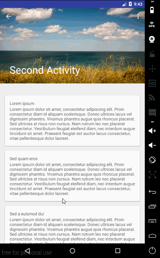
(效果的话,相信你自己也看到了。)
Floating Labels for EditText
TextInputLayout 说的简单点就是EditText套上一个label,你可以在其中一个CardViews上做些修改。修改res/layout/activity_second.xml的某一个CardViews
<android.support.design.widget.TextInputLayout android:layout_width="match_parent" android:layout_height="wrap_content"> <EditText android:layout_width="match_parent" android:layout_height="wrap_content" android:inputType="textEmailAddress" android:hint="Email" /> </android.support.design.widget.TextInputLayout>运行app,你可以看到: 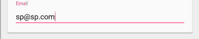 .
.
关于TextInputLayout的中文文档可以看:
使用TextInputLayout创建一个登陆界面
终于翻译的差不多了,虽然本人自知翻译的很烂,但也可以留下来做个纪念。最后建议大家自己按照上面的代码码一码,会出现问题的留言给我,因为本人自己测试的时候出了很多的错,所以有的错误我可能可以帮你解决。
- Material Design 学习(一)
- Material Design学习(一)
- Material Design 学习(一)
- Material Design 学习(一)
- Material Design学习笔记(一)
- Material Design学习回顾(一)
- Android Material Design 学习(一)
- Material Design动画(一)
- Material Design主题(一)
- Material Design概述(一)
- Material Design动画(一)
- Material Design Lite学习(一) 概述及环境搭建
- Material Design学习跟随demo解读(一)
- Material Design学习(二)
- Material Design 学习(二)
- (一) 学习 Material Design 控件之 Snackbar
- Material Design控件使用(一)
- Material Design for Developers(一)概述
- max_join_size报错
- phpcms V9 内联/关联链接 字符串较长链接无法正确替换的问题完美解决
- iOS开发数据库篇—SQLite常用的函数
- iOS对图像进行尺寸压缩
- 集群节点临时重启
- Material Design学习(一)
- Spark 机器学习 —— 从决策树到随机森林
- vector::reserve && vector::resize
- UDP协议
- AndroidStudio
- android中长按listview弹出菜单后如何在菜单选择方法中获取当前listview的位置
- Handling Runtime Changes
- iOS计算时间差
- 二叉树的各种基本操作运算多文件组织