CSS background 属性
来源:互联网 发布:淘宝客服任职要求 编辑:程序博客网 时间:2024/05/17 18:23
CSS background 属性

定义和用法
background 简写属性在一个声明中设置所有的背景属性。
可以设置如下属性:
- background-color
- background-position
- background-size
- background-repeat
- background-origin
- background-clip
- background-attachment
- background-image
如果不设置其中的某个值,也不会出问题,比如 background:#ff0000 url('smiley.gif'); 也是允许的。
可能的值
CSS background-color 属性
可能的值
CSS background-position 属性
可能的值
- top left
- top center
- top right
- center left
- center center
- center right
- bottom left
- bottom center
- bottom right
如果您仅规定了一个关键词,那么第二个值将是"center"。
默认值:0% 0%。
x% y%第一个值是水平位置,第二个值是垂直位置。
左上角是 0% 0%。右下角是 100% 100%。
如果您仅规定了一个值,另一个值将是 50%。
xpos ypos第一个值是水平位置,第二个值是垂直位置。
左上角是 0 0。单位是像素 (0px 0px) 或任何其他的 CSS 单位。
如果您仅规定了一个值,另一个值将是50%。
您可以混合使用 % 和 position 值。
CSS3 background-size 属性
语法
background-size: length|percentage|cover|contain;
设置背景图像的高度和宽度。
第一个值设置宽度,第二个值设置高度。
如果只设置一个值,则第二个值会被设置为 "auto"。
测试percentage以父元素的百分比来设置背景图像的宽度和高度。
第一个值设置宽度,第二个值设置高度。
如果只设置一个值,则第二个值会被设置为 "auto"。
测试cover把背景图像扩展至足够大,以使背景图像完全覆盖背景区域。
背景图像的某些部分也许无法显示在背景定位区域中。
测试contain把图像图像扩展至最大尺寸,以使其宽度和高度完全适应内容区域。测试CSS background-repeat 属性
可能的值
CSS3 background-origin 属性
语法
background-origin: padding-box|border-box|content-box;
CSS3 background-clip 属性
语法
background-clip: border-box|padding-box|content-box;
CSS background-attachment 属性
可能的值
CSS background-image 属性
可能的值
渐变色:
CSS3 Gradient 分为 linear-gradient(线性渐变)和 radial-gradient(径向渐变)。而我们今天主要是针对线性渐变来剖析其具体的用法。
在不同浏览器的用法不同之处就是前面的前缀不一样。
线性渐变在 Webkit 下的应用
语法:
-webkit-linear-gradient( [<point> || <angle>,]? <stop>, <stop> [, <stop>]* )//最新发布书写语法-webkit-gradient(<type>, <point> [, <radius>]?, <point> [, <radius>]? [, <stop>]*) //老式语法书写规则参数:-webkit-gradient 是 webkit 引擎对渐变的实现参数,一共有五个。第一个参数表示渐变类型(type),可以是linear(线性渐变)或者radial(径向渐变)。第二个参数和第三个参数,都是一对值,分别表示渐变起点和终点。这对值可以用坐标形式表示,也可以用关键值表示,比如 left top(左上角)和left bottom(左下角)。第四个和第五个参数,分别是两个color-stop函数。color-stop 函数接受两个参数,第一个表示渐变的位置,0为起点,0.5为中点,1为结束点;第二个表示该点的颜色。如图所示:


我们先来看一个老式的写法示例:
background: -webkit-gradient(linear,center top,center bottom,from(#ccc), to(#000));效果如下所示:

接着我们在来看一下新式的写法:
-webkit-linear-gradient(top,#ccc,#000);颜色渐变的方向
起始点(Starting Point)的工作方式类似于 background position。您可以设置水平和垂直位置为百分比,或以像素为单位,或在水平方向上可以使用left/center/right,在垂直方向上可以使用top/center/bottom。位置起始于左上角。如果你不指定水平或垂直位置,它将默认为center。其工作方式主要包含:Top → Bottom、Left → Right、bottom → top、right → left等,接着我们主要一种一种来看其实现的效果:
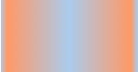
1、开始于center(水平方向)和top(垂直方向)也就是Top → Bottom:
/* Firefox 3.6+ */background: -moz-linear-gradient(top, #ace, #f96);/* Safari 4-5, Chrome 1-9 *//* -webkit-gradient(, [, ]?, [, ]? [, ]*) */background: -webkit-gradient(linear,top,from(#ace),to(#f96));/* Safari 5.1+, Chrome 10+ */background: -webkit-linear-gradient(top, #ace, #f96);/* Opera 11.10+ */background: -o-linear-gradient(top, #ace, #f96);效果:

2、始于left(水平方向)和center(垂直方向)也是就Left → Right:
/* Firefox 3.6+ */background: -moz-linear-gradient(left, #ace, #f96);/* Safari 5.1+, Chrome 10+ */background: -webkit-linear-gradient(left, #ace, #f96);/* Opera 11.10+ */background: -o-linear-gradient(left, #ace, #f96);效果如下:

3、起始于left(水平方向)和top(垂直方向):
background: -moz-linear-gradient(left top, #ace, #f96);background: -webkit-linear-gradient(left top, #ace, #f96);background: -o-linear-gradient(left top, #ace, #f96);效果如下:

4、Linear Gradient (with Even Stops):
/* Firefox 3.6+ */background: -moz-linear-gradient(left, #ace, #f96, #ace, #f96, #ace);/* Safari 4-5, Chrome 1-9 */background: -webkit-gradient(linear, left top, right top, from(#ace), color-stop(0.25, #f96), color-stop(0.5, #ace), color-stop(0.75, #f96), to(#ace));/* Safari 5.1+, Chrome 10+ */background: -webkit-linear-gradient(left, #ace, #f96, #ace, #f96, #ace);/* Opera 11.10+ */background: -o-linear-gradient(left, #ace, #f96, #ace, #f96, #ace);效果如下:

5、with Specified Arbitrary Stops:
/* Firefox 3.6+ */ background: -moz-linear-gradient(left, #ace, #f96 5%, #ace, #f96 95%, #ace); /* Safari 4-5, Chrome 1-9 */ background: -webkit-gradient(linear, left top, right top, from(#ace), color-stop(0.05, #f96), color-stop(0.5, #ace), color-stop(0.95, #f96), to(#ace)); /* Safari 5.1+, Chrome 10+ */ background: -webkit-linear-gradient(left, #ace, #f96 5%, #ace, #f96 95%, #ace); /* Opera 11.10+ */ background: -o-linear-gradient(left, #ace, #f96 5%, #ace, #f96 95%, #ace);效果如下:
6、角度(Angle):
正如上面看到的示例,如果您不指定一个角度,它会根据起始位置自动定义。如果你想更多的控制渐变的方向,您不妨设置角度试试。例如,下面的两个渐变具有相同的起点left center,但是加上一个30度的角度。
没有角度的示例代码:
background: -moz-linear-gradient(left, #ace, #f96);background: -webkit-linear-gradient(left,#ace,#f96);background: -o-linear-gradient(left, #ace, #f96);加上30度的角度代码:
background: -moz-linear-gradient(left 30deg, #ace, #f96);background: -webkit-gradient(linear, 0 0, 100% 100%, from(#ace),to(#f96));background: -o-linear-gradient(30deg, #ace, #f96);效果图如下:


当指定的角度,请记住,它是一个由水平线与渐变线产生的的角度,逆时针方向。因此,使用0deg将产生一个左到右横向梯度,而90度将创建一个从底部到顶部的垂直渐变。我来看看你核心代码:
background: -moz-linear-gradient(<angle>, #ace, #f96);background: -webkit-gradient(<type>,<angle>, from(#ace), to(#f96));background: -webkit-linear-gradient(<angle>, #ace, #f96);background: -o-linear-gradient(<angle>, #ace, #f96);我们来看看各角度的区别:
.deg0 { background: -moz-linear-gradient(0deg, #ace, #f96); background: -webkit-gradient(linear,0 50%,100% 50%,from(#ace),to(#f96)); background: -webkit-linear-gradient(0deg, #ace, #f96); background: -o-linear-gradient(0deg, #ace, #f96);} .deg45 { background: -moz-linear-gradient(45deg, #ace, #f96); background: -webkit-gradient(linear,0 100%,100% 0%,from(#ace),to(#f96)); background: -webkit-linear-gradient(45deg, #ace, #f96); background: -o-linear-gradient(45deg, #ace, #f96);}.deg90 { background: -moz-linear-gradient(90deg, #ace, #f96); background: -webkit-gradient(linear,50% 100%,50% 0%,from(#ace),to(#f96)); background: -webkit-linear-gradient(90deg, #ace, #f96); background: -o-linear-gradient(90deg, #ace, #f96);}.deg135 { background: -moz-linear-gradient(135deg, #ace, #f96); background: -webkit-gradient(linear,100% 100%,0 0,from(#ace),to(#f96)); background: -webkit-linear-gradient(135deg, #ace, #f96); background: -o-linear-gradient(135deg, #ace, #f96);}.deg180 { background: -moz-linear-gradient(180deg, #ace, #f96); background: -webkit-gradient(linear,100% 50%,0 50%,from(#ace),to(#f96)); background: -webkit-linear-gradient(180deg, #ace, #f96); background: -o-linear-gradient(180deg, #ace, #f96);}.deg225 { background: -moz-linear-gradient(225deg, #ace, #f96); background: -webkit-gradient(linear,100% 0%,0 100%,from(#ace),to(#f96)); background: -webkit-linear-gradient(225deg, #ace, #f96); background: -o-linear-gradient(225deg, #ace, #f96);}.deg270 { background: -moz-linear-gradient(270deg, #ace, #f96); background: -webkit-gradient(linear,50% 0%,50% 100%,from(#ace),to(#f96)); background: -webkit-linear-gradient(270deg, #ace, #f96); background: -o-linear-gradient(270deg, #ace, #f96);}.deg315 { background: -moz-linear-gradient(315deg, #ace, #f96); background: -webkit-gradient(linear,0% 0%,100% 100%,from(#ace),to(#f96)); background: -webkit-linear-gradient(315deg, #ace, #f96); background: -o-linear-gradient(315deg, #ace, #f96);}.deg360 { background: -moz-linear-gradient(360deg, #ace, #f96); background: -webkit-gradient(linear,0 50%,100% 50%,from(#ace),to(#f96)); background: -webkit-linear-gradient(360deg, #ace, #f96); background: -o-linear-gradient(360deg, #ace, #f96);}效果如下:

除了起始位置和角度,你应该指定起止颜色。起止颜色是沿着渐变线,将会在指定位置(以百分比或长度设定)含有指定颜色的点。色彩的起止数是无限的。如果您使用一个百分比位置,0%代表起点和100%是终点,但区域外的值可以被用来达到预期的效果。 这也是通过CSS3 Gradient制作渐变的一个关键所在,其直接影响了你的设计效果,像我们这里的示例都不是完美的效果,只是为了能给大家展示一个渐变的效果,大家就这样先用着吧。我们接着看一下不同的起址色的示例:
background: -moz-linear-gradient(top, #ace, #f96 80%, #f96);background: -webkit-linear-gradient(top,#ace,#f96 80%,#f96);background: -o-linear-gradient(top, #ace, #f96 80%, #f96);效果如下:

如果没有指定位置,颜色会均匀分布。如下面的示例:
background: -moz-linear-gradient(left, red, #f96, yellow, green, #ace);background: -webkit-linear-gradient(left,red,#f96,yellow,green,#ace);background: -o-linear-gradient(left, red, #f96, yellow, green, #ace);效果如下

7、渐变上应用透明度(Transparency):
透明渐变对于制作一些特殊的效果是相当有用的,例如,当堆叠多个背景时。这里是两个背景的结合:一张图片,一个白色到透明的线性渐变。我们来看一个官网的示例吧:
background: -moz-linear-gradient(right, rgba(255,255,255,0), rgba(255,255,255,1)),url(http://demos.hacks.mozilla.org/openweb/resources/images/patterns/flowers-pattern.jpg);background: -webkit-linear-gradient(right, rgba(255,255,255,0), rgba(255,255,255,1)),url(http://demos.hacks.mozilla.org/openweb/resources/images/patterns/flowers-pattern.jpg);background: -o-linear-gradient(right, rgba(255,255,255,0), rgba(255,255,255,1)),url(http://demos.hacks.mozilla.org/openweb/resources/images/patterns/flowers-pattern.jpg);接着看看效果吧

本文转自:http://www.w3school.com.cn/cssref/pr_background.asp
http://www.cnblogs.com/lhb25/archive/2013/01/30/css3-linear-gradient.html
- [CSS]CSS background属性
- CSS background-position 属性
- css背景属性 Background
- css 属性 background:transparent;
- css的background属性
- CSS background-position 属性
- css background 各种属性
- CSS background属性详解
- CSS background 属性
- CSS background-repeat 属性
- CSS background-attachment 属性
- css属性扫一遍吧---------background。
- CSS background 属性
- CSS background-repeat 属性
- CSS background-position 属性
- CSS background-repeat 属性
- css的background 属性
- css background属性
- android 图片压缩
- pojFinancial Management1004
- 个性化推荐算法:GRM,CF,NBI的实现
- maven 详解
- Python学习 (字符串细讲)
- CSS background 属性
- JAVA WEB开发笔记
- Angular JS 跨域
- dlopen、dlsym和dlclose的使用和举例
- maven搭建ssm分模块框架+activeMQ (myeclipse版) (四)
- 强悍的命令行(三)
- 全排列递归算法
- 大话重构——改善代码
- 如何理解Gabor滤波器