用sklearn绘制ROC曲线
来源:互联网 发布:比利时保拉王后知乎 编辑:程序博客网 时间:2024/05/21 09:15
How to plot a ROC Curve in Scikit learn?
The ROC curve stands for Receiver Operating Characteristic curve, and is used to visualize the performance of a classifier. When evaluating a new model performance,accuracy can be very sensitive to unbalanced class proportions. The ROC curve is insensitive to this lack of balance in the data set.
On the other hand when using precision and recall, we are using a single discrimination threshold to compute the confusion matrix. The ROC Curve allows the modeler to look at the performance of his model across all possible thresholds. To understand the ROC curve we need to understand the x and y axes used to plot this. On the x axis we have the false positive rate, FPR or fall-out rate. On the y axis we have the true positive rate, TPR or recall.
To test out the Scikit calls that make this curve for us, we use a simple array repeated many times and a prediction array of the same size with different element. The first thing to notice for the roc curve is that we need to define the positive value of a prediction. In our case since our example is binary the class “1” will be the positive class. Second we need the prediction array to contain probability estimates of the positive class or confidence values. This very important because the roc_curve call will set repeatedly a threshold to decide in which class to place our predicted probability. Let’s see the code that does this.
1) Import needed modules
from sklearn.metrics import roc_curve, aucimport matplotlib.pyplot as pltimport random
2) Generate actual and predicted values. First let use a good prediction probabilities array:
actual = [1,1,1,0,0,0]predictions = [0.9,0.9,0.9,0.1,0.1,0.1]
3) Then we need to calculated the fpr and tpr for all thresholds of the classification. This is where the roc_curve call comes into play. In addition we calculate the auc or area under the curve which is a single summary value in [0,1] that is easier to report and use for other purposes. You usually want to have a high auc value from your classifier.
false_positive_rate, true_positive_rate, thresholds = roc_curve(actual, predictions)roc_auc = auc(false_positive_rate, true_positive_rate)
4) Finally we plot the fpr vs tpr as well as our auc for our very good classifier.
plt.title('Receiver Operating Characteristic')plt.plot(false_positive_rate, true_positive_rate, 'b',label='AUC = %0.2f'% roc_auc)plt.legend(loc='lower right')plt.plot([0,1],[0,1],'r--')plt.xlim([-0.1,1.2])plt.ylim([-0.1,1.2])plt.ylabel('True Positive Rate')plt.xlabel('False Positive Rate')plt.show()The figure show how a perfect classifier roc curve looks like:
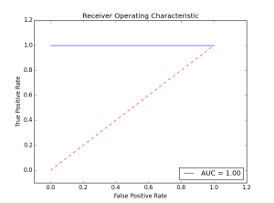
Here the classifier did not make a single error. The AUC is maximal at 1.00. Let’s see what happens when we introduce some errors in the prediction.
actual = [1,1,1,0,0,0]predictions = [0.9,0.9,0.1,0.1,0.1,0.1]
As we introduce more errors the AUC value goes down. There are a couple of things to remember about the roc curve:
- There is a tradeoff betwen the TPR and FPR as we move the threshold of the classifier.
- When the test is more accurate the roc curve is closer to the left top borders
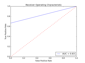
- A useless classifier is one that has its ROC curve exactly aligned with the diagonal. How does that look like? Let’s say we have a classifier that always gives 0.5 for the classification probabilities.
actual = [1,1,1,0,0,0]predictions = [0.5,0.5,0.5,0.5,0.5,0.5]
The ROC Curve would like this:

Concerning the AUC, a simple rule of thumb to evaluate a classifier based on this summary value is the following:
- .90-1 = very good (A)
- .80-.90 = good (B)
- .70-.80 = not so good (C)
- .60-.70 = poor (D)
- .50-.60 = fail (F)
This example dealt with a two class problem (0,1). For a multi-class example checkout this scikit-learn documentation example:
- http://scikit-learn.org/stable/auto_examples/plot_roc.html
This was an intro to the ideas behind the roc curve and the scikit functions that enable this.
- 用sklearn绘制ROC曲线
- 用sklearn绘制ROC曲线
- sklearn画ROC曲线
- python-sklearn中RandomForestClassifier函数以及ROC曲线绘制
- python sklearn画ROC曲线
- ROC曲线 及其绘制
- ROC曲线的绘制
- ROC曲线的绘制
- ROC曲线的绘制
- 如何绘制ROC曲线
- 使用Sklearn模型做分类并绘制机器学习模型的ROC曲线
- R语言绘制ROC曲线
- 使用R绘制ROC曲线
- R语言-绘制ROC曲线
- R语言-绘制ROC曲线
- sklearn 如何去画ROC曲线
- python绘制precision-recall曲线、ROC曲线
- ROC曲线绘制及AUC计算
- Alarm(找规律)
- Spring事务配置
- Android-Activity生命周期 基本方法的作用
- Alarm
- 《Java线程池》Executor 以及Executors
- 用sklearn绘制ROC曲线
- basic info for linux oralce
- 笔记2——C++ static关键字与一维动态数组的使用
- 工程实践中最常用的10大数据结构与算法讲解(0)
- iOS 自动布局注意事项
- 二十三.优化整个项目界面
- ajax 多文件上传
- HDU 4352 XHXJ's LIS(数位DP+状压)
- java.security.NoSuchAlgorithmException: TLS SSLContext not available