RingProgressBar
来源:互联网 发布:淘宝上怎么买域名 编辑:程序博客网 时间:2024/05/29 14:44
A material design circle the progress bar,You can download it in image loading and file upload when used.
Screenshots
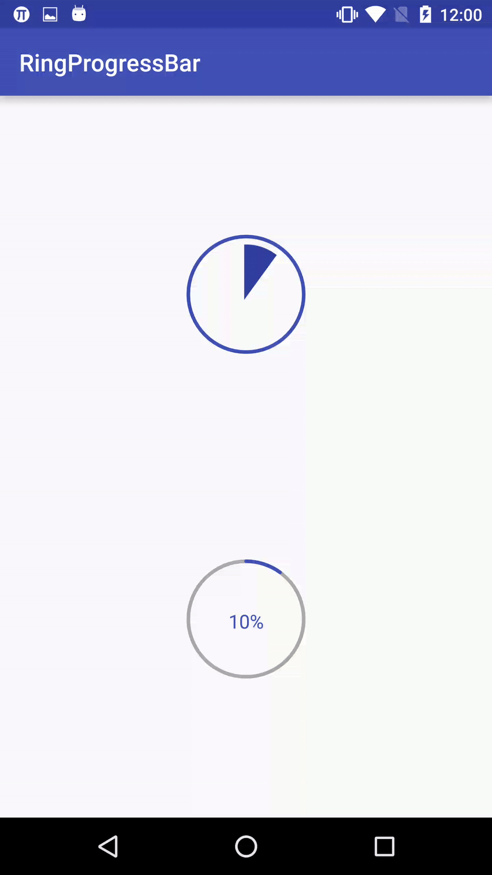
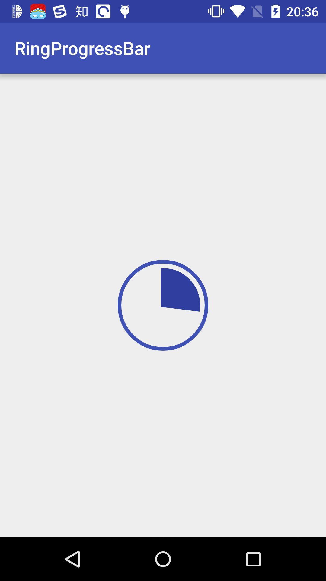
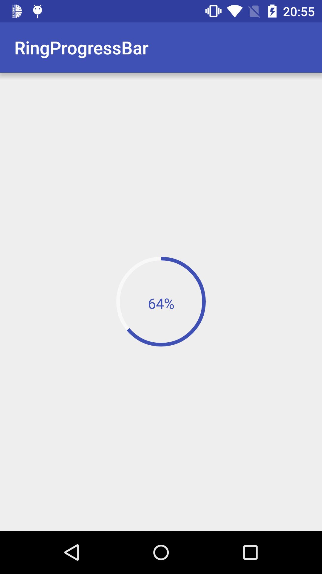
Import
Step 1. Add the JitPack repository to your build file Add it in your root build.gradle at the end of repositories: allprojects { repositories { ... maven { url "https://jitpack.io" } } }Step 2. Add the dependency dependencies { compile 'com.github.HotBitmapGG:RingProgressBar:V1.2.1' }Directions
- custom properties
Usage
- 1.In the XML
<io.netopen.hotbitmapgg.library.view.RingProgressBar android:id="@+id/progress_bar_1" android:layout_width="wrap_content" android:layout_height="wrap_content" android:layout_centerInParent="true" android:layout_alignParentTop="true" app:max="100" android:layout_marginTop="100dp" app:ringColor="@color/colorPrimary" app:ringProgressColor="@color/colorPrimaryDark" app:ringWidth="3dp" app:style="FILL" app:textColor="@color/colorPrimary" app:textIsShow="true" app:textSize="16sp" /> <io.netopen.hotbitmapgg.library.view.RingProgressBar android:id="@+id/progress_bar_2" android:layout_width="wrap_content" android:layout_height="wrap_content" android:layout_centerInParent="true" android:layout_alignParentBottom="true" android:layout_marginBottom="100dp" app:max="100" app:ringColor="@android:color/darker_gray" app:ringProgressColor="@color/colorPrimary" app:ringWidth="3dp" app:style="STROKE" app:textColor="@color/colorPrimary" app:textIsShow="true" app:textSize="16sp" />- 2.In the code
mRingProgressBar = (RingProgressBar) findViewById(R.id.progress_bar); // Set the progress bar's progress mRingProgressBar.setProgress(progress); mRingProgressBar.setOnProgressListener(new RingProgressBar.OnProgressListener() { @Override public void progressToComplete() { // Progress reaches the maximum callback default Max value is 100 Toast.makeText(MainActivity.this, "complete", Toast.LENGTH_SHORT).show(); } });Tips
- Increased after the completion of a tick to show animation effects, but don't know this have any practical application, so the code commented out, students in need can use open comments.
Other
知了日报客户端: https://github.com/HotBitmapGG/RxZhiHu
高仿 BiliBili 客户端: https://github.com/HotBitmapGG/OhMyBiliBili
Gank.io 客户端: https://github.com/HotBitmapGG/StudyProject
妹子福利 App: https://github.com/HotBitmapGG/MoeQuest
圆环进度条:https://github.com/HotBitmapGG/RingProgressBar
仿芝麻信用分仪表盘: https://github.com/HotBitmapGG/CreditSesameRingView
License
Copyright 2016 HotBitmapGG
Licensed under the Apache License, Version 2.0 (the "License"); you may not use this file except in compliance with the License. You may obtain a copy of the License at
http://www.apache.org/licenses/LICENSE-2.0
Unless required by applicable law or agreed to in writing, software distributed under the License is distributed on an "AS IS" BASIS, WITHOUT WARRANTIES OR CONDITIONS OF ANY KIND, either express or implied. See the License for the specific language governing permissions and limitations under the License.
- RingProgressBar
- 自定义控件,动画效果的进度圆环RingProgressBar
- HTML 可拖动层的实现 -- vb2005xu自己动手系列
- 通知 notification
- android相对布局
- python 有关时间操作的一些代码
- PHP学习路程感悟 -- 对路了真好
- RingProgressBar
- PHP 解析HTML元素实例 -- vb2005xu PHP进阶教程之一
- 设置横竖频 设备方向 软件方向
- Java ResultSetMetaData之getColumnName与getColumnLabel
- PHP一行代码集成雅虎宝贝鱼在线翻译功能 -- JAVAEYE不支持IE8
- 我是色色 -- 个人站开通 (*^__^*) 嘻嘻……
- Android模拟器:Genymotion
- 重构 css 布局 -- 重构公司网站,面向web2.0规范前端项目开发
- JS创建对象多种方法