切换背景图像综合练习题
来源:互联网 发布:dfa算法 编辑:程序博客网 时间:2024/06/05 14:44
任务
给每个列表定义不同的背景颜色
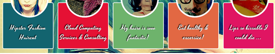
提示:使用结构伪类选择器:nth-of-type()
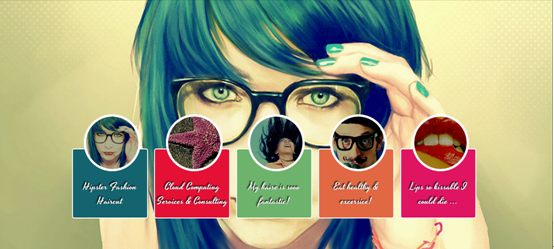
设置缩略图外形效果
提示:使用伪元素::after制作圆形效果

1、给每个缩略图设置不同的图片
提示:使用伪结构选择器:nth-of-type(),并且配合::after
2、给每个缩略图添加透明度蒙板效果
提示:使用伪类选择器::before给缩略图添加蒙板效果
3、鼠标悬浮在缩略图上时,修改缩略图上蒙板的透明度
提示:通过:hover和::before配合修改opacity的值为0
4、点击缩略图,切换背景图片
提示:通过目标选择器:target进行背景图片的切换
5、控制不是被点击图片的层级大小,让其不显示
提示:通过“否定选择器:not()”和“目标选择器:target”来控制不是被切换的背景图像不显示
<!DOCTYPE HTML><htmllang="en-US"> <head> <meta charset="UTF-8"> <title>CSS3 Full Background Slider </title> <style type="text/css"> @importurl("http://www.w3cplus.com/demo/css3/base.css"); @importurl("http://fonts.googleapis.com/css?family=Yesteryear"); html,body { height: 100%; } /*设置背景图片全屏显示,并且居中*/ img.bg { min-height: 100%; min-width: 1024px; width: 100%; height: auto !important; height: 100%; position: fixed; top: 0; left: 50%; z-index:1; -webkit-transform: translateX(-50%); -moz-transform: translateX(-50%); -o-transform: translateX(-50%); -ms-transform: translateX(-50%); } /*设置背景图片从左向右移入显示的动画效果*/ /* Slide Left */ @-webkit-keyframes 'slideLeft' { 0% { left: -500px; } 100% { left: 0; } } @-moz-keyframes 'slideLeft' { 0% { left: -500px; } 100% { left: 0; } } @-o-keyframes 'slideLeft' { 0% { left: -500px; } 100% { left: 0; } } @-ms-keyframes 'slideLeft' { 0% { left: -500px; } 100% { left: 0; } } @keyframes 'slideLeft' { 0% { left: -500px; } 100% { left: 0; } } /*设置背景图像从底部向顶部移入的动画效果*/ /* Slide Bottom */ @-webkit-keyframes 'slideBottom' { 0% { top: 350px; } 100% { top: 0; } } @-moz-keyframes 'slideBottom' { 0% { top: 350px; } 100% { top: 0; } } @-ms-keyframes 'slideBottom' { 0% { top: 350px; } 100% { top: 0; } } @-o-keyframes 'slideBottom' { 0% { top: 350px; } 100% { top: 0; } } @keyframes 'slideBottom' { 0% { top: 350px; } 100% { top: 0; } } /*设置背景图片由小到大放大动画效果*/ /* Zoom In */ @-webkit-keyframes 'zoomIn' { 0% { -webkit-transform: scale(0.1); } 100% { -webkit-transform: none; } } @-moz-keyframes 'zoomIn' { 0% { -moz-transform: scale(0.1); } 100% { -moz-transform: none; } } @-ms-keyframes 'zoomIn' { 0% { -ms-transform: scale(0.1); } 100% { -ms-transform: none; } } @-o-keyframes 'zoomIn' { 0% { -o-transform: scale(0.1); } 100% { -o-transform: none; } } @keyframes 'zoomIn' { 0% { transform: scale(0.1); } 100% { transform: none; } } /*设置背景图像由大到小缩小动画效果*/ /* Zoom Out */ @-webkit-keyframes 'zoomOut' { 0% { -webkit-transform: scale(2); } 100% { -webkit-transform: none; } } @-moz-keyframes 'zoomOut' { 0% { -moz-transform: scale(2); } 100% { -moz-transform: none; } } @-ms-keyframes 'zoomOut' { 0% { -ms-transform: scale(2); } 100% { -ms-transform: none; } } @-o-keyframes 'zoomOut' { 0% { -o-transform: scale(2); } 100% { -o-transform: none; } } @keyframes 'zoomOut' { 0% { transform: scale(2); } 100% { transform: none; } } /*背景图像旋转出现动画效果*/ /* Rotate */ @-webkit-keyframes 'rotate' { 0% { -webkit-transform: rotate(-360deg) scale(0.1); } 100% { -webkit-transform: none; } } @-moz-keyframes 'rotate' { 0% { -moz-transform: rotate(-360deg) scale(0.1); } 100% { -moz-transform: none; } } @-ms-keyframes 'rotate' { 0% { -ms-transform: rotate(-360deg) scale(0.1); } 100% { -ms-transform: none; } } @-o-keyframes 'rotate' { 0% { -o-transform: rotate(-360deg) scale(0.1); } 100% { -o-transform: none; } } @keyframes 'rotate' { 0% { transform: rotate(-360deg) scale(0.1); } 100% { transform: none; } } /*设置背景图像不显示动画效果*/ @-webkit-keyframes 'notTarget' { 0% { z-index: 75; } 100% { z-index: 75; } } @-moz-keyframes 'notTarget' { 0% { z-index: 75; } 100% { z-index: 75; } } @-ms-keyframes 'notTarget' { 0% { z-index: 75; } 100% { z-index: 75; } } @-o-keyframes 'notTarget' { 0% { z-index: 75; } 100% { z-index: 75; } } @keyframes 'notTarget' { 0% { z-index: 75; } 100% { z-index: 75; } } .slider { position: absolute; width: 100%; text-align: center; z-index: 9999; bottom: 100px; } .slider li { display: inline-block; width: 170px; height: 130px; margin-right: 15px; } .slider a { display: inline-block; width: 170px; padding-top: 70px; padding-bottom: 20px; position: relative; cursor: pointer; border: 2px solid #fff; border-radius: 5px; vertical-align: top; color: #fff; text-decoration: none; font-size: 22px; font-family: 'Yesteryear', cursive; text-shadow: -1px -1px 1px rgba(0, 0, 0, 0.8),-2px -2px 1px rgba(0, 0, 0, 0.3),-3px -3px 1px rgba(0, 0, 0, 0.3); } /*任务一、设置不同列表的背景色*/ 写入正确选择器{ background-color: #02646e; } 写入正确选择器{ background-color: #eb0837; } 写入正确选择器{ background-color: #67b374; } 写入正确选择器{ background-color: #e6674a; } 写入正确选择器{ background-color: #e61061; } /*任务二、设置缩略图形状*/ 写入正确选择器{ content:""; display: block; height: 120px; width: 120px; border: 5px solid #fff; border-radius: 50%; position: absolute; left: 50%; margin-left: -60px; z-index: 9999; top: -80px; } /*任务三、设置缩略图背景图像*/ 写入正确选择器{ background: url(http://m.lsqifu.com/demo/css3/CSS3Fullbackground/sbg1.jpg) no-repeat center; } 写入正确选择器{ background: url(http://www.baicaihr.com/demo/css3/CSS3Fullbackground/sbg2.jpg) no-repeat center; } 写入正确选择器{ background: url(http://www.lsqifu.com/demo/css3/CSS3Fullbackground/sbg3.jpg) no-repeat center; } 写入正确选择器{ background: url(http://www.dztcgroup.com/demo/css3/CSS3Fullbackground/sbg4.jpg) no-repeat center; } 写入正确选择器{ background: url(http://www.dztcsd.com/demo/css3/CSS3Fullbackground/sbg5.jpg) no-repeat center; } /*任务四、给缩略图添加蒙板效果*/ 写入正确选择器{ content:""; display: block; height: 120px; width: 120px; border: 5px solid #fff; border-radius: 50%; position: absolute; left: 50%; margin-left: -60px; z-index: 99999; top: -80px; background: rgba(0,0,0,0.3); } /*任务五、鼠标悬浮时,修改缩略图蒙板透明度*/ 写入正确选择器{ opacity:0; } /*任务六、点击综略图,切换背景图*/ /*背景图从左向右出现*/ 写入正确选择器{ z-index: 100; -webkit-animation-name: slideLeft; -webkit-animation-duration: 1s; -webkit-animation-iteration-count: 1; -moz-animation-name: slideLeft; -moz-animation-duration: 1s; -moz-animation-iteration-count: 1; -ms-animation-name: slideLeft; -ms-animation-duration: 1s; -ms-animation-iteration-count: 1; -o-animation-name: slideLeft; -o-animation-duration: 1s; -o-animation-iteration-count: 1; animation-name: slideLeft; animation-duration: 1s; animation-iteration-count: 1; } /*背景图从下向上出现*/ 写入正确选择器{ z-index: 100; -webkit-animation-name: slideBottom; -webkit-animation-duration: 1s; -webkit-animation-iteration-count: 1; -moz-animation-name: slideBottom; -moz-animation-duration: 1s; -moz-animation-iteration-count: 1; -ms-animation-name: slideBottom; -ms-animation-duration: 1s; -ms-animation-iteration-count: 1; -o-animation-name: slideBottom; -o-animation-duration: 1s; -o-animation-iteration-count: 1; animation-name: slideBottom; animation-duration: 1s; animation-iteration-count: 1; } /*背景图由小到大出现*/ 写入正确选择器{ z-index: 100; -webkit-animation-name: zoomIn; -webkit-animation-duration: 1s; -webkit-animation-iteration-count: 1; -moz-animation-name: zoomIn; -moz-animation-duration: 1s; -moz-animation-iteration-count: 1; -ms-animation-name: zoomIn; -ms-animation-duration: 1s; -ms-animation-iteration-count: 1; -o-animation-name: zoomIn; -o-animation-duration: 1s; -o-animation-iteration-count: 1; animation-name: zoomIn; animation-duration: 1s; animation-iteration-count: 1; } /*背景图由大到小出现*/ 写入正确选择器{ z-index: 100; -webkit-animation-name: zoomOut; -webkit-animation-duration: 1s; -webkit-animation-iteration-count: 1; -moz-animation-name: zoomOut; -moz-animation-duration: 1s; -moz-animation-iteration-count: 1; -ms-animation-name: zoomOut; -ms-animation-duration: 1s; -ms-animation-iteration-count: 1; -o-animation-name: zoomOut; -o-animation-duration: 1s; -o-animation-iteration-count: 1; animation-name: zoomOut; animation-duration: 1s; animation-iteration-count: 1; } /*背景图旋转出现*/ 写入正确选择器{ z-index: 100; -webkit-animation-name: rotate; -webkit-animation-duration: 1s; -webkit-animation-iteration-count: 1; -moz-animation-name: rotate; -moz-animation-duration: 1s; -moz-animation-iteration-count: 1; -ms-animation-name: rotate; -ms-animation-duration: 1s; -ms-animation-iteration-count: 1; -o-animation-name: rotate; -o-animation-duration: 1s; -o-animation-iteration-count: 1; animation-name: rotate; animation-duration: 1s; animation-iteration-count: 1; } /*任务七、设置不显示的背景图层级*/ /* Not Target */ 写入正确选择器{ -webkit-animation-name: notTarget; -webkit-animation-duration: 1s; -webkit-animation-iteration-count: 1; -moz-animation-name: notTarget; -moz-animation-duration: 1s; -moz-animation-iteration-count: 1; -ms-animation-name: notTarget; -ms-animation-duration: 1s; -ms-animation-iteration-count: 1; -o-animation-name: notTarget; -o-animation-duration: 1s; -o-animation-iteration-count: 1; animation-name: notTarget; animation-duration: 1s; animation-iteration-count: 1; } </style> </head> <body> <div class="slider"> <ul class="clearfix"> <li><a href="#bg1">Hipster Fashion Haircut </a></li> <li><a href="#bg2">Cloud Computing Services & Consulting</a></li> <li><a href="#bg3">My haire is sooo fantastic!</a></li> <li><a href="#bg4">Eat healthy & excersice!</a></li> <li><a href="#bg5">Lips so kissable I could die ...</a></li> </ul> </div> <img src="http://www.w3cplus.com/demo/css3/CSS3Fullbackground/bg1.jpg" alt="" class="bg slideLeft" id="bg1" /> <img src="http://www.w3cplus.com/demo/css3/CSS3Fullbackground/bg2.jpg" alt="" class="bg slideBottom" id="bg2" /> <img src="http://www.w3cplus.com/demo/css3/CSS3Fullbackground/bg3.jpg" alt="" class="bg zoomIn" id="bg3" /> <img src="http://www.w3cplus.com/demo/css3/CSS3Fullbackground/bg4.jpg" alt="" class="bg zoomOut" id="bg4" /> <img src="http://www.w3cplus.com/demo/css3/CSS3Fullbackground/bg5.jpg" alt="" class="bg rotate" id="bg5" /> </body> 0 0
- 切换背景图像综合练习题
- 切换背景图像综合练习题
- 切换背景图像综合练习题
- CSS3背景:background-origin、background-clip、 background-size、multiple backgrounds、制作导航菜单综合练习题
- SQL 初级综合练习题
- 利用Math.random做背景图像随机切换
- 《操作系统》期末复习综合练习题
- 练习题(1) 切换图片
- css3学习笔记(三)---切换背景图像,融合笔记二的知识
- 综合各类透明背景层
- CSS:背景颜色/背景图像
- 《信息安全管理》综合练习题(一)
- 《信息安全管理》综合练习题(二)
- C语言综合练习题(01)
- 制作3D旋转导航综合练习题
- 购物车综合练习题angular js
- html5 游戏背景切换
- Button 点击切换背景
- PHP运行模式
- iOS开发中的警告(Objective-C和Swift)
- 第四周项目-3单链表应用(2)-链接单链表
- 第四周项目5-多项式求和
- linux 下 时间字符串怎么解析成秒
- 切换背景图像综合练习题
- 第四周项目2-建设“单链表”算法库
- 网易2017秋招编程题
- android studio中添加retrolambda,并使用idk8新特性的配置记录
- JavaEE项目实战(OA系统)之十八_流程审批之一
- Java中Comparator、Comparable总结
- spring3.x企业应用开发 摘要
- Android 中CheckBox设置自定义图片
- 第四周项目6—— 多项式求和