Vue中你不知道但却很实用的黑科技
来源:互联网 发布:淘宝指纹膜硅胶哪里买 编辑:程序博客网 时间:2024/04/30 09:17
链接:https://zhuanlan.zhihu.com/p/24173419
来源:知乎
著作权归作者所有。商业转载请联系作者获得授权,非商业转载请注明出处。
最近数月一直投身于 iView 的开源工作中,完成了大大小小 30 多个 UI 组件,在 Vue 组件化开发中积累了不少经验。其中也有很多带有技巧性和黑科技的组件,这些特性有的是 Vue 文档中提到但却容易被忽略的,有的更是没有写在文档里,今天就说说 Vue 组件的高级玩法。
写在前面
本文所讲内容大多在 iView 项目中使用,大家可以前往关注,并结合源代码来研究其中的奥妙。项目地址:
iview/iview
目录
- 递归组件
- 自定义组件使用 v-model
- 使用$compile()在指定上下文中手动编译组件
- 内联模板inline-template
- 隐式创建 Vue 实例
递归组件
递归组件在文档中有介绍,只要给组件指定一个 name字段,就可以在该组件递归地调用自己,例如:
var iview = Vue.extend({ name: 'iview', template: '<div>' + // 递归地调用它自己 '<iview></iview>' + '</div>'})这种用法在业务中并不常见,在 iView 的级联选择组件中使用了该特性
(iview/iview)
效果如下图所示:
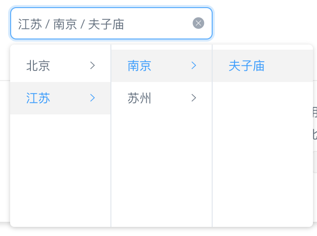
图中每一列是一个组件(caspanel.vue),一开始想到用 v-for来渲染列表,但后面发现扩展性极低,而且随着功能的丰富,实现起来很困难,处理的逻辑很多,于是改写成了递归组件:
<ul v-if="data && data.length" :class="[prefixCls + '-menu']"> <Casitem v-for="item in data" :prefix-cls="prefixCls" :data.sync="item" :tmp-item="tmpItem" @click.stop="handleClickItem(item)" @mouseenter.stop="handleHoverItem(item)"></Casitem></ul><Caspanel v-if="sublist && sublist.length" :prefix-cls="prefixCls" :data.sync="sublist" :disabled="disabled" :trigger="trigger" :change-on-select="changeOnSelect"></Caspanel>props 比较多,可以忽略,但其中关键的两个是data和 sublist,即当前列数据和子集的数据,因为预先不知道有多少下级,所以只需传递下级数据给组件本身,如果为空时,递归就结束了,Vue 这样设计的确很精妙。
注:该方法在 Vue 1.x 和 2.x 中都支持。
自定义组件使用 v-model
我们知道,v-model是在表单类元素上进行双向绑定时使用的,比如:
<template> <input type="text" v-model="data"> {{ data }}</template><script> export default { data () { return { data: '' } } }</script>这时data就是双向绑定的,输入的内容会实时显示在页面上。在 Vue 1.x 中,自定义组件可以使用 props 的.sync双向绑定,比如:
<my-component :data.sync="data"></my-component>在 Vue 2.x 中,可以直接在自定义组件上使用 v-model了,比如:
<my-component v-model="data"></my-component>在组件my-component中,通过this.$emit('input')就可以改变data的值了。
虽然 Vue 1.x 中无法这样使用,但是如果你的组件的模板外层是 input、select、textarea等支持绑定 v-model 特性的元素,也是可以使用的,比如 my-component 的代码是:
<template> <input type="text"></template>那也可以使用上面2.x的写法。
使用$compile()在指定上下文中手动编译组件
注:该方法是在 Vue 1.x 中的使用介绍,官方文档并没有给出该方法的任何说明,不可过多依赖此方法。
使用$compile()方法,可以在任何一个指定的上下文(Vue实例)上手动编译组件,该方法在 iView 新发布的表格组件 Table 中有使用:
iview/iview
由于表格的列配置是通过一个 Object 传入 props 的,因此不能像 slot 那样自动编译带有 Vue 代码的部分,因为传入的都是字符串,比如:
{ render (row) { return `<i-button>${row.name}</i-button>` }}render函数最终返回一个字符串,里面含有一个自定义组件 i-button,如果直接用{{{ }}}显示,i-button 是不会被编译的,那为了实现在单元格内支持渲染自定义组件,就用到了$compile()方法。
比如我们在组件的父级编译:
// 代码片段const template = this.render(this.row); // 通过上面的render函数得到字符串const div = document.createElement('div');div.innerHTML = template;this.$parent.$compile(div); // 在父级上下文编译组件this.$el.appendChild(cell); // 将编译后的html插入当前组件这样一来, i-button就被编译了。
在某些时候使用$compile()确实能带来益处,不过也会遇到很多问题值得思考:
- 这样编译容易把作用域搞混,所以要知道是在哪个Vue实例上编译的;
- 手动编译后,也需要在合适的时候使用$destroy()手动销毁;
- 有时候容易重复编译,所以要记得保存当前编译实例的id,这里可以通过 Vue 组件的_uid来唯一标识(每个Vue实例都会有一个递增的id,可以通过this._uid获取)
另外,Vue 1.x 文档也有提到另一个$mount()方法,可以实现类似的效果,在 Vue 2.x 文档中,有 Vue.compile()方法,用于在render函数中编译模板字符串,读者可以结合来看。
内联模板inline-template
内联模板并不是什么新鲜东西,文档中也有说明,只是平时几乎用不到,所以也容易忽略。简短解说,就是把组件的 slot 当做这个组件的模板来使用,这样更为灵活:
<!-- 父组件: --><my-component inline-template> {{ data }}</my-component><!-- 子组件 --><script> export default { data () { return { data: '' } } }</script>因为使用了 inline-template 内联模板,所以子组件不需要<template>来声明模板,这时它的模板直接是从 slot 来的{{ data }},而这个 data 所在的上下文,是子组件的,并不是父组件的,所以,在使用内联模板时,最容易产生的误区就是混淆作用域。
隐式创建 Vue 实例
在 webpack 中,我们都是用 .vue 单文件的模式来开发,每个文件即一个组件,在需要的地方通过 components: {}来使用组件。
比如我们需要一个提示框组件,可能会在父级中这样写:
<template> <Message>这是提示标题</Message></template><script> import Message from '../components/message.vue'; export default { components: { Message } }</script>这样写没有任何问题,但从使用角度想,我们其实并不期望这样来用,反而原生的window.alert('这是提示标题')这样使用起来更灵活,那这时很多人可能就用原生 JS 拼字符串写一个函数了,这也没问题,不过如果你的提示框组件比较复杂,而且多处复用,这种方法还是不友好的,体现不到 Vue 的价值。
iView 在开发全局提示组件(Message)、通知提醒组件(Notice)、对话框组件(Modal)时,内部都是使用 Vue 来渲染,但却是 JS 来隐式地创建这些实例,这样我们就可以像http://Message.info('标题')这样使用,但其内部还是通过 Vue 来管理。相关代码地址:
iview/iview
下面我们来看一下具体实现:
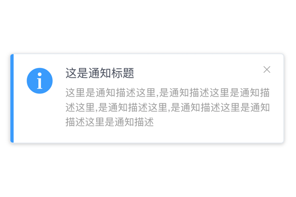
上图是最终效果图,这部分 .vue 代码比较简单,相信大家都能写出这样一个组件来,所以直接说创建实例的部分,先看下核心代码:
import Notification from './notification.vue';import Vue from 'vue';import { camelcaseToHyphen } from '../../../utils/assist';Notification.newInstance = properties => { const _props = properties || {}; let props = ''; Object.keys(_props).forEach(prop => { props += ' :' + camelcaseToHyphen(prop) + '=' + prop; }); const div = document.createElement('div'); div.innerHTML = `<notification${props}></notification>`; document.body.appendChild(div); const notification = new Vue({ el: div, data: _props, components: { Notification } }).$children[0]; return { notice (noticeProps) { notification.add(noticeProps); }, remove (key) { notification.close(key); }, component: notification, destroy () { document.body.removeChild(div); } }};export default Notification;与上文介绍的$compile()不同的是,这种方法是在全局(body)直接使用 new Vue创建一个 Vue 实例,我们只需要在入口处对外暴露几个 API 即可:
import Notification from '../base/notification';const prefixCls = 'ivu-message';const iconPrefixCls = 'ivu-icon';const prefixKey = 'ivu_message_key_';let defaultDuration = 1.5;let top;let messageInstance;let key = 1;const iconTypes = { 'info': 'information-circled', 'success': 'checkmark-circled', 'warning': 'android-alert', 'error': 'close-circled', 'loading': 'load-c'};function getMessageInstance () { messageInstance = messageInstance || Notification.newInstance({ prefixCls: prefixCls, style: { top: `${top}px` } }); return messageInstance;}function notice (content, duration = defaultDuration, type, onClose) { if (!onClose) { onClose = function () { } } const iconType = iconTypes[type]; // if loading const loadCls = type === 'loading' ? ' ivu-load-loop' : ''; let instance = getMessageInstance(); instance.notice({ key: `${prefixKey}${key}`, duration: duration, style: {}, transitionName: 'move-up', content: ` <div class="${prefixCls}-custom-content ${prefixCls}-${type}"> <i class="${iconPrefixCls} ${iconPrefixCls}-${iconType}${loadCls}"></i> <span>${content}</span> </div> `, onClose: onClose }); // 用于手动消除 return (function () { let target = key++; return function () { instance.remove(`${prefixKey}${target}`); } })();}export default { info (content, duration, onClose) { return notice(content, duration, 'info', onClose); }, success (content, duration, onClose) { return notice(content, duration, 'success', onClose); }, warning (content, duration, onClose) { return notice(content, duration, 'warning', onClose); }, error (content, duration, onClose) { return notice(content, duration, 'error', onClose); }, loading (content, duration, onClose) { return notice(content, duration, 'loading', onClose); }, config (options) { if (options.top) { top = options.top; } if (options.duration) { defaultDuration = options.duration; } }, destroy () { let instance = getMessageInstance(); messageInstance = null; instance.destroy(); }}到这里组件已经可以通过http://Message.info()直接调用了,不过我们还可以在 Vue 上进行扩展:
Vue.prototype.$Message = Message;
这样我们可以直接用this.$http://Message.info()来调用,就不用 import Message 了。
后记
Vue 组件开发中有很多有意思的技巧,用好了会减少很多不必要的逻辑,用不好反而还弄巧成拙。在开发一个较复杂的组件时,一定要先对技术方案进行调研和设计,然后再编码。
iView 还有很多开发技巧和有意思的代码,后面有时间我们再继续探讨吧,最近发布的几个版本都有较大的更新,希望大家可以关注和推广 iView
- Vue中你不知道但却很实用的黑科技
- 小白的柳州麻将黑科技.Part1 = 你不知道的门清
- JavaScript 各种遍历方式详解,有你不知道的黑科技
- Android-测试技巧 – 你所不知道的测试黑科技
- JavaScript 各种遍历方式详解,有你不知道的黑科技
- JavaScript 各种遍历方式详解,有你不知道的黑科技
- JavaScript 各种遍历方式详解,有你不知道的黑科技
- 先知创新大会议题第二弹:你不知道的网络安全黑科技
- 纯CSS实现轮播图效果,你不知道的CSS3黑科技
- 你不知道的世界各国科技排行榜!
- 11个实用但你可能不知道的Python程序库
- 11个实用但你可能不知道的Python程序库
- 11个实用但你可能不知道的Python程序库
- [实用]Dev-c++中你所不知道的快捷键
- Android 开发中一些很有用但你不知道的方法
- Android 开发中一些你不知道但很有用的类和方法
- Android 开发中一些很有用但你不知道的方法
- Android 开发中一些很有用但你不知道的方法(一)
- UE4 解析json
- 【pylon笔记1】Qt+pylon的配置
- ssh-agent代理管理git私钥
- iOS 10.1.1开发IPv6 被拒
- 微信支付问题总结
- Vue中你不知道但却很实用的黑科技
- svn检出与运行
- 十四周OJ1数组逆序
- 关于table设置换行的处理
- vultr vps自定义ISO安装windows2003系统过程附带序列号
- WPF中将Window Show到桌面的指定位置
- 【Unity】优化UGUI 滚动条ScrollRect(高效复用)
- https 学习笔记以及在 retrofit/okhttp 中的使用 (超多图, 爪机慎入)
- 使用truelicense实现用于JAVA工程license机制(包括license生成和验证)