OutlookBar(vs2003c#winform)
来源:互联网 发布:发胶什么牌子好 知乎 编辑:程序博客网 时间:2024/05/16 19:52
原文地址:http://www.codeproject.com/KB/list/VivantlistOutlook.aspx
Process
首先,我们需要确定OutlookXPtoolbar的属性。对所有控件大致浏览后,不断选择添加控件,以至达到和所规划的控件深度控制最相似的外观,例如按钮,然后逐渐形成Outlook bar。由于我们已经知道如何使用(VivantList)这一部分,所以关键是从最小结尾开始,但要对我们最终目标有个总体思路。
(Note: For this project, I am not going to program mouse dragging to rearrange the order of items in the bar.)
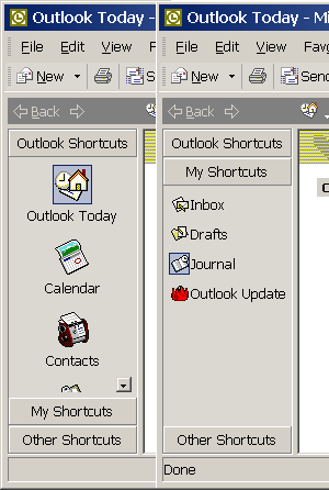
首先,我们注意到这个bar有两种模式,一种是和Explorer的下拉菜单‘大图标’相似,一种是‘List’模式。对于后者来说相对容易,而且在这个阶段不存在什么困难。继续看。大致一看,可以通过设置FlatStyle=Flat属性改变按钮外观。但是,进一步观察发现,一旦鼠标落在文本标签上就触发按钮高亮显示。这样就需要对Button控件采取一些特别策略,因为对System.Window.Forms.Button控件来说鼠标事件不具备public functions。这里我们需要做很多准备,但我喜欢让things显得'.NET friendly',所以寻找另一种解决方案。
对于这个问题,我决定自己生成按钮。微软提供了友好方式来写自己的按钮。下面是一个public class:
System.Windows.Forms.ButtonBase
这个类提供了一些默认属性。此外,可以从这个类继承并在窗体设计器中看到这个控件。当使用从System.Windows.Forms.Control 像 a Panel or TreeView继承时,你就会明白VS2003是做什么的了。假如你不熟悉这个问题,窗体设计器也不能显示控件编辑,这将引起其它很多麻烦。我将在其他时间继续讲解这是为什么。
尽管如此,我找到了ButtonBase类的处理方法。用了大约30min时间,我迅速生成了一个满足我需要的控件,它继承了UserControl类。
using System;using System.Collections;using System.ComponentModel;using System.Drawing;using System.Data;using System.Windows.Forms;namespace DemoOutLookBar{ /// <summary> /// Summary description for CustomButton. /// </summary> public class CustomButton :System.Windows.Forms.UserControl // System.Windows.Forms.ButtonBase { /// <summary> /// Required designer variable. /// </summary> private System.ComponentModel.Container components = null; private System.Drawing.Icon m_Icon; private bool m_MouseIsOver = false; private bool m_MouseIsDown = false; public CustomButton() { // This call is required by the Windows.Forms Form Designer. InitializeComponent(); // TODO: Add any initialization after the InitializeComponent call this.SetStyle(System.Windows.Forms.ControlStyles.DoubleBuffer, true); this.SetStyle( System.Windows.Forms.ControlStyles.SupportsTransparentBackColor, true); this.SetStyle( System.Windows.Forms.ControlStyles.AllPaintingInWmPaint, true); this.UpdateStyles(); } /// <summary> /// Clean up any resources being used. /// </summary> protected override void Dispose( bool disposing ) { if( disposing ) { if(components != null) { components.Dispose(); } } base.Dispose( disposing ); } #region Component Designer generated code /// <summary> /// Required method for Designer support - do not modify /// the contents of this method with the code editor. /// </summary> private void InitializeComponent() { // // CustomButton // this.Name = "CustomButton"; this.Size = new System.Drawing.Size(96, 96); } #endregion public void PerformOnMouseEnter(EventArgs e) { this.OnMouseEnter(e); } public void PerformOnMouseLeave(EventArgs e) { this.OnMouseLeave(e); } public void PerformOnMouseDown(MouseEventArgs e) { this.OnMouseDown(e); } public void PerformOnMouseUp(MouseEventArgs e) { this.OnMouseUp(e); } public void PerformOnLeave(EventArgs e) { this.OnLeave(e); } public void PerformClick(EventArgs e) { this.OnClick(e); } protected override void OnMouseEnter(EventArgs e) { m_MouseIsOver = true; base.OnMouseEnter (e); this.Refresh(); } protected override void OnMouseLeave(EventArgs e) { m_MouseIsOver = false; base.OnMouseLeave (e); this.Refresh(); } protected override void OnMouseDown(MouseEventArgs e) { m_MouseIsDown = true; base.OnMouseDown (e); this.Refresh(); } protected override void OnMouseUp(MouseEventArgs e) { m_MouseIsDown = false; base.OnMouseUp (e); this.Refresh(); } protected override void OnLeave(EventArgs e) { m_MouseIsDown = false; base.OnLeave (e); this.Refresh(); } protected override void OnPaint(PaintEventArgs e) { if (m_Icon != null)//If we have an image draw it { e.Graphics.DrawIcon(m_Icon, new System.Drawing.Rectangle(2, 2, this.ClientRectangle.Width - 3, this.ClientRectangle.Height - 3)); } if (m_MouseIsOver) { e.Graphics.DrawRectangle(new System.Drawing.Pen(Color.FromArgb(10, 36, 106)), 0,0,this.ClientRectangle.Width - 1, this.ClientRectangle.Height - 1); e.Graphics.FillRectangle(new SolidBrush(Color.FromArgb(75, 10, 36, 140)), 1,1,this.ClientRectangle.Width - 2, this.ClientRectangle.Height - 2); if(m_MouseIsDown) e.Graphics.FillRectangle(new SolidBrush(Color.FromArgb(50, 10, 36,140)), 1,1,this.ClientRectangle.Width - 2, this.ClientRectangle.Height - 2); } base.OnPaint (e); } public System.Drawing.Icon Icon { get { return m_Icon; } set { m_Icon = value; } } }}
在你看来,这个控件像Outlook flat buttons一样,但是对一些鼠标功能来说也具有一定的公有属性。边注:通过比较可以设置一些颜色和一些其它不太一样的地方。为了使用自己制定的按钮,我们将用和System.Windows.Forms.Button类似的方式简化Click事件的内容。
既然我们可以复制基本的属性,现在就仔细观察Outlook bar。在Adobe Photograph中测量一下,我发现大图标的尺寸是32 X 32 pixels with a 36 X 36 pixel box 。但是小图标尺寸则不一致,有的16 X 16 pixels,有的只有19 X 20 pixels!按钮右侧没有像素线。我通过制作20*20pixels的小按钮来纠正这些问题。不知道这是不是微软的一个失误。但这将成为我们在这个项目中对原目标的区别。
现在我们面临一个选择。我们需要在列表中显示两种排列。但在一个列表中不能同时显示两种不一样形式的排列。最终,在中心位置,模仿list view控件设计一个控件。我们必需决定是继承VivantRow设计两种不一样的排列控件,还是创建一个新的控件,让它继承VivantRow从而给予自身模式来改变图层显示。由于以上最终原因,我决定利用模式创建一个新的排列控件。这样,列表就可以具有像微软list view控件一样的模式。这意味着所以的图层显示代码必需人工编写,所以为了简化,我只制作了两层。我假如了新的排列控件和文本标签和定制好的按钮。
private void LayoutList() { this.SuspendLayout(); this.customButton1.Anchor = ((System.Windows.Forms.AnchorStyles) (System.Windows.Forms.AnchorStyles.Top | System.Windows.Forms.AnchorStyles.Left)); this.customButton1.Location = new System.Drawing.Point(5, 3); this.customButton1.Size = new System.Drawing.Size(20, 20); this.label1.Location = new System.Drawing.Point(25, 0); this.label1.Size = new System.Drawing.Size(this.ClientSize.Width - 25 , 28); this.label1.TextAlign = System.Drawing.ContentAlignment.MiddleLeft; this.Size = new System.Drawing.Size(this.Parent.ClientSize.Width, 28); this.RowHeight = 28; this.ResumeLayout(false); }
private void LayoutLargeIcon() { this.SuspendLayout(); this.customButton1.Anchor = ((System.Windows.Forms.AnchorStyles) (System.Windows.Forms.AnchorStyles.Top)); this.customButton1.Location = new System.Drawing.Point((this.ClientSize.Width/2) - (18 + 1), 6); this.customButton1.Size = new System.Drawing.Size(36, 36); this.label1.Location = new System.Drawing.Point(0, 46); this.label1.Size = new System.Drawing.Size(this.ClientSize.Width , 16); this.label1.TextAlign = System.Drawing.ContentAlignment.TopCenter; this.Size = new System.Drawing.Size(this.Parent.ClientSize.Width, 66); this.RowHeight = 66; this.ResumeLayout(false); }
接下来,我们添加一个模式属性,触发它可以改变图层样式。
private void LayoutRows(ViewMode Vmode) { switch (Vmode) { case (ViewMode.Large_Icons): LayoutLargeIcon(); break; case(ViewMode.List): LayoutList(); break; } this.Update(); }
public ViewMode Mode { get { return m_Mode; } set { m_Mode = value; LayoutRows(m_Mode); } }
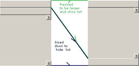
现在排列控件已经做好,我们移动它到sliding panels 或者tabs。为此,我利用VivantWrapper,触发它来控制大小,然后在顶部单独添加一个按钮,这就是OutLookWrapper控件。我也拉下两个按钮,这样可以设置scrolling。我们一会将它们拉回来。
思考之后,我决定将这个容纳OutLookWrappers的控件做成VivanList。我们接下来要做的是让它们排列,并设置其按钮大小依据另外的OutLookWrapper。我初始这么设计,合并一些tab控件代码。但是,我想一个VivantList在这里可以处理的很好。所以,我们从VivantRow继承OutLookWrapper,并为整个bar控件添加一个wrapper。
在这里我先停止一下。需要用一些事件来完成先前的一些计划。许多和scrolling相关的代码使事情变得很累赘。现在,假如存在一些小错误,我将留给你,看看是否你感兴趣。但是,我可以解释一旦它完全工作了。
Structure
从这里开始,我们将看看它的结构。一旦清楚了结构,剩下的就是编译和测试了。我将从结构跳转到最终结果。
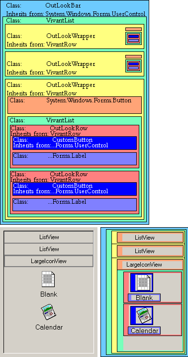
以上我们对结构有了认识,现在来看一些类:
OutLookWrapper Mode This gets or sets the display mode of the icons in the tab. This property's type is ![[Enum]](http://www.codeproject.com/images/symbols/Enum.GIF)
ViewMode.
Text This gets or sets the text that appears on the button at the top of the tab.
AddRow(OutLookRow Row) This method adds an OutLookRow to the OutLookWrapper.
OutLookRow Icon This gets or sets the icon that is displayed in the OutLookRow.
Text This gets or sets the text that is displayed below the icon in the OutLookRow.
SetAction(new ButtonClicked(ClikedBlank)); This method takes a delegate that is the type of ButtonClicked. ButtonClicked acts as a function pointer for a function that takes no arguments. This function is executed when the icon or text is clicked on. This is in place of raising an event when the icon is clicked on. This is done this way for no other reason than my personal preference; it can easily be changed to an event.
OutLookBar AddRow(OutLookWrapper Row) This method adds an OutLookWrapper to the OutLookBar.
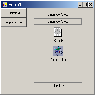
Final Product
So, now that we have it all together, let’s see how to use it.
- Place an
OutLookBar on a form with the Forms Designer. - Create a new
OutLookWrapper: OutLookWrapper m_OLW = new OutLookWrapper(); - Set the text of the
OutLookWrapper: m_OLW.Text = "ListView";
- Create
OutLookRows to fill the OutLookWrapper: - Create a function that you wish to be executed when the icon is clicked on.
private void ClikedBlank(){ MessageBox.Show("You Clicked Blank!!!");}
- Create your new
OutLookRow. OutLookRow m_OLR = new OutLookRow(); - Set the icon for your
OutLookRow. m_OLR.Icon = new Icon("..//..//Icon1.ico");
- Set the text for your
OutLookRow. m_OLR.Text = "Blank";
- Pass in the Action function for your
OutLookRow. m_OLR.SetAction( new ButtonClicked(ClikedBlank)); Add your OutLookRow to your OutLookWrapper.
m_OLW.AddRow(m_OLR);
- Set the mode of your
OutLookWrapper: m_OLW.Mode = ViewMode.List;
- Add your
OutLookWrapper to your OutLookBar: this.outLookBar1.AddRow(m_OLW.Mode);
And that's it!
I recommend you embed your icons into your program, rather than reading them from file as I have done above. For more information on a simple way to do this, see: Understanding Embedded Resources in Visual Studio .NET by James T. Johnson.
To see more, I recommend you download the sample project.
Future Plans
- Add mouse wheel support.
- Debug scroll buttons.
- Maybe, add mouse dragging.
- Test using background images on
OutLookWrapper.
History
- 11/14/04 - Initial upload.
- 11/18/04 - Completed article and uploaded working control.
Final Words
Please, feel free to post any feedback you might have. Even if I don’t directly respond to it, I will read it. The feedback I get will guide the development of this or any project I do. Thanks.
- OutlookBar(vs2003c#winform)
- winform 自定义控件制作---OutlookBar
- WinForm界面开发之“OutLookBar”工具条
- WinForm界面开发之“OutLookBar”工具条
- WinForm界面开发之“OutLookBar”工具条
- WinForm界面开发之“OutLookBar”工具条
- C# WinForm开发系列 - ToolBar/OutlookBar/Tab/Wizard
- C# WinForm开发系列 - ToolBar/OutlookBar/Tab/Wizard
- c# outlookBar
- Outlookbar-style menu interface
- 关于outlookbar的资料
- [js] outlookbar的使用
- OutLookBar控件的使用
- OutLookBar的使用
- vs2003C#datagrid单行行高设定
- outlookbar标题变粗解决方案
- OutlookBar: A Simplified Outlook Style Sidebar Control
- OutlookBar样式的JS导航栏
- oop中设计类的时候应该遵守的原则
- ASP.NET弹出关闭窗口
- Java值传递以及引用的传递、数组的传递!!
- ASP.NET弹出关闭窗口
- 多域名共用一个空间
- OutlookBar(vs2003c#winform)
- 关于数据库标间关系的几点建议!!!!
- SQLite 轻量级数据库简介
- 在Visual C#里面用ListView显示数据记录
- 电影大全
- TGPBitmap与TBitmap的相互转换
- DELPHI语言下WINDOWS SDK
- C#下拉树控件
- 三个Java宝贝