购物车里面的加减按钮
来源:互联网 发布:mac给iphone充电闪跳 编辑:程序博客网 时间:2024/05/22 04:33
AnimShopButton
项目地址:mcxtzhang/AnimShopButton
简介:仿饿了么加入购物车旋转控件 - 自带闪转腾挪动画 的按钮。自带海量可定制 UI 属性。在 RecyclerView 中使用,切换 LayoutManager 也是没有问题的
更多:作者 提 Bug 示例 APK
标签:
动画-自定义View-购物车-饿了么-
A shopping cart button with a telescopic displacement rotation animation ...
一个仿饿了么 带伸缩位移旋转动画的购物车按钮
注意,本控件非继承自ViewGroup,而是纯自定义 View,实现的仿饿了么加入购物车控件,自带闪转腾挪动画的按钮。
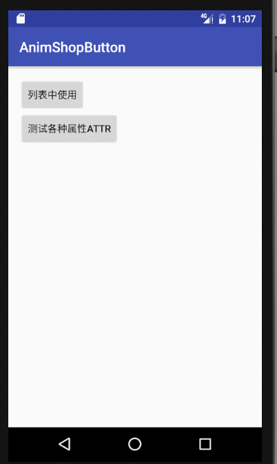
图 1 项目中使用的效果,考虑到了View的回收复用,
并且可以看到在RecyclerView中使用,切换LayoutManager也是没有问题的,

图 2 Demo 效果,测试各种属性值
Article
相关博文:
http://blog.csdn.net/zxt0601/article/details/54235736
https://gold.xitu.io/post/587220b9a22b9d005892422a
Import
Step 1. Add the JitPack repository to your build file
Step 1. 在项目根 build.gradle 文件中增加 JitPack 仓库依赖。
allprojects { repositories { ... maven { url "https://jitpack.io" } } }Step 2. Add the dependency
dependencies { compile 'com.github.mcxtzhang:AnimShopButton:V1.0.0' }Usage
xml:
<!--使用默认 UI 属性--> <com.mcxtzhang.lib.AnimShopButton android:id="@+id/btn1" android:layout_width="wrap_content" android:layout_height="wrap_content" app:maxCount="3"/> <!--设置了两圆间距--> <com.mcxtzhang.lib.AnimShopButton android:id="@+id/btn2" android:layout_width="wrap_content" android:layout_height="wrap_content" app:count="3" app:gapBetweenCircle="90dp" app:maxCount="99"/> <!--仿饿了么--> <com.mcxtzhang.lib.AnimShopButton android:id="@+id/btnEle" android:layout_width="wrap_content" android:layout_height="wrap_content" app:addEnableBgColor="#3190E8" app:addEnableFgColor="#ffffff" app:hintBgColor="#3190E8" app:hintBgRoundValue="15dp" app:hintFgColor="#ffffff" app:maxCount="99"/>注意: 加减点击后,具体的操作,要根据业务的不同来编写了,设计到实际的购物车可能还有写数据库操作,或者请求接口等,要操作成功后才执行动画、或者修改 count,这一块代码每个人写法可能不同。
使用时,可以重写onDelClick()和onAddClick()方法,并在合适的时机回调onCountAddSuccess()和onCountDelSuccess()以执行动画。
效果图如图 2.
Attributes
这么多属性够你用了吧。
1 0
- 购物车里面的加减按钮
- 购物车加减按钮
- 一个简单的购物车加减按钮
- 购物车自定义加减按钮
- 购物车数字加减按钮
- Android自定义购物车加减按钮
- Angular购物车的加减
- ecshop优化2-商品页购买数量加减按钮ecshop购物车页加减按钮
- iOS xib制作开发购物数量加减的按钮
- 怎么样给ECShop购物车添加购买数量加减按钮
- 购物车数量的加减,以及全选
- 二级购物车的全选加减总数
- 购物车 数量的加减部分代码
- 购物车加减的简单实现
- ionic 购物车的加减框
- 购物车加减控件
- 购物车数量加减
- 购物车实现加减
- Java内部类详解
- 云计算技术火热 云计算人才紧缺
- 循环链表应用——约瑟夫环问题
- 以resnet作为前置网络的ssd目标提取检测
- [].forEach.call() 方法
- 购物车里面的加减按钮
- 使用python实现GBK转unicode码查询表
- UEditor上传图片到项目外部目录-java
- Android中HttpURLConnection使用详解
- HttpClient4.5.2由Client客户端上传File文件流至Server服务端
- Python中数据加载、存储与文件格式
- web前端之了解node四:事件循环、EventEmitter
- PCL安装调试备忘
- Java入门——对象