伸缩盒子子中align-items与align-content和justify-content的区别
来源:互联网 发布:阿里云香港主机怎么样 编辑:程序博客网 时间:2024/04/29 21:37
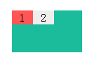
首先来个盒子
<div class="wrap"> <div class="child child-1">1</div> <div class="child child-2">2</div> </div>css通用样式
* { margin: 0px; padding: 0px; } .wrap { margin: 200px auto; display: flex; width: 100px; height: 60px; background-color: #1abc9c; text-align: center; } .child{ width: 30px; height: 20px; line-height: 20px; background-color: #f55; } .child-2{ background-color: #eee; }一、当盒子为单行显示时(就是上面代码的结果)
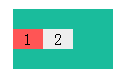
加上:
.wrap{align-content: center;}结果:
结论:在单行显示时align-content: center屁用没有
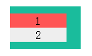
再加上:
.wrap{align-items: center;}结果:
结论:单行时候垂直居中使用align-items: center;
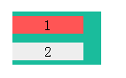
二、当盒子为多行显示时
加上:
.child{width:80px;}然后就是两种情况:
情况一:.wrap{flex-wrap:wrap;align-content: center;}
结果:
情况二:.wrap{flex-wrap:wrap;align-items: center;}
0 0
- 伸缩盒子子中align-items与align-content和justify-content的区别
- flex布局中align-items 和align-content的区别
- flex布局中align-content和align-items的区别
- css弹性盒模型属性align-items与justify-content
- CSS中flex布局中align-items 和align-content的区别
- flex布局justify-content属性和align-items,align-self属性
- flex 布局 justify-content:center; align:items; mobile 解决老版box 兼容性问题
- align-content
- HTML5基础加强css样式篇(伸缩容器属性:flex-direction, flex-wrap,flex-flow,align-items,align-content)(五十三)
- css3中 resize 、outline-offset、outline align-items属性 inherit和auto的区别
- text-align 和 align的区别
- align-items
- align和text-align区别
- text-align:justify和display:inline-block
- align和valign的区别
- textalign和align的区别
- text-align:justify使用
- justify-content的属性详解
- Chapter 4: 序列式容器之 heap and priority queue
- 进程—内存描述符(mm_struct)
- MySQL 数据导入导出
- 栈运用之括号匹配
- nginx: [emerg] socket() [::]:80 failed (97: Address family not supported by protocol) 报错
- 伸缩盒子子中align-items与align-content和justify-content的区别
- 自编多媒体演示程序
- ApacheBeam前瞻
- MySQL 字符集设置
- 用IHttpModule解决输入中文地址乱码问题(一)
- javascript
- 最大子序列问题的四种解法
- OrmLite—表的创建及使用
- MySQL 语句级避免重复插入—— Insert Select Not Exist