css居中那点事儿
来源:互联网 发布:淘宝网点照明设计软件 编辑:程序博客网 时间:2024/06/05 23:54
css居中那点事儿
在css中对元素进行水平居中是非常简单的,然而使元素垂直居中就不是一件简单的事情了,多年以来,垂直居中已经成为了CSS领域的圣杯,因为它是极其常见的需求,但是在实践中却不是一件简单的事情。下面我会简单介绍水平居中,并着重讨论垂直居中。
第一部分:水平居中
1.实现行内元素的居中。方法:在行内元素外面的块元素的样式中添加:text-align:center;

<!DOCTYPE html><html lang="en"><head> <meta charset="UTF-8"> <title>Document</title> <style> div{text-align: center;} img{width: 200px;height: 200px;border: thin solid red;} </style></head><body> <div> <img src="pic.png"> </div></body></html>
注意:对于某个块元素的居中,不能在其父元素的样式中设置text-align:center,这是无效的。下面介绍块元素的居中方式。
2.实现块级元素的水平居中。
方法一:设置其左右两边的外补丁为auto。
<!DOCTYPE html><html lang="en"><head> <meta charset="UTF-8"> <title>Document</title> <style> div{width: 200px;height: 100px;background: red;margin:0 auto;} </style></head><body> <div>this is a div</div></body></html>
注意:如果块级元素是body的直接子元素,不设置宽,则默认100%,看不出效果;不设置高,且div中没有内容,则高度默认为0。因此,一定要同时设置块级元素的宽和高,这样才能看出来效果。对于在一个div中的另一个div希望居中,也可以使用这个方式,因为这时的margin是相对于其父元素而言的。
方法二:使用绝对定位和负边距。
代码如下所示:
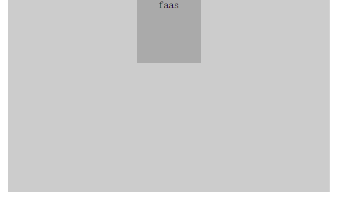
<!DOCTYPE html><html lang="en"><head> <meta charset="UTF-8"> <title>Document</title> <style> *{margin:0;padding: 0;} #parent{width: 500px;height: 300px;background: #ccc;margin: 0 auto;position:relative; } #son{ width: 100px;height: 100px;background: #aaa;text-align: center; position: absolute; left: 50%; margin-left: -50px; /*注意:因为绝对定位是left的值是相对于son的最左边为50%,所以需要使用margin-left再向左偏移宽度的一半 */ } </style></head><body> <div id="parent"> <div id="son">faas</div> </div> </body></html>
效果图如下:
第二部分:垂直居中
1.行内元素的垂直居中
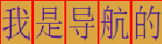
A 我们在写导航菜单时,往往采用将<a>标签写入float的<li>中,且为了美观,我们常常需要将a标签中的内容水平居中和垂直居中。水平居中我们在上面已经介绍了,通过在字体的父元素内设置text-align:center;即可实现。那么垂直居中呢?对于文字而言,我们只需要将行高设置为字体所在块元素的高度即可。
html代码如下:
<body> <ul> <li><a href="">我</a></li> <li><a href="">是</a></li> <li><a href="">导</a></li> <li><a href="">航</a></li> <li><a href="">的</a></li> </ul> </body>
css代码如下:
<style> *{padding: 0;margin: 0;list-style: none;text-decoration: none;} ul li{float: left;/*width: 40px;height: 40px;*/} a{display: block;width: 70px;height: 40px;background: #daa541;border:1px solid red;text-align: center;line-height: 40px;} </style>
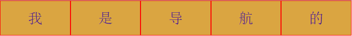
我把a标签的display属性值修改为了block,所以我们就可以修改a标签的宽度和高度了,因为li是包含a的,li会由其中的内容(即a标签)撑开,所以在li中的width和height是不需要设置的。
因为a成为了块级元素,所以水平居中只需要在a中添加text-decoration:none;即可。将line-height的高度和height的高度设置为相同的,就可以实现垂直居中了。
B 如果要对a标签中的字体居中,实际上还有一种更为简单的方法。
即将a的display属性设置位block之后,不设置其宽度和高度(li的宽度和高度也不设置),为了看清楚,我们可以给a加border,这时得到的效果图如下:
即a的大小完全是由字体撑开的,这时我们可以通过设置上下左右的padding值达到与A方法相同的效果。html代码与A中相同,css代码如下:
*{padding: 0;margin: 0;list-style: none;text-decoration: none;} ul li{float: left;} a{display: block;background: #daa541;border:1px solid red; padding:10px 30px;}
大家可以看到,这里我只设置了上下padding值为10px,左右padding值为30px;在A中的width height text-align(实现水平居中) line-height(实现竖直居中)这些属性全都没有设置,只使用了padding:10px 30px;来代替,所以这种方法是值得推荐的。
效果图如下:
C 另外一种方法也可以实现行内元素的垂直居中。
代码如下:
<!DOCTYPE html><html lang="en"><head> <meta charset="UTF-8"> <title>Document</title> <style> *{margin:0;padding: 0;} #parent{width: 500px;height: 300px;background: #ccc; display:table-cell; vertical-align: middle;} </style></head><body> <div id="parent"> <span>faas</span> </div> </body></html>
即我们将id为parent的div元素的display属性值设置位table-cell,这时,即让标签元素以表格单元格的形式呈现,类似于td标签。这时就可以通过设置vertical-align来实现垂直居中了。但值得注意的是:table-cell会被其他一些css属性破坏,比如float和position:absolute等等。且一旦设置位table-cell,这时margin就不能用了。这种方法也可以用于块级元素的垂直居中。
也可以使用display:flex; 以及 align-items:center; 但是这样就不能用text-align:center;
2.块级元素的垂直居中。
方法一:使用绝对定位和负边距。
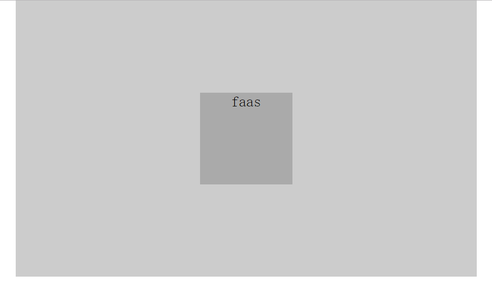
<!DOCTYPE html><html lang="en"><head> <meta charset="UTF-8"> <title>Document</title> <style> *{margin:0;padding: 0;} #parent{width: 500px;height: 300px;background: #ccc;margin: 0 auto;position:relative; } #son{ width: 100px;height: 100px;background: #aaa;text-align: center; position: absolute;top: 50%;margin-top: -50px; } </style></head><body> <div id="parent"> <div id="son">faas</div> </div> </body></html>
方法二:使用display:table-cell;方法。
<!DOCTYPE html><html lang="en"><head> <meta charset="UTF-8"> <title>Document</title> <style> *{margin:0;padding: 0;} #parent{width: 500px;height: 300px;background: #ccc; display:table-cell; vertical-align: middle;} </style></head><body> <div id="parent"> <div>faas</div> </div> </body></html>
大家可以看出,这个方法与行内元素的垂直居中并没有什么区别。
方法三:使用display:flex;代码如下:
<!DOCTYPE html><html lang="en"><head> <meta charset="UTF-8"> <title>Document</title> <style> *{margin:0;padding: 0;} #parent{width: 500px;height: 300px;background: #ccc; margin:0 auto; display: flex; align-items:center; } #parent>div{background: red;width: 100px;height: 100px;} </style></head><body> <div id="parent"> <div>faas</div> </div> </body></html>
在父元素中添加display:flex;align-items:center;即可实现竖直居中。
第三部分:水平竖直同时居中(重点)
方法一:使用绝对定位和负边距
代码如下
<!DOCTYPE html><html lang="en"><head> <meta charset="UTF-8"> <title>Document</title> <style> *{margin:0;padding: 0;} #parent{width: 500px;height: 300px;background: #ccc;margin: 0 auto;position:relative; } #son{ width: 100px;height: 100px;background: #aaa;text-align: center; position: absolute;top: 50%;margin-top: -50px; left: 50%;margin-left: -50px; } </style></head><body> <div id="parent"> <div id="son">faas</div> </div> </body></html>
效果如下:
方法二:使用display:flex
代码如下:
<!DOCTYPE html><html lang="en"><head> <meta charset="UTF-8"> <title>Document</title> <style> *{margin:0;padding: 0;} #parent{width: 500px;height: 300px;background: #ccc; margin:0 auto; display: flex; align-items:center; justify-content:center;} #parent>div{background: red;width: 100px;height: 100px;} </style></head><body> <div id="parent"> <div>faas</div> </div> </body></html>
即只需要在父元素的样式中添加display:flex;align-items:center实现竖直居中,justify-content:center;实现水平居中。
方法三:同样使用display:flex.
代码如下:
<!DOCTYPE html><html lang="en"><head> <meta charset="UTF-8"> <title>Document</title> <style> *{margin:0;padding: 0;} #parent{width: 500px;height: 300px;background: #ccc; margin:0 auto; display: flex; } #parent>div{background: red;width: 100px;height: 100px; margin: auto;} </style></head><body> <div id="parent"> <div>faas</div> </div> </body></html>
我们发现只需要在父元素中设置display:flex;在子元素中设置margin:auto。
方法四:使用css3属性
在方法一中,我们必须知道子元素的width和height才能使用负边距使其居中,但是如果其width和height不是确定的值,这个方法就不可用了。下面这种使用css变形属性的方法可以很好的解决这一问题,因为translate()变形函数中使用的百分比值时,是以这个元素自身的宽度和高度为基准进行换算和移动的。举例如下:
<!DOCTYPE html><html lang="en"><head> <meta charset="UTF-8"> <title>居中方法</title> <style> #father{ position: relative; width: 500px; height: 500px; background: #ccc; } #son{ position: absolute; top:50%; left:50%; width: 100px; background: #ddd; transform:translate(-50%,-50%); } </style></head><body> <div id="father"> <div id="son">子元素,没有设置高度。子元素,没有设置高度。子元素,没有设置高度。子元素,没有子元素,没有设置高度。</div> </div></body></html>
代码中我只设置了宽度,而没有设置高度,即高度自适应,最终效果如下所示:
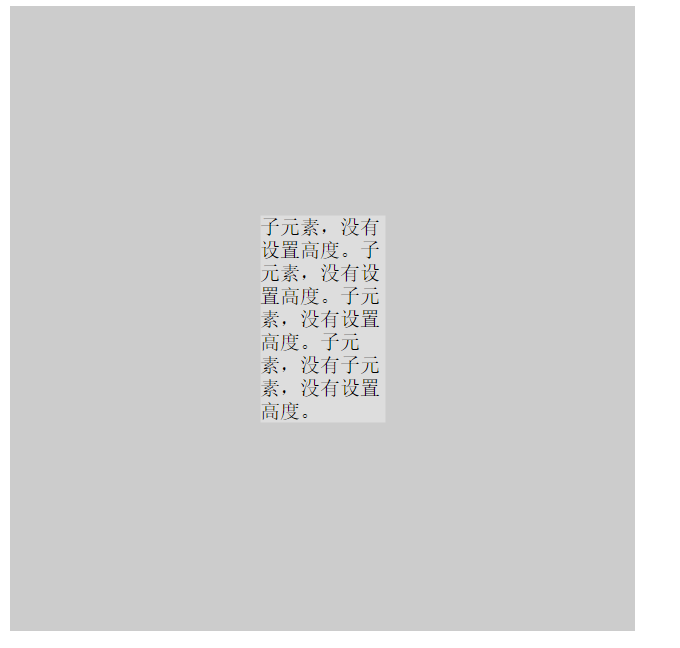
即使我们添加或减少内容,也可以达到垂直居中的目的!
方法五:
在父元素中使用position:relative;在子元素中使用position:absolute;将其margin值设置为auto;并且四个方向都设置为0即可。
代码如下所示:
<!DOCTYPE html><html lang="en"><head> <meta charset="UTF-8"> <title>居中方法</title> <style> .parent{ position: relative; width: 200px; height: 200px; background-color: blue; } .son{ position: absolute; width: 50px; height: 50px; margin:auto; left:0;right: 0;top: 0;bottom: 0; /*使用margin:auto和四个方向都是0,有一种五马分尸的感觉*/ background-color: red; } </style></head><body> <div class="parent"> <div class="son"> 居中元素 </div> </div></body></html>
最终效果如下所示:
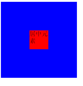
这样做的好处就是我们我们不需要知道父元素和子元素的宽度和高度,而只要使其尺寸固定即可。
- css居中那点事儿
- 【CSS】关于样式优先级的那点事儿
- 程序员那点事儿
- XML那点事儿
- 喝酒那点事儿
- P2P那点事儿
- 招聘那点事儿
- 性能那点事儿
- CMD那点事儿
- 面试那点事儿
- AOP 那点事儿
- 【中差评也就那点事儿】
- 系统维护那点事儿
- Proxy 那点事儿
- ContentProvider 那点事儿
- Lock 那点事儿
- ThreadLocal 那点事儿
- 结婚那点事儿
- 关于spi flash芯片m25p80驱动以及其简单的mtd驱动分析
- 用JS将一个升序数组转换成一个二叉排序树
- 极光推送集成
- css常用属性
- struts2升级之后jsp到action传值出现乱码问题
- css居中那点事儿
- Java学习之TreeSet
- Spring MVC使用ModelAndView进行重定向
- AndroidStudio与eclipse打包的时候报错。Error:(4) Error: "ssdk_instapager_login_html" is not translated in "en"
- 2017年上半年软件程序员考试---初级程序员--考点总结1
- JavaScript中的事件对象
- php下载时VC各版本的区别和Non Thread Safe、Thread safe的简单辨析
- SpringMVC中的数据校验
- appium使用sendkeys输入银行卡卡号(每4个数字自动空一格)总是输入不正确的解决办法