React Native 系列(九) -- Tab标签组件
来源:互联网 发布:mac下rar解压软件 编辑:程序博客网 时间:2024/05/24 03:14
前言
本系列是基于React Native版本号0.44.3写的。很多的App都使用了Tab标签组件,例如QQ,微信等等,就是切换不同的选项,显示不同的内容。那么这篇文章将介绍RN中的Tab标签组件。
Tab标签
什么是Tab标签?(ps:我是这样叫的),就拿微信来说吧,底部有4个选项卡,点击不同的按钮切换不同的内容。
在RN中有两个组件负责实现这样的效果,它们是:
- TabBarIOS
- TabNavigator
TabBarIOS
和NavigatorIOS相似,看名字就知道该组件只适用于iOS,不能用于android。
TabBarIOS 常用属性
barTintColor string:标签栏的背景颜色。 style:样式 tintColor string: 当前被选中的标签图标的颜色。 unselectedItemTintColor string: 当前没有被选中的标签图标的颜色。仅在iOS 10及以上版本有效 translucent bool: 一个布尔值,决定标签栏是否需要半透明化。TabBarIOS.Item
- 注意:
TabBarIOS.Item必须包装一个View,作为点击选项卡,切换的view
TabBarIOS.Item 常用属性
badge string, number :在图标右上角显示一个红色的气泡。 icon Image.propTypes.source :给当前标签指定一个自定义的图标。如果定义了systemIcon属性, 这个属性会被忽略。 onPress function :当此标签被选中时调用。你应该修改组件的状态来使得selected={true}。 selected bool :这个属性决定了子视图是否可见。如果你看到一个空白的页面,很可能是没有选中任何一个标签。 selectedIcon Image.propTypes.source :当标签被选中的时候显示的自定义图标。如果定义了systemIcon属性,这个属性会被忽略。如果定义了icon而没定义这个属性,在选中的时候图标会染上蓝色。 systemIcon enum('bookmarks', 'contacts', 'downloads', 'favorites', 'featured', 'history', 'more', 'most-recent', 'most-viewed', 'recents', 'search', 'top-rated') :一些预定义的系统图标。注意如果你使用了此属性,标题和自定义图标都会被覆盖为系统定义的值。 title string :在图标下面显示的标题文字。如果定义了systemIcon属性,这个属性会被忽略使用步骤
创建
TabBar标签: 使用下面行代码,底部就会有一个条<TabBarIOS></TabBarIOS>添加选项卡
<TabBarIOS.Item title='首页' icon={{uri: 'tabbar_home_select' , scale: 3}}> <View style={{flex: 1, justifyContent: 'center', alignItems: 'center', backgroundColor: 'red'}}> <Text>首页</Text> </View></TabBarIOS.Item>监听按钮点击,切换界面
- 只要设置对应的
tabBarItem的selected为true,就会自动跳转到对应界面 - 注意:
tabBarItem的selected属性不能写死,可以定义个flag来标记当前选中的item - 监听
tabBarItem的点击,修改selected属性
- 只要设置对应的
实战演练
先看效果图: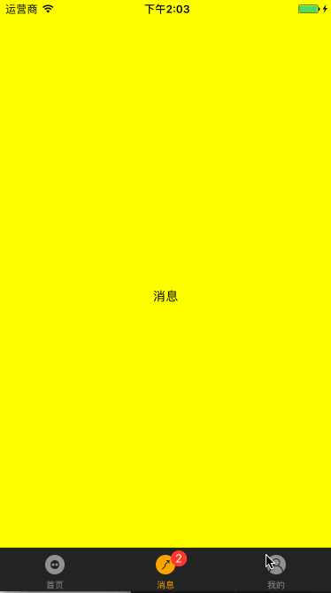
我们在index.ios.js文件做修改,直接创建一个TabBarIOS组件:
render() { return ( <TabBarIOS tintColor='orange' barTintColor='black' > </TabBarIOS> );}再创建三个选项卡(ps:3个选项卡创建方式类似,所以这里只贴出创建一个的代码,),icon是图片,关于图片方面的知识,本文最后做一个总结吧:
<TabBarIOS.Item title='首页' icon={{uri: 'tabbar_home_select' , scale: 3}} selected={true} > <View style={{flex: 1, justifyContent: 'center', alignItems: 'center', backgroundColor: 'red'}}> <Text>首页</Text> </View></TabBarIOS.Item>监听按钮点击,然后实现界面切换,我们需要定义一个flag记录当前选中的,
constructor(props) { super(props); // 初始状态 this.state = { selectIndex:0, };}给TabBarIOS.Item添加点击事件:
<TabBarIOS.Item title='首页' icon={{uri: 'tabbar_home_select' , scale: 3}} onPress={()=>{ this.setState({ selectIndex:0 }) }} selected={0==this.state.selectIndex}>我们会发现,创建3个TabBarIOS.Item的代码是一样的,避免写重复代码,我们可以抽取出来:
_renderTabBarItem(title, iconName, selected, bgColor, badgeNumber){ return ( <TabBarIOS.Item title={title} icon={{uri: iconName, scale: 3}} onPress={()=>{ this.setState({ selectIndex: selected }) }} badge={badgeNumber} selected={this.state.selectIndex === selected} > <View style={{flex: 1, justifyContent: 'center', alignItems: 'center', backgroundColor: bgColor}}> <Text>{title}</Text> </View> </TabBarIOS.Item> );}然后我们整个创建标签Tab的代码就应该是这样:
render() { return ( <TabBarIOS tintColor='orange' barTintColor='black' > {this._renderTabBarItem("首页", 'tabbar_my_select', 0, 'red', null)} {this._renderTabBarItem("消息", 'tabbar_my_select', 1, 'yellow', 2)} {this._renderTabBarItem("我的", 'tabbar_my_select', 2, 'cyan', null)} </TabBarIOS> );}TabNavigator
本系列上篇文章中,介绍到React Navigation组件中包含了TabNavigator。所以接下来的讲解是在引入了React Navigation的基础之上的。
常用属性
screen:和导航的功能是一样的,对应界面名称,可以在其他页面通过这个screen传值和跳转。 navigationOptions:配置TabNavigator的一些属性 { title:标题,会同时设置导航条和标签栏的title tabBarVisible:是否隐藏标签栏。默认不隐藏(true) tabBarIcon:设置标签栏的图标。需要给每个都设置 tabBarLabel:设置标签栏的title。推荐 }tabBarPosition:设置tabbar的位置,iOS默认在底部,安卓默认在顶部。(属性值:'top','bottom') swipeEnabled:是否允许在标签之间进行滑动 animationEnabled:是否在更改标签时显示动画 lazy:是否根据需要懒惰呈现标签,而不是提前,意思是在app打开的时候将底部标签栏全部加载,默认false,推荐为true trueinitialRouteName: 设置默认的页面组件 backBehavior:按 back 键是否跳转到第一个Tab(首页), none 为不跳转 tabBarOptions:配置标签栏的一些属性iOS属性 activeTintColor:label和icon的前景色 活跃状态下 activeBackgroundColor:label和icon的背景色 活跃状态下 inactiveTintColor:label和icon的前景色 不活跃状态下 inactiveBackgroundColor:label和icon的背景色 不活跃状态下 showLabel:是否显示label,默认开启 style:tabbar的样式 labelStyle:label的样式安卓属性 activeTintColor:label和icon的前景色 活跃状态下 inactiveTintColor:label和icon的前景色 不活跃状态下 showIcon:是否显示图标,默认关闭 showLabel:是否显示label,默认开启 style:tabbar的样式 labelStyle:label的样式 upperCaseLabel:是否使标签大写,默认为true pressColor:material涟漪效果的颜色(安卓版本需要大于5.0) pressOpacity:按压标签的透明度变化(安卓版本需要小于5.0) scrollEnabled:是否启用可滚动选项卡 tabStyle:tab的样式 indicatorStyle:标签指示器的样式对象(选项卡底部的行)。安卓底部会多出一条线,可以将height设置为0来暂时解决这个问题 labelStyle:label的样式 iconStyle:图标样式 实战演练
我们创建App.js,然后在index.ios.js文件引用该组件:
import App from './App'export default class RNDemoTwo extends Component { render() { return ( <App/> ); }}现在来配置下App.js文件:
import {TabNavigator} from 'react-navigation'import HelloViewCompnent from './HelloViewComponent'import DetailComponent from './DetailComponent'import ThreeComponent from './Three'import CustTabBarItem from "./TabBarItem"const SimpleApp = TabNavigator({ Home: { screen: HelloViewCompnent, navigationOptions: ({navigation}) => ({ tabBarVisible: true, tabBarLabel: '首页', tabBarIcon: ({focused, tintColor})=>( <CustTabBarItem tintColor={tintColor} focused={focused} selectImage={{uri: 'tabbar_home_select'}} normalImage={{uri: 'tabbar_home'}} /> ), }) }, Detail: { screen: DetailComponent, navigationOptions: ({navigation}) => ({ tabBarLabel: '消息', tabBarIcon: ({focused, tintColor})=>( <CustTabBarItem tintColor={tintColor} focused={focused} selectImage={{uri: 'tabbar_licai_select'}} normalImage={{uri: 'tabbar_licai'}} /> ), }) }, Three: { screen: ThreeComponent, navigationOptions: ({navigation}) => ({ tabBarLabel: '我的', tabBarIcon: ({focused, tintColor})=>( <CustTabBarItem tintColor={tintColor} focused={focused} selectImage={{uri: 'tabbar_my_select'}} normalImage={{uri: 'tabbar_my'}} /> ), }) }},{ tabBarPosition:'bottom', swipeEnabled:false, animationEnabled:false, lazy:true, tabBarOptions:{ activeTintColor:'red', inactiveTintColor:'black', style:{backgroundColor:'#fff',}, labelStyle: { fontSize: 16, // 文字大小 }, }})export default SimpleApp可以看到我们导入了三个页面组件,一个CustTabBarItem,
三个页面组件很简单,都类似,由于篇幅原因,只贴出一个就行了:
export default class HelloViewCompnent extends Component { render() { return ( <View style={styles.container}> <Text style={styles.welcome}> 首页 </Text> </View> ); }}const styles = StyleSheet.create({ container: { flex: 1, justifyContent: 'center', alignItems: 'center', backgroundColor: 'white', }, welcome: { fontSize: 20, textAlign: 'center', margin: 10, },});最后,就是我们的TabBarItem.js文件了:
export default class TabBarItem extends Component { render(){ return ( <Image source={this.props.focused ? this.props.selectImage : this.props.normalImage} style={{tintColor: this.props.tintColor, width: 25, height: 25}}/> ); }}保存代码,运行项目,不出意外,应该和使用TabBarIOS是一样的效果。
关于Image组件
由于这里我们都使用到<Image/>组件,这里就稍微讲一下。
- Image:用于加载图片,可加载网络图片,也可以加载本地图片
Image常用属性
source {uri: string}, number : 设置Image图片资源 blurRadius number:让图片模糊 defaultSource {uri: string, width: number, height:number, scale: number}, number 占位图片,在读取图片时默认显示的加载提示图片 resizeMode enum('cover', 'contain', 'stretch', 'repeat', 'center') 决定图片尺寸大小。 cover: 在保持图片宽高比的前提下缩放图片,直到宽度和高度都大于等于容器视图的尺寸(如果容器有padding内衬的话,则相应减去)。译注:这样图片完全覆盖甚至超出容器,容器中不留任何空白。 contain: 在保持图片宽高比的前提下缩放图片,直到宽度和高度都小于等于容器视图的尺寸(如果容器有padding内衬的话,则相应减去)。译注:这样图片完全被包裹在容器中,容器中可能留有空白 stretch: 拉伸图片且不维持宽高比,直到宽高都刚好填满容器。repeat: 重复平铺图片直到填满容器。图片会维持原始尺寸。仅iOS可用。 center: 居中不拉伸。本地图片存放位置
- 直接放在RN项目中
- 可以放在
ios项目中,放到images.xcassets文件中
- 可以放在
- 可以放在
android项目中(安卓中图片文字不能以数字开头,也不能有大写字母)
- 可以放在
如何加载本地图片
- RN中加载资源:require(文件路径),用于加载RN中的资源,不管是图片,还是json都是一样的
- uri:指定一个资源路径,就会自动加载
- uri加载注意:通过uri加载资源,必须设置图片尺寸,否则不显示
- 如果网络加载http图片,iOS默认不支持,需要开启
App Transport。
致谢
如果发现有错误的地方,欢迎各位指出,谢谢!
- React Native 系列(九) -- Tab标签组件
- react-native tab标签
- ReactNative组件-react-native-scrollable-tab-view
- React Native Touchable系列组件
- (九)React Native---ScrollView组件
- React Native系列之-组件初入门
- 《React-Native系列》36、 ReactNative地图组件
- 《React-Native系列》41、刨根问底Picker组件
- 《React-Native系列》36、 ReactNative地图组件
- 《React-Native系列》40、刨根问底Picker组件
- react native Touchable 系列组件使用详解
- React Native三方组件之scrollable-tab-view
- react-native-tab-navigator
- React-native学习过程 九 Text组件综合应用
- React Native组件篇(四) — Touchable系列组件
- 【REACT NATIVE 系列教程之九】REACT NATIVE版本升级步骤与注意事项!
- react-native源码分析系列五 绘制js组件
- React-Native系列Android——自定义View组件开发
- Ecology7二次开发:添加浏览按钮弹窗前事件代码
- Oracle小练习
- qt开发环境
- MySql索引总结
- UVa 1225 分子量 (Molar Mass)ACM
- React Native 系列(九) -- Tab标签组件
- 最短路问题及路径回归
- HDU 6143 (容斥)
- Android注册时总是出现"验证码不正确"问题的解决
- DeepLearning(花书)第二章主要内容(1-6节)
- 《Mining Text Data》阅读笔记---第1章 An Introduction to Text Mining
- Linux内核中断:request_irq,free_irq
- 几个算法小题目
- Hdu 6143 Killer Names(第二类strling数)