Python可视化库Matplotlib的使用
来源:互联网 发布:js代码断点调试 编辑:程序博客网 时间:2024/05/21 19:35
一。导入数据
import pandas as pdunrate = pd.read_csv('unrate.csv')unrate['DATE'] = pd.to_datetime(unrate['DATE'])print(unrate.head(12))
结果如下: DATE VALUE0 1948-01-01 3.41 1948-02-01 3.82 1948-03-01 4.03 1948-04-01 3.94 1948-05-01 3.55 1948-06-01 3.66 1948-07-01 3.67 1948-08-01 3.98 1948-09-01 3.89 1948-10-01 3.710 1948-11-01 3.811 1948-12-01 4.0二。使用Matplotlib库
import matplotlib.pyplot as plt#%matplotlib inline#Using the different pyplot functions, we can create, customize, and display a plot. For example, we can use 2 functions to :plt.plot()plt.show()
结果如下:
三。插入数据
first_twelve = unrate[0:12]plt.plot(first_twelve['DATE'], first_twelve['VALUE'])plt.show()

由于x轴过于紧凑,所以使用旋转x轴的方法 结果如下。
plt.plot(first_twelve['DATE'], first_twelve['VALUE'])plt.xticks(rotation=45)#print help(plt.xticks)plt.show()

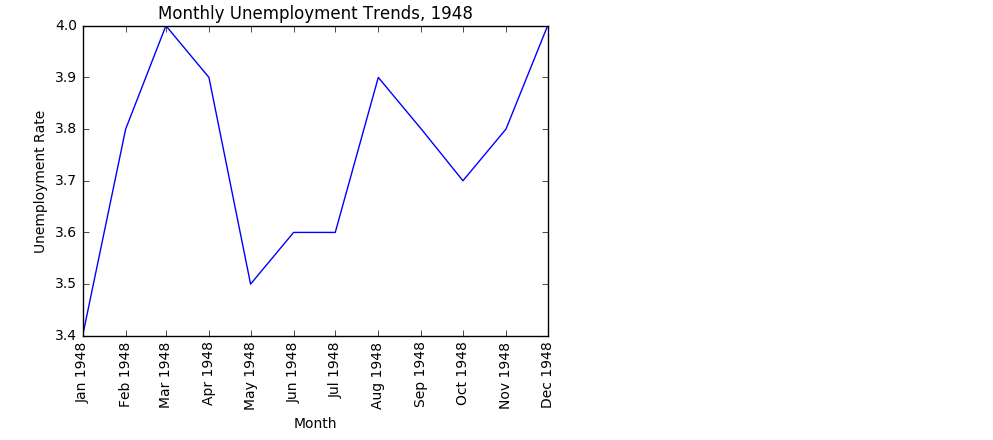
四。设置x轴y轴说明
plt.plot(first_twelve['DATE'], first_twelve['VALUE'])plt.xticks(rotation=90)plt.xlabel('Month')plt.ylabel('Unemployment Rate')plt.title('Monthly Unemployment Trends, 1948')plt.show()
五。子图设置
import matplotlib.pyplot as pltfig = plt.figure()ax1 = fig.add_subplot(4,3,1)ax2 = fig.add_subplot(4,3,2)ax2 = fig.add_subplot(4,3,6)plt.show()

六。一个图标多个曲线。
1.简单实验。

unrate['MONTH'] = unrate['DATE'].dt.monthunrate['MONTH'] = unrate['DATE'].dt.monthfig = plt.figure(figsize=(6,3))plt.plot(unrate[0:12]['MONTH'], unrate[0:12]['VALUE'], c='red')plt.plot(unrate[12:24]['MONTH'], unrate[12:24]['VALUE'], c='blue')plt.show()

2.使用循环
fig = plt.figure(figsize=(10,6))colors = ['red', 'blue', 'green', 'orange', 'black']for i in range(5): start_index = i*12 end_index = (i+1)*12 subset = unrate[start_index:end_index] plt.plot(subset['MONTH'], subset['VALUE'], c=colors[i]) plt.show()

3.设置标签
fig = plt.figure(figsize=(10,6))colors = ['red', 'blue', 'green', 'orange', 'black']for i in range(5): start_index = i*12 end_index = (i+1)*12 subset = unrate[start_index:end_index] label = str(1948 + i) plt.plot(subset['MONTH'], subset['VALUE'], c=colors[i], label=label)plt.legend(loc='best')#print help(plt.legend)plt.show()

4。设置完整标签
fig = plt.figure(figsize=(10,6))colors = ['red', 'blue', 'green', 'orange', 'black']for i in range(5): start_index = i*12 end_index = (i+1)*12 subset = unrate[start_index:end_index] label = str(1948 + i) plt.plot(subset['MONTH'], subset['VALUE'], c=colors[i], label=label)plt.legend(loc='upper left')plt.xlabel('Month, Integer')plt.ylabel('Unemployment Rate, Percent')plt.title('Monthly Unemployment Trends, 1948-1952')plt.show()

七。折线图(某电影评分网站)
1.读取数据
import pandas as pdreviews = pd.read_csv('fandango_scores.csv')cols = ['FILM', 'RT_user_norm', 'Metacritic_user_nom', 'IMDB_norm', 'Fandango_Ratingvalue', 'Fandango_Stars']norm_reviews = reviews[cols]print(norm_reviews[:10])

2.设置说明
num_cols = ['RT_user_norm', 'Metacritic_user_nom', 'IMDB_norm', 'Fandango_Ratingvalue', 'Fandango_Stars']bar_heights = norm_reviews.ix[0, num_cols].valuesbar_positions = arange(5) + 0.75tick_positions = range(1,6)fig, ax = plt.subplots()ax.bar(bar_positions, bar_heights, 0.5)//ax.bar绘制折线图,bar_positions绘制离远点的距离,0.5绘制离折线图的宽度。ax.set_xticks(tick_positions)ax.set_xticklabels(num_cols, rotation=45)//横轴的说明 旋转45度 横轴说明ax.set_xlabel('Rating Source')ax.set_ylabel('Average Rating')ax.set_title('Average User Rating For Avengers: Age of Ultron (2015)')plt.show()

3.旋转x轴 y轴
import matplotlib.pyplot as pltfrom numpy import arangenum_cols = ['RT_user_norm', 'Metacritic_user_nom', 'IMDB_norm', 'Fandango_Ratingvalue', 'Fandango_Stars']bar_widths = norm_reviews.ix[0, num_cols].valuesbar_positions = arange(5) + 0.75tick_positions = range(1,6)fig, ax = plt.subplots()ax.barh(bar_positions, bar_widths, 0.5)ax.set_yticks(tick_positions)ax.set_yticklabels(num_cols)ax.set_ylabel('Rating Source')ax.set_xlabel('Average Rating')ax.set_title('Average User Rating For Avengers: Age of Ultron (2015)')plt.show()

八。 散点图
1。基本散点图
fig, ax = plt.subplots()ax.scatter(norm_reviews['Fandango_Ratingvalue'], norm_reviews['RT_user_norm'])ax.set_xlabel('Fandango')ax.set_ylabel('Rotten Tomatoes')plt.show()

2.拆分散点图
#Switching Axesfig = plt.figure(figsize=(5,10))ax1 = fig.add_subplot(2,1,1)ax2 = fig.add_subplot(2,1,2)ax1.scatter(norm_reviews['Fandango_Ratingvalue'], norm_reviews['RT_user_norm'])ax1.set_xlabel('Fandango')ax1.set_ylabel('Rotten Tomatoes')ax2.scatter(norm_reviews['RT_user_norm'], norm_reviews['Fandango_Ratingvalue'])ax2.set_xlabel('Rotten Tomatoes')ax2.set_ylabel('Fandango')plt.show()

Ps:还是呈现很强的相关性的,基本呈直线分布
阅读全文
0 0
- Python可视化库Matplotlib的使用
- Matplotlib可视化库的使用
- Python数据可视化(matplotlib库)
- 【干货】Python使用matplotlib实现数据可视化
- 高效使用 Python 可视化工具 Matplotlib
- python的数据可视化库 matplotlib 和 pyecharts
- Matplotlib入门:Python的可视化绘制工具包
- Python 之大数据量的可视化----Matplotlib
- python数据可视化-matplotlib库初体验
- Python可视化库matplotlib(基础整理)
- python可视化--matplotlib
- python可视化-matplotlib学习
- python matplotlib的使用
- python的matplotlib使用
- 使用Python的netCDF4和matplotlib.basemap包进行气象数据的可视化
- Python进阶(四十)-数据可视化の使用matplotlib进行绘图
- python之matplotlib库的使用
- python之matplotlib库的使用
- TCP介绍及TCP网络编程
- 动态规划问题小结
- 前端学习路径+学习方法+书籍推荐+教学视频分享
- 一个大型高并发系统的性能调优会涉及到什么?
- 设置matplotlib中文显示
- Python可视化库Matplotlib的使用
- oracle常用函数小结(二)
- WatchService——监控硬盘文件改动功能用法及其缺陷
- PyTorch的入门教程实战
- MySQL免安装版配置方法
- 算法练习(8) —— 动态规划
- 关于vs2005、vs2008和vs2010项目互转的总结
- Python--matplotlib绘图可视化知识点整理
- GitHub 手把手教你如何把本地项目或代码提交到Github托管