[WPF,XAML,ScrollBar,ScrollViewer,Style] 自定义滚动条
来源:互联网 发布:阿里云 cdn节点数量 编辑:程序博客网 时间:2024/06/05 01:02
自定义 ScrollViewer 的滚动条样式,如下图所示:
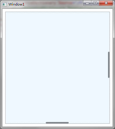
ScrollBar 在滚动时会自动显示并隐藏,而且 ScrollBar 存在于 Viewport 的区域中。
ScrollViewer.xaml
<ResourceDictionary xmlns="http://schemas.microsoft.com/winfx/2006/xaml/presentation" xmlns:x="http://schemas.microsoft.com/winfx/2006/xaml"> <Style x:Key="ScrollBarThumb" TargetType="{x:Type Thumb}"> <Setter Property="OverridesDefaultStyle" Value="true"/> <Setter Property="IsTabStop" Value="false"/> <Setter Property="Template"> <Setter.Value> <ControlTemplate TargetType="{x:Type Thumb}"> <Grid> <Rectangle Fill="#90000000" RadiusX="3" RadiusY="3"/> </Grid> </ControlTemplate> </Setter.Value> </Setter> </Style> <Style x:Key="HorizontalScrollBarPageButton" TargetType="{x:Type RepeatButton}"> <Setter Property="OverridesDefaultStyle" Value="true"/> <Setter Property="Background" Value="Transparent"/> <Setter Property="Focusable" Value="false"/> <Setter Property="IsTabStop" Value="false"/> <Setter Property="Opacity" Value="0"/> <Setter Property="Template"> <Setter.Value> <ControlTemplate TargetType="{x:Type RepeatButton}"> <Rectangle Fill="{TemplateBinding Background}" Width="{TemplateBinding Width}" Height="{TemplateBinding Height}"/> </ControlTemplate> </Setter.Value> </Setter> </Style> <Style x:Key="VerticalScrollBarPageButton" TargetType="{x:Type RepeatButton}"> <Setter Property="OverridesDefaultStyle" Value="true"/> <Setter Property="Background" Value="Transparent"/> <Setter Property="Focusable" Value="false"/> <Setter Property="IsTabStop" Value="false"/> <Setter Property="Opacity" Value="0"/> <Setter Property="Template"> <Setter.Value> <ControlTemplate TargetType="{x:Type RepeatButton}"> <Rectangle Fill="{TemplateBinding Background}" Width="{TemplateBinding Width}" Height="{TemplateBinding Height}"/> </ControlTemplate> </Setter.Value> </Setter> </Style> <Style x:Key="for_scrollbar" TargetType="{x:Type ScrollBar}"> <Setter Property="Stylus.IsPressAndHoldEnabled" Value="false"/> <Setter Property="Stylus.IsFlicksEnabled" Value="false"/> <Setter Property="Background" Value="Transparent"/> <Setter Property="Margin" Value="0,1,1,6"/> <Setter Property="Width" Value="5"/> <Setter Property="MinWidth" Value="5"/> <Setter Property="Opacity" Value="0"/> <Setter Property="Template"> <Setter.Value> <ControlTemplate TargetType="{x:Type ScrollBar}"> <Grid x:Name="Bg" SnapsToDevicePixels="true"> <Track x:Name="PART_Track" IsEnabled="{TemplateBinding IsMouseOver}" IsDirectionReversed="true"> <Track.DecreaseRepeatButton> <RepeatButton Style="{StaticResource VerticalScrollBarPageButton}" Command="{x:Static ScrollBar.PageUpCommand}"/> </Track.DecreaseRepeatButton> <Track.IncreaseRepeatButton> <RepeatButton Style="{StaticResource VerticalScrollBarPageButton}" Command="{x:Static ScrollBar.PageDownCommand}"/> </Track.IncreaseRepeatButton> <Track.Thumb> <Thumb Style="{StaticResource ScrollBarThumb}"/> </Track.Thumb> </Track> </Grid> </ControlTemplate> </Setter.Value> </Setter> <Style.Triggers> <Trigger Property="Orientation" Value="Horizontal"> <Setter Property="Background" Value="Transparent"/> <Setter Property="Margin" Value="1,0,6,1"/> <Setter Property="Height" Value="5"/> <Setter Property="MinHeight" Value="5"/> <Setter Property="Width" Value="Auto"/> <Setter Property="Opacity" Value="0"/> <Setter Property="Template"> <Setter.Value> <ControlTemplate TargetType="{x:Type ScrollBar}"> <Grid x:Name="Bg" SnapsToDevicePixels="true"> <Track x:Name="PART_Track" IsEnabled="{TemplateBinding IsMouseOver}"> <Track.DecreaseRepeatButton> <RepeatButton Style="{StaticResource HorizontalScrollBarPageButton}" Command="{x:Static ScrollBar.PageLeftCommand}"/> </Track.DecreaseRepeatButton> <Track.IncreaseRepeatButton> <RepeatButton Style="{StaticResource HorizontalScrollBarPageButton}" Command="{x:Static ScrollBar.PageRightCommand}"/> </Track.IncreaseRepeatButton> <Track.Thumb> <Thumb Style="{StaticResource ScrollBarThumb}"/> </Track.Thumb> </Track> </Grid> </ControlTemplate> </Setter.Value> </Setter> </Trigger> </Style.Triggers> </Style> <!-- ScrollViewer --> <Style x:Key="for_scrollviewer" TargetType="{x:Type ScrollViewer}"> <Setter Property="BorderBrush" Value="LightGray"/> <Setter Property="BorderThickness" Value="0"/> <Setter Property="HorizontalContentAlignment" Value="Left"/> <Setter Property="HorizontalScrollBarVisibility" Value="Auto"/> <Setter Property="VerticalContentAlignment" Value="Top"/> <Setter Property="VerticalScrollBarVisibility" Value="Auto"/> <Setter Property="Template"> <Setter.Value> <ControlTemplate TargetType="{x:Type ScrollViewer}"> <Border BorderBrush="{TemplateBinding BorderBrush}" BorderThickness="{TemplateBinding BorderThickness}" SnapsToDevicePixels="True"> <Grid Background="{TemplateBinding Background}"> <ScrollContentPresenter Cursor="{TemplateBinding Cursor}" Margin="{TemplateBinding Padding}" ContentTemplate="{TemplateBinding ContentTemplate}"/> <ScrollBar x:Name="PART_VerticalScrollBar" HorizontalAlignment="Right" Maximum="{TemplateBinding ScrollableHeight}" Orientation="Vertical" Style="{StaticResource for_scrollbar}" ViewportSize="{TemplateBinding ViewportHeight}" Value="{TemplateBinding VerticalOffset}" Visibility="{TemplateBinding ComputedVerticalScrollBarVisibility}"/> <ScrollBar x:Name="PART_HorizontalScrollBar" Maximum="{TemplateBinding ScrollableWidth}" Orientation="Horizontal" Style="{StaticResource for_scrollbar}" VerticalAlignment="Bottom" Value="{TemplateBinding HorizontalOffset}" ViewportSize="{TemplateBinding ViewportWidth}" Visibility="{TemplateBinding ComputedHorizontalScrollBarVisibility}"/> </Grid> </Border> <ControlTemplate.Triggers> <EventTrigger RoutedEvent="ScrollChanged"> <BeginStoryboard> <Storyboard> <DoubleAnimation Storyboard.TargetName="PART_VerticalScrollBar" Storyboard.TargetProperty="Opacity" To="1" Duration="0:0:1"/> <DoubleAnimation Storyboard.TargetName="PART_VerticalScrollBar" Storyboard.TargetProperty="Opacity" To="0" Duration="0:0:1" BeginTime="0:0:1"/> <DoubleAnimation Storyboard.TargetName="PART_HorizontalScrollBar" Storyboard.TargetProperty="Opacity" To="1" Duration="0:0:1"/> <DoubleAnimation Storyboard.TargetName="PART_HorizontalScrollBar" Storyboard.TargetProperty="Opacity" To="0" Duration="0:0:1" BeginTime="0:0:1"/> </Storyboard> </BeginStoryboard> </EventTrigger> <EventTrigger RoutedEvent="MouseEnter" SourceName="PART_VerticalScrollBar"> <BeginStoryboard> <Storyboard> <DoubleAnimation Storyboard.TargetName="PART_VerticalScrollBar" Storyboard.TargetProperty="Opacity" To="1" Duration="0:0:1"/> </Storyboard> </BeginStoryboard> </EventTrigger> <EventTrigger RoutedEvent="MouseLeave" SourceName="PART_VerticalScrollBar"> <BeginStoryboard> <Storyboard> <DoubleAnimation Storyboard.TargetName="PART_VerticalScrollBar" Storyboard.TargetProperty="Opacity" To="0" Duration="0:0:1"/> </Storyboard> </BeginStoryboard> </EventTrigger> <EventTrigger RoutedEvent="MouseEnter" SourceName="PART_HorizontalScrollBar"> <BeginStoryboard> <Storyboard> <DoubleAnimation Storyboard.TargetName="PART_HorizontalScrollBar" Storyboard.TargetProperty="Opacity" To="1" Duration="0:0:1"/> </Storyboard> </BeginStoryboard> </EventTrigger> <EventTrigger RoutedEvent="MouseLeave" SourceName="PART_HorizontalScrollBar"> <BeginStoryboard> <Storyboard> <DoubleAnimation Storyboard.TargetName="PART_HorizontalScrollBar" Storyboard.TargetProperty="Opacity" To="0" Duration="0:0:1"/> </Storyboard> </BeginStoryboard> </EventTrigger> </ControlTemplate.Triggers> </ControlTemplate> </Setter.Value> </Setter> </Style></ResourceDictionary>MainWindow.xaml
<Window x:Class="WpfApplication1.MainWindow" xmlns="http://schemas.microsoft.com/winfx/2006/xaml/presentation" xmlns:x="http://schemas.microsoft.com/winfx/2006/xaml" Title="MainWindow" Height="300" Width="300"> <Window.Resources> <ResourceDictionary> <ResourceDictionary.MergedDictionaries> <ResourceDictionary Source="resources/scrollviewer.xaml"/> </ResourceDictionary.MergedDictionaries> </ResourceDictionary> </Window.Resources> <Grid> <ContentControl Margin="10"> <ContentControl.Template> <ControlTemplate TargetType="{x:Type ContentControl}"> <ScrollViewer Style="{StaticResource for_scrollviewer}"> <ContentPresenter/> </ScrollViewer> </ControlTemplate> </ContentControl.Template> <Canvas Height="1600" Width="1600" Background="AliceBlue"> </Canvas> </ContentControl> </Grid></Window>这个滚动样式同样可以应用到其他控件,例如: ItemsControl,有兴趣的朋友可以试试!
- [WPF,XAML,ScrollBar,ScrollViewer,Style] 自定义滚动条
- [WPF,XAML,ScrollBar,ScrollViewer,Style] 自定义滚动条
- WPF-自定义滚动条ScrollBar
- 自定义WPF滚动条(ScrollViewer):仿苹果系统规划
- 自定义WPF滚动条(ScrollViewer):仿苹果系统规划
- WPF ScrollViewer(滚动条) 自定义样式表制作 图文并茂
- WPF ScrollViewer(滚动条) 自定义样式表制作 图文并茂
- WPF ScrollViewer(滚动条) 自定义样式表制作 (改良+美化)
- WPF ScrollViewer(滚动条) 自定义样式表制作 图文并茂
- C#中WPF下自定义滚动条ScrollViewer样式
- WPF ScrollViewer滚动条根据内容自动滚动到底部
- 潘鹏整理WPF(5)滚动条ScrollViewer
- WPF中WrapPanel、StackPanel等添加滚动条ScrollViewer
- wpf 中使用 ScrollViewer 滚动条不出现
- CSS3自定义滚动条样式 -webkit-scrollbar
- CSS3自定义滚动条样式 -webkit-scrollbar
- android自定义滚动条(ScrollBar)样式
- CSS3自定义滚动条样式 -webkit-scrollbar
- Entity Framework 4-第四篇-Entity Framework在三层架构中的使用
- jpa+spring+hibernate
- HDU 4161(Iterated Difference )
- jQuery技巧
- Oracle 存储过程
- [WPF,XAML,ScrollBar,ScrollViewer,Style] 自定义滚动条
- 【Android】短信应用——短信截获
- numpy中的通用函数(ufunc)的广播机制(Broadcasting)依赖于数组shape属性
- Linux从命令行启动,gvim反应非常慢的问题
- firefox附加组件开发者指南(三)——XUL简介(上)
- XML转JSON 个人总结
- 也谈智能手机游戏开发中的分辨率自适应问题
- 对称数
- R语言学习笔记2——常用数学函数