iOS 7过渡之--控件
来源:互联网 发布:新版淘宝店铺装修教程 编辑:程序博客网 时间:2024/06/10 00:50
Controls are UI elements that users either view (to get information) or interact with (to perform an action). All iOS 7 controls have an updated appearance, and most of them also have different metrics.
Because UIControl inherits from UIView, you can use a control’s tintColor property to tint the control. For more information about tinting views, see Using Tint Color.
By default, system-provided controls support system-defined animations and appearance changes that indicate highlighted and selected states.
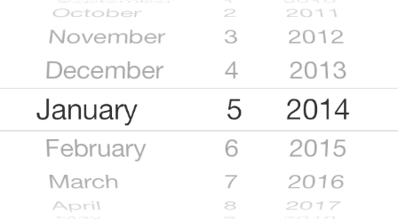
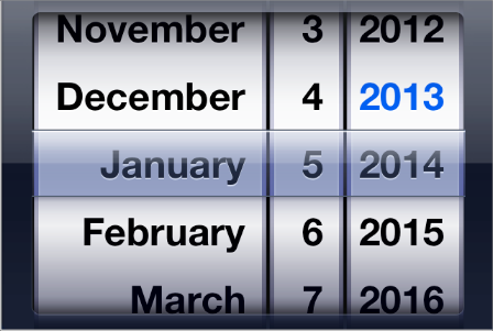
Date Picker
A date picker displays components of date and time, such as minutes, hours, days, and years.
The overall size of the date picker is the same in iOS 7 as it is in iOS 6, but the appearance is very different.
iOS 7
iOS 6
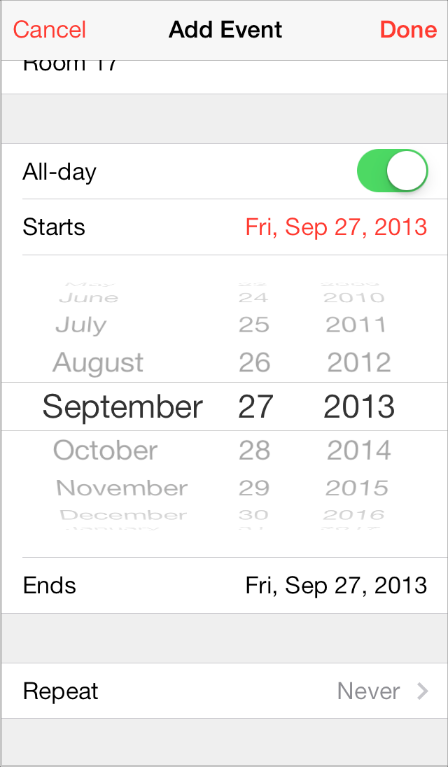
iOS 7 apps tend to embed date pickers within the content instead of displaying them in a different view. For example, Calendar dynamically expands a table row to let users specify a time without leaving the event-creation view:
Contact Add Button
A Contact Add button—that is, a UIButton of type UIButtonTypeContactAdd—lets users add a contact’s information to a text field or other text-based view.
The size and appearance of the Contact Add button have changed in iOS 7.
iOS 7
iOS 6
Detail Disclosure Button
A Detail Disclosure button—that is, a UIButton of type UIButtonTypeDetailDisclosure—reveals additional details or functionality related to an item in a table or other view. In iOS 7, the Detail Disclosure button uses the same symbol as the Info button.
The size and appearance of the Detail Disclosure button has changed in iOS 7:
iOS 7
iOS 6
When a Detail Disclosure button appears in a table row, tapping elsewhere in the row doesn’t activate the button; instead, it selects the row item or triggers app-defined behavior.
Info Button
An Info button—that is, a UIButton of type UIButtonTypeInfoLight or UIButtonTypeInfoDark—reveals configuration details about an app, sometimes on the back of the current view. In iOS 7, the Info button uses the same symbol as the Detail Disclosure button.
The size and appearance of the Info button have changed in iOS 7.
iOS 7
iOS 6 (shown in Weather)
Label
A label displays static text.
By default a label uses the system font, so it looks different in iOS 7 than it does in iOS 6.
iOS 7
iOS 6
Be sure to use the UIFont method preferredFontForTextStyle to get the text for display in a label.
Page Control
A page control indicates how many views are open and which one is currently visible.
The size and appearance of the page control have changed in iOS 7.
iOS 7 (control shown in Weather)
iOS 6 (control shown in Weather)
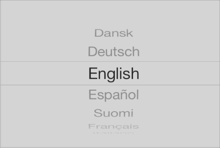
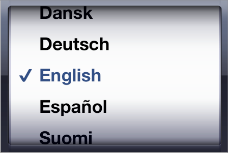
Picker
A picker displays a set of values from which a user can choose.
The overall size of a picker is the same in iOS 7 as it is in iOS 6; its appearance and behavior in iOS 7 are similar to the appearance and behavior of the date and time picker.
iOS 7
iOS 6
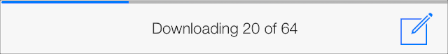
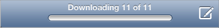
Progress View
A progress view shows the progress of a task or process that has a known duration.
The size and appearance of the progress view—shown here in the Mail toolbar—have changed in iOS 7.
iOS 7
iOS 6
If you currently use the trackTintColor property to specify a tint for the progress view’s track, the track continues to use this tint in iOS 7. If you set trackTintColor to nil, the track uses the tint of its parent.
Refresh Control
A refresh control performs a user-initiated content refresh—typically, in a table.
The size and appearance of the refresh control have changed in iOS 7.
iOS 7
iOS 6
Rounded Rectangle Button
The rounded rectangle button has been deprecated in iOS 7. Instead, use the system button—that is, aUIButton of type UIButtonTypeSystem.
iOS 7 system buttons don’t include a bezel or a background appearance. A system button can contain a graphical symbol or a text title, and it can specify a tint color or receive its parent’s color.
NOTE
In iOS 7, UIButtonTypeRoundedRect has been redefined as UIButtonTypeSystem. An app that uses a rounded rectangle button in iOS 6 automatically gets the system button appearance when it links against iOS 7.
If you need to display a button that includes a bezel, use a button of type UIButtonTypeCustom and supply a custom background image.
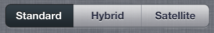
Segmented Control
A segmented control is a linear set of segments, each of which functions as a button that can display a different view.
The size and appearance of the segmented control have changed in iOS 7.
iOS 7
iOS 6
In iOS 7, the segmented control uses a single style, and the segmentedControlStyle property is unused.
Slider
A slider lets users make adjustments to a value or process throughout a range of allowed values.
The size and appearance of the slider have changed in iOS 7.
iOS 7
iOS 6
iOS 7 continues to use the tints you specify for the minimum and maximum track images and for the thumb, using the properties minimumTrackTintColor, maximumTrackTintColor, and thumbTintColor. If you set the minimumTrackColor property to nil, the area uses the tint of its parent; if you set themaximumTrackTintColor or thumbTintColor properties to nil, both areas use their default color.
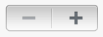
Stepper
A stepper increases or decreases a value by a constant amount.
The size and appearance of the stepper have changed in iOS 7.
iOS 7
iOS 6
In iOS 7, by default, a stepper treats custom increment and decrement images as template images.
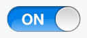
Switch
A switch presents two mutually exclusive choices or states (typically used only in table views).
The size and appearance of the switch have changed in iOS 7.
iOS 7
iOS 6
iOS 7 continues to use the tints you specify for the on and off—or disabled—states and for the thumb, using the properties onTintColor, tintColor, and thumbTintColor.
In iOS 7, by default, custom on and off images are ignored.
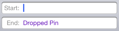
Text Field
A text field accepts a single line of user input.
The size and appearance of the text field have changed in iOS 7.
iOS 7 (two text fields shown in Maps)

iOS 6 (two text fields shown in Maps)
Be sure to use the UIFont method preferredFontForTextStyle to get the text for display in a text view.
- iOS 7过渡之--控件
- iOS 7过渡之--控件
- IOS 7过渡之---支持IOS 6
- IOS 7过渡之---支持IOS 6
- iOS 7过渡指南
- iOS 7 交互式过渡
- IOS 7 过渡之 Content Views (视图内容)
- IOS 7 过渡之 Content Views (视图内容)
- iOS 7用户界面过渡指南
- iOS 7用户界面过渡指南
- iOS 7用户界面过渡指南
- iOS 7用户界面过渡指南
- iOS 7用户界面过渡指南
- iOS 7用户界面过渡指南
- iOS 7用户界面过渡指南
- iOS 7用户界面过渡指南
- iOS 7用户界面过渡指南
- iOS 7用户界面过渡指南
- Activity启动模式与flag
- stickUp固定页面元素
- oj-3rd__阿尔法星距离
- 第二周作业
- clang++的诡异之处
- iOS 7过渡之--控件
- 九度 题目1012:畅通工程
- 关系型数据库
- 真诚的程序员
- Google为防NSA监控,将把关搜索加密推广至全球
- flex自定义组件
- Linux C一站式学习习题答案11.6.3 求n次方
- Identity的知识
- 涣发大号