Button、ImageButton及ImageView详解
来源:互联网 发布:全息图片制作软件 编辑:程序博客网 时间:2024/06/05 14:45
Button、ImageButton及ImageView详解
略解:
1. ImageButton 继承自 ImageView。两者具备甚小,因为 ImageView 同样可以点击相应,同样有点击的阴影效果。实际上他们的区别在于默认 style。比如同样放一个背景和一个图片,会发现 ImageButton 的图片会居中,但大小不伸缩。但在 ImageView 里的图片会居中而且按控件空间大小自动伸缩。造成这个区别的是 ImageView 的一个参数:android:scaleType="fitCenter",这个会自动伸缩。不会自动伸缩的 ImageButton 为:android:scaleType="center"。
2. 那么他们与 Button 的区别呢?这个比较大了,因为 Button 继承自 TextView。就是说 Button 上面可以写文字,可以放一个背景。而 ImageView/ImageButton 可以放一个背景和一个图片。所以如果我们想做一个按钮需要文字是会使用 Button,而如果需要一个组合一个图片和一个背景的效果的按钮,则要用 ImageView/ImageButton。
详解::
在应用程序开发过程中,很多时候需要将View的background或者src属性设置为图片,即美观又支持点击等操作。常见的有Button、ImageButton及Imageview,以ImageView为例,在图片浏览器或者编辑工具的开发中使用得非常广泛。由于三者之间存在非常紧密的联系,又有微妙的差别,有时候会傻傻地分不清到底该用谁。本篇文章通过概念讲解与代码分析的形式对它们做一个详细的总结,完全清楚的小伙伴希望指出文中描述的不足之处。
1、基本概念
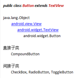
Button,普通按钮,是各种UI中最常用的组件之一,也是Android开发中最受欢迎的组件之一,用户可以通过触摸它来触发一系列事件。按钮的样式默认为系统按钮的背景,不同的设备、不同的平台版本有不同的按钮风格。其类结构图如下:
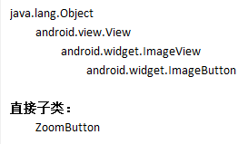
ImageButton,显示一个可以被用户点击的图片按钮,默认情况下,ImageButton看起来像一个普通的按钮。按钮的图片可用通过<ImageButton> XML元素的android:src属性或setImageResource(int)方法指定。要删除按钮的背景,可以定义自己的背景图片或设置背景为透明。其类结构图如下:
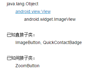
ImageView,显示任意图像(包括图标),可以加载各种来源的图片(如资源或图片库),实际应用中需要计算图像的尺寸以达到最佳效果,并提供例如缩放和着色(渲染)等各种显示选项。类结构图如下:
组件支持的属性与响应的方法在后面对异同点进行对比分析时会给出。
2、相似点
通过XML布局设计与Java代码实现可以发现,Button、ImageButton及Imageview的相似之处有以下三点(只列出常用的,下同):
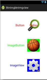
A、背景图片,三者均可以通过android:background=”@drawable/imgName”来设置背景图片;设置后效果图如下:
B、背景颜色,三者均可以通过android:background=”#RGB”来设置背景颜色;为方便观察,同时设置了ImageButton和ImageView组件的src属性(资源图片),设置后效果图如下:
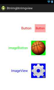
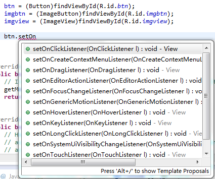
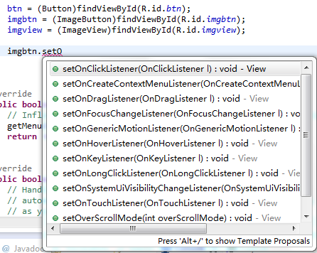
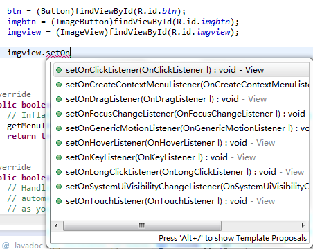
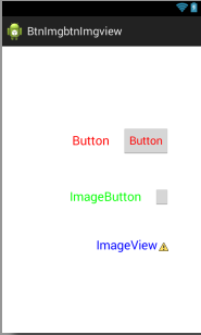
C、触摸事件,三者均可以定义用户触摸时的响应方法,如最常用的点击事件监听器setOnClickListener()对应的onClick()方法;响应函数展示图如下:
3、不同点
类似的,Button、ImageButton及Imageview的不同之处有以下三点:
A、资源图片,Button不支持android:src=”@drawable/imgName”属性,而ImageButton和ImageView可以通过该属性来设置资源图片(前景图较易理解);设置后效果图如下面左图,而右图是弹出的Button属性选择框,确实不存在src属性;
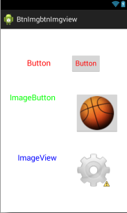
B、文本内容,ImageButton和ImageView不支持android:text=”@string/textContent”属性,而Button可以通过该属性来定义按钮名称;设置后效果图如下,两者的属性选择框这里就不给出了;
C、响应方法,ImageView能够实现的方法有限,而Button和ImageButton相对来来说多一些,如设置视图的过滚动模式方法setOverScrollMode(int mode),从上述2中的响应方法展示图中可以看出;
注意:虽然某个组件不支持某个属性,但在XMl文件中定义时为其添加该属性(自动弹出的属性选择框中没有,可以手写)并不会有任何警告或者错误,只是也不会有任何反应,即不会出现对应的效果。
4、XML代码
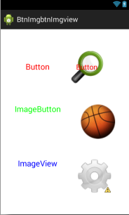
Button、ImageButton及ImageView组件各定义了一个,分别添加了TextView组件用以说明当前组件类型,且均设置了background、src及text属性。这里给出最终的xml文件代码:

1 <LinearLayout xmlns:android="http://schemas.android.com/apk/res/android" 2 xmlns:tools="http://schemas.android.com/tools" 3 android:layout_width="match_parent" 4 android:layout_height="match_parent" 5 android:orientation="vertical" 6 android:gravity="center_vertical" > 7 8 <LinearLayout 9 android:layout_width="wrap_content"10 android:layout_height="wrap_content"11 android:orientation="horizontal"12 android:layout_gravity="right"13 android:layout_marginRight="50dp"14 android:gravity="center_vertical" >15 16 <TextView 17 android:layout_width="wrap_content"18 android:layout_height="wrap_content"19 android:paddingRight="20dp"20 android:text="@string/btn"21 android:textSize="20sp"22 android:textColor="#f00" />23 24 <Button android:id="@+id/btn"25 android:layout_width="wrap_content"26 android:layout_height="wrap_content"27 android:gravity="center"28 android:background="@drawable/btn"29 android:src="@drawable/btn"30 android:text="@string/btn"31 android:textColor="#f00" />32 33 </LinearLayout>34 35 <LinearLayout36 android:layout_width="wrap_content"37 android:layout_height="wrap_content"38 android:orientation="horizontal"39 android:layout_gravity="right"40 android:layout_marginRight="50dp"41 android:gravity="center_vertical"42 android:layout_marginTop="50dp" >43 44 <TextView 45 android:layout_width="wrap_content"46 android:layout_height="wrap_content"47 android:paddingRight="20dp"48 android:text="@string/imgbtn"49 android:textSize="20sp"50 android:textColor="#0f0" /> 51 52 <ImageButton android:id="@+id/imgbtn"53 android:contentDescription="@null"54 android:layout_width="wrap_content"55 android:layout_height="wrap_content"56 android:gravity="center"57 android:src="@drawable/imgbtn"58 android:background="#0f0"59 android:text="@string/imgbtn"60 android:textColor="#f00" />61 62 </LinearLayout>63 64 <LinearLayout65 android:layout_width="wrap_content"66 android:layout_height="wrap_content"67 android:orientation="horizontal"68 android:layout_gravity="right"69 android:layout_marginRight="50dp"70 android:gravity="center_vertical"71 android:layout_marginTop="50dp" >72 73 <TextView 74 android:layout_width="wrap_content"75 android:layout_height="wrap_content"76 android:paddingRight="20dp"77 android:text="@string/imgview"78 android:textSize="20sp"79 android:textColor="#00f" /> 80 81 <ImageView android:id="@+id/imgview"82 android:contentDescription="@null"83 android:layout_width="wrap_content"84 android:layout_height="wrap_content"85 android:gravity="center"86 android:src="@drawable/imgview"87 android:background="#00f"88 android:text="@string/imgview"89 android:textColor="#f00" />90 91 </LinearLayout>92 93 </LinearLayout>
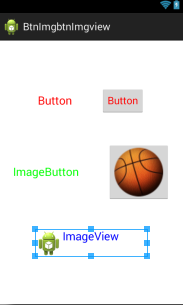
最终的效果图如下:
5、总结
本文主要从Android组件的src、background、text及onClick四个属性,通过图文的形式讲解了Button、ImageButton及ImageView三者之间的异同点。至于在Java代码中让它们完成哪些具体的操作,需要根据实际的应用情况来进行实现,这里就不举例了。
在布局设计与组件属性设置过程中可以发现一个很有趣的现象(从上面的大部分效果图中也可见,右下角的黄色感叹三角):将TextView与ImageView这两个组件加入同一个LinearLayout后,Eclipse会提示一个警告。截图如下:
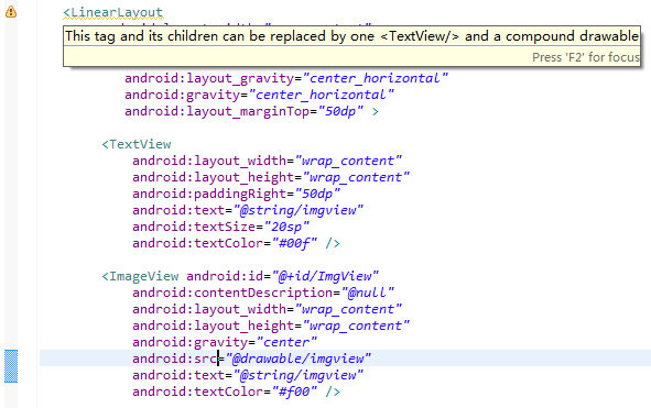
大致意思是说:如果要为TextView组件添加图标,可以通过其自身的属性来完成。什么也没想,直接通过android:drawableLeft=”@drawable/imgName”在其左边放一张图片(此处用工程中默认图标),然后将原本的ImageView组件去除,果然,警告消失了。如图:
当然,实际开发时该用ImageView还是得用。个人觉得有趣是因为当前的Eclipse会根据添加的组件及位置来猜测开发者的意图,并进行相应的判断,必要时给出提示。像上述情况,它得出的结论可能是我想在TextView文本后面放一个对应的标志性图标,而没有判断出其自身在这里只作为一个标志性文本。
说到警告,虽然一般不会影响到程序的正常运行,但总归是一个缺陷。若用Lint工具对整个项目进行分析,就可以发现,资源与代码冗余现象普遍存在,久而久之,会影响到项目的管理与维护。
如Eclipse和Lint均会提示ImageView和ImageButton这两个组件在XMl文件中定义时需要设置contentDescription(描述)属性,官方的解释是为视力不便者提供使用说明文本,可见Google考虑得相当周到。不过大部分应用是不需要设置什么组件说明文本的,最简单也是最高效的消除该警告的方法是在组件属性中加入如下代码:
1 android: contentDescription=”@null”;- Button、ImageButton及ImageView详解
- FAQ_15_android Imageview ImageButton Button
- ImageView和ImageButton和Button
- ImageView、ImageButton、Button三者比较
- Android - 控件(View)之TextView, Button, ImageButton, ImageView, CheckBox
- Android 用户界面 Button TextView EditView CheckBox RadioGroup ImageView ImageButton
- android中ImageView、ImageButton、Button之间的区别
- android中ImageView、ImageButton、Button之间的区别
- Android中Button,ImageButton,ImageView之间的区别
- android中ImageView、ImageButton、Button之间的区别
- Android中ImageView、ImageButton、Button之间的区别
- android中ImageView、ImageButton、Button之间的区别
- Android控件——TextView、EditText、ImageView、Button、ImageButton
- android中ImageView、ImageButton、Button之间的区别
- 为什么Button,ImageButton有焦点,textview,imageview没有焦点
- Android中ImageView和ImageButton的比较详解
- 系出名门Android(5) - 控件(View)之TextView, Button, ImageButton, ImageView, CheckBox, RadioButton, AnalogClock, DigitalClock
- Android - 控件(View)之TextView, Button, ImageButton, ImageView, CheckBox, RadioButton, AnalogClock, DigitalClock 的简单介绍
- Android md5加密
- 滑动窗口的最大值
- 工作区和暂存区
- Swift 协议
- Graphical Model(概率图模型)的浅见
- Button、ImageButton及ImageView详解
- 管理修改
- Future,FutureTask,Callable,Runnable的用法
- 韩顺平java 第30讲 布局管理器
- 《Orange's 一个操作系统的实现》学习笔记(二) 实模式和保护模式
- 面试题——Struts2如何防止表单重复提交
- ajax 跨域丢失cookie的问题
- 设置控件圆角,任意角 (网址)
- bzoj1001 【beijing2006】狼抓兔子