菜单导航 纯CSS3液态胶合效果的环形菜单按钮特效
来源:互联网 发布:怎么增加端口 编辑:程序博客网 时间:2024/05/02 04:24
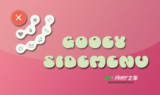
这是一款效果非常有创意的纯CSS3液态胶合效果的环形菜单按钮特效。该环行菜单按钮在用户点击主菜单按钮后,两行子菜单会以环状的方式打开,并且子菜单就像液体一样,能够胶合,具有弹性,效果非常炫酷。
查看原文
查看在线演示Demo和更多原文内容教程:纯CSS3液态胶合效果的环形菜单按钮特效
使用方法
HTML结构
在HTML结构中,主菜单按钮使用input[type='checkbox']的复选框和一个<label>元素来制作。子菜单按钮是一组<button>元素。
<div class='wrap'> <input type='checkbox' id='checking' style='display:none;' /> <button class='blob'>★</button> <button class='blob'>✉</button> <button class='blob'>⚙</button> <button class='blob'>❤</button> <button class='blob'>✌</button> <button class='blob'>✎</button> <button class='blob'>♫</button> <button class='blob'>✆</button> <label class='blob' for='checking'> <span class='bar'></span> <span class='bar'></span> <span class='bar'></span> </label></div> 该环形菜单的液态融合效果使用SVG过滤器来制作。在SVG过滤器中,有3个滤镜:第一个是高斯模糊滤镜,第二个是颜色矩阵滤镜,第三个是混合滤镜。混合滤镜可以将多个输入滤镜混合为一个。
<svg> <defs> <filter id="filt"> <feGaussianBlur in="SourceGraphic" result="blur" stdDeviation="10" /> <feColorMatrix in="blur" mode="matrix" values="1 0 0 0 0 0 1 0 0 0 0 0 1 0 0 0 0 0 18 -7" result="filt" /> <feBlend in2="filt" in="SourceGraphic" result="mix" /> </filter> </defs></svg> 在这个效果中,颜色矩阵滤镜的输入是高斯模糊滤镜,然后混合滤镜将颜色矩阵的输出和源图像进行混合,制作液体融合效果。
关于SVG滤镜的详细介绍,可以参考:SVG进阶 | SVG过滤器(SVG Filters)
CSS样式
在CSS样式中,需要注意的是引用SVG过滤器的方式。在非webkit内核的浏览器中,外连的css样式表中引用SVG过滤器需要写完整的路径,而如果是内联的CSS样式可以直接通过ID来引用。
filter: url("../index.html/#filt");-webkit-filter: url("#filt"); 主菜单按钮的点击时通过checkbox hack来实现的。
.wrap .blob[for="checking"] { z-index: 30; font-size: 60px; text-align: center; color: #fff; transition: transform 0.5s ease-in-out 0.2s; -webkit-transition: -webkit-transform 0.5s ease-in-out 0.2s; -moz-transition: transform 0.5s ease-in-out 0.2s; -o-transition: transform 0.5s ease-in-out 0.2s; -ms-transition: transform 0.5s ease-in-out 0.2s;}.wrap .blob:not([for="checking"]) { width: 50px; height: 50px; top: 15px; left: 15px; font-size: 30px; transition: all 0.5s ease-in-out; -webkit-transition: all 0.5s ease-in-out; -moz-transition: all 0.5s ease-in-out; -o-transition: all 0.5s ease-in-out; -ms-transition: all 0.5s ease-in-out;}.wrap .blob:not([for="checking"]):hover { color: #F44336; animation: harlem 0.5s linear forwards; -webkit-animation: harlem 0.5s linear forwards; -moz-animation: harlem 0.5s linear forwards; -o-animation: harlem 0.5s linear forwards; -ms-animation: harlem 0.5s linear forwards;}.wrap > #checking:checked ~ .blob:nth-child(2) { margin-left: 85px; margin-top: 10px; background-color: #fff;}.wrap > #checking:checked ~ .blob:nth-child(3) { margin-top: 145px; margin-left: 65px; background-color: #fff;}.wrap > #checking:checked ~ .blob:nth-child(4) { margin-top: 160px; margin-left: 10px; background-color: #fff;}.wrap > #checking:checked ~ .blob:nth-child(5) { margin-top: 85px; margin-left: 10px; background-color: #fff;}.wrap > #checking:checked ~ .blob:nth-child(6) { margin-top: 63px; margin-left: 63px; background-color: #fff;}.wrap > #checking:checked ~ .blob:nth-child(7) { margin-top: 65px; margin-left: 145px; background-color: #fff;}.wrap > #checking:checked ~ .blob:nth-child(8) { margin-top: 112px; margin-left: 112px; background-color: #fff;}.wrap > #checking:checked ~ .blob:nth-child(9) { margin-top: 10px; margin-left: 160px; background-color: #fff;}.wrap > #checking:checked ~ .blob[for="checking"] > .bar:nth-child(1) { transform: rotate(45deg); -webkit-transform: rotate(45deg); -moz-transform: rotate(45deg); -o-transform: rotate(45deg); -ms-transform: rotate(45deg); margin-top: 37px;}.wrap > #checking:checked ~ .blob[for="checking"] > .bar:nth-child(2) { transform: rotate(-45deg); -webkit-transform: rotate(-45deg); -moz-transform: rotate(-45deg); -o-transform: rotate(-45deg); -ms-transform: rotate(-45deg); margin-top: -10px;}.wrap > #checking:checked ~ .blob[for="checking"] > .bar:nth-child(3) { opacity: 0;} harlem帧动画是鼠标滑过子菜单时的CSS动画效果。完整的代码请参考下载文件。
1 0
- 菜单导航 纯CSS3液态胶合效果的环形菜单按钮特效
- HTML5 SVG和CSS3炫酷液态菜单按钮特效
- 纯CSS3带动画效果导航菜单
- 纯HTML+CSS3 导航菜单
- 纯 CSS3 的导航菜单生成工具和教程
- jQuery 导航菜单点击伸缩展开效果的JS特效
- CSS3 实现导航菜单的 3D 翻转动画效果
- 纯CSS实现二级导航菜单效果
- 由纯CSS3实现的超酷飞行状下拉菜单特效
- 网页特效 ? 菜单导航
- 抽屉效果的导航菜单
- css3导航下拉菜单
- 几个不错的jquery导航菜单特效
- 纯CSS的导航下拉菜单
- 适合移动手机使用的js环形菜单特效插件
- CSS3 下拉菜单按钮
- CSS3菜单按钮
- css3的属性transition制作菜单导航
- 默认创建的vs项目,并不能识别QtDir
- JavaScriptCore和Objective-C 交互
- MFC VARIANT使用
- RxJava 驯服数据流之 hot & cold Observable
- Android下拉刷新发展历程
- 菜单导航 纯CSS3液态胶合效果的环形菜单按钮特效
- OpenCV 相关记录
- Photoshop插件parker真正破解方法
- Servlet
- android 布局分析工具HierarchyView
- 全排列
- ios导入静态库时报错:"_OBJC_CLASS_$_"
- centos安装mongodb3.0及php mongo扩展和代码测试
- 解题报告:POJ_3460&HDU_1685 Booksort IDA*