Android Material Design系列之主题样式介绍说明等
来源:互联网 发布:mac系统安装flash 编辑:程序博客网 时间:2024/05/01 12:42
今天这篇文章应该算是Material Design系列的补充篇,因为这篇文章本来应该放到前面讲的,因为讲的是主题嘛,对于一些状态和颜色的介绍,因为我们一新建一个项目时,系统自带了三个属性的颜色,现在就重点介绍这三个颜色属性的意义和作用。讲明白这个,留着以后讲别的用。
最常用的三个颜色属性
- colorPrimary
- colorPrimaryDark
- colorAccent
这三个分别代表什么意思呢?
* colorPrimaryDark 是状态栏底色
* colorPrimary 如果你不手动自己去修改toolbar背景色的话,它就是默认的toolbar背景色
* colorAccent 各控制元件(比如:checkbox、switch 或是 radio) 被勾选 (checked) 或是选定 (selected) 的颜色
文字描述可能还不是很直观,来看张图,如下: 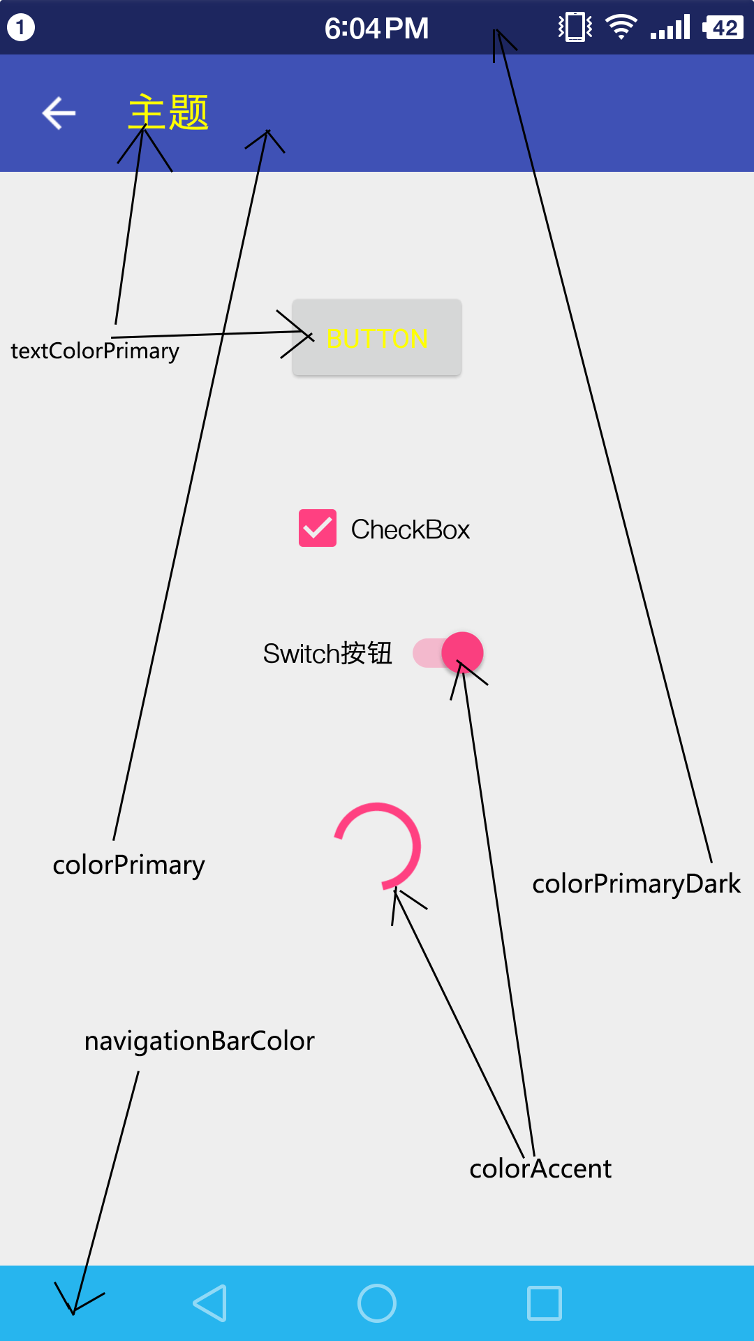
其他属性相关介绍
- navigationBarColor 导航栏的背景色,但只能用在 API Level 21 以上的版本,也就是5.0以上才可以
- windowBackground App 的背景色
- colorControlNormal 这个也只能在API21以上才能用各控制元件的预设颜色和colorAccent正好对应
在Style上设置
以上的颜色属性均是在 style 的属性中设置。如下: 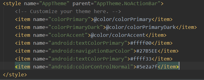
关于这些颜色的属性介绍就到这里了,相信大家应该都明白了。要是光讲这些文章有点短,不太充实,所以今天我们再补充两个非常简单的 Material Design 风格的控件,可能大家都知道了,知道的就不用看了哈,略过就好。
TextInputLayout
TextInputLayout继承LinearLayout,因此我们需要将EditView包含在TextInputLayout之内才可以使用,言外之意:TextInputLayout不能单独使用。里面可以包含一个且只能有一个EditText,与传统的EditText不同,在输入时EditText的hint提示文字会滑到上方,在用户输入的同时提示用户当前要输入的是什么,同时还可以设置输入错误的提示信息。
代码布局如下:
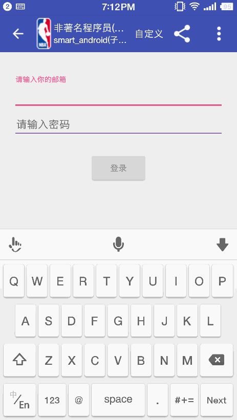
<android.support.design.widget.TextInputLayout android:id="@+id/email_textlayout" android:layout_width="match_parent" android:layout_height="wrap_content" android:layout_marginLeft="20dp" android:layout_marginRight="20dp" android:layout_marginTop="35dp" > <EditText android:id="@+id/email_et" android:layout_width="match_parent" android:layout_height="wrap_content" android:hint="请输入你的邮箱" android:inputType="textEmailAddress" android:textColor="@color/text_color"/></android.support.design.widget.TextInputLayout>TextInputLayout常用的方法有如下:
* setHint():设置提示语。
* getEditText():得到TextInputLayout中的EditView控件。
* setErrorEnabled():设置是否可以显示错误信息。
* setError():设置当用户输入错误时弹出的错误信息。
特别注意:TextInputLayout不能单独使用,必须包裹EditView组件,且只能一个,设置错误提示信息时一定要先setErrorEnabled(true);再设置setError()。
TextInputEditText
TextInputEditText和TextInputLayout类似,Design包还有一个组件TextInputEditText,它继承了AppCompatEditText,可以在右侧显示出错误信息的小弹窗提示。用法和TextInputEditText类似,而且不用设置错误信息消除,重新在TextInputEditText输出会自动取消,非常的灵活和人性化。
用法很简单:
<android.support.design.widget.TextInputEditText android:id="@+id/pwd_et" android:layout_width="match_parent" android:layout_height="wrap_content" android:layout_marginLeft="20dp" android:layout_marginRight="20dp" android:hint="请输入密码" android:inputType="textEmailAddress" android:textColor="@color/text_color"/>效果图
到这里今天的内容就讲完了,Material Design系列其实还没有完,今天讲了主题样式,下次就有可能讲根据主题样式设置夜间模式,还有以后的转场动画等内容。这个系列可能有些基础,但是众口难调还请大家理解,会的同学可以略过,不会的就好好学习。总之,都是为了大家更进一步。重口难调,还请大家理解。
这个系列的讲解和实例都会整理在一个demo里,demo的github地址:https://github.com/loonggg/MaterialDesignDemo 去star吧,我会慢慢完善的。
欢迎关注微信公众号:非著名程序员(smart_android),每天每周定时推送原创技术文章。所有技术文章, 均会在微信订阅号首发,关注微信公众号可以及时获得技术文章推送。
- Android Material Design系列之主题样式介绍说明等
- Android Material Design系列之主题样式介绍说明等
- Material Design之主题样式
- Android Material Design系列之CoordinatorLayout,CollapsingToolbarLayout等
- android material design 主题
- android 5.0新特性之Material Design 使用Material主题
- Android Material Design之修改样式
- Android Material Design系列之Navigation Drawer
- Android Material Design系列之Toolbar
- Android Material Design系列之Palette
- Android Material Design系列之夜间模式
- Android Material Design系列之TextInputLayout
- Android Material Design系列之SnackBar
- Android Material Design系列之CollapsingToolbarLayout
- Android Material Design系列之TextInputLayout
- Android Material Design系列之夜间模式
- Android Material Design系列之Palette
- Android Material Design系列之夜间模式
- 前清时期坐过堂
- Codeforces Round #305 (Div. 1) A. Mike and Frog(数学)
- android studio 提高编译的速度,安装apk过慢问题解决
- 警告 libpng warning: iCCP: known incorrect sRGB profile
- 自适应布局,响应式布局以及rem,em区别
- Android Material Design系列之主题样式介绍说明等
- windows下eclipse连接hadoop
- 删数
- Android 画波纹进度条
- 数据结构实验之二叉树七:叶子问题
- NoSuchMethodError: android.content.res.Resources.getDrawable
- SpringMVC实战(五)-处理POST提交JSON数据
- 【HDU】1551 - Cable master(二分)
- 黄金分割比的研究