Matplotlib:plotting
来源:互联网 发布:淘宝代销数据包 编辑:程序博客网 时间:2024/05/21 09:30
前言
本教程源于Scipy Lecture Notes,URL:http://www.scipy-lectures.org/
本教程若有翻译不当或概念不明之处,请大家留言,博主及时更正,以便后来的用户更好更舒适地学习本教程。
转载本文请注明出处,谢谢。
感谢
非常感谢Bill Wing和Christoph Deil的审阅和校正。
作者:Nicolas Rougier, Mike Müller, Gaël Varoquaux
本章内容:
4.1 介绍
4.2 简单绘图
4.3 图形,子图,坐标轴和刻度
4.4 其他类型的图形:示例和练习
4.5 教程之外的内容
4.6 快速参考
4.1 介绍
Matplotlib可能是二维图形中最常用的Python包。它提供了一个非常快的可视化Pyhton数据的方法和许多可供发布的格式化图形。接下来,我们将要在包含大多数常见情况的交互模式下探索Matplotlib。
4.1.1 IPython和Matplotlib模式
Ipython是一个增强的交互式Python Shell。它有许多有趣的功能,包括命名输入和输出、访问Shell命令、改进调试等更多内容。它是Pyhton中科学计算工作流的核心,与Matplotlib结合一起使用。
有关Matlab/Mathematica类似功能的交互式Matplotlib会话,我们使用IPython和它的特殊Matplotlib模式,使能够非阻塞绘图。
Ipython console 当使用IPython控制台时,我们以命令行参数--matplotlib启动它(-pylab命令用在非常老的版本中)
IPthon notebook 在IPthon notebook中,我们在notebook的起始处插入以下魔法函数:%matplotlib inline
4.1.2 pyplot
pyplot为matplotlib面向对象的绘图库提供了一个程序接口。它以Matlab为关系模型。因此,plot中的大多数绘图命令都具有类似的Matlab模拟参数。重要的命令将使用交互示例进行说明。
from matplotlib import pyplot as plt
4.2 简单绘图
在本节中,我们将在同一个图形中绘制余弦和正弦函数,我们将从默认设置开始,逐步充实图形,使其变得更好。
第一步:获取正弦和余弦函数的数据
import numpy as npX = np.linspace(-np.pi, np.pi, 256, endpoint=True)C, S = np.cos(X), np.sin(X)
X现在是一个numpy数组,有256个值,范围从-π到+π(包括),C是余弦(256个值),S是正弦(256个值)。
要运行该示例,你可以在IPython交互式会话中键入它:
$ ipython --pylab
这将我们带到IPython命令提示符下:
IPython 0.13 -- An enhanced Interactive Python.? -> Introduction to IPython's features.%magic -> Information about IPython's 'magic' % functions.help -> Python's own help system.object? -> Details about 'object'. ?object also works, ?? prints more.Welcome to pylab, a matplotlib-based Python environment.For more information, type 'help(pylab)'.
你可以下载每个例子,使用常规的Python命令运行它,但是这样做你会失去交互数据操作的便利性。
$ python exercice_1.py
你也可以通过点击相应的图形来获取每个步骤的源。
4.2.1 使用默认设置绘图

Documentation
- plot tutorial
- plot() command
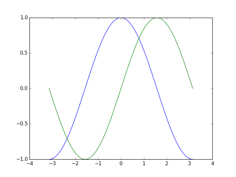
import numpy as npimport matplotlib.pyplot as pltX = np.linspace(-np.pi, np.pi, 256, endpoint=True)C, S = np.cos(X), np.sin(X)plt.plot(X, C)plt.plot(X, S)plt.show()
4.2.2 示例默认值
Documentation
- Customizing matplotlib
import numpy as npimport matplotlib.pyplot as plt# Create a figure of size 8x6 inches, 80 dots per inchplt.figure(figsize=(8, 6), dpi=80)# Create a new subplot from a grid of 1x1plt.subplot(1, 1, 1)X = np.linspace(-np.pi, np.pi, 256, endpoint=True)C, S = np.cos(X), np.sin(X)# Plot cosine with a blue continuous line of width 1 (pixels)plt.plot(X, C, color="blue", linewidth=1.0, linestyle="-")# Plot sine with a green continuous line of width 1 (pixels)plt.plot(X, S, color="green", linewidth=1.0, linestyle="-")# Set x limitsplt.xlim(-4.0, 4.0)# Set x ticksplt.xticks(np.linspace(-4, 4, 9, endpoint=True))# Set y limitsplt.ylim(-1.0, 1.0)# Set y ticksplt.yticks(np.linspace(-1, 1, 5, endpoint=True))# Save figure using 72 dots per inch# plt.savefig("exercice_2.png", dpi=72)# Show result on screenplt.show()
4.2.3 更改线条颜色和宽度
Documentation
- Controlling line properties
- Line API
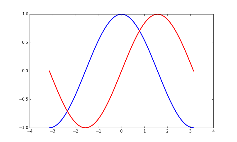
第一步,我们要将余弦函数设置为蓝色,正弦函数设置为红色,并且将它们都设置为稍微粗的线型。我们也会稍微改变一下图形的大小,使它更宽阔一些。
...plt.figure(figsize=(10, 6), dpi=80)plt.plot(X, C, color="blue", linewidth=2.5, linestyle="-")plt.plot(X, S, color="red", linewidth=2.5, linestyle="-")...
4.2.4 设置边界

Documentation
- xlim() command
- ylim() command
当前图形的边界有点紧凑,我们想要预留一些空间,以便清楚地查看所有数据点。
...plt.xlim(X.min() * 1.1, X.max() * 1.1)plt.ylim(C.min() * 1.1, C.max() * 1.1)...
4.2.5 设置刻度
Documentation
- xticks() command
- yticks() command
- Tick container
- Tick locating and formatting
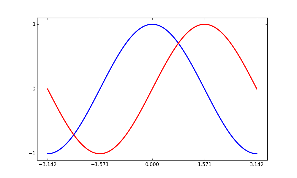
当前刻度不太理想,因为它们未显示正弦函数和余弦函数有趣的值,我们将更改它们,以便只显示这些值。
...plt.xticks([-np.pi, -np.pi/2, 0, np.pi/2, np.pi])plt.yticks([-1, 0, +1])...
4.2.6 设置刻度标签

Documentation
- Working with text
- xticks() command
- yticks() command
- set_xticklabels()
- set_yticklabels()
刻度现在被正确放置,但是它们的标签不是很明确。我们可能猜测3.142代表π,它应该更好地使其明确出来。当我们设置刻度值时,我们还可以在第二个参数列表中提供相应的标签。注意,我们将使用LATEX语法,允许标签更好地呈现出来。
...plt.xticks([-np.pi, -np.pi/2, 0, np.pi/2, np.pi],[r'$-\pi$', r'$-\pi/2$', r'$0$', r'$+\pi/2$', r'$+\pi$'])plt.yticks([-1, 0, +1],[r'$-1$', r'$0$', r'$+1$'])...
4.2.7 移动轴线

Documentation
- Spines
- Axis container
- Transformations tutorial
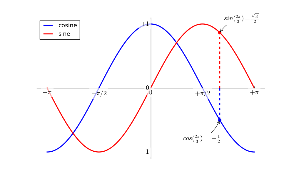
轴线是连接轴刻度线并且标记数据区域边界的线。 他们可以被放置在任意位置,直到现在,他们在轴的边界。 我们将改变它,因为我们想把它们放置在中间。 因为它有四个边界(顶部/底部/左侧/右侧),我们将它们的颜色设置为none来丢弃顶部和右侧边界,我们移动底部和左侧的边界将数据空间坐标变为原点。
...ax = plt.gca() # gca stands for 'get current axis'ax.spines['right'].set_color('none')ax.spines['top'].set_color('none')ax.xaxis.set_ticks_position('bottom')ax.spines['bottom'].set_position(('data',0))ax.yaxis.set_ticks_position('left')ax.spines['left'].set_position(('data',0))...
4.2.8 添加图例

Documentation
- Legend guide
- legend() command
- Legend API
让我们在左上角添加一个图例,这只需要将label(这将被用在图例框中)关键字参数添加到plot命令中。
...plt.plot(X, C, color="blue", linewidth=2.5, linestyle="-", label="cosine")plt.plot(X, S, color="red", linewidth=2.5, linestyle="-", label="sine")plt.legend(loc='upper left')...
4.2.9 注释一些点

Documentation
- Annotating axis
- annotate() command
让我们使用annotate命令注释一些有趣的点。 我们选择了数值2π/3,我们想注释正弦和余弦。 首先,我们将在曲线上绘制一个标记以及一条直虚线。然后,我们将使用annotate命令显示一些带有箭头的文本。
...t = 2 * np.pi / 3plt.plot([t, t], [0, np.cos(t)], color='blue', linewidth=2.5, linestyle="--")plt.scatter([t, ], [np.cos(t), ], 50, color='blue')plt.annotate(r'$sin(\frac{2\pi}{3})=\frac{\sqrt{3}}{2}$',xy=(t, np.sin(t)), xycoords='data',xytext=(+10, +30), textcoords='offset points', fontsize=16,arrowprops=dict(arrowstyle="->", connectionstyle="arc3,rad=.2"))plt.plot([t, t],[0, np.sin(t)], color='red', linewidth=2.5, linestyle="--")plt.scatter([t, ],[np.sin(t), ], 50, color='red')plt.annotate(r'$cos(\frac{2\pi}{3})=-\frac{1}{2}$',xy=(t, np.cos(t)), xycoords='data',xytext=(-90, -50), textcoords='offset points', fontsize=16,arrowprops=dict(arrowstyle="->", connectionstyle="arc3,rad=.2"))...
4.2.10 问题在于细节
Documentation
- Artists
- BBox
由于蓝色和红色的线,刻度标签现在几乎不可见。我们可以放大它们,我们也可以调整它们的属性,以便它们可以被呈现在半透明的白色背景中。这会允许我们看到数据和标签。
...for label in ax.get_xticklabels() + ax.get_yticklabels():label.set_fontsize(16)label.set_bbox(dict(facecolor='white', edgecolor='None', alpha=0.65))...
4.3 图形、子图、坐标轴和刻度
matplotlib中的"figure"表示用户界面中的整个窗口。 在这个figure中可以有多个“subplot”。
到目前为止,我们已经明确地创建了图形和坐标轴。 这对于快速绘图很方便。 我们可以使用更多的控制来显示图形、子图和坐标轴,虽然子图将绘图定位在规则网格中,轴线允许在图中自由放置。根据你的意图,这两者都是可用的。我们已经使用图形和子图来工作了,但是我们没有明确地调用它们。当我们调用plot时,matplotlib调用gca()获取当前坐标轴,同时,gca依次调用gcf()获取当前图形,如果None,它调用figure()创建一个figure对象,严格的说,是创建一个subplot(111)。下面让我们来看一看详细情况。
4.3.1 图形
一个figure对象是标题为"Figure#"的GUI窗口,Figure命名是以1开始,与以0开始索引的常规Python方式截然不同。这显然是Matlab风格。以下有几个参数确定figure对象的外观:
ArgumentDefaultDescriptionnum1number of figurefigsizefigure.figsizefigure size in in inches (width, height)dpifigure.dpiresolution in dots per inchfacecolorfigure.facecolorcolor of the drawing backgroundedgecolorfigure.edgecolorcolor of edge around the drawing backgroundframeonTuredraw figure frame or not
默认值可以在源文件中指定,并且在大多数时间都会使用,只有图形的编号经常改变。
与其他对象一样,你可以设置figure对象的属性,也可以使用带有设置选项的setp方法设置figure。
使用GUI窗口时,你可以通过单击右上角的X按钮关闭figure对象,但是你可以通过调用close已编程方式关闭figure。根据不同的参数,它关闭:(1)当前figur(无参数);(2)指定参数(figure数字或实例作为参数);(3)所有figure(all作为参数)。
plt.close(1) # Closes figure 1
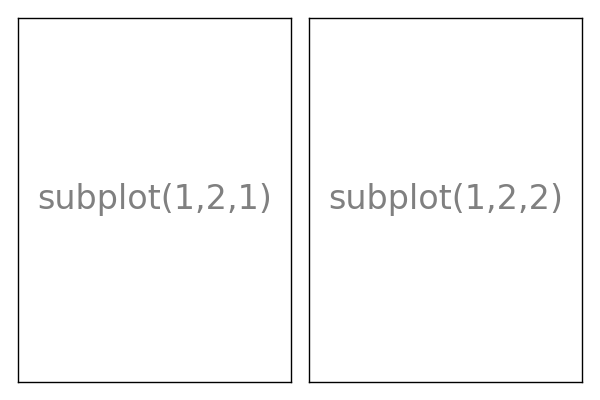
4.3.2 子图
使用子图可以在常规网格中排列图,你需要指定行数、列数以及图区。注意,gridspec命令是一个更强大的选择。


4.3.3 轴线
坐标轴非常类似于子图,但允许将绘图放置在figure中的任何位置。所以,如果我们想把一个较小的图形放在一个更大的图里面,我们将用axes方法这样做。


4.3.4 刻度
格式友好的刻度是准备发布figure重要的组成部分,Matplotlib为刻度提供了一个完全可配置的系统。有刻度定位符指定刻度应该出现在那里和刻度格式化给刻度你想要的外观,主要刻度和次要刻度可以独立的被定位和格式化,默认的次要刻度不显示,即它们只有一个空列表,因为它是NullLocator(见下文)。
刻度定位符
刻度定位符控制刻度的位置,它们设置如下:
ax = plt.gca()ax.xaxis.set_major_locator(eval(locator))
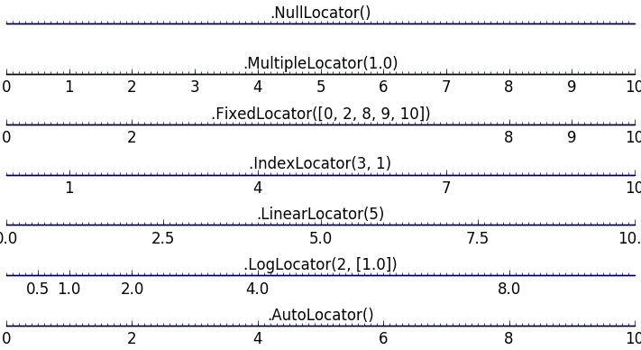
有几种定位器适用于不同类型的要求:
所有这些定位器派生自基类matplotlib.ticker.Locater。你可以使用自己的派生定位器,将刻度作为日期处理可能特别棘手。因此,matplotlib在matplotlib.dates提供了特别的定位符。
4.4 其他类型的图形:示例和练习
4.4.1 常规图(Regular Plots)
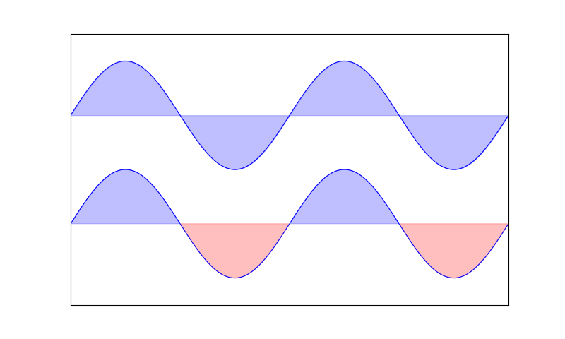
你需要使用fill_between命令,从以下代码开始,尝试
n = 256X = np.linspace(-np.pi, np.pi, n, endpoint=True)Y = np.sin(2 * X)plt.plot(X, Y + 1, color='blue', alpha=1.00)plt.plot(X, Y - 1, color='blue', alpha=1.00)
4.4.2 散点图(Scatter Plots)

n = 1024X = np.random.normal(0,1,n)Y = np.random.normal(0,1,n)plt.scatter(X,Y)
4.4.3 柱状图(Bar Plots)
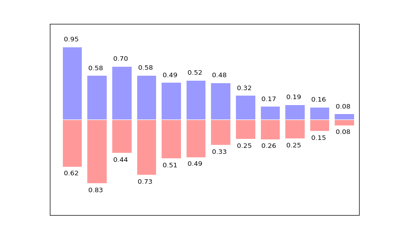
n = 12X = np.arange(n)Y1 = (1 - X / float(n)) * np.random.uniform(0.5, 1.0, n)Y2 = (1 - X / float(n)) * np.random.uniform(0.5, 1.0, n)plt.bar(X, +Y1, facecolor='#9999ff', edgecolor='white')plt.bar(X, -Y2, facecolor='#ff9999', edgecolor='white')for x, y in zip(X, Y1): plt.text(x + 0.4, y + 0.05, '%.2f ' % y, ha='center', va='bottom')plt.ylim(-1.25, +1.25)
4.4.4 等高线图(Contour Plots)
def f(x, y): return (1 - x / 2 + x ** 5 + y ** 3) * np.exp(-x ** 2 -y ** 2)n = 256x = np.linspace(-3, 3, n)y = np.linspace(-3, 3, n)X, Y = np.meshgrid(x, y)plt.contourf(X, Y, f(X, Y), 8, alpha=.75, cmap='jet')C = plt.contour(X, Y, f(X, Y), 8, colors='black', linewidth=.5)
4.4.5 显示图像(Imshow)
def f(x, y): return (1 - x / 2 + x ** 5 + y ** 3) * np.exp(-x ** 2 - y ** 2)n = 10x = np.linspace(-3, 3, 4 * n)y = np.linspace(-3, 3, 3 * n)X, Y = np.meshgrid(x, y)plt.imshow(f(X, Y))
4.4.6 饼图(Pie Plots)
Z = np.random.uniform(0, 1, 20)plt.pie(Z)
4.4.7 向量场图(Quiver Plots)
n = 8X, Y = np.mgrid[0:n, 0:n]plt.quiver(X, Y)
4.4.8 网格线(Grids)
axes = plt.gca()axes.set_xlim(0, 4)axes.set_ylim(0, 3)axes.set_xticklabels([])axes.set_yticklabels([])
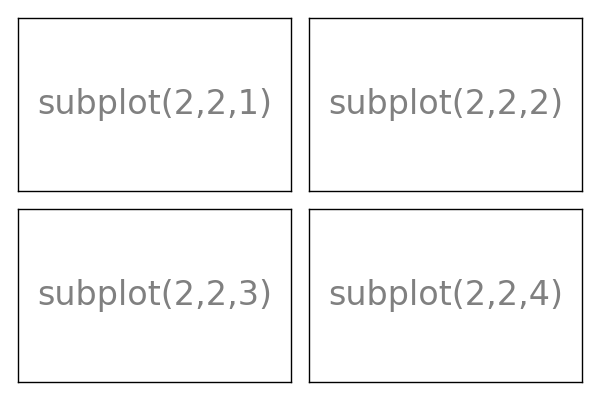
4.4.9 多图(Multi Plots)
plt.subplot(2, 2, 1)plt.subplot(2, 2, 3)plt.subplot(2, 2, 4)
4.4.10 极轴(Polar Axis)
plt.axes([0, 0, 1, 1])N = 20theta = np.arange(0., 2 * np.pi, 2 * np.pi / N)radii = 10 * np.random.rand(N)width = np.pi / 4 * np.random.rand(N)bars = plt.bar(theta, radii, width=width, bottom=0.0)for r, bar in zip(radii, bars): bar.set_facecolor(cm.jet(r / 10.)) bar.set_alpha(0.5)
4.4.11 三维图(3D Plots)
from mpl_toolkits.mplot3d import Axes3Dfig = plt.figure()ax = Axes3D(fig)X = np.arange(-4, 4, 0.25)Y = np.arange(-4, 4, 0.25)X, Y = np.meshgrid(X, Y)R = np.sqrt(X**2 + Y**2)Z = np.sin(R)ax.plot_surface(X, Y, Z, rstride=1, cstride=1, cmap='hot')
4.4.12 文本(Text)
- Matplotlib:plotting
- matplotlib Plotting commands summary——matplotlib.pyplot函数功能说明
- plotting pieces
- PlotKit - Javascript Chart Plotting
- Plotting in jQuery
- Plotting Factor Analysis Results
- Interactive plotting with rbokeh
- bokeh.plotting API
- Plotting Graphic with R
- MatPlotLib
- matplotlib
- matplotlib
- matplotlib
- matplotlib
- matplotlib
- matplotlib
- matplotlib
- matplotlib
- html5 canvas 画笔透明的实现方法
- 【自考】—信系开管这次我们走心了
- 班级 学号 姓名 map集合映射
- Django自定义访问日志模块
- C语言,从字符串中提取一个字符串,int substr(char dst[], char src[],int start,int len)
- Matplotlib:plotting
- 看菜鸟如何更改Windows下 MySQL5.7 版本的服务名
- Linux设备驱动程序安装fatal error: linux/module.h: No such file or directory
- 使用ListView实现垂直跑马灯效果
- Windows运行PHP+MYSQL时,MYSQL服务无法正常启动的解决办法(1053错误)
- 数据结构(八)线性表链式存储结构
- 加速iOS开发的28个第三方库
- Ubuntu麒麟下搭建FTP服务
- leetCode练习(78)