pandas小记:pandas高级功能
来源:互联网 发布:淘宝超级会员要买多少 编辑:程序博客网 时间:2024/05/16 01:57
http://blog.csdn.net/pipisorry/article/details/53486777
pandas高级功能:面板数据、字符串方法、分类、可视化。
面板数据
{pandas数据结构有一维Series,二维DataFrame,这是三维Panel}pandas有一个Panel数据结构,可以将其看做一个三维版的,可以用一个由DataFrame对象组成的字典或一个三维ndarray来创建Panel对象:
import pandas.io.data as web
pdata = pd.Panel(dict((stk, web.get_data_yahoo(stk, '1/1/2009', '6/1/2012')) for stk in ['AAPL', 'GOOG', 'MSFT','DELL']))
Note: stk代表指标,6个指标;三维:stk,company,time.
Panel中的每一项(类似于DataFrame的列)都是一个DataFrame
>>> pdata
<class 'pandas.core.panel.Panel'>
Dimensions: 4 (items) x 868 (major_axis) x 6 (minor_axis)
Items axis: AAPL to MSFT
Major_axis axis: 2009-01-02 00:00:00 to 2012-06-01 00:00:00
Minor_axis axis: Open to Adj Close
>>> pdata = pdata.swapaxes('items', 'minor')
>>>pdata['Adj Close']
三维度ix标签索引
基于ix的标签索引被推广到了三个维度,因此可以选取指定日期或日期范围的所有数据,如下所示:>>> pdata.ix[:,'6/1/2012',:]
>>>pdata.ix['Adj Close', '5/22/2012':,:]
另一个用于呈现面板数据(尤其是对拟合统计模型)的办法是“堆积式的” DataFrame 形式:
>>> stacked=pdata.ix[:,'5/30/2012':,:].to_frame()
>>>stacked
DataFrame有一个相应的to_panel方法,它是to_frame的逆运算:
>>> stacked.to_panel()
<class 'pandas.core.panel.Panel'>
Dimensions: 6 (items) x 3 (major_axis) x 4 (minor_axis)
Items axis: Open to Adj Close
Major_axis axis: 2012-05-30 00:00:00 to 2012-06-01 00:00:00
Minor_axis axis: AAPL to MSFT
皮皮Blog
字符串方法String Methods
Series is equipped with a set of string processing methods in the strattribute that make it easy to operate on each element of the array, as in thecode snippet below. Note that pattern-matching instr generally usesregularexpressions by default (and insome cases always uses them). See more atVectorized String Methods.
In [71]: s = pd.Series(['A', 'B', 'C', 'Aaba', 'Baca', np.nan, 'CABA', 'dog', 'cat'])In [72]: s.str.lower()Out[72]: 0 a1 b2 c3 aaba4 baca5 NaN6 caba7 dog8 catdtype: object皮皮Blog
分类Categoricals
Since version 0.15, pandas can include categorical data in a DataFrame. For full docs, see thecategorical introduction and theAPI documentation.
In [122]: df = pd.DataFrame({"id":[1,2,3,4,5,6], "raw_grade":['a', 'b', 'b', 'a', 'a', 'e']})Convert the raw grades to a categorical data type.
In [123]: df["grade"] = df["raw_grade"].astype("category")In [124]: df["grade"]Out[124]: 0 a1 b2 b3 a4 a5 eName: grade, dtype: categoryCategories (3, object): [a, b, e]Rename the categories to more meaningful names (assigning to Series.cat.categories is inplace!)
In [125]: df["grade"].cat.categories = ["very good", "good", "very bad"]Reorder the categories and simultaneously add the missing categories (methods underSeries.cat return a newSeries per default).
In [126]: df["grade"] = df["grade"].cat.set_categories(["very bad", "bad", "medium", "good", "very good"])In [127]: df["grade"]Out[127]: 0 very good1 good2 good3 very good4 very good5 very badName: grade, dtype: categoryCategories (5, object): [very bad, bad, medium, good, very good]Sorting is per order in the categories, not lexical order.
In [128]: df.sort_values(by="grade")Out[128]: id raw_grade grade5 6 e very bad1 2 b good2 3 b good0 1 a very good3 4 a very good4 5 a very goodGrouping by a categorical column shows also empty categories.
In [129]: df.groupby("grade").size()Out[129]: gradevery bad 1bad 0medium 0good 2very good 3dtype: int64皮皮blog
可视化Plot
DataFrame内置基于matplotlib的绘图功能
直接绘制
Plotting docs.
In [130]: ts = pd.Series(np.random.randn(1000), index=pd.date_range('1/1/2000', periods=1000))In [131]: ts = ts.cumsum()In [132]: ts.plot()Out[132]: <matplotlib.axes._subplots.AxesSubplot at 0xaf49988c>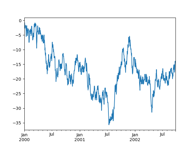
On DataFrame, plot() is a convenience to plot all of the columns with labels:
In [133]: df = pd.DataFrame(np.random.randn(1000, 4), index=ts.index, .....: columns=['A', 'B', 'C', 'D']) .....: In [134]: df = df.cumsum()In [135]: plt.figure(); df.plot(); plt.legend(loc='best')Out[135]: <matplotlib.legend.Legend at 0xaf499d4c>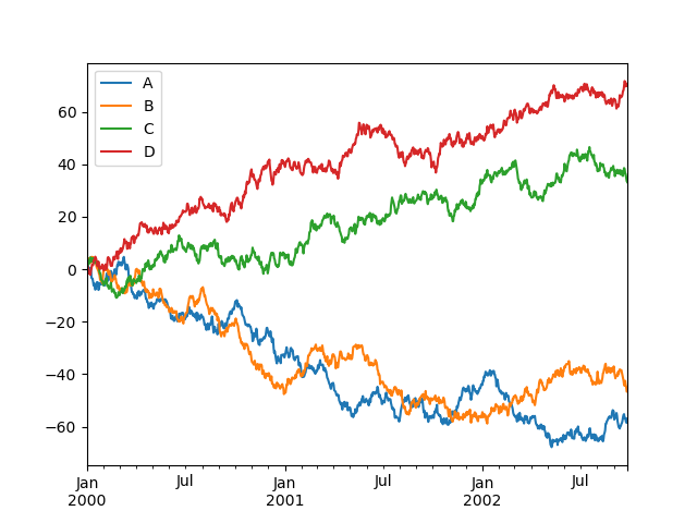
绘制盒图
Python中有许多可视化模块,最流行的当属matpalotlib库[matplotlib绘图基础]。稍加提及,我们也可选择bokeh和seaborn模块[python高级绘图库seaborn]。
使用matplotlib

使用pandas模块中集成R的ggplot主题来美化图表
要使用ggplot,我们只需要在上述代码中多加一行:

比matplotlib.pyplot主题简洁太多。
更好的是引入seaborn模块
该模块是一个统计数据可视化库:


绘制散点图scatter
df:
age fat_percent
0 23 9.5
1 23 26.5
2 27 7.8
3 27 17.8
4 39 31.4
5 41 25.9
plt.show(df.plot(kind='scatter', x='age', y='fat_percent'))

Note: 不指定x,y会出错: ValueError: scatter requires and x and y column
绘制直方曲线图

绘制其它图


from: http://blog.csdn.net/pipisorry/article/details/53486777
ref: 《利用Python进行数据分析》*
利用Python进行数据分析——pandas入门(五)
API Reference
pandas-docs/stable
Notebook Python: Getting Started with Data Analysis
Python数据分析入门
Python and R: Is Python really faster than R?
- pandas小记:pandas高级功能
- pandas小记:pandas数据结构
- pandas小记:pandas基本设置
- pandas小记:pandas数据输入输出
- python使用pandas小记
- pandas小记:pandas索引和选择
- pandas小记:pandas计算工具-汇总统计
- pandas小记:pandas索引和选择
- pandas小记:pandas计算工具-汇总统计
- pandas
- pandas
- Pandas
- pandas
- pandas
- pandas
- pandas
- Pandas
- pandas
- 走进AngularJs(七) 过滤器(filter)
- 梯度寻优
- Unicode(UTF-8, UTF-16)令人混淆的概念
- Activity内嵌Fragment,当Activity recreate时Fragment被添加多次,造成相互遮盖
- 判断应用是否处于前台的六种方法优缺点?
- pandas小记:pandas高级功能
- JavaScript停止冒泡和阻止浏览器默认行为
- 第十五周—C语言 项目3(二维数组)
- cocos2d-x创建新工程的方法
- kmeans
- hdu 1796 容斥+dfs+lcm
- SPOJ 375 Query on a tree
- Eclipse快捷键
- 字符编码笔记:ASCII,Unicode和UTF-8