可视化MNIST之降维探索Visualizing MNIST: An Exploration of Dimensionality Reduction-1
来源:互联网 发布:手机设计家具软件 编辑:程序博客网 时间:2024/05/16 14:03
At some fundamental level, no one understands machine learning.
It isn’t a matter of things being too complicated. Almost everything we do is fundamentally very simple. Unfortunately, an innate human handicap interferes with us understanding these simple things.
Humans evolved to reason fluidly about two and three dimensions. With some effort, we may think in four dimensions. Machine learning often demands we work with thousands of dimensions – or tens of thousands, or millions! Even very simple things become hard to understand when you do them in very high numbers of dimensions.
Reasoning directly about these high dimensional spaces is just short of hopeless.
As is often the case when humans can’t directly do something, we’ve built tools to help us. There is an entire, well-developed field, called dimensionality reduction, which explores techniques for translating high-dimensional data into lower dimensional data. Much work has also been done on the closely related subject of visualizing high dimensional data.
These techniques are the basic building blocks we will need if we wish to visualize machine learning, and deep learning specifically. My hope is that, through visualization and observing more directly what is actually happening, we can understand neural networks in a much deeper and more direct way.
And so, the first thing on our agenda is to familiarize ourselves with dimensionality reduction. To do that, we’re going to need a dataset to test these techniques on.
MNIST
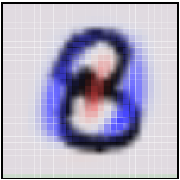
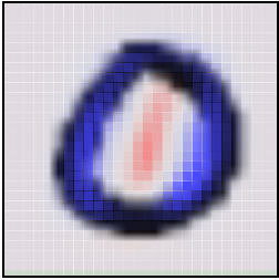
MNIST is a simple computer vision dataset. It consists of 28x28 pixel images of handwritten digits, such as:
Every MNIST data point, every image, can be thought of as an array of numbers describing how dark each pixel is. For example, we might think of 
≃⎡⎣⎢⎢⎢⎢⎢⎢⎢⎢⎢⎢⎢⎢⎢⎢⎢⎢⎢00000000000000000000000000000000000000000000000000000000000000000000000000000000000000.6.7.7.50000000000.81111111.9.30000000.4.4.4.7111000000000000.1.10000000000000000000000000000000000000000000000000000000000⎤⎦⎥⎥⎥⎥⎥⎥⎥⎥⎥⎥⎥⎥⎥⎥⎥⎥⎥Since each image has 28 by 28 pixels, we get a 28x28 array. We can flatten each array into a
Not all vectors in this 784-dimensional space are MNIST digits. Typical points in this space are very different! To get a sense of what a typical point looks like, we can randomly pick a few points and examine them. In a random point – a random 28x28 image – each pixel is randomly black, white or some shade of gray. The result is that random points look like noise.
Images like MNIST digits are very rare. While the MNIST data points are embedded in 784-dimensional space, they live in a very small subspace. With some slightly harder arguments, we can see that they occupy a lower dimensional subspace.
People have lots of theories about what sort of lower dimensional structure MNIST, and similar data, have. One popular theory among machine learning researchers is the manifold hypothesis: MNIST is a low dimensional manifold, sweeping and curving through its high-dimensional embedding space. Another hypothesis, more associated with topological data analysis, is that data like MNIST consists of blobs with tentacle-like protrusions sticking out into the surrounding space.
But no one really knows, so lets explore!
The MNIST Cube
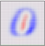
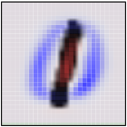
We can think of the MNIST data points as points suspended in a 784-dimensional cube. Each dimension of the cube corresponds to a particular pixel. The data points range from zero to one according to the pixels intensity. On one side of the dimension, there are images where that pixel is white. On the other side of the dimension, there are images where it is black. In between, there are images where it is gray.
If we think of it this way, a natural question occurs. What does the cube look like if we look at a particular two-dimensional face? Like staring into a snow-globe, we see the data points projected into two dimensions, with one dimension corresponding to the intensity of a particular pixel, and the other corresponding to the intensity of a second pixel. Examining this allows us to explore MNIST in a very raw way.
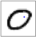
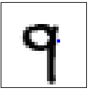
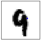
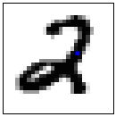
In this visualization, each dot is an MNIST data point. The dots are colored based on which class of digit the data point belongs to. When your mouse hovers over a dot, the image for that data point is displayed on each axis. Each axis corresponds to the intensity of a particular pixel, as labeled and visualized as a blue dot in the small image beside it. By clicking on the image, you can change which pixel is displayed on that axis.
Exploring this visualization, we can see some glimpses of the structure of MNIST. Looking at thepixels
Despite minor successes like these, one can’t really can’t understand MNIST this way. The small insights one gains feel very fragile and feel a lot like luck. The truth is, simply, that very little of MNIST’s structure is visible from these perspectives. You can’t understand images by looking at just two pixels at a time.
But there’s lots of other perspectives we could look at MNIST from! In these perspectives, instead of looking a face straight on, one looks at it from an angle.
The challenge is that we need to choose what perspective we want to use. What angle do we want to look at it from horizontally? What angle do we want to look at it from vertically? Thankfully, there’s a technique called Principal Components Analysis (PCA) that will find the best possible angle for us. By this, we mean that PCA will find the angle that spreads out the points the most (captures the most variance possible).
But, what does it even mean to look at a 784-dimensional cube from an angle? Well, we need to decide which direction every axis of the cube should be tilted: to one side, to the other, or somewhere in between?
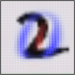
To be concrete, the following are pictures of the two angles PCA chooses. Red represents tilting a pixel’s dimension to one side, blue to the other.
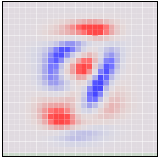
If an MNIST digit primarily highlights red, it ends up on one side. If it highlights blue, it ends up on a different side. The first angle – the “first principal component” – will be our horizontal angle, pushing ones (which highlight lots of red and little blue) to the left and zeros (which highlight lots of blue and little red) to the right.
Now that we know what the best horizontal and vertical angle are, we can try to look at the cube from that perspective.
This visualization is much like the one above, but now the axes are fixed to displaying the first and second ‘principal components,’ basically angles of looking at the data. In the image on each axis, blue and red are used to denote what the ‘tilt’ is for that pixel. Pixel intensity in blue regions pushes a data point to one side, pixel intensity in red regions pushes us to the other.
While much better than before, it’s still not terribly good. Unfortunately, even looking at the data from the best angle, MNIST data doesn’t line up nicely for us to look at. It’s a non-trivial high-dimensional structure, and these sorts of linear projections just aren’t going to cut it.
Thankfully, we have some powerful tools for dealing with datasets which are… uncooperative.
Optimization-Based Dimensionality Reduction
What would we consider a success? What would it mean to have the ‘perfect’ visualization of MNIST? What should our goal be?
One really nice property would be if the distances between points in our visualization were the same as the distances between points in the original space. If that was true, we’d be capturing the global geometry of the data.
Let’s be a bit more precise. For any two MNIST data points,
This value describes how bad a visualization is. It basically says: “It’s bad for distances to not be the same. In fact, it’s quadratically bad.” If it’s high, it means that distances are dissimilar to the original space. If it’s small, it means they are similar. If it is zero, we have a ‘perfect’ embedding.
That sounds like an optimization problem! And deep learning researchers know what to do with those! We pick a random starting point and apply gradient descent. 2
This technique is called multidimensional scaling (or MDS). If you like, there’s a more physical description of what’s going on. First, we randomly position each point on a plane. Next we connect each pair of points with a spring with the length of the original distance,
We don’t reach a cost of zero, of course. Generally, high-dimensional structures can’t be embedded in two dimensions in a way that preserves distances perfectly. We’re demanding the impossible! But, even though we don’t get a perfect answer, we do improve a lot on the original random embedding, and come to a decent visualization. We can see the different classes begin to separate, especially the ones.
Sammon’s Mapping
Still, it seems like we should be able to do much better. Perhaps we should consider different cost functions? There’s a huge space of possibilities. To start, there’s a lot of variations on MDS. A common theme is cost functions emphasizing local structure as more important to maintain than global structure. A very simple example of this is Sammon’s Mapping, defined by the cost function:
In Sammon’s mapping, we try harder to preserve the distances between nearby points than between those which are far apart. If two points are twice as close in the original space as two others, it is twice as important to maintain the distance between them.
For MNIST, the result isn’t that different. The reason has to do with a rather unintuitive property regarding distances in high-dimensional data like MNIST. Let’s consider the distances between some MNIST digits. For example, the distance between the similar ones, 

,)=4.53
 ,)=12.0,)
Because there’s so many ways similar points can be slightly different, the average distance between similar points is quite high. Conversely, as you get further away from a point, the amount of volume within that distance increases to an extremely high power, and so you are likely to run into different kinds of points. The result is that, in pixel space, the difference in distances between ‘similar’ and ‘different’ points can be much less than we’d like, even in good cases.
from: http://colah.github.io/posts/2014-10-Visualizing-MNIST/
- 可视化MNIST之降维探索Visualizing MNIST: An Exploration of Dimensionality Reduction-1
- 可视化MNIST:降维之探索Visualizing MNIST: An Exploration of Dimensionality Reduction
- 可视化MNIST之降维探索Visualizing MNIST: An Exploration of Dimensionality Reduction-2
- MNIST 可视化
- tensorflow之MNIST手写字符集训练可视化
- 海量数据挖掘MMDS week4: 推荐系统之数据降维Dimensionality Reduction
- MNIST数据可视化
- MNIST数据可视化
- 3.MNIST可视化
- mnist
- mnist
- mnist
- MNIST
- MNIST 数据集可视化代码
- Tensorflow之Mnist入门
- TensorFlow之深入MNIST
- tensorflow 入门之MNIST
- tensorflow初学之MNIST
- 视觉是如何演化的1
- HDFS DataNode 设计实现解析
- 2016-AspNet-MVC教学-8-异步Controller的应用
- ROS系统安装
- 石子合并
- 可视化MNIST之降维探索Visualizing MNIST: An Exploration of Dimensionality Reduction-1
- 使用fdisk e2fsck resize2fs调整Linux分区大小
- Android postTranslate和preTranslate
- 如何判断Edittext输入完成
- hdoj 天气情况 1437 (打表&数学)
- ROS知识要点
- Java序列化与反序列化
- JAVA启动参数
- 字节码操作_javassist库_动态创建新类_属性_方法_构造器_API详解JAVA216-217