可视化MNIST之降维探索Visualizing MNIST: An Exploration of Dimensionality Reduction-2
来源:互联网 发布:淘宝直播安卓版 编辑:程序博客网 时间:2024/05/18 22:45
Graph Based Visualization
Perhaps, if local behavior is what we want our embedding to preserve, we should optimize for that more explicitly.
Consider a nearest neighbor graph of MNIST. For example, consider a graph
Given such a graph, we can use standard graph layout algorithms to visualize MNIST. Here, we will use force-directed graph drawing: we pretend that all points are repelling charged particles, and that the edges are springs. This gives us a cost function:
Which we minimize.
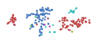
The graph discovers a lot of structure in MNIST. In particular, it seems to find the different MNIST classes. While they overlap, during the graph layout optimization we can see the clusters sliding over each other. They are unable to avoid overlapping when embedded on the plane due to connections between classes, but the cost function is at least trying to separate them.
One nice property of the graph visualization is that it explicitly shows us which points are connected to which other points. In earlier visualizations, if we see a point in a strange place, we are uncertain as to whether it’s just stuck there, or if it should actually be there. The graph structure avoids this. For example, if you look at the red cluster of zeros, you will see a single blue point, the six 
t-Distributed Stochastic Neighbor Embedding
The final technique I wish to introduce is the t-Distributed Stochastic Neighbor Embedding (t-SNE). This technique is extremely popular in the deep learning community. Unfortunately, t-SNE’s cost function involves some non-trivial mathematical machinery and requires some significant effort to understand.
But, roughly, what t-SNE tries to optimize for is preserving the topology of the data. For every point, it constructs a notion of which other points are it’s ‘neighbors,’ trying to make all points have the same number of neighbors. Then it tries to embed them so that those points all have the same number of neighbors.
In some ways, t-SNE is a lot like the graph based visualization. But instead of just having points be neighbors (if there’s an edge) or not neighbors (if there isn’t an edge), t-SNE has a continuous spectrum of having points be neighbors to different extents.
t-SNE is often very successful at revealing clusters and subclusters in data.
t-SNE does an impressive job finding clusters and subclusters in the data, but is prone to getting stuck in local minima. For example, in the following image we can see two clusters of zeros (red) that fail to come together because a cluster of sixes (blue) get stuck between them.
A number of tricks can help us avoid these bad local minima. Firstly, using more data helps a lot. Because these visualizations are embeded in a blog post, they only use 1,000 points. Using the full 50,000 MNIST points works a lot better. In addition, it is recommended that one usesimulated annealing and carefully select a number of hyperparamters.
Well done t-SNE plots reveal many interesting features of MNIST.
An even nicer plot can be found on the page labeled 2590, in the original t-SNE paper, Maaten & Hinton (2008).
It’s not just the classes that t-SNE finds. Let’s look more closely at the ones.
The ones cluster is stretched horizontally. As we look at digits from left to right, we see a consistent pattern.
 →
→ →
→ →
→ →
→ →
→
They move from forward leaning ones, like
Similar structure can be observed in other classes, if you look at the t-SNE plot again.
Visualization in Three Dimensions
Watching these visualizations, there’s sometimes this sense that they’re begging for another dimension. For example, watching the graph visualization optimize, one can see clusters slide over top of each other.
Really, we’re trying to compress this extremely high-dimensional structure into two dimensions. It seems natural to think that there would be very big wins from adding an additional dimension. If nothing else, at least in three dimensions a line connecting two clusters doesn’t divide the plane, precluding other connections between clusters.
In the following visualization, we construct a nearest neighbor graph of MNIST, as before, and optimize the same cost function. The only difference is that there are now three dimensions to lay it out in.
(click and drag to rotate)
The three dimensional version, unsurprisingly, works much better. The clusters are quite separated and, while entangled, no longer overlap.
In this visualization, we can begin to see why it is easy to achieve around 95% accuracy classifying MNIST digits, but quickly becomes harder after that. You can make a lot of ground classifying digits by chopping off the colored protrusions above, the clusters of each class sticking out. (This is more or less what a linear Support Vector Machine does.4) But there’s some much harder entangled sections, especially in the middle, that are difficult to classify.
Of course, we could do any of the above techniques in 3D! Even something as simple as MDS is able to display quite a bit in 3D.
(click and drag to rotate)
In three dimensions, MDS does a much better job separating the classes than it did with two dimensions.
And, of course, we can do t-SNE in three dimensions.
(click and drag to rotate)
Because t-SNE puts so much space between clusters, it benefits a lot less from the transition to three dimensions. It’s still quite nice, though, and becomes much more so with more points.
If you want to visualize high dimensional data, there are, indeed, significant gains to doing it in three dimensions over two.
Conclusion
Dimensionality reduction is a well developed area, and we’re only scratching the surface here. There are hundreds of techniques and variants that are unmentioned here. I encourage you to explore!
It’s easy to slip into a mind set of thinking one of these techniques is better than the others, but I think they’re all complementary. There’s no way to map high-dimensional data into low dimensions and preserve all the structure. So, an approach must make trade-offs, sacrificing one property to preserve another. PCA tries to preserve linear structure, MDS tries to preserve global geometry, and t-SNE tries to preserve topology (neighborhood structure).
These techniques give us a way to gain traction on understanding high-dimensional data. While directly trying to understand high-dimensional data with the human mind is all but hopeless, with these tools we can begin to make progress.
In the next post, we will explore applying these techniques to some different kinds of data – in particular, to visualizing representations of text. Then, equipped with these techniques, we will shift our focus to understanding neural networks themselves, visualizing how they transform high-dimensional data and building techniques to visualize the space of neural networks. If you’re interested, you can subscribe to my rss feed so that you’ll see these posts when they are published.
(I would be delighted to hear your comments and thoughts: you can comment inline or at the end. For typos, technical errors, or clarifications you would like to see added, you are encouraged to make a pull request on github)
Acknowledgements
I’m grateful for the hospitality of Google’s deep learning research group, which had me as an intern while I wrote this post and did the work it is based on. I’m especially grateful to my internship host, Jeff Dean.
I was greatly helped by the comments, advice, and encouragement of many Googlers, both in the deep learning group and outside of it. These include: Greg Corrado, Jon Shlens, Matthieu Devin, Andrew Dai, Quoc Le, Anelia Angelova, Oriol Vinyals, Ilya Sutskever, Ian Goodfellow, Jutta Degener, and Anna Goldie.
I was strongly influenced by the thoughts, comments and notes of Michael Nielsen, especially his notes on Bret Victor’s work. Michael’s thoughts persuaded me that I should think seriously about interactive visualizations for understanding deep learning.
I was also helped by the support of a number of non-Googler friends, including Yoshua Bengio, Dario Amodei, Eliana Lorch, Taren Stinebrickner-Kauffman, and Laura Ball.
This blog post was made possible by a number of wonderful Javascript libraries, including D3.js,MathJax, jQuery, and three.js. A big thank you to everyone who contributed to these libraries.
We have a number of options for defining distance between these high-dimensional vectors. For this post, we will use L2 distance,
d(xi,xj)=∑n(xi,n−xj,n)2−−−−−−−−−−−−−√ d(xi,xj)=∑n(xi,n−xj,n)2 ↩We initialize the points’ positions by sampling a Gaussian around the origin. Our optimization process isn’t standard gradient descent. Instead, we use a variant of momentum gradient descent. Before adding the gradient to the momentum, we normalize the gradient. This reduces the need for hyper-parameter tuning. ↩
Note that points can end up connected to more, if they are the nearest neighbor of many points. ↩
This isn’t quite true. A linear SVM operates on the original space. This is a non-linear transformation of the original space. That said, this strongly suggests something similar in the original space, and so we’d expect something similar to be true. ↩
- 可视化MNIST之降维探索Visualizing MNIST: An Exploration of Dimensionality Reduction-2
- 可视化MNIST:降维之探索Visualizing MNIST: An Exploration of Dimensionality Reduction
- 可视化MNIST之降维探索Visualizing MNIST: An Exploration of Dimensionality Reduction-1
- MNIST 可视化
- tensorflow之MNIST手写字符集训练可视化
- 海量数据挖掘MMDS week4: 推荐系统之数据降维Dimensionality Reduction
- MNIST数据可视化
- MNIST数据可视化
- 3.MNIST可视化
- mnist
- mnist
- mnist
- MNIST
- MNIST 数据集可视化代码
- Tensorflow之Mnist入门
- TensorFlow之深入MNIST
- tensorflow 入门之MNIST
- tensorflow初学之MNIST
- 回调函数
- 希尔排序
- 老旧电商系统升级改造日记 - 2. 数据导入,然后搞定硬编码问题
- POJ 1789Truck History
- Java---设计模块(设计模块的简介及最简单的俩个单例代码加测试)
- 可视化MNIST之降维探索Visualizing MNIST: An Exploration of Dimensionality Reduction-2
- 《古文字学》学习
- UFLDL Tutorial 笔记
- Android开发中的一个小功能 清空搜索框的文字
- Android开发:解决android:gravity不能居中问题
- Micro2440数据传输---串口通信
- ubuntu下安装编译链
- select标签中显示指定内容
- Java内存区域划分